Sunday, April 28, 2013

Sunday Songs: Madonna - Cyberraga

MADONNA - CYBERRAGA
http://www.youtube.com/watch?v=7ATjzPc0D5A&feature=player_embedded
I'm in no position to actually cast an opinion on Madonna as a whole. As a major pop name, my hipster blood has always kept me away, but the little I have heard I've generally enjoyed. This is a track my parents have had on a mix CD for a long time before I'd ever really gotten into music, and I've always liked it. It's a calm, laid back piece with some Asian atmosphere that was only released on the Japanese and Australian discs of "Music" as a bonus track, and it needs more exposure. Give it a listen!

As a guy who's not listened to much Madonna at all, no links.

End Recording,
Ego.

Saturday, April 27, 2013

Pixel Art Lesson: xolstice's "Kiki and Jiji" (Smooth Curves, Dithering, Contrast)

http://www.youtube.com/watch?v=SgZsEO2OJNs&feature=player_embedded
An unreleased song from AC:R, used in one of the Desmond segments. I like it, it should've been in the official soundtrack.

This week I wanted to handle smoothing curves. It's a big component in my own work - I'm a stickler for even curves. Turns out that xolstice came along on PJ and handed me a perfect piece to use to discuss them! Despite really being into smooth perfect curves, I find it one of the most absurdly hard things to discuss, but I think over the past couple of days I wrote xolstice an excellent breakdown of what it means.

xolstice's "Kiki and Jiji"

Major Themes: Smooth Curves, Dithering, Contrast

this was my first pixel art ever, that's why it's rough and all. I just found some tutorials here in PJ~ *goes off to study more*
Alright, first off, that is an amazing attitude to come in with. Confident enough to post, humble enough to admit flaws, enthusiastic and interested in active improvement.
After a couple of comments complimenting the cuteness of the piece I showed up.
From just a view, this looks really nice. Kiki is cute, the animation is pleasant, and overall it just feels good to look at.
Looking closer, well, it's pretty obvious that you haven't been at this all that long. Don't take that as a bad thing, I'm not trying to be harsh or anything! In fact, looking in and seeing all the ways it's mistaken actually makes it pretty amazing that it still came out looking so nice, so that's pretty awesome of you.
The biggest thing that this needs work on is smoothness. The curves are all moving generally in the right way, but they are often rough and jagged. The, uh, ribbon (I think? I don't remmeber Kiki's design very well) is a great example of where the curves would flow in a much smoother way. Typically, you can get this with an exponential progression of sizes - if I'm not being clear here let me know and I'll elaborate, since this is an important thing.
Second, you have some color weirdness. The biggest issue, I'd say, is one of contrast, the difference in lightness/darkness between shades of a color. For example, on the ribbon again, you have three reds: a light pink, a red, and a darker outline. The light pink is so similar to the others, however, that it's practically invisible unless zoomed in quite a bit. The darker purple on the dress (not the outline though) and the darkest yellow on the broom are both a little too bright in my opinion. Note that as saturation increases, you will need more contrast to differentiate the shades of a color - this is likely why the contrast on the face and hair are fine, since they are lower saturation colors. 
On the face, I can see you attempted a bit of dithering with the cheeks, I'm guessing because you saw the idea in the tutorials or something. On the broom, the dithering works well, but on the cheeks it has some trouble because the contrast is so high between the orange and the tan that instead of blending perfectly, the checkerboard is clearly visible. An interesting experiment though. If you want the dithering to work a bit better there, make the lighter orange a little closer to the tan of the face.
Last is banding. This is a hard concept to explain, but since you seem open to reading tutorials I'd recommend this one: http://www.pixel.schlet.net/#C2
I thought it might be self-serving to post my own banding tutorial. 
Regardless, it's a pretty good piece and I look forward to seeing you improve. Keep up that enthusiasm for learning!
(ps do you mind if I use this as an example in a tutorial of my own I am writing about pixel art?)
I figured I should start ASKING these artists if I'm engaging with them while I'm writing these. I mean, I always give proper credit and all, but still, explicit permission is nice.
Anyway, my first wave of crits over, he replied:
hello! thank you for the constructive feedback! I can't seem to get dithering right. I am also having a hard time getting a good "flow" with animation. It always turns out clunky for me =/ It would be really great if you can give me a bit of advice on this exponential progression of sizes~

Also, yes you can use it for a tutorial! I'd be glad if this could be used to help others too~
I'd be glad too! This prompting was all I needed to go into this full force.
No problem!
On animation, I wouldn't worry about it. The way it looks right actually is just right in the animation sense - being slow and maybe a bit jumpy isn't that bad since the frames each look nice and have a good logical progression to them. In particular, the slow movement of them reminds me of some old video game idle stances (I'm thinking of Tales of Phantasia in particular right now). Kinda charming in and of itself. I will admit though, I'm no pro when it comes to animation, my stuff is focused on single scenes.
No kidding there, I don't animate stuff at all. I've been meaning to do more experimenting there, but it's a huge investment of work to do it.
For dithering, well, that's got two elements. The first is practice. It took me YEARS to start gettin' dithering really okay. The second is to understand that dithering is not only checkerboards - the idea is that you make a gradation of it - it's pretty remarkable how many different colors you can make out of just two. Here, take a look:
That's all the same two colors. If they weren't in as big blocks with each other, it'd be even smoother. The thing to remember is that there are TWO purposes to dithering: transitioning and texturing. The former is about making the dithering as un-apparent as possible, making several colors that seem to seemlessly blend into each other. The latter is the opposite, where you WANT the viewer to see the dithering because it gives it a kinda rough look like unhewn stone. Unfortunately, there's no surefire way to make your dithering do one or the other. I think the biggest thing you can do to make it transition rather than texture would be to use a higher number of stages of dithering and to have colors be closer together. But really, this is a lot of practice stuff.
One of these days I'll probably write a post about dithering. Articulation beyond the basics gets tricky though.
For an interesting experiment with that, try using an established weird palette, just to try. The CGA and ZX Spectrum palettes might be a bit too bizarre to use as early teaching tools, but Dawnbringer's Palette and the C64 Palette (pepto or ptoing) are great. They have low numbers of available colors, making dithering helpful to get more variety, but are set up well so that the colors can blend together well already. Something to think about trying!
Those are weird palettes that force you into limited colors, and the C64 one especially is amazing for teaching dithering since it typically requires a lot of use of the grays as buffering colors, which is an ideal thing to use for dithering. I really like the c64 palette. It stands for Commodore 64 by the way, and the reason I said "pepto or ptoing" is that there are actually two versions of the palette made by those people. The c64's colors were analog, which means we don't have perfect hex representations of them, we had to make estimations. Ptoing's version is slightly lighter than pepto's but they both have their uses.
And now for curves. The general theory involved is that the length of each line should be progressively longer or shorter without jumping around - so, a curve could go from like a 5px segment to a 3px to a 2px to a 2px to a 1px, but not from a 5px to a 2px to a 3px to a 1px. Don't worry if that's kinda abstract sounding, I'm gonna illustrate it.
Here's an absolutely perfect curve, in that it's not a curve at all. It is 100% smooth because there are no changes. Unfortunately, it's pretty bad at indicating direction changes :p

Conversely, here's an absolutely imperfect curve, a complete 90 degree turn. This indicates direction change, but it's not exactly elegant. It's a sharp corner rather than a curve. So if the ideal is somewhere in between...

Then this? Okay, this is an exact compromise, made of THREE lines - a horizontal, a 45 degree angle, and a vertical. Again, this is a little better at expressing the curve, but it's still not all that elegant. It is, however, suitable for specifically styled pieces. Let's enhance it further.

Uh oh, I made this one red. Something is wrong with this curve. It looks like it might be alright at indicating change of direction, but it's not smooth in any sense of the word. The big reason is that there's no progression of segment direction - it goes from a 3-long diagonal to a several-long horizontal to a diagonal to a horizontal to diagonal to vertical to diagonal to vertical again, etc.

This one also seems better, but it's deceptive. While this uses shorter segments, giving us more lines and direction shifts, it has the same problem as the previous one - it alternates between diagonal and flat. Here, this next one is connected:

This is a sort of "idealized" version of the previous one. If you compare them, this one is similar but uses straight lines rather than a jerky shifting from diagonal to flat. We're definitely getting more curve-like though.

I think I've grounded the idea of the wrong way to do it there. But what do you do instead? This technically follows the basic concept. See how it has a long flat segment, then a single pixel shifted off of that is another line of slightly less length? That's the idea, to make single shifts and each line length is a bit less than the previous one until you reach single pixels, which you then switch to doing the exact same thing with vertical flat segments. The problem on this one is that it's too abrupt - there's one one additional segment before going fully diagonal. If the philosophy was carried fully, we'd get better curves.

Both of these are when the concept is taken to its full length, but with different start points along the original line and slightly different patterns of lengths. Experiment with different patterns to develop different curves that are all smooth. This is where the idea of being "exponential" comes into play though - you don't necessarily want to just make each line 1 pixel shorter. Doing that gives you a remarkably squared-off curve. Like this one:

It's okay to repeat certain lengths to make the curve more severe or more gradual, and it's okay to jump line lengths to shorten the overall size of a curve - I often skip over a 4px long segment to go straight to from a 5px to a 3px. It's also okay to small deviations from the pattern if it enhances the curve, but doing so means that you're going to almost NEED anti-aliasing in later steps to keep it smooth.

This is a generally great curve, following all of the principles. However, there's that long straight diagonal there, and that puts this linear section in a smooth curve. So we need to break the rule a bit. Here's a suggestion from me: has to stay this subtle though, much more than this and the curve will break.
It has a bump in it, but that gives it enough of a curve to be believable, and with anti-aliasing it won't really be noticeable. It has to stay this subtle though, much more than this and the curve will break.

Want to make it a little more personal? I've applied the concept to a couple areas of this piece. The general concept applies everywhere though.
I must stress, this is the principle behind the matter, but it is in no way universal. I confess that I am personally partial to very clean curves, and they are sometimes limited in the angles they represent without significant work. With assistance from anti-aliasing though, smooth curves are quite versatile, and on a piece that focuses cuteness having nice pleasing curves is helpful to the aesthetic.
Now, this was an awful lot of text, so I hope it was easy to understand. Keep up the good work, this is an awesome start!
I'm now waiting on a response back, but we're done for now. So, what do you think? Do you understand what I mean by smooth curves and how I would obtain them? Constantly changing lines length with the changes occurring in a single direction.

I've got several other posts in the works, but they probably won't come before tomorrow's Sunday Songs. Also, CISPA is dead! I like to think I helped in making a difference. Later!
End Recording,
Ego.

Sunday, April 21, 2013

Sunday Songs: Vampire The Masquerade Bloodlines ~ Chiasm - Isolated


http://www.youtube.com/watch?v=OdDXjyjAAGE&feature=player_embedded
If you're a fan of dark metal, you'll like the soundtrack to Vampire. If you like spooky ambience music, you'll like the soundtrack to Vampire. If you want music for a soundtrack to your own tabletop game of Vampire, this is a great place to look. Lots of licensed music in the game too, but only stuff that really fits, unlike some games where they license music just to license music.
I haven't played the game, but I really like the soundtrack. I confess that I haven't actually played any of the tabletop World of Darkness games either.
The Main Menu theme is very close to a vocal-less version of Massive Attack's "Angel".
Isolated is among my favorites of the soundtrack, but it's a hard choice.

Links:
Main Menu
The Asylum ~ Chiasm - Isolate
Downtown Theme
Empire Hotel Banquet ~ Darling Violetta - Smaller God
The Last Round ~ Genitorturers - Lecher Bitch
Glaze Club ~ Aerial - Pound
Moldy Old World
The Prince's Dream (Unused)
End Credits ~ Lacuna Coil - Swamped
Come Around (Unused)

End Recording,
Ego.

Pixel Art Lessons: Creating A Framework For A Piece (feat. Kits, MetalReaper, Ego)

http://www.youtube.com/watch?v=PsO6ZnUZI0g&feature=player_embedded
Kanye West is kind of a ridiculous narcissist, but I think that's an intentional part of the "character" he projects to the public, and when I think of it in that way I find it entertaining. I'm not a particularly large fan of his rapping in general, but his voice is pretty good so once in a while he has something worthwhile come out. This continues the trend of remixes and other songs that make USE of Harder, Better, Faster, Stronger being better than the original, which I think is too repetitive on its own but is amazing as a component in other songs, mixes, and mashups.

Finally done! Sorry this one took forever to write.

Anyway, today I'm going to deviate a bit from my usual path, even more than last week. Usually I feature a single piece and critique it to point out how it could be improved so that you don't make the same mistakes in your own work. Last week I did that, but I made a large feature out of my own edit of the piece to demonstrate the revisions in action.
Today, there is no central piece being featured.

Creating A Framework For Your Piece

Featuring: "Dimibite" (by MetalReaper), "Lace (Standing)" (by Kits), "Rayquaza" "Graying Tower" "Igurock" (all 3 by Ego aka me)

Major Themes: Sketches, Purpose, Linework, Color-Blocking, Tracing

Alright, so there's several main paths that can be taken to start a piece. Which one you take depends on both taste and the circumstances, and I'll make it obvious what those are.

The first step is, of course, to have an idea. I'm sorry, I don't have advice to give you there - I struggle with it myself, which is why I produce maybe 2 or 3 serious pieces of my own in a year. I do a lot of little stuff and helping stuff, but very little that is wholly original.
So let's just pretend you HAVE an idea.

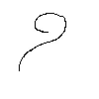
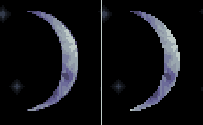
That taken care of, the next question I'd ask is: can you draw? Like, pen(cil) and paper? If yes, you have the option of creating a sketch! Taking the time to plan out your piece on a page has two uses. First, it lets you experiment with general composition in a way that can be a little more annoying when going on a pixel scale. Here's a couple sketches I've done for images.

First one is wholly original and is in sharpie, the other two are in pencil and feature GLaDOS (from when Portal 2 released) and the Pokemon Rayquaza. These formed the basis of my 3 favorite fully original pixel arts I've done in the past couple years.
Second, if you feel uncomfortable with crafting smooth lines from scratch on a pixel basis, having a sketch can give you something to literally TRACE over to make sure that the lines can turn out pretty good! It's great, regardless of the purpose of the piece.

Of course, a sketch isn't necessary. If you don't have drawing talent, no worries! I mean, you should seriously consider giving it a shot cuz it (along with other mediums) can more easily teach some elements of art as whole that you can apply to your pixels. That's just editorial commentary though, don't sweat it if you don't care about drawing.

Sketches can help regardless of the purpose of the piece. However, when you do get started on a piece and you turn on your graphics program, you need to consider what your piece is FOR. Is it a game asset? Is it just a standalone piece like a character? Is it a full scene?

I should stop beating around the bush and get to the paths to actually make the image. There are three main start points that I use: clean lines, sketching, and color blocking. Let's talk about each one.
Clean Lines
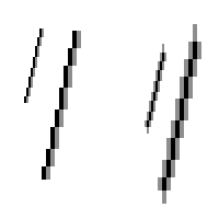
The most common one I see, and a frequently used path for beginners. The idea is that you go through, drawing lines at the zoomed-in view. This is the one that requires the LEAST prep work beforehand.
Let's see a couple samples.
MetalReaper's Dimibite. This had colors when he posted it, but it pretty obviously came from a baseline of hard black lines.
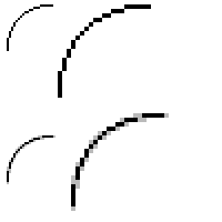
This is the lines to the Graying Tower sketch above. Basic lineart can be just plain old lines, or you can fill in general region colors to make things make sense.
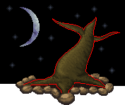
This is the GLaDOS piece again. The point of showin' this one is to show that, while I'm talking about STARTING a piece today, it's completely viable to do a piece in stages. See, here I did the head, made it's lines, did all the work to make it look all pretty, and then made the lines for the next bit, which I then completed before making the next section. That's a fine way to work (I mean, I was even doing it myself), but I warn that the pieces you do first aren't gonna be left alone later, they WILL require touching up if you do it in stages.

So what's the benefits and problems of using a clean-lined strategy? Well, the big benefit is that it gives you the entire piece's framework already made. Even better, it doesn't require much additional work on the lines once you get going.
Additionally, specific purposes are much better off with lines. Specifically, game sprites frequently feature solid outlines around them, meaning that they can often benefit from starting with clean lines. The reason game sprites often use them is that a hard outline makes it much easier to distinguish from the background, making things less confusing for the player.
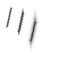
There are some troubles with lines too. One of my big issues with clean lines is that they're time-consuming to produce. Another major one is that some curves can't be done perfectly without the use of anti-aliasing or colored outlines, so that can make it imperfect. Another issue is that it can be pretty severely lacking in depth, though this can be alleviated with effort, often with careful use of filling in color areas.

A big issue with any lineart is that it is often the instinct of the new pixel artist to do it in black on a white background. I actually altered the lines above to make a point, I usually don't work in black. Black is bad because once it's there, you're going to forget to change it, and unless you're emulating a specific style or have a noticeably large game sprite, you don't want pure black. I've discussed before the ways that pure black can eat detail, as can a pure white background. Also, a pure white background is both glaring to look at and a pain if you intend to use white as a color in your piece - make the background environment something neutral and something you won't use in the piece.
This is a recommended color type from me. Nobody uses this color, and most colors show up well on it. If you couldn't tell, it's a desaturated red.

Creating lines over sketches is pretty easy. If you intend to use lineart and an original sketch, tracing with clean lines is worth it. 

Sketch Lines
Sketch lines allow you to use your regular drawing abilities, specifically the sort you would use for oekaki, without having to deal with the vagueness of a scanned and zoomed pencil drawing. It gives you a middle ground between a real sketch and clean lines.

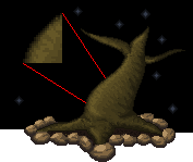
In this, I had an initial base I was working around, which is unnecessary. The idea is that I just created this rough sketch of the character to shape things out while still saying usable on a pixel level. The second image there, with just the red, is the most important step. From there, if you want to be more precise you can turn sketch lines INTO clean lines, or you can just start working.

However, this doesn't get ANY of the actual pixel level work done for you. It's just framework.

This doesn't get a ton of benefit out of having ANOTHER sketch beneath it, and probably would just spend more time without actually beginning the pixel-scale work.
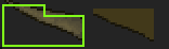
Color-Blocking
Color-blocking is the hardest to explain, and my favorite for personal use. The idea is that each major mass of the subject is crafted into a single cluster of a color. Each mass has a separate color, eventually forming a conglomerate of strange colors that acts as a guideline to the form of the image.
It's kinda hard to explain, so let's just see a couple examples of it.
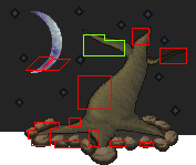
This was what I used for my Rayquaza piece. Every major mass has its own unique color, and I used similar colors of varying values to remind myself about depth. If you notice, the curves are actually there already, just waiting to be filled in - very little additional linework necessary, just like the clean lines, but it makes a piece without lines much easier to do and handles the depth issue. It DOES have that same issue that some angles of curve don't look smooth until anti-aliased.
This is the Igurock image I did. It was first built over a sketch by MetalReaper, so it's done tracing-style, which I tend to do for my pieces since I'm personally not very fond of doing clean lines. Once I have a well-crafted color blocking image though, it was a piece of cake to go over and create lines for it since the style for this piece needed lines.

So the benefits here are that it lets you get a whole image of depth on the table already ready for you to work. This can easily be done over a sketch, and easily done over over Sketchy Lines as well. It's the best for pieces where you don't intend to have any outline at all, and still a good contender to apply lines to afterward. Combining the two practices is probably the best in my opinion, but that's style and taste.
This piece, Lace (Standing) by Kits, was submitted to Pixel Joint like this. It's pretty much all color-blocked! If you color-block and make the colors complementary to each other, you can wind up with an interesting piece in itself. However, it also provides a framework for building a more refined piece, as I did with my edit of this:
A big feature that tends to come out of pieces with heavy influence from their color-blocking is that you get large expanses of single colors, so if you're looking to make an image that evokes the cel-shaded style found in games like No More Heroes or Zelda: The Wind Waker, color-blocking is a great path..
******
So really, it's up to you which way you think is best, but each has their benefits. I challenge you to go out and try something new!
Later folks. Oh, and I'll be altering the blog layout for tomorrow's CISPA Blackout. Keep the internet free!
End Recording,
Ego.

Tuesday, April 16, 2013

On Schoolwork: Ethics of Posting Essays

http://www.youtube.com/watch?v=UrWt077ybcU&feature=player_embedded
My heart and mind is with Boston. Huge thanks to @YourAnonNews for providing incredibly fast news free from the major networks' agendas. In this time of trouble, have a calm an bright song to lift your spirits a bit.

Hi! If you haven't noticed by now, there's this Tag called Schoolwork that I sometimes post under. That's where I put the things I do for my classes that I think are worthy or sharing. Mostly, this means the essays I write for my classes. In a lot of ways, I feel like it should be treated no differently than anything else.

But that's not really the case.

Why is it different? Well, because of the essay piracy environment. For those of you who've never dealt with that particular world, here's a rundown:

* Students get assigned a lot of work. It's to be expected.
* Inevitably, students get assigned essays, given a prompt and told to go write (usually with an approximate length).
* Some students either don't feel confident enough in their own writing ability or are too lazy or "busy" to get it done. They turn instead to having it done for them.
* Most people, when asked, will not write a student's essay for them on command. They don't want to put out the extra work. However, the demand for essays means that sometimes people put the essays they've already written onto the internet, providing our "desperate" students with opportunity to cheat.

This doesn't sound like a big scene - I mean, most students write their own work, right? Well, it's bigger than it sounds. Especially here in university, every single class that writes essays gets to have quite the discussion about Academic Integrity, or not cheating. Submission of essays gets run through a program that scans automatically for plagiarism. I don't know, I've never stolen essays, but they certainly make it sound like a major issue.

So that's all fine and all, but what does it have to do with me? Well, let's look at that last step of the list: "sometimes people put the essays they've already written onto the internet, providing our "desperate" students with opportunity to cheat."
That, unfortunately, sounds like me. I put my essays up, and people are free to cheat off of them. Question is: am I myself breaking Academic Integrity by providing the essays that others could cheat off of? I mean, it's not entirely a question of me being so small-scale that it doesn't matter: literally hundreds of people have viewed my essays. If you Google for place-names essay or german peasants war essay, I'm on the front page, and those aren't hyper-specific topics. If you search Giovanni and Lusanna essay, just any essay about one of the most significant Renaissance cases we know about, I'm the very first link, right on top of two essay piracy links, one of which is about BUYING an essay. I think it's safe to assume that there is decent potential for my essays to be pirated. I've done more than my share of worrying about this stuff - more than you'd think.
But I think I have the ethical high ground here.

The key to it is intention. When you submit your essay to one of those essay piracy sites, it's very clear what you're trying to do: give others your essay, or sell your essay to others. I'm doing neither of those things. On all my recent essays, I disclaim that others are not free to use my content, and I'm not just paying lip service to that. Unlike those sites, I don't welcome cheating.

If my intention is not to provide the essay to others, why on earth am I posting them? A few reasons.
1) First is for feedback. Turns out that however good of a grade I get, I'm not a master. I love to receive feedback, whether it be a simple typo correction or a whole new topic that's related. Knowing anything about writing or any of the topics I've written about makes you invaluable to me. Some fella made a comment on the Pir Inayat Khan essay about how Khan started the Universal Sufism movement, which I didn't know about and led me into a really interesting area, and I'd love to see more stuff like that.
2) Second, I post them for the freedom of information. By that I mean, I'm learning all this cool stuff at university (however much it doesn't feel like it at times), and I think that other people could be improved by also knowing cool stuff. I have no interest in actually becoming a teacher, but I still think that I have that educational mindset. I like sharing knowledge - that's why I write the weekly Pixel Art Lessons, and why I go so far into my design mindset on AvW posts. My schoolwork i just as much for you all to learn as it is for me to improve.
3)  Pride. I work hard on these essays (usually just for one night of hard work, but it still counts) and no one ever gets to see them but my professors! So I put it on the internet to kinda show off that I'm not spending a bajillion dollars on a fancy degree for no reason at all.
4) I confess, I kinda post them to fill space when I'm light on content. Not a good reason to post, but a true one.

I genuinely think that while it's certainly possible for people to come along and steal my essays, I'm in the clear for posting my essays. That's not what they're for.

Thanks for listening to me ramble about all this. At least you got a song out of it.
End Recording,
Ego.

Monday, April 15, 2013

Avatar World, Art: Half of the Monk's Moves, Waterbender Playbook Image

http://www.youtube.com/watch?v=OFTqgwyO7-Y&feature=player_embedded
Haven't played The Last Story, probably won't cuz even "modern" JRPGs are full of all the things that rub me the wrong way. Soundtrack's great though, as I'd expect from Nobuo Uematsu. For, you know, NOT doing FFXIII, this sounds an awful lot like it could be a FFXIII song. Not a bad thing though - as I've expressed before, while FFXIII disappoints me, it has a really good soundtrack.

I'm sorry there's been not much stuff lately, I've been a little stuck writing-wise. I made a little headway into the Monk here, but in general my thoughts have been elsewhere. Namely, my time's been completely dominated by anime. In the past 1.5 to 2 weeks, I started watching Ghost in the Shell Stand Alone Complex, finished it, watched Eden of the East and its two movies, and am now watching most of Steins;Gate and it is amazing. I'm hesitant to say any of these is good enough to knock Samurai Champloo out my top anime spot, but GitS:SAC and S-G both come awful close. If you have any more recommendations for awesome anime, especially if it's free on Hulu or if it's on Netflix, I'd love to hear.

So I've been tearing my brain apart because I can't figure out how the hell to do the rest of The Monk's moves. First, some thoughts.

The Name: A fella in my thread on Story Games brought up the idea of not calling the class The Monk at all, but instead going for The Guru. It's a really interesting proposal! The Guru is a more literal tie to the Avatar mythos, and has a great benefit of making the clear distinction between this spiritual monk and the very commonly-known D&D Monk (a martial artist that I would better represent as a Ninja). Still, Monks and Gurus aren't exactly the same thing, and Monks have a little better name recognition, even if we ignore all the D&D Monk recognition. I'm still thinking on this.

The Stats and Basic Moves: The Monk (which I'm gonna keep calling it until I make a final choice) is a Solid/Natural playbook, since that gives me a strong defensive hold on the game while permitting him to be strong at Meditating. Being a good Meditator was important to me. In general, they're not going to be using many Hot moves, which also makes some sense (though one stat array will probably have a +0 Hot instead of a -1). They're decent enough at Keen, being aware of their surroundings and stuff. As for Fluid, you might assume that they wouldn't do a ton of Move With Intention since they're still and all, but I would argue that a deliberate stillness can be Moving With Intention in the same way that taking a stance can be. The thing to keep in mind about the trigger is that you have to make the CHOICE to not move - it has to be proactive.

Playbook Moves: I'll just toss up what I have.
Energy Pathways: You may spend 1 Chi to distribute your remaining Chi as you please to any character you touch. Other characters may donate their Chi to you with a touch.
Probably the most radical move on the playbook by a lot. I really like the idea that through his understanding of Chakras and life energy he can not only manipulate it within an individual, but also channel it through several. He needs to be in physical contact to do it though. The other thing is he can stockpile it for free, but distributing it away has a cost. Honestly, I'll probably end up giving a cost to take in the end - can you imagine what would happen if a Ninja took this move? Holy shit.
Aware and Alert: When the MC triggers a Tag or Environment Tag against you, (they lose) / (you gain) an additional Chi.
Just one of the two though will be the final move, I just haven't picked yet.
An alternate version of this exists that's less volatile, but also boring: You may Observe Carefully using Natural.
I've had this idea around for a while. I'm pretty happy with this one - it's defensive and gets at the whole "aware of surroundings" thing without needing Keen.
Chi Armor: Whenever you would take harm, you may spend Chi equal to the harm dealt (before armor is applied) to ignore the damage.
I haven't a clue what this does to balance, but I thought it was a cool idea. It's things like this that make the Monk want all of his friends' Chi.

The other three moves have names/ideas without mechanisms.
Stillness:
I really want to expand on the idea that the Monk's calmness and stillness doesn't make him worse-off than the other, more mobile playbooks. It's a tough one - I had something of a draft about when you trigger Move With Intention through NOT moving (as described above) but I didn't like what I ended up with. I think it was something super-lame like MWI with Solid or some crap like that.
Spiritual:
Almost certainly a modification of Meditate, but I don't know HOW it does that. I can feel something really clever hiding here, but I haven't quite ferreted that out yet. I suspect I need an inspiration flash for this one - maybe I'll go watch some media featuring Monk characters. I feel kinda tempted to look to the actual Spirit World for guidance here, but that was sort of the Avatar's schtick.
Clarity of Thought:
Somewhat of an afterthought, this seems like the right direction but I haven't the foggiest what to do with it.

So, that's actually all that's here today for the Monk, sorry if you were expecting more. I REALLY could use some ideas - heck, I think I'll have an easier time with the freakin' Aristocrat. The Monk is tough because they're not about fighting but are characters in an Action game, and much of what they do is a fluffy spiritual thing rather than any sort of concrete action, making it hard to write triggers that are specific enough while still giving freedom to imagine.

Because I feel bad about leaving so much of the Monk up in the air, and because I'm kinda late after promising this as a Friday post, I drew an image that I think goes pretty good as The Waterbender. Stylistically it's similar to the Scholar one, which is why I'm grouping them as playbook images.
Drawn initially as just some doodling, it grew into a Waterbender. Much more stylized than the previous one, I'm still not 100% sure how I feel about it. Chances are you'll see another Waterbender at some point instead.

Welp. Enjoy, and please help with the Monk stuff.
End Recording,
Ego.

Sunday, April 14, 2013

Sunday Songs: Zone of the Enders - Beyond the Bounds (Eshericks Remix)

SUNDAY SONGS: ZONE OF THE ENDERS FEAT KARYYN - BEYOND THE BOUNDS (ESHERICKS REMIX)
http://www.youtube.com/watch?v=iAPEWGjmimk&feature=player_embedded
This was on a remix CD that comes with Zone of the Enders HD. The whole CD is pretty decent, but Beyond the Bounds is a great song. Reminds me of NIER actually. The original song is by KARYYN, and the remix is by Eshericks. Gonna have to check out some more by them, but I don't have anything right now, sorry. Linkless.

Putting the finishing touches on that Avatar World Monk post, so it'll be up in a few hours probably. Glad everyone seems to have enjoyed that latest Pixel Art Lesson!

End Recording,
Ego.

Saturday, April 13, 2013

Pixel Art Lessons: Skypehopert's "At Sunset" (Banding/AA, Low Colors, "Story")

http://www.youtube.com/watch?v=BVnPiLi8vOo&feature=player_embedded
Not always a Jeremy Soule fan, I think much of each of his soundtracks ends up as ambient filler, but there's always a few songs on each of them that is really good. This is one of 'em, from Guild Wars 2. I'm no MMO fan, and the game ain't quite my speed, but the soundtrack is pretty good, even for Soule's standards (which, while I'm iffy on much of his work, the production value is always sky-high).

Hey, sorry for the bit of delay on the lesson this week. I was busy the rest of Wednesday and I've been having headaches all week that have discouraged me from writing.

This week is a little different. While I gave crit to the creator of this one, I didn't do quite as much as I'm gonna talk about today. So really, today is a "I take a piece, talk for a moment, then do an edit as demonstration of principles" day.

Skypehopert's "AT SUNSET"

Major Themes: Banding/AA, Low Colors, Story-in-Art


 The main villain wants to destroy the fairy-tale world by nuclear bomb.
This piece came as an entry to the weekly challenge on PixelJoint. Here's the restrictions on it:
Create an image including at least two panels of a new and original comic story featuring the dawn of a new super hero or super villain, such as the radioactive spider biting Peter Parker or the symbiote infecting Eddie Brock.
Canvas Size - Unrestricted.
Colours - Max 10.
Transparency - Optional.
Animation - No.
Now, there's some factors in there. First off: yes, if you've been paying attention, I entered this competition myself, so Skypehopert was technically a competitor. Ain't no hard feelings there though. Second, there's three significant restrictions on the art:
* At least two Panels,
* Origin of a Superhero/Villain
* Low colors, maximum of 10.
Here's my original commentary:
Really liking the visual style in this, and the sixth and seventh panels (the close-ups on the gas-mask man) are pretty freakin' awesome looking, composition-wise. You made some kick-ass color choices too.
The biggest trouble is that I don't see the "dawn of a new SUPER villain." It's really a pretty fine distinction though, I'm very impressed.
On a pixel scale though, this has a bunch of issues, most notably some crazy banding going on. The ore and what it's resting on have some problems defining themselves, and many of the lines could do with some smoothing. Several spelling issues (and needless abbreviations) break the really great style, but if you're not natively English that's not a big deal really.
Really liking the look of it all though!
No lie, I'm way big on the style. Let's see how well he did with the minimum restrictions
* At least two panels. No problem!
* Origin. Personally, I'm not entirely sure I buy it, since when I think Super Villain, I think of them having some sort of Superpower, rather than just being a villain. Bond villains aren't supervillains, in the same way that I personally don't consider Batman a superhero (Iron Man and Green Lantern are fringe cases since their position involve physical changes to their bodies). Of course, ultimately this is the semantics of the competition. I'm not actually that concerned with anything so petty as disqualifying him or anything, but clarity of the story would aid it.
*  This looks like it fits the low color count! A good look gets me a seven count: Black, Orange, Dark Orange, Yellow, Dark Yellow, Green, White. Unfortunately, there's a mess of duplicates in there (racking the count to 40), but since they're not visible they have no impact o the piece, so no problem.

Now, like I said, the biggest trouble is the banding and jagged areas. When I was on Jiinchu's piece, I talked about how Banding was often the cause of a misplaced attempt at transitioning between two colors, a job much better performed by smart curves and anti-aliasing. This piece is an excellent example of the OTHER big cause of banding, where one is attempting to follow a lightsource and illuminate regions tracing along an outline. In general, this isn't even a misplaced mindset, just an error in the exact execution.
The main technique to fix it is pretty easy - simply stagger the actual clusters of pixels so they don't line up directly with the others, thus preventing the banding issue while still keeping the light hitting that surface. It can take a little practice to get used to staggering, especially since our minds are programmed to square things up and make 'em neat. It gets pretty second-nature after a while though.

The other side of the banding coin is the jagged lines, such as the right side of the larger figure in panel 7 or the left side of the hand in panel 3. These are caused mostly by hasty pacing and attempting to get either structures with sharp corners, non-perfect curves, or straight edges at non-standard angles. The solution is the same as the misplaced banding explored with Jiinchu's piece, smart curves and anti-aliasing. Take your time, and zoom out frequently. The key to curves is to get a natural-looking progression of lengths, either increasing or decreasing, while the key to lines is to keep them regular and to keep each of the lengths as close to each other as possible (this sort of thing I might talk about further in the future).

That's the only TRUE problem in the piece as it stands, though there are other minor ones. With that alone, I think that fixing the piece's flaws is certainly possible. Beyond that though, I think there's some interesting potential in the piece that would remain unexplored simple by repairing the broken lines and banding. Here's what I have from my own editing:
At the most basic level, I've cleaned a lot of the lines and repaired the banding. Most of my work was focused on Panels 3, 6, 7, and 8. My greatest contribution was that I made the lighting a little stronger - you get some shape on the figures now rather than just some edge outlines. I've removed all the duplicate colors, as well as the white (which was only in the eye of the gunman and the timestamp). On the finer point, I've refined the stickmen a little, though not much - they're very expressive already.
The hand is a bit of a pride point for me! I don't think that the cloth or rock ever made a huge deal of sense, but I've done what I can to make 'em more interesting to look at.

The big important point when running with low colors is to keep up the contrast. Heavily saturated colors are good for that, since they're bold and need less contrast to stand apart from each other. Saturated colors DO need a little more contrast to differentiate themselves from their own shadows - saturation makes hues contrast each other, but values appear more similar. That's my experience at least.

The last point is about telling a story with your work. Now, I'm of a belief that text is HARD to integrate firmly into an image's story - words and pictures don't get treated the same. If at all possible to just show rather than tell, do it. This piece is a pretty good example of both ways! In the original, I think the text detracts from it. I think there were ways to better communicate "nuclear material" but the motions of the stickmen are really good. If you're gonna add text, be careful - the text at the very least should be written in a stylistically-similar way, not just in its pixels but also in diction. For example, the abbreviations here ("LOL", etc) aren't a very serious sounding conversation, but the drama of the scene is a pretty serious type of thing, with nuclear material and the bold sunset and the death and all that. The dissonance in tone kinda breaks the mood. Now, as I said in the post, there are great reasons why textual issues should be ignored, or at least discounted - in this case, I have strong suspicions that Skypehopert isn't a native English speaker. I might be wrong and he's just typin' sloppy-like, but benefit of the doubt and all that.
Telling a story is hard. Sometimes in pixel art I get lost, lost in all the technical details and single objects and characters. Being zoomed in so close and not always having the full image in mind can make it hard to keep the whole thing in mind, and it can be hard. I confess that I don't feel as careful and deliberate with my art as I do with my RPG design - when it comes to design, every choice I make is very thought-through, including what making that choice says about the principles and theme of my design. With art, I often just fall to what I think looks good.
Keep the story in mind. It's powerful, and if the challenge is to incorporate the story then don't ignore a well-told narrative just because it's a visual challenge. They're linked, and the weakness or strength of one uplifts the other.

With that point, I think I'm done for the day. Sorry for taking so long this week, and sorry for a light-on-the-images day. Hope you liked the edit, and thanks to Skypehopert for being a great test subject.

End Recording,
Ego.

Wednesday, April 10, 2013

Avatar World: The Rest of the Waterbender

http://www.youtube.com/watch?v=JBDbx28PXGA&feature=player_embedded
Desert Dwellers do some interesting soundscape stuff, a lot of which is very appropriate for Waterbenders.

Hey there, been pounding away at making the Monk work and I just am stuck on the back half of his moves. So I'm gonna take a break from that and write the remaining parts of the Waterbender! I came up with much of this in December while in Morocco, but hadn't put the finishing touch on much of it. Because there is more to a playbook than their moves! (although those are the most important part)

Because they're the most important part, here's a move I wrote with some help from James on Story Games.
Stances (1): When you set up a waterbending stance, spend 1 Water and roll Move With Intention. On a 10+, you may choose to forgo your usual choices to make your next Waterbending roll an automatic 10. Similarly, on a 7-9, you may forgo your usual choice to use the number you roll when you next Waterbed or a 7, whichever is greater.
Stances (2): When you set up a waterbending stance, spend 1 Water. Until you leave the stance, you take +1 to Waterbending rolls, but have a Tag appropriate to the stance.
Those are the two possibilities. The intention is to emulate the various setups that Waterbenders often take - most significant in the show are the Octopus Form (which Korra uses regularly in full combat) and the Water Vortex that Aang and Korra use. It also allows for the use of all sorts of those "big" moves.
You probably noticed that there's two versions. The first is more radical, and a cooler mechanic in my mind, but the second one is a lot safer. Also the name is dumb and basic and I need to come up with something a little better there.

Stat (Pick One Array):
* Natural +0, Hot +1, Solid -1, Keen +1, Fluid +2
* Natural +1, Hot -1, Solid +0, Keen +1, Fluid +2
* Natural +0, Hot +1, Solid +1, Keen -1, Fluid +2
* Natural +1, Hot +0, Solid +1, Keen -1, Fluid +2
Look (Pick One From Each Set):
* Thick winter clothes, light and non-restricting clothes, loincloth and leaves, city clothes with furs.
* Empty eyes, soft eyes, stern eyes, vibrant eyes, stormy eyes.
Gear:
Armor Type: No armor
You start with:
* A waterskin of some variety where you carry your Water.
* A small weapon, such as a small knife, club, or staff.

Oaths:
You swore to a family member that you'd accomplish what?
Look to the player at your left. What did you promise to do for them?

Chi:
Gain a point of Chi when you act (pick 2):
* Calm and Kind
* Vindictive and Tempestuous
* Mothering and Parental
* Enthusiastic and Impatient 
* _________

Special:
Once you've trained with a Waterbending master, you are more efficient about your water use and may carry an additional Water.

Improvement:
__ +1 Fluid (max +3)
__ +1 Natural (max +3)
__ +1 Hot (max +3)
__ +1 Solid (max +3)
__ Take another playbook move.
__ Take a move from another playbook.
__ Take another Chi key from the list, or write your own.
The gear list bugs me, it doesn't strike me as interesting, but the gear isn't the cool part of Waterbenders in the first place. The Special is a gamble with the game balance, so I dunno there - I have a backup lined up if this really doesn't work great. Also, got a preference for the Stances move, or perhaps a better name? Thanks.
So that's all I have for Avatar World today! If by Friday I don't have the rest of the Monk I'm just gonna post what I have already.
End Recording,
Ego.

Sunday, April 7, 2013

Sunday Songs: Paranoia Agent - Yume no Shima Shinen Kouen

http://www.youtube.com/watch?v=seV2DwFu3Lg&feature=player_embedded
Been watching so much anime recently, really loving it. Thanks to Allegra's suggestion on Twitter, I've started watching Paranoia Agent, and it's really strange, but interesting. This is the opening song, and damn do I love it.

No links for a show I've only just started and don't have the soundtrack for. Sorry.
Links:
Paranoia Agent

Hey, if you guys have any recommendations for great anime, I'm always on the lookout, especially if it's free. I'm a big fan of the sci-fi stuff (really enjoyed Ghost in the Shell Stand Alone Complex and Steins;Gate) but am flexible and open. Other stuff I've loved: Fullmetal Alchemist Brotherhood, Soul Eater, Samurai Champloo (which is the top spot).

I intend to get more than just the Pixel Art Lesson up this week, even if I don't finish my work on the Monk I'm gonna post him. Plus, I think I have some recent art laying around I can showcase. Lastly, I'm nearing the point where I can actually unveil my Binding of Isaac Let's Play.
Later folks.
End Recording,
Ego.

Wednesday, April 3, 2013

Pixel Art Lessons: Jiinchu's "Darkness" (Banding, Anti-Aliasing, Pillow Shading)

http://www.youtube.com/watch?v=dp9X7bChcPs&feature=player_embedded
I finished Ghost In The Shell Stand Alone Complex the other day. It was freakin' awesome. This song, the ending to season 2, is just amazing. I recommend the series completely, it's some of the best sci-fi out there.

Jiinchu is a newcomer to Pixeljoint. He's Brazilian, and doesn't speak any English. And I've been working to help him as much as I can.

Unfortunately, there's that language barrier in the way. See, if you hadn't noticed by now, pixel art uses quite a bit of jargon. We talk about banding and anti-aliasing and dithering and pillow shading, not to mention the idioms I tend to use in my own speech. Metaphors and common phrases cease to be helpful, and this all assumes that Google Translate manages to catch even  my basic English. As such, after my first post I scaled back my language to more translatable messages and started using a lot of illustrations. Seriously, two dozen pictures at least. In the end, I give maybe three complete approaches to understanding banding, and I think it's the best explanations of banding I've ever given.

Without further ado, let's begin.

Jiinchu's "Darkness"

Major Themes: Banding, Anti-Aliasing, Pillow Shading, Lightsource.


This is the original. See how many things you can notice before moving on! (there's a lot to notice...)
What did I notice?
You misinterpreted - pillow shading is a critique.
This piece has the concept in the right place, but the pixel execution has a lot of problems. The primary two problems are pillow shading and banding.
Pillow shading, if you're not aware, is the practice of shading each individual object as if the viewer themself is the light source (in this case it's actually slightly above the viewer). It's a very common problem among those new to pixel art. It's a problem because a) it facilitates banding (your second issue, I'll get to that in a second), and b) it causes your image to lose depth. The problem is that looks like every individual object has its very own lightsource right in front of it; the rocks each have their own, the tree has its own, the moon has its own, etc. Because of that, they don't appear unified, and are each lit approximately the same amount. Comprehending the idea of placing a light source (and sticking to it) is one of the most important steps to realizing shape. Here, I've illustrated real quick.
Step 1: I grayed out your image so my highlighting is visible - that's just for this example. I then added the place where I was going to make the primary lightsource - I placed it slightly from the front and significantly to the left. You don't always place the lightsource so close to the actual piece, but that's how I need it to illustrate well.


Step 2: I mapped out "How would the light rays hit things?" This is a planning step.


Step 3: I block out the highlights and shadows of things based on the light ray trajectories I planned out. For reference, all this is drawn free-hand - none of the pixel lines are smoothed or precise. You can already see the difference from your piece in that you can concretely see the three-dimensional shape of the tree.


Step 4: I don't mean to imply that you can only have one light source though - let's add a second one to make the piece even more dynamically lit. Let's make the moonlight hit the piece! I'm not gonna map trajectory this time, but think that even though it's on the left, it's actually behind and very far away (as a side note, that moon is very large compared to the tree). The rocks overshadowed by the tree get NONE of this light. This one is just to see how that lightsource would work alone...


Step 5: And now let's put the two lightsources together! The lit up parts overlap - the shadows of one can't override highlights of the other.
How's that look? You can see the shape, and more specifically the DEPTH - some parts look absolutely further away than others. Do you see my point?
Let's hit my couple other quick points about lightsource before I move to Banding. The moon: the moon shouldn't really have any shadows at all. Think about it - nothing is casting a shadow on the moon other than the earth itself, which is what causes the cresent. The moon isn't perfectly smooth, but from so far away it's effectively neutral. Any shading on the moon should be used to represent the vast mountainous ranges or craters or sunken areas that we can actually see - essentially, take a look at some photos of the moon.
Alright, I'm bad at explaining banding. It's basically when you have curves of pixels that are exactly hugging each other without variation in the shape of the clusters. It creates a weird pseudo-gradient effect that makes the lines almost "blurry" and indistinct. Your outline on the tree which is a perfect hugging line is like that, as is the shading on the moon. This is a common symptom of pillow shading, where shadows move out radially and in a steady gradation. I'm just going to refer you to the amazing Pixelation tutorial on banding, it does a much better explanation job than I am here. http://www.pixel.schlet.net/#C2
Neither of these things (lightsource, banding) are things to be ashamed of doing. It's common. Especially banding, probably because it's hard to explain. Still, they don't look all that good, and if you can train yourself to find these things, then your work will improve. And once you understand a lightsource and all of this, THEN you start looking to texturing - cracks and bumps and ridges and divets. I hope some of this helps - I know it's an awful large post, but I mean it in the most helpful way. Good luck, hoping to see more from you in the future! :)
Too bad that link doesn't help in this case with the language barrier in the way, but if it had been good for him I wouldn't have written my later spiel.
His response:
Wow, I really can not imagine how complex a simple paisagem.Vou I was sure that I must now produce the maximum realism in my art, thanks for the great tip :thumbsup:.
I confess, I hadn't thought about the language thing on my first reading. I thought this was sarcasm - it's not the first time I've had one of my rather-extensive posts come off as arrogant and know-it-all, so I'm a touch sensitive toward that (as a side note, that's actually where my handle Ego comes from!).
Me again:
Well, you don't need maximum realism. That's jumping the gun a bit. Something can remain stylized and unique and "unrealistic" without falling into these traps. Almost everything, save literal abstract art, uses lightsource. Anime uses it. Video games use it (The Legend of Zelda The Wind Waker is hyper-stylized and uses lightsource extensively, and even old games for the Game Boy and stuff used them). They've been in use since humans managed to use multiple shades of the same color to imply light and darkness. All this to say that you can HAVE a stylized piece while sticking to the rules of reality, like how light works. Pillow shading though is a specifically pixel-art issue, and is more to do with aesthetic than realism - it just so happens that the bad-looking pillow shading usually results from poor lightsourcing. Banding is an entirely pixel aesthetic unrelated to realism.
And I'm a fan of non-realism when done deliberately. But, as the saying goes, you need to understand the rules before you can break 'em. And seeing your piece history here so far, I think that putting some more thought into these things could really help that.
And it's not as complex as it looks - I'm just wordy. The main thing to just keep in mind the way light works, and to watch for banding. There's no tricks to banding that I've found, that one's just building up pixel technique over time. Good luck, and I hope it really does help you some!
It might sound a bit self-serving, but I think this is a great point that's worth understanding. I preach a lot of obeying the standards of reality, and I think that drives toward the idea that I rank realism over style. I don't - I really don't. Style and panache is far more important than just representing things just as they are. While that's a good test of ability, it lacks for some imagination, though particular visions of reality can easily be worth presenting. But for me, learning the trappings of how things are in reality is simply a stepping stone, giving me a grounding in reality so I can deliberately break the rules in constructing pieces. And it has to be deliberate, consciously done with thought given to the impact of the decision upon the piece.
So learn realism, and then start breaking things. That's why it bugs me when people jump right into manga-style and stuff - the work is inevitably flawed in areas like anatomy when they begin doing their own work. Learn to draw in a manga style and you've locked yourself into one way of doing things; learn the rules of the world, and you can experiment infinitely.
For an example of style out of realism from my own work, I'm hugely fond of very clean, perfect curves. This limits me a bit in dealing with certain angles as I find them hard to smooth out. Uneven pixel formations bug the hell out of me in my own work. I know it's a bit limiting and that real life often involves imperfect curves, but I just don't like 'em. Check out my vector work especially, the little imperfections in the curves drive me nuts.
Jiinchu:
Again help me. Their tips are great, but I struggle to understand some parts, I'm Brazilian. Remake this I will work, and what do we see bring forth xD
 Me:
Sure thing, I'll help as much as I can, and try to use pictures to show what I mean rather than just telling. Just try to follow as much as you can, and I can help further on things that didn't make sense. :)
 Jiinchu:
 I made a new version of this work, with pillow shading correct, check if it goes '-'

This is totally way better. There's another comment but it's only in Portuguese, and I re-cover the idea he talks about anyway.
Me:
Yes! For the record, you didn't insert pillow shading, you removed it. But yes, it looks noticeably better!
That doesn't mean we're done though. We've fixed the pillow shading issue to a pretty good degree, things follow a consistent lightsource now. The moon also looks better. The banding is still an issue though, and that, along with the colors (pukahuna is right and I'm gonna talk about that), is the topic of the moment.
I'll take another shot at banding since I don't feel I did it justice earlier. Banding is the name given to a pixel scenario where a line (or curve) of pixels directly hugs another one. The intention of it is usually to attempt to smooth the transition between two color.  One problem: banding looks really bad. Instead, we have a technique called anti-aliasing that performs the same function (smoothing out a color transition) without the problem of looking really bad, unless overdone of course (since pretty much anything looks bad when overdone).

Here, I'll use some pictures to explain anti-aliasing and banding.
1. I drew a squiggle freehand.

2. I cleaned it up into a single one pixel wide line. This will be the base on which I'm explaining.

3. THIS is banding. They're both one pixel of banding as "shading" to transition between white and black. The one on the left is one-sided, the one on the right is completely covered.

4. The one that was on the left, the one-sided banding, applied to the squiggle. Not looking quite right.

5. Now it definitely doesn't look right. This is the full surrounding banding. This is still just one pixel on either side of every black pixel. See how it forms distinct bands of black and grey? Those bands are where the word banding comes from.

6. This is what we call staircase banding. It is pretty much the worst. Multiple successive bands of progressively lighter colors.

7. We've applied the staircase banding to the squiggle. It now looks almost nothing like the original squiggle and the bands are forming an indistinct blurring effect. It doesn't look good at all, and it was actually upsetting to draw it for this example. Thankfully, I very rarely see people actually do this to this sort of degree. This is just about the lowest point of banding.
Think about what the banding in these scenarios is really doing: it's altering the shape of the squiggle. It no longer has the same shape - it's thicker and the precise curves have been broken down. The technique you're using to try and soften a particular shape has made it into a different shape instead. Plus it just doesn't look good.
8. Let us switch tracks for moment now. We've discussed banding as bad, but what's the alternative. As I mentioned, anti-aliasing. Anti-aliasing is a technique where you put a transition color only at the corners of the original line, rather than along the entire line in a consistent manner. I've drawn a quarter-circle (on top) and given a single color of anti-aliasing.

See how the shape didn't change? It made the transition less harsh while preserving form.
9. I've applied that single color of anti-aliasing to the original clean squiggle.

That's appealing and simple!
10. However, there is such a thing as too much anti-aliasing. This is the same quarter-circle, but with two and three colors of anti-aliasing. They start intruding upon the shape, and the three-color one is actually starting to band a little bit.
11. A second color of anti-aliasing on the squiggle.

12. And a third!

This is still much nicer than any of the banding pieces, but it's not as clean, smooth, and simple as the one-color anti-aliasing.
13. This is just a clarifications, but you can band with more than one-pixel-width lines. These are just as bad, if not worse.

But how to apply this? Your piece isn't made of single-pixel lines, after all. The key is to use anti-aliasing at harsh transitions and jagged curves. Let's do an example with your piece: the moon.
This is an image of your moon - the original is on the right. You can see have the edges are pretty rough, even though the shape is right. The cresent is good, but for some reason it isn't quite smooth. That's because of the bright colors on the black background making the pixel changes at the corners very obvious. On the left, I've anti-aliased your moon. Even though bright colors are touching dark ones, because I've provided a transition color at the exact corners where the jaggedness appeared, it looks a lot smoother.
Where else can we see banding show up where anti-aliasing would be prefered? I've pointed out a couple. 
1. First, basically the whole tree is ringed in a band of the dark. It's vaguely like an outline, but is so close to the black in color that it just bands onto the other colors, not to mention that an outline would be weird considering the style of the rest of the piece.
2. This area on the trunk is positively covered in an excessive amount of banding and overzealous anti-aliasing.
3. Almost all the rocks have some degree of banding to them.
That should be enough about banding and anti-aliasing to get you going! Next, color.
Color is a hard subject. On the one hand, you haven't done anything WRONG with the colors. On the other hand though, these are definitely not your optimal colors. There are three things to consider about color here: conservation, contrast, and consistency. Let's hit them each real quick.
For easy reference, this is your palette, organized together. If two colors are precisely side-by-side, it means I think they're so similar that they're practically undistinguishable. 

Conservation: This is the practice of using as few colors as necessary to achieve the desired appearance. You have 32 colors plus transparency (which we count as a color), many of which are very similar to each other. Oddly, you use a lot of shades on the tree, but chose to only use a couple shades on the rocks. I'll get to that. 
Contrast: This is how different each individual shade is from its neighbors. You tend to use low contrast - the tree has absurdly low contrast, the soil and stars have negligible contrast. The moon and rocks have fairly moderate levels of contrast - I'm quite fond of the moon's colors. Typically, the lower the contrast, the more colors you need to use to display shading. The tree could use some more contrast. 
Consistency: This is what is hurting the piece. As Pukahuna is saying, the tree is fairly dark compared to the rocks, it doesn't pick up as much light, which is weird. In theory, the light should make the tree about as bright as the rocks, although a different color. Really, this is a matter of experimentation, just working it til it works right. Trying to get similar levels of contrast through a piece gives it a unified look, and doing so will keep your color count sane. 
On color choice: There's a lot of brown in this piece. That's not bad, but it IS a lot of brown. I like the moon's colors though, they're nice. 
That's probably enough rambling from me. Let me know if something translates poorly and I'll take another stab. Have fun revising, and seriously, this version looks way better than the original, nice job.
 That's pretty intense. He followed through cheerfully with an edit!
Still getting a bit better. He's gotten the AA stuff down a bit better, and the moon is pretty nice, but he's got the banding still, and even now I can say he's still working on the color count thing. I took another round.
Very neat. I can see two area where most of the changes happened, in the moon edges and the rock colors. I would still take a look at what I said about banding last time, as the tree itself has many issues still, but the other parts are improved.
The moon is definitely a lot smoother, wouldn't you agree? I certainly think so. An additional thing to look at with the moon would be the bottom tip. It doesn't taper to a point the way the top tip does, which makes it odd not symmetrical.
Another thing about the moon is that you only ADDED anti-aliasing to the corners. In general it looks good, but it slightly deforms some curves; try experimenting with cutting into the existing bits instead if adding more makes the curve warp. This is fairly intuition-based, you'll get better at (and feel more confident about) trying to refine using anti-aliasing if you keep practicing.
As for the rocks, I would say that the colors are much better in that they feel in line with the image now. I still think the sheer number of colors on the tree and the "smooth" appearance that gives it makes it look a bit odd next to the rocks, but just talking about the actual shades, they fit much better.
Really, you just need to get to work on clearing out the banding. As you go through it, you'll find that you need to round out a few curves.
And because I feel bad weird about a critique post with no pictures, I did an edit of your piece to show you some of what I would do. Not everything I do here is necessary, much of it is based on my own personal preference, but it should be a good example of the potential in the piece.
1. First I would reduce the color count. Your piece has 39 plus transparency colors in it, which is far, far beyond what I need or want for myself. I select similar regions of tree color and fuse them together, then make the rocks and the tree the same brown. I do the same grouping procedure on the moon and the stars. The moon colors also got a slight increase in contrast. I did no alterations of the actual shape of anything. I got it down to 11 plus transparency colors.

2. I then went to work on refining the pixels. The moon got some very careful changes, and I tried to alleviate the banding when I went to work on the tree. I only got through the left side, top tip, and left branch, though I could continue. I made pretty regular use of a technique called dithering, which is a sot of checkerboard pattern meant to trick the eye into thinking it's seeing an intermediary color. No need to rush into trying that one out; you should master the idea of anti-aliasing and removing banding first. I also did something I've been meaning to mention, I changed the stars. The stars were very large for the scale of the piece, and real stars don't quite glow like that. The glow was causing some major banding on its own, so I dropped the stars to be much more simplistic.


I could continue and do the rest of the piece, but I'm more interested in seeing what you do next. Get to work on the banding, I know you can clean it all up!
 I've done a little more as well.
I'm pretty fond of it.
Responses:
 I do not know what to do. Place dithering at all? :X
Me:
No need for that. I mean, if you'd like to experiment with that, go ahead, but it's not necessary. The most important thing is removing the banding from the piece, probably by replacing it with careful anti-aliasing.
So before I go off in the wrong direction and re-explain something, what exactly are you having trouble understanding? Do you understand what I mean when I say banding after the explanation before? Did you understand my explanation of anti-aliasing? Do you understand the words but don't know how to find the banding inside your actual piece? Or can you find it but don't know how to actually change it?
You answer should help me to figure out how to help you.
Jiinchu:
There is a difficulty in the language. From most to least understand the word "banding", in which case it means "bandas", what really makes no sense to it. I can refine the trunk? Adding colors?
And me, pretty intense post again. This is my best explanation of banding I think.
Excellent, I can help with that! Unfortunately banding is simply jargon so we doesn't have other words that mean the same thing, but I can explain what I mean when I say the word.
The word I use, "banding," is a term we use to refer to a certain configuration of pixels in pixel art. When you have a row of pixels, we just call that a line. But if you take two lines of exactly the same shape and slightly different colors and put them right up next to each other, this is what we call a band. Here's a picture, take them into your art program and zoom in so you can see what I'm talking about on a single-pixel scale.
*
This is a one-pixel line. There is nothing wrong with it.
*
This is a band. See how the lines, which are the exact same but one is gray and one is black, are right next to each other? This is bad. When zoomed out, it makes the line look somewhat blurry and ugly. This is the important thing to understand: when I say Banding, this situation of two similar but differently colored lines or curves right next to each other like this. Whenever I say banding, think about this blurry appearance.
*
This can happen in layers as well. The more bands on a line the worse it looks.
*
Banding doesn't only happen on staight lines. In this curve, you can see that instead of each identical (but different colored) curve is lined up with the others. When zoomed out, this looks very bad for several reasons, but the most important is that it looks blurry and jagged. The shape of the line is not clear, and it is not smooth. But what do you do instead?
* With the straight line, you do nothing. It doesn't need transition colors at all! Even if your banding is just two different images near each other, try to avoid making that pattern of identical lines next to each other.
*
If we just leave the curve alone, it looks okay, but not great. We want to make it smoother, but how do we do that without banding?
*
The answer is anti-aliasing! The technique you used on the moon to make it smoother by putting an in-between color at the corners is the key to smoothing out imperfect lines without banding.
That is a very textbook definition of banding. (heh, I wish they made pixel art textbooks...) That general pattern is the important thing to learn to notice in your art, and then you revise the piece to have different things such as anti-aliasing instead of banding. Now, I'll point out some things about your piece in particular.
*
This is your image with some marks by me. Most of your colors have been made much more grey so my marks can stand out - that is not a thing you need to do. You can see that I have put red boxes and green boxes. Inside the red boxes are areas where I think you have banding. The parts I think have some banding have been left their original color, so they look darker. The green box is actually something I think you did well, so I'll talk about that first.
*
In this green box, I think you did it correctly. Instead of the shading being the same shape as the line, you've placed it only in the corners in an attempt to use anti-aliasing. It is not the most sophisticated anti-aliasing job, but it is a noticeable and strong attempt! With practice, you will discover how to make your anti-aliasing look even better - once you have the theory down, it's just a lot of practice and experimentation to find what looks good.
*
This is an example of one of the red boxes, right from the middle of the trunk. When I just show the curve and the banding (the section in the middle), do you notice the way the in-between color almost perfectly sticks to the outline? That is what I said was the banding pattern, correct? It makes it looks somewhat blurry and jagged. On the right, I have given a demonstration of how I would fix it, by placing the shade only in the corners. You should also notice that I did not do anti-aliasing on the 45-degree angle. This is also what I am pointing out with the red boxes on the moon. 45-degree angles are like perfect horizontal and vertical lines in that you don't need to anti-alias them. There are things you can do to smooth them out still (such as tapering my anti-aliasing as I approach it) but that's getting into more advanced use. For now, just understand that you place shades just in the corners to smooth out a line rather all along it, and that 45-degree angles don't need as much anti-aliasing.
So that should be a fairly decent explanation of what banding is and how to solve it. All those other red boxes I made have their own examples of banding; take a close look and try to find it, and then figure out how to change it into anti-aliasing instead.
As for your other questions, refining the trunk is a possibility. By removing the banding, you'll have given the trunk a much better silhouette, leaving it in a great state to texture it, though bark texture isn't quite a specialty of mine. However, you should NOT add colors. The best situation would actually involve removing some colors. Remember that in pixel art, we often try to use as few colors as possible to create the desired appearance. Your tree trunk uses many more colors than necessary.  You have somewhere around 14 colors on the tree trunk, and I think you could easily only use 5 to get the same general appearance.

Does this help you understand any better? If not, ask all the questions you need, but try to be as specific as possible about what you are not understanding so I can answer your precise troubles. Good luck!
Seriously. If you don't get banding by now, I'm not sure how to better spell it out without doing it, like, face-to-face. In fact, if you care to learn and you still don't get it from these two sets of text, the other lessons, and the Pixelation and Pixeljoint tutorials, let me know and I will try to teach you face-to-face over Skype or something.

He answered with thanks but didn't post a revision to the piece. He posted what is effectively a sequel piece, but I'm not gonna talk about that one here until I'm sure he's not gonna do any more editing.  Besides, this post is gargantuan. Later folks, hope you get some real benefit out of this.

End Recording,
Ego.