Sunday, March 31, 2013

Sunday Songs: Cryoshell - Gravity Hurts (ft. Niels Brinck)

http://www.youtube.com/watch?v=cs6NQre8s28&feature=player_embedded
Cryoshell is a pretty good band. They have some great pieces and some not-so-great ones, but on the whole, they're pretty awesome. A lot of it reminds of me of a female-backed Lacuna Coil, a more goth-y Halestorm, or a more rocking Evanescence. They had significant support from LEGO's Bionicle division, who used several of their songs - I confess that this is where I found them. They're Danish. It took them until 2010 to finally release an album after their formation in 2006 - I think I stumbled onto them in, well, sometime pretty close to their formation actually!
They worked with Neils Brinck for a few songs, notably Face Me and Gravity Hurts. These are their main male-backed songs. Gravity Hurts got a re-recording with a female vocalist several years later, and while the production values are noticeably higher, I just don't quite like it as much.

I recommend checking them out.

Links:
Creeping in my Soul
Feed
Closer to the Truth
The Room
Come To My Heaven
Murky
Face Me

End Recording,
Ego.

Wednesday, March 27, 2013

Pixel Art Lessons: MetalReaper's Fakemon (The Basics of Spriting)

http://zirconstudios.bandcamp.com/track/fabrication-ft-jillian-aversa?from=embed

Sorry for Bandcamp, but no Youtube vids for this one. This is Fabrication by zircon (Andrew Aversa) and featuring Jillian Aversa, from his newest album Identity Sequence, which I've talked about before. Been really enjoying this song lately, as well as Unity. The lyrics to this one burst with game potential to me: "Agents of Miscreation" is an awesome premise for a game. Also liking "ghosts of fabrication" but that first one is just stuck in my head and I don't know what to do with it. Ideas?

Hello again! I was gonna do OCEANSCENTED today, but decided MetalReaper's was a better fit. Surprisingly, most of my talk at OCEANSCENTED isn't that long, plus some of it gets at some more advanced material. I mean, while I've come at a lot of stuff over the past month of doing these, I haven't actually hit the "let's do the basics" stuff!

MetalReaper's "Starter Sprites", plus Dimibite

Major Themes: The Basics of Pixel Art (Lines, Colors, both count and the threat of black, Anti-aliasing, Shape, and my process)


MetalReaper is a fucking awesome artist. He has a bunch of these great drawings of re-interpreting pokemon as though they were to actually exist - not a super-original idea, but instead of trying to fit pokemon into existing animal molds, he bases it more off the pokemon and just makes sure it's sensible.
On the other hand,he's a brand new spriter. Like, I'm talking about his very first sprites today. I'm gonna pre-empt this: I might come off a touch harsh. I KNOW I make the medium come off as intimidating, and I apologize about that. But I think I'm a soft enough touch in how I teach that it's still user-friendly.

Now, my work actually started before he posted the pieces. HE made a journal entry asking:
P.S. if anyone has any experience in Spriting i really could use some help lol, ive been making a few but im not thrilled about them
To which I replied:
Post up a couple of the sprites (or just upload somewhere and link here) and I'll see if I can't help out some. It'll also help to know if you have restrictions to work with, such as size or color count. I'm no fakemon designer, but I've got I think I've got enough pixel experience to help out.
Good advice. Never be afraid to seek improvement just because you feel ashamed of the pieces - if you don't know how to get better, ask away!
MR:
thankyou, ill post up some sprites soon, and i have been working with a 64x64 canvas for small sprites, and a 90x90 for the large sprites on MS paint, as for the colors, i dont have any set in stone, but i have a general idea of what it will look like, just getting the shade of color down
Me:
Awesome.
I think we spoke on different wavelengths here - in spriting and pixel art in general color count refers less to how many kinds of colors (such as, say, red, maroon, green, brown) and more to the number of very exact shades (essentially the number of hexadecimal codes present). It's the latter that really matters to pixel art from a skill/technical perspective (though obviously the former is a major aspect on the design side).
The question of which colors is a bit less important than the actual number of precise shades - color count is often limited by the technology, and when it's not (as is generally the case on a computer) we self-impose restrictions either as a personal challenge or to foster a particular look. Color-conservation is one of the hallmarks of pixel art when compared to other mediums, along with avoidance of general tool use (such as the smudge tool or automatic anti-aliasing as is common with brush tools). Fewer colors is also harder though typically.
If you know this and I'm being daft, my apologies.

As for the size, 64x64 and 90x90 is a pretty large set of sprites. Cool though, and definitely doable. As for MS Paint, lots of spriters do use MS Paint so it's totally usable but I must say I recommend downloading a free program like GIMP or GraphicsGale for their ability to work with layers, which is nice for keeping track of changes over time and for testing animations (if that's relevant for this project).

And hey, no problem. Looking forward to helping out - it's been a bit since I've stretched my pixel muscles so this'll be some good fun.
This is important. TO ALL ASPIRING PIXEL-ARTISTS OUT THERE: NUMBER OF COLORS MEANS NUMBER OF HEX CODES. Blue is not a color. Blue is THOUSANDS of colors. Understanding this, and the idea that in pixel art we attempt to restrict our color count, is vitally important.
MR:
holy crap, lol i had no idea about all that, ive honestly never done any spriting before so what you just anounced was helpful, and about ms paint lol, ive somewhat been doing that>> i um copy what ever im working on atleast like 3 times and paste them side by side to see what changes i like or shading lol, so i guesss i was doing it the hard way. but yeah ill post some of the sprites i have finished
Me:
Yeah, it's a pretty major disconnect from most other artistic mediums since we use the same word to refer to different things.
And yeah, just keeping a bunch of side by side stuff definitely works, after a bit it just becomes a little space-heavy and comparison becomes a side-by-side thing rather than directly toggling them over each other (for me personally, putting 'em side by side tends to make me think of those spot-the-difference images while using layers just makes it that much more obvious). Same end result hough, so if you're comfortable doing it as you are, keep it up! Can't wait to see 'em!
That's when he posted 'em.
The three starters, plus shiny versions. I devote 90% of my attention to the first one, Dimibite. Here's a link to his own concept art for Dimibite.
http://metalreaper.deviantart.com/art/Fakemon-Grass-Starters-338183171
Aaand here I go:
Pretty good for a first try!

I'll note that if these are using an official pokemon style, I'm no expert there and operate without regard to any particular established style most of the time. umbbe seems to know what's generally going on there, but I'll try to incorporate those elements here.
Also, this is probably gonna get really long. I'm trying not to make it too wordy or anything, but I have a tendency to do that. So apologies if this becomes an intimidating wall of text - I'll try to break it up with pictures!
 Umbbe posted this:
Regarding the pokemon style - avoid blending the black into the background, as the sprites are supposed to be portable and blending the color in gives them an awkward halo.
Also try to use large even areas for shading, as dithering is not really used anymore in the modern pokemon sprites.

To add interest to the outlines, lighten them up according to the shading, using the main shadow colors.
Which is absolutely correct. As I said, I'm not a pokemon-style pro, but what Umbbe said matches my own experience.
Back to me!
Alright, let's begin from the top! I'll zone in on just the top-left on to start.

If you're now a regular reader of my pixel art critiques, starting from here you should try to identify some of the issues you see. It's been four months since I posted this critique originally, so without re-reading it, I see black outlines, outer-AA, banding, misshapen curves, nonsense shading, single-pixel highlights, and iffy color selection. What do you see?
First idea is what umbbe mentioned: outer-antialiasing. This is a spriting technique where you place an intermediate color between the outline and the background, rather than standard AA where the same is done between the color masses inside a sprite. Outer AA is a strong skill when doing a solid scene of pixel art, but is problematic when doing sprites that will be used over a large number of backgrounds. Let's see it when I take away its white background and pretend he's moving over some brown rocks now.
Not so pretty, huh. Now, there ARE colors that operate as decent Outer AA even on sprites, but they tend to be confined to extremely neutral colors such as grays and deep browns. An example of this can be seen on the Mario & Luigi Superstar Saga sprites, which all have consistent outer AA. However, for here, let's scrap it. (This is one of the primary benefits of a non-Paint program, because Paint doesn't handle transparency).
Now, let's tackle a few more things. Hmm..let's start with outlines. For starters, you used solid black. This is extremely common, even in professional pixel arts, but, thanks to a lesson taught to me by another pixel artist once, I no longer use solid black in large amounts, especially as sprites get smaller in size. The issue is that black is a space-hog.
This other pixel artist was Metaru. I don't remember where he said it - on a deviantArt piece, on the Spriter's Resource Community, or what, but it's stuck with me.
Zoomed in, you can see all the colors and pixels really easily. Zoom out though, and the black eats up pretty much any specific work that happens to be next to it. However, black makes an excellent color to keep the sprite separated from the background. What I do now is I try to avoid INTERNAL black outlines - in other words, if the outline isn't touching the transparency directly, I don't use black. Thankfully, you have some additional colors to use - you have 11+Transparency (and we do have to treat transparency as a color), and you average color restrictions are: 4 (8-bit), 8 (16-bit), 16 (32-bit), and while a few have 32 color limitations typically from that point the technology is no longer a restriction. I'll call this a 16-color piece then - gives me some wiggle room, but I can't go crazy. So let's change some of those black outlines into colored ones!
So let's see how I'm doing with colors: added a dark brown, a dark green, and a dark grey, but removed a very light gray that was only present in the tooth - one-off colors are pretty pointless. I made an exception for the pupil. Overall, this will help a bit, but it's not enough yet. The outline still has issues.
Probably the largest issue with the outlines is...well, there's two. The first is that you've outlined somethings off when I think they don't need to be - the head could be integrated into the body, the back leg connected, etc. The different coloration on the back can probably be eased into the rest of the body as well - I don't think it's actually a separate mass. Let's try that...
The other issue is one that will come with practice - smoothness. Some of those curves are pretty rough. This isn't easy to explain - but I'll give it a shot. When you move along a curve, you have lines of varying length, each cluster offset by a single pixel as it moves around the curve. Look at the bottom curve of the tail, for example. From the bottom, it goes "Insdistinct distance covered by leg + 2pxH showing" -> "4pxH" -> "1px" -> "2pxH" -> "1px" -> "2pxH" -> "1xp" -> "1px" -> "1px" -> "1px" -> "2pxV" -> "1px" ->"6pxV" where H and V refer to the Horizontal or Vertical orientation of the line. Now, all that moving back and forth between 2s and 1s isn't very smooth! In an ideal curve, you would have a progression, large horizontals narrowing down to ones, and then rising linearly to larger vertical lines.
Now, I've done quite a lot of smoothing. In a couple spots I smoothed with a touch of AA, but in most cases I smoothed by evening out jagged curves. Three areas got major curve treatment: the tail, the belly, and the leaf-spikes/back. Let's begin with the tail, since I was just talking about that. Here's what it looks like now: "Indistinct distance behind leg + 3pxH showing" -> "3pxH" -> "2pxH" -> "2pxH" -> "1px" -> "1px" -> "1px" -> "1px" -> "1px" -> "1px" -> "1px" -> "2pxV" -> "6pxV". That certainly SOUNDS smoother, and it is in reality too.
The key to doing the back-spikes this way is to determine what's in front of what and remember that curves need to be set up to continue smoothly even once the curve is no longer visible behind another spike. That same principle drove my change on the belly - the underside now follows a strong curve, making the belly seem less flat and more natural.
You know, I think it's a bit hard to see the difference this is really making with all of the colors and AA and everything in the way. Can you believe I haven't even gotten to colors or shading yet? Let's make it really obvious what the outline work really did - let's drop the colors. This is what your original looks like with all the colors replace by a single solid gray.
And this is what our new repaired one looks like with all colors replaced by the same grey, with internal outlines given a darker grey.
Big changes. And it's definitely stronger, if I do say so myself.
I'm not hugely thrilled with some aspects of the head outline either (it looks too long to me, even given the design) but it's good enough that I'm not going to touch it. Other than that, I think it's time to move into the next stage!

Let's talk about color next. Not even shading yet, just color. Looking at the colors of official pokemon sprites, I see one trend more than any other, and that's toward using two or three shades of each type of color and using them in large blocks. Thanks to smart shaping and curving (along with lightsource-affected outlines - don't worry, I'll get to that), they have remarkably little AA, dithering, or other smoothing techniques. Other observations worth noting:
1) The black isn't black. At least on Pokemon Black2/White2 sprites, the "black" they're using is actually hex-code #101010. Doing something like this isn't uncommon in spriting. The GBA Fire Emblem games, for example, used a "black" of #282828, which is actually remarkably light. Conversely, their white isn't white, but instead is an extremely light grey - also common, but this one is also very common among the nonprofessional spriting community because, for some reason, solid white eats color the same way solid black does, plus since many spriters work on Paint's white background it makes transparency all weird.
2) Almost nothing remains at its saturation level, and there's a distinct pattern. The brightest color of a ramp (which is the progression of colors used to represent how a single color is affected by the light - for example, your greens form a ramp, your browns form a ramp, and your greys form a ramp) is the least saturated, and as you get darker, the saturation increases. Your piece follows this rule in general, but in a far more subtle fashion - it really is quite grand in the pokemon sprites.
3) The color ramps are integrated into each other sometimes. This is where certain colors from one ramp show up in other ramps. For example, Venusaur has two major instances of this. The first is that the dark colored outline for his blue-green skin is ALSO the dark colored outline for the leaf. The darkest color of the plant stump growing from his back is integrated both as its own brown color, plus as the darkest yellow, and the darkest red. In this way, the color scheme is drawn together and colors are conserved in the process. This isn't always necessary - Bulbasaur has none, for example - but it's always a good idea to keep an eye out for where one can unify their colors.

Now, to Dimibite himself. You intention is clear - a light green for the skin, a dark green for the back and spikes, and brown spots on the knees. I'll note that, looking at the concept art for Dimibite you drew, the knee bits looks more like spots there, where here they looks like large almost-square bands that expand over almost the whole knee-elbow region - consider shrinking them. Let's build a color ramp diagram of your existing Dimibite sprite, with my colored outlines thrown in and the extraneous grey thrown out.

Let's take the refined colorless fellow and try blocking out some color regions. I used some colors of my own picking this time - they're just preliminaries though.

Learning color ramp integration is a great skill. Honestly, the ramp is only mildly integrated.
Colors will slide around slightly as I work, as I experiment or reconsider things. I've got the base colors slotted into place, and have built my color ramp - I integrated the greens into two branching paths, and built the others off of the black. I employed a technique known as hue-shifting (where the colors slide toward a different hue as I move along the ramp), which is pretty common since it infuses some major visual interest in things. That integrated color ramp I built has 15+Transparency colors, which is actually exactly where I want it.
As an aside, I'll now be smoothing curves whenever I notice that they need fixing, and likely won't call out every time I do so.
Is it time to move to shading? Yeah, yeah it is. How exactly should we start? Well, I'll start by setting this new little fella aside and looking at what you did on your original!
In general, you avoided the #1 issue facing new pixel artists - light source problems. Many new pixel artists forget to set a particular light source and operate from there, which produces a flat image. Despite you having done so mostly-correctly here, I just want to stress that light source is SO important. I'll point out that the middle section between the legs doesn't really follow your lightsource great - chances are it would just be all in shadow.
However, you fell into a far more subtle trap of pixel art is multiple locations: banding. Banding is strange in that it seems like it would help, but really doesn't. What it is is where you have a block of color and you exactly trace along that line with your anti-aliasing color, forming a sort of exact barrier between the lighter and darker color. This doesn't smooth the color like AA does, instead creating what I can only call "fuzziness." You do this several times, as I circle in red here, but you really exemplify it on the tail - you couldn't have given me a better example really.
Explaining banding is HARD! Which sucks because it is SO COMMON. That's likely linked - it's common because it's hard to explain and understand, since common sense makes it sound like a good idea. Next week (probably) I'll be presenting a much better explanation of banding, one I think I really nailed.
The next bit I want to call attention to is how you used your highest highlight on the green. Pretty much, you didn't use it enough. On the foreleg, you used two single-pixel dots of it. That doesn't really DO anything. Single pixels in regions of other colors don't really show up, they get drowned out by the surrounding color. Lots of single pixels working together can affect things pretty heavily (and that's actually the basis of dithering), but otherwise you need larger clusters to affect the image. On the back leg, the highlight probably should be larger. Lastly, the head highlight is more effective, but shouldn't be hugging the outline. Even disregarding banding, his head is round and since the lightsource is slightly from the front rather than just from the left, it would hit a bit more head on.

Let's get back to the new little fella now and draw in some shading blocks.
...Okay, I got carried away and forgot to keep saving intermediate steps to show off a process. I'll just work through what I did in text.
So I went through a few distinct stages. First I worked on the main body color and started with the darker shade. I filled in where the light would shield the light from view, taking care to keep curves smooth. I followed up with the highlight color, marking out the high spots. I repeated this process with the back-spikes, and decided to fuse some parts together (made sense with your concept sketch at least) and then did a quick marking up of the knee spots and the grey bits. Really, I think a lot of this came from intuition, so it's hard to explain. If you have any specific bits you want explained, let me know and I'll expand.
I made two special changes to the piece. First, the tail. I made it shorter. It felt really long as it was, and looking at your concept sketch it DEFINITELY looks shorter, so hey, shifted it. I think it looks better now.
The other thing? I expanded the shading to the outlines. Typically on the left side, I decided to change outline segments to be brighter in following the lightsource. I was careful to not do it in a way that made the specific parts unreadable, and as long as the lines are essentially contiguous it doesn't encounter the issues seen with Outer AA.
And, uh, I think that about wraps up this guy. Compare between original and my edit!
I admit, it's not exactly the pokemon style, but I think it looks pretty good as an image.
Okay, I'm going to talk about the others in more abstract terms now - I'm not image-editing anymore or this post would take me EVEN LONGER.
About the middle fella, uh, Pupyre. We have an... issue here. Look carefully - you can see a couple of stray pixels of varying colors floating around. And that's just the visible ones. With a color analysis in GIMP, you have 163+Trans colors there. What does this indicate? Well, more than anything, this is indicative of automatic tools, which have the ability to use these near-invisible colors to help smooth things over. I can tell you worked on this without tools, but there were tools SOMEWHERE leaving it all over. I would recommend fixing that first.
Other things involve dropping the saturation of the red mouth (it's WAY too vibrant for the rest of him), maybe adding a bit of color to the pup (even a grey pup likely has a hints of color, solid grey is pretty rare as a primary color), and fixing the WILD banding on the underbelly. Also, there IS such a thing as over-antialiasing, where you antialias to a point that it becomes blurry rather than smooth. Also, I'm not sure that's the best way to handle the furry tail, but I'm not sure what WOULD be. Lastly, I'd increase the size of his spots, but recall that since they're not separate masses raised from the fur, they'll follow the shading pattern of the fur without changing it up.

The last one, Plattle, doesn't have anywhere near the weirdness of Pupyre. In general, the same lessons applied to Dimibite will work here. As umbbe mentioned though, dithering has kinda fallen out of style with the official pokemon sprites. I again will warn against large sections of solid greys, outer AA, internal black outlines, and the weird curve of the bill. I think Plattle is the best-executed of them.

I would not concern yourself with shiny pokemon yet. Worth considering, but that can be messed with later once you have sound outlines and shading.

If this sounds like an awful lot of stuff, don't worry about it. These are definitely good for a first attempt at pixel art, and this really is just a matter of practice. Keep up the hard work, I'm excited to see the next revision!
A lesson in critique: End with excitement. If it sounds like you're bored or you don't actually care, why should they bother? Even if you don't intend to return to discuss it again, just be excited for them. It's encouraging, especially if you've just spent thousands of words pointing out their flaws.


Since I have no intention to return to MetalReaper in the next little bit in these posts, I'll talk about Igurock. Igurock is another fakemon he posted concept art of, but did not sprite. I decided to make it myself for fun, and ended up teaching with it as well. If you were curious about one of the ways my process works, here it is!
Actually really did feel unhappy with the tail, so I did a new version. There's an extra color in there too, but it's still only 12+Transparency.

...heck, let's make this a bit educational. Not in detail, just basic process since it's quite different than how I edited Dimibite.
1. Took your concept art directly and scaled it down to the 90x90 limitation box.

2. The most significant step, called Color Blocking. I use various colors, none of which will be used in the final and each entirely unrelated to the actual piece, to separate the actual form and color blocks of the character. So essentially, I have horns, brown/rocky body, smoother white underbelly, grass spikes, stony clusters in the skin (represented by several colors that will not be so segregated in the final). The arms and legs are also separated at the elbow/knees, and the underjaw and underbelly are separate. These color blocks form the basis of the next step...

3. Stuck it over white and made the color blocks partially transparent and established the external pure black outlines.

4. Extended a slightly lighter outline over the main junctions internally, so as separating out the legs/arms, the head from the body, and the tail from the foreground mass.

5. Used an even lighter grey to finish outlining.

6. Removed the colors to have my basic form.

7. The final. I established a palette, perhaps a little too unsaturated to really be a pokemon sprite, but it's still a pretty small palette without much integration - I don't need it so much. Also shaded, using some of my own pixel stylings rather than the more explicit and clean pokemon style. Still not 100% happy with the grass spikes and a couple textures and the tail, but I like it enough now.

There. Hopefully that wasn't too much at all, just thought I'd share the process since I'm used to doing that.
 

Monday, March 25, 2013

Art and Actual Play: Polaris! (Session 1)

http://grooveshark.com/#!/s/Tides+Of+Time/3ztD8k?src=5
This took WAY too much work to get onto here. Anyway, Fox Amoore is a professional musician who does a lot of piano work, and happens to do some video game covers on the side. This one, of Ecco II: The Tides of Time, is very evocative of the feel I get from the dying world described in Polaris's fiction. It was also the theme song for me during the final chapters of Kurt Vonnegut's Cat's Cradle.
Why is there such a consistent trend of amateur musicians out there being furries? It baffles me. Doesn't change the fact that he's a great artist though.

So today I played Polaris with Adam, Kelley, and Arnold (last names redacted for privacy) over Google+ Hangouts. I've owned the Polaris rules since Christmas, but didn't think I'd have a chance to use them for a while! I mean, Kenny/Kris/Dan/Luke aren't exactly up for this sort of game, or that's what I had in mind. It takes a bit more of a serious tone, and I'm pretty sure we couldn't do it justice - not with only one person (me) willing to give a full read of the book and having never played myself. I've talked to/seen Arnold around the Story Games forum every so often, though I don't know Adam. Kelley I didn't know either - except through amazing coincidence, she was the MC for the over-the-web Monsterhearts game that Paul T playtested my Doppleganger in! So I'd watched a session of their game about a week before actually gaming with her, which is pretty funny.

So, after bumbling through some tech-issues, we played Polaris! Polaris is a game by Ben Lehman about "Chivalric Tragedy at the Utmost North." That's the subtitle for the game on the back. Here's the blurb, the closest I can get to an elevator pitch here.
Once upon a time, as far north as north can go, there lived the greatest people that this world will ever know. We cannot look upon them as they were, but we can understand them as they die, melting like a snowflake in the sun.
This is no longer a history; this is not yet a story. This is all that remains. Whatever else is what you make of it.
Now, I've read the fluffy canonical-background chapter, and Arnold knew it, but Kelley and Adam hadn't. And so, we ignored it, because it's like 30 pages of somewhat arcane flowery descriptive text. We took the most important bits: we're all Knights of a Queen of this city that is constantly under attack by Demons. That's it. We didn't mention King Polaris or the Dawn or any of that stuff because we don't care.
I do recommend to anyone who gets the text that they should totally read it if they have some spare time to devote to some awfully poetic text, cuz it's a neat story and setting, but the game didn't need it to function.

Okay, I should explain the system real quickly. There are four players, and each player takes a stance on each character: the Heart, the New Moon, the Full Moon, and the Mistaken. Scenes move around the table in a Fiasco-esque manner, a scene per character per round. The Heart is the character's player. When it is your character's turn, you, the Heart, advocate for your character. When it is your turn, the player to your left is the New Moon, and controls secondary characters with personal and interpersonal relationships with you. On your right is the Full Moon, who controls secondary characters with social and hierarchical ties to you. Across from you is the Mistaken, who plays the antagonists of your character - they are the ones you will have conflict with.
When it is the Heart's turn, you frame and narrate a scene, going through free play until the Mistaken takes issue with something you say, at which point they start a conflict. Conflict is resolved using Key Phrases, sets of words that you use to negotiate a different outcome to the scene. Your conflict phrases are:
* But Only If: A sort of "Yes, But," adding a condition to the action. They can reply with any ritual phrase.
* And Furthermore: If But Only If is "Yes, But," this is "Yes, And," tacking on even more that happens. They can't respond with But Only If or It Was Not Meant To Be.
And Furthermore must be justified with a use of one of your themes. I'll get there.
* It Shall Not Come To Pass: This is where you put it up to the dice to decide whether you get what you want. On a success, you get what you want, conflict's over. On a failure, the Mistaken gets what they want, conflict's over.
* You Ask Far Too Much: The Mistaken isn't being reasonable, and you want them to provide something else. They give you either a lesser version of the same, or something radically different, and you have to pick between the old (unreasonable) statement and the new option.
You also need to use one of your themes on this one.
* It Was Not Meant To Be: A conflict-ender, this is where you give up on your attempted action to try and minimize the consequences.
* And That Was How It Happened: A conflict-ender, this is where you accept the conditions and play continues with all statements true.
The themes I was talking about are a lot like Aspects in Fate or Traits in Dogs In The Vineyard. They're sorted into Offices (formal positions, authorities), Blessings (artifacts, actual stuff), Abilities (stuff you know, stuff you can do), and Fates (events, common ties for players, relationships). We also put names inside each of the New Moon/Full Moon/Mistaken categories.
We also have scores for the stats Zeal, Ice, Light, and Weariness. Zeal starts at 4, Ice and Light are at 1, and Weariness is 0. As we advance (level up) our Zeal falls and our Ice and Light rise. When we're out of Zeal, Weariness starts rising instead. Ice is for fighting internal and social demons, Light is for actually killing monstrous demons.

Oh, and did I mention that the game is GMless?

All characters start with a certain set of aspects, one for each theme. Everyone has the Office Knight of the Order of the Stars, has the Blessing Starlight Sword, and the Ability Lore of Demons. Everyone also has a similar Fate to tie us together - all of us but Arnold put Doppleganger Among Us, while Arnold had Demons Among Us. This may have been miscommunication or intentional, I dunno, it's not actually very important. In addition to that, everyone had two Aspects of their choice. Let's just go through the characters now!

POLARIS
Starring...
Arnold as Musca! I (Max) am his Full Moon, Adam is his New Moon, and Kelley is his Mistaken!
Kelley as Rasalus! Adam is her Full Moon, I am her New Moon, and Arnold is her Mistaken!
Adam as Ascella! Arnold is his Full Moon, Kelley is his New Moon, and I am his Mistaken!
and me, Max/Ego as Algol! Kelley is my Full Moon, Arnold is my New Moon, and Adam is my Mistaken!

Musca has the Office aspect Curator of the Leftmost Museum, and the Blessing aspect Horns of Suhail. He is a seasoned knight, and very well informed. The horns are an ancient and treasured artifact of the knights, long-ago taken from the great demon Suhail - and it desperately wants them back. In matters of academics, he is often called upon.
Rasalus has the Office aspect Chaperon to Prince Azhure and the Blessing aspect Formless Key. Many moons ago he left training at the top of his class and was placed as the Prince's guard, and he's awful rusty from it. He's not happy with his position, and secretly wishes the Queen ill so he can be free of the prince (as there'll be no need for him once Azhure is king). His formless key has yet to meet a lock it cannot open.
Ascella has the Office aspect Youngest Initiate and the Ability aspect Lore of Colors. Somewhat able at magic, he was, well, not the top of his class, out-done often by Kuma. He is apprenticed at the museum under Musca, and once tried to put out Algol's star as an experiment. He is in love with Prince Azhure. His Lore of Colors is the style of magic he employs and is learning from the Museum.
Algol has the Blessing aspect Heart of a Dying Star and the Ability aspect Technique: Rise From The Grave. Algol is a violent and hardened knight who fights until his death on the battlefield, only to awaken later. Prophecy says that when his dying star goes out, he will finally die his last death, but that doesn't keep Algol from wielding it on the front lines as one of the greatest weapons in the knighthood's arsenal. He trains the recruits as well, including recently Kuma and Ascella. He is Rasalus's brother. It is no secret that Algol is dead - he take pride in his ability to continue to give to the kingdom.

We also have a cast of supporting characters!
Prince Azhure is the son of the great Queen, and is under the supervision of Rasalus. He is the object of Ascella's love.
Kuma is a new Knight also apprenticed at the Museum. Highly skilled in many arts, she is the darling of rising star of the latest crop, much to Ascella's resentment. Algol is impressed with her abilities and has placed her on his squad when they go out into battle. She is a proxy daughter for Musca.
Sarin is Kuma's mother, and has a close relationship with Musca.
The Order of the Prism is the mystical organization for magic-users that Ascella is desperate to join.
Gameya is Rasalus's girlfriend.
Tarf the Seer is the court's grand diviner, and the brother of Ascella. Tarf has accused Algol of being the doppleganger introducing treachery into the ranks of the knighthood.
Suhail the Demon Chylde is desperate to get his horns back from Musca, but knows not how to find them.
Giauzar the Dragon is a demon of incredible power. Musca wishes to slay him with his bare fists. He has slain Algol several times in combat, and Algol wants revenge.
Ymri is an Ice Demon who is Rasalus's greatest foe.

We started off with Adam and Ascella (meaning I'm the one who gets to object at things he does), framing a scene where there's an exhibition going on at the Museum showcasing a dissected demon, with Kuma giving the narration and explanation of the various parts and such, with everyone in attendance - Rasalus is here with the Prince, Musca is nearby, Algol is there resenting that he has to sit through the presentation ("I've woken up inside demons, I know my way around their parts. I don't need to be lectured.") Ascella is skulking about the area, kinda miffed that he's been entirely looked over in favor of Kuma again, but it's not so bad because the Prince is here. Adam asserts that Ascella sneaks by under Rasalus's nose and slips a note into Prince Azhure's pocket without anyone noticing. The note says to meet him in the Cloud Observatory at the top of the Museum, signed as, like, a secret admirer.
We flitted forward in time, Ascella and Azhure are up in the Observatory, discussing stuff like Azhure just wanting some more freedom and stuff. Now, remember that this is all just free narration on Adam's part so far - that's kinda stressful, and I probably should've jumped on a conflict a little faster (the undetected secret note was probably him cue-ing a conflict) but at this point I knew where I was gonna hit him. Azhure mentioned that he didn't actually ditch Rasalus - he'd just asked for a bit of privacy. After a few more moments of charged silence, Ascella went in for the kiss - and THAT was where I hit with a conflict phrase. Not that Azhure would pull back or anything, but I said he could have the kiss "But Only If" Rasalus walked in in the middle of it. He, uh, took it without complaint. That's when Rasalus burst into a bit of rage, yelling and pummeling the young knight for being the first one to slip through his fingers - this anger was part fear-of-failing, part anger-at-threat-to-the-prince, and part this-has-never-happened-before-am-I-getting-old-or-what. THAT Adam didn't want to take, so he said "You Ask Far Too Much" and spent his Office theme - he's the youngest initiate, surely Rasalus would not be that physically brutal. I offered up my alternate, that instead of being beaten senseless, Rasalus would immediately drag him before the Queen. Adam bounced back "But Only If" he still won over the prince's heart, and I let him have that and ended the conflict.
So It Was.
Adam didn't get any Experience this round - he failed no rolls and wasn't particularly cynical or dark. I mean, he gave up his safety for true love, he's freakin' hopeful.

We moved to the next scene, this time it would feature Rasalus. Kelley made it an immediate follow-up scene, dragging Ascella before the Queen. I confess - I don't actually remember too much of this scene. I DO know that the end result was that Ascella would be allowed to live, but Rasalus had to take personal responsibility for his life. This is added responsibility on Rasalus, AND it implies that Ascella is gonna have some REAL grunt-work to do, rather than his cushy Museum apprenticeship. Rasalus also negotiated for some greater freedom to operate and to have his girlfriend closer. Also, the final complication that was added in wasthat, as he turned away, Rasalus saw the twinkling of Ymir in the Queen's eye. What exactly that means has yet to be see, but it cannot bode well...
So It Was.
Sorry Kelley that I don't have too much memory of this scene. I think I was running my own brain as fast as I could trying to figure out what the hell I was gonna do with my own scene.
Kelley also got experience from the scene, and got an advance. Rasalus's Zeal dropped to 3 and she raised his Ice to 2.

The third scene was mine, featuring Algol. Adam was my opposition. I framed Algol going to the palace after the Museum exhibition, doing his general patrol route that he occasionally gets assigned (he hates it), checking in on various recruits, etc. until he's down in the basement/dungeon area, moving along on his patrol when he hears low chanting from down the passage. He moved along, quietly approaching, the voice getting louder as he got closer, until he was hiding just out of sight next to the door it was coming through. Looking through the crystalline door, he could see the figure of Tarf the Seer speaking to a shadowy for- no, not a shadowy form, an actual being made of Shadow, a demon. Gripping his weapon tightly in his left hand and forming his starlight sword in his right, he stepped out, kicked his way straight through the crystal door and rushed forward. Stretching out his hand, the dying star flared its brilliant red as it lashed out, obliterating the demon.
Wait. But Only If!
Adam said that I could have that if, as I destroy this creature of shadow with my fading light, the star draws in the shadows and causes it to go into implosion, bursting out into a black hole. He Asks Far Too Much! I spend my Lore of Demons, I know my demons and there's no way I would have attacked like this if it could have been so catastrophic to my Star. Adam provides the alternative that the demon instead seeps into Algol, and yeah, I can deal with that.
Scene's not over yet though, Tarf's still here! Having blasted the demon to oblivion, Algol swings around, slamming Tarf in the head with the flat of his Starlight Sword, and pinning him to the ground. Adam comes around "But Only If" this Tarf is actually just a simulacrum! And yeah, I can deal with that, so as my sword slams into his head it passes right through and the whole body crumples into a pile of snow, and Algol gets out of there
So It Was.
Algol totally got Experience - I took a demon into me. And was a vicious mother-fucker - I kinda feel like Algol is totally the lead front-liner of the knighthood since he never stops going, plus he has an incredible weapon. But I blew the Experience roll - instead of an advance, I got a refresh, recharging my themes so I have some more freedom with my phrases.

The final scene of the night went to Arnold and Musca. Musca was sent along to the palace dungeon to investigate the pile of snow in the room with the shadow bits on the floor (and probably scorch marks on the walls and ceiling - Algol doesn't know subtlety with that thing :/). He's brought Kuma along for educational purposes. While he's in there, he's doing his magic-forensics thing and decides to steal away a bit of the snow for further analysis - he tucks it into one of the hollowed out Horns of Suhail. Kelley only lets him do that if putting that magic-laden snow in it alerts Suhail to their location. Arnold reverses that yeah, that's cool, but only if he brings along a horde for the assault. Kelley agrees, but says that Suhail gets to kill Kuma pretty much immediately. Arnold pushes it with a dice roll, but fails. Arnold eats the loss and Suhail rages forward, appearing in the space. Seeing all the knights around, he turns to retreat to get backup, but as he goes, he slams one of his arms into Kuma, whose neck breaks as she hits the ground.
In a panic, Musca races to the somewhat-nearby Algol, who uses his Dying Star to try to bring Kuma back to life. It works - partially. Musca must feed her the blood of a demon weekly for her to keep her recaptured soul. Musca agrees, and finishes by uttering a challenge, in a voice that demons realm-wide can hear, to Suhail, challenging him to single combat. Arnold tried to negotiate to get Giauzar there too, but couldn't get it out of Kelley.
So It Was.
Arnold pulled some experience from a failed roll he'd made. He got an advance, and upped his Light to 2 as his Zeal dropped to 3.

That was the game! It was a lot of fun. I was really iffy about ritual phrases to start with, but they were starting to get natural by the end. With a touch more practice, this could really hum along.
A regular theme of the game was, unfortunately, that looking through the book was a nightmare. No indexing, not clearly or easily organized, and the text is full of flowers and fluff, which, while it makes it evocative and interesting to read, makes it pretty bad as a reference text. When the game was going though, things really did work.

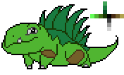
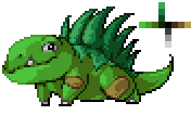
Hey, so I mentioned Art, right? Well, I illustrated my favorite image from the night.
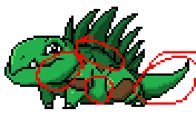
Click for full-size.
So, uh, did I mention that according to the book, Algol means A Ghoul, or A Demon Star? That name is pretty much where everything else came from. He's a fucking beast. And like all good dying stars, it's blood red. Image-wise, it was quite an exercise trying this pose anatomically. Also, deciding how to clothe him was actually kind of a really hard time - I hate doing fashion for my guys, it's hard to make it interesting yet also easy enough for me to make it follow the form and not kill myself actually doing it. I'm pretty happy with how the clothes came, and very happy with the piece as a whole. You might notice that the crest there technically breaks from the fabric contours - a) I'm not doing that shit or I'd never be happy with it, and b) it looks better this way. Gives the image a sort of emblem. That crest is unique to Algol btw.
You know, doing this image and thinking about Algol, I realized, he's not a Polaris character. He's a fucking Mythender.
As a side note, this piece could make for a great Firebender picture with not-that-much changing. Might do that eventually if I need to recycle some assets.

Anyway, the game and the art-ing were both a ton of fun. We're talking about trying to play again sometime, though it may not materialize for a while. Well, now that I've actually written an AP post the day I played, I'm going to bed, it's fuckin' 4am.

End Recording,
Ego.

Sunday, March 24, 2013

Sunday Songs: Julien-K - Waking Up

http://www.youtube.com/watch?v=mZCgZ_1jwmU&feature=player_embedded
I confess, Julien-K came to my attention through Shadow The Hedgehog. That is a really bad game with some really good music. This wasn't Julien-K's first contribution to Sonic Team, though this song is actually on one of their albums (Death To Analog, which released in 2009). However, through StH, I've started listening to a bit of their other stuff. Not much, so today is also linkless (sorry, I promise next week will have links!) but you should check out their stuff.
The band was originally a side-project of Orgy that grew into its own thing. I don't know much about Orgy either. Sorry.

Anyway, enjoy the music, I should be back, like, tonight or tomorrow with another post!

Links:
None due to lack of knowledge.

End Recording,
Ego.

Saturday, March 23, 2013

Avatar World and Art: The Waterbender

http://www.youtube.com/watch?v=VBE_FZ5wBY8&feature=player_embedded
Guess what? I have waited FOUR. FUCKING. MONTHS. to use this song. I've been sitting on this song since a couple days after I wrote the original batch of waterbender moves, because I thought it sounded great for a waterbender post. And then I didn't DO any waterbender posts for a long time. Especially the beginning of this song makes me think so much of the desolate, barely-holding-on feel of the Southern Water Tribe, or the Prox tribe in the Golden Sun games, or the ice-blighted world at the end of Vonnegut's Cat's Cradle. It says Water to me. It's quiet and slow and calm, yet sad.
ENJOY IT.

Hey, I have Avatar World stuff! And better than that, Waterbender stuff! I finished The Legend of Korra, so I finally felt comfortable re-writing the waterbender moves. See, I didn't want to go near them until post-LoK cuz, I mean, I'd have to be an idiot to leave out the stuff done by a primarily-Water Avatar. Turns out she didn't do very much creative with her power :/ I wish Hama were here.
But things are good! And I've finished writing, and I have art, and I get to use my Waterbender song I've been sitting on (and in the meantime I totally found another one :/). If you're only here because you like art, just scroll down.

Water: You have a small supply of Water you bring with you. These tokens are used to fuel your Waterbending abilities. You can carry up to 3 Water by default. Replenish your Water whenever you come across a sufficiently-sized body of water.
Codifying the tokens in with a move like Sympathetic Tokens does. If you're using Water directly from a body of water instead of your own supply, being in the presence of that body of water basically just counts as an infinitely-replenishing source of Water.

Waterbending: When you psychically manipulate water in combat, spend 1 Water and roll+Fluid. On a hit, choose from the list. On a 10+, choose 3. On a 7-9, choose 1. You may pick a single option multiple times.
     * Deal 1 harm.
     * Impose a tag on a foe.
     * Impose an environmental tag.
     * Get the spent Water back.
If you take the harm option multiple times, it is considered one large attack for purposes of ignoring armor (even if it narratively considered multiple strikes).
Altered it a touch. I suspect the most common strategy will be: on a 10+, pick 2 and get the water back, on a 7-9 pick something and lose the water. It does, however, allow for someone with almost no water left to be conservative, and for someone with a lot of Water to go all out. I'm actually feeling rather comfortable with that balance now where I was hesitant before. I imagine this'll be important to watch balance-wise when it hits the table.
Also fixed my "to attack" weirdness by saying that you roll when you do it in combat. Waterbending out of combat is just done or it's the place for a custom move.

Moon-Chosen: When the moon has risen, you have +1 Fluid (max+3).
Unchanged! Turns out I like this one.

Icebending: You can control ice as if it were liquid water, and can shift water to ice (and vice-versa). When you bend ice in combat, roll Waterbending with Keen instead, and add the following option:
     * Deal 1 harm an impose the tag Frozen to the target.
Very simple. You roll with a less-optimal stat but get a more powerful option to use - but remember that that option doesn't exactly help more than once, since once they have the tag, it doesn't help to keep applying it. Instead, this actually gives incentive to targeting multiple foes, since you can freeze up a bunch of guys while hurting them. Feeling much better about this move.

Streaming: When you deal harm with Waterbending, you may spend a number of Water up to your Fluid score. For each Water, deal an additional harm.
And this is the "I really really hate you" move. It looks super-powerful, but it's actually not too bad I don't think. If you can carry three Water, spend one to Waterbend, get a 10+ and pump all three into harm, add your remaining Water in, you're dealing 5-harm - enough to easily kill a single enemy, but you're completely drained of Water now and the stars kinda had to align for that to work right. Performed near a body of water, this is very powerful, but that's true of waterbenders in the show as well - and there's a reason that pro-bending banned streaming water like this.
I am worried about the balance here of course, but it's not a sustainable weapon really.

Healer: When you take time to cover a wound with water and lay hands upon it, roll+Natural. On a 10+, the wound is visibly cured and 3 harm is healed. On a 7-9, 1 harm is healed but the wound is visibly unchanged.
Also totally happy with this. Also, if you don't have any Water remaining you obviously can't do this since you can't "cover a wound with water."

Okay, that's technically six moves with Water. Now, that means 5 actual functional moves, but you know what? I'm writing, like, THREE freaking sub-playbooks (Blood-, Plant-, probably a Phases- one that expands on ice and vapor) about various advanced bendings for this guy. You can all just deal with it.

Also I have this super exciting cross-Bender sub-playbook idea based around a move called Weatherdance. It's under development, but I'm very excited to share it.

*****************************
And the art! I'm so thrilled with how this came out.
Chance are, Blogger just resized the sucker. If you want the full version, deviantArt didn't try to change it on me.
http://horn-head-o.deviantart.com/art/Waterbender-360100145

Here's the original sketch for it:
http://i22.photobucket.com/albums/b330/maxdxam/Waterbender_Sketch_zps47e35cd0.png

Anyway, this sketch was actually done as a personal sketch in our sketchbooks for my Drawing 101 class, so I guess it's technically gonna get graded. I'm so happy with it, it does EXACTLY what I wanted. the proportions aren't ridiculous (I made sure with the height, though his fingers are a bit long), things are dynamically posed, the water is really damn convincing even with some slight warps in the lines cause by my digitizing process.

The outfit is based ever-so-loosely on the Water Tribe outfits, loose-fitting with triangular ends and a trim. However, I didn't want to do an exact clone of the water clothes - again, trying to avoid being so direct with my plagiarism. You're not gonna see arrows on the heads of my airbenders. Anyway, it turned out perfect in every way I wanted, and I'm highly considering putting this on a shirt for me to wear.

As for it's use, I DON'T think I'll be using this as the playbook image! Instead, this is giving me a bit more of an impression as an in-text illustration. We'll see how much art I can actually make though before I finalize a decision like that. Regardless, I'm super-happy with it and hope you like it too.

Seeya later folks. Like always, I appreciate any feedback I can get!
End Recording,
Ego.

Thursday, March 21, 2013

Pixel Art Lessons: YellowLemon's Remains of a Tribesman (Banding, Color Burn, Color Selection Theory)

http://www.youtube.com/watch?v=uoAwyHQ19Z0&feature=player_embedded
PrototypeRaptor is awesome. He does glitch, electronic, and dubstep stuff, and this is just one of his great pieces. Another is his Open Your Heart remix from Sonic Adventure.

Hey, I'm here typing instead of studying because I'm a terrible student!

This is part a series of posts where I share the pixel art critiques I've given and generalize them so the rest of the world can learn something! I try to be as explanatory as possible, so, while lengthy, these should be decently accessible. Because it turns out you can learn just as much from analyzing the amateurs as you can from observing the pros!
For a greater intro, look for posts tagged "Pixel Art Lessons."

YellowLemon's "Remains of a Tribesman"

Major Themes: Banding, Color Burn, Color Selection Theory

I could probably use some background on this one. See, on PixelJoint, every week there's a challenge. A set of specifications is given, and people take a shot at completing a piece in one week that fits the requirements. Over the following week, people vote on them, and then the top three pieces get ribbons. I myself participated a couple weeks ago with The Amazing Man-Spider, and actually won third place! But that's not relevant. I'm describing this because today's piece we're examining was a weekly challenge entry! The challenge:
Recently the Moai statues on Easter Island have been found out to have undiscovered parts under the ground. Create an image depicting what you think is buried in the ground.

Canvas size - Unrestricted.
Colours - Max 15.
Transparency - No.
Animation - No.
So let's see what YellowLemon pulled together!
That looks pretty decent! But it has some troubles. What was his description.
I swear I wasn't trying to be "fashionably late" with this. I had some trouble with my wrist, and had to take a slow pace with this one.
On Monday, my idea was to make a row of FOUR moais (pretty ambitious, yes): a skeleton, a rocket, a fetus (yeah, might have not gone with it) and a PEZ dispenser. On Tuesday, my wrist started acting up, so I ended up concentrating on what I thought would be the best concept.
(There should be 3 shades of each color, but there's an unnecessary extra shade of brown that I can't pin down anymore.)
EDIT: Added texture to the underground soil. It might be a bit distracting, though.
I came in after that first edit. From what I can tell, those little stones in the soil didn't exist when it was first posted, but were added by when I showed up. Let's just get right into what I said!

Found your loose brown pixel for ya.
Looks pretty good. Cyan on the sky is kind of a blinding color, and there's some crazy staircase banding going with the spear shaft. I'd recommend that, unless you're intentionally going for a "stratified, distinct layers of dirt" look, you try out some more unconventional (meaning non-checkerboard) dither patterns to make a more natural-looking gradient. Could be a fun thing to try out.

Idea in general's pretty fun though, and the texturing in the dirt isn't really distracting at all, it adds a pretty good look to the otherwise-plain dirt.
If you look in the original image up there, you won't see the loose pixel. He edited it out pretty quick, and I hadn't had the idea to save versions of things I crit cuz I hadn't planned this series then. Anyway, that post was my attempt at brevity. I was met with:
Ego, thanks for finding the lost pixel  and also for the C&C!

So, with "blinding" you mean that the sky color is too bright, and with "crazy" banding, you mean it looks bad?

The "layers of dirt" wasn't really what I was shooting for, but it seemed the most time-effective thing to do to add texture to the dirt. I don't know if it would be OK to change the soil again, since the deadline is already up
Questions asking for a bit of clarification? Welp, time to toss brevity out the window! I should warn you now, I kinda went a little nuts with my posts to YellowLemon. I was in essay-writing mode from classes and was actually learning some stuff myself in my research, so I went a touch overboard.
Okay, I'll hit this with a bit more detail.

Cyan, and very highly saturated colors in general, have a tendency to little hard on the eyes. The worst suspects, to me, tend to be cyan, lime green, and fushia/light purple, though pretty much. Now, in the right circumstances, these colors can be perfectly usable. They become problematic, however, when they interfere with the surrounding colors. See, exceptionally bold colors (such as these ones I've mentioned, in addition to others, like solid black) have a tendency to, uh, "eat up" the colors directly around them. Other colors, especially  less bold/more neutral colors like less-saturated colors, browns (oddly, even quite saturated browns often wind up pretty neutral in my books), and greys, are overwhelmed by the stronger colors, making fine details hard to make out.

As an alternative explanation, colors of high saturation in large sheets can be, well, blinding. Just open up a basic program like paint and fill the screen with #00ccff. Then try filling it with, say, #afc1c6. The difference ought to be clear.

So it isn't really that the sky is too BRIGHT, so to speak, but it's too BOLD. On the whole, this piece has a pretty neutral palette, filled with a lot of (relatively saturated) brown and flat gray, with the sky being a very strong color that distracts from the rest of the piece. You only have about half saturation on the cyan, but because cyan itself is one of the more powerful colors and its only neighbors are literally toneless greys, it comes off very strong. Dimming down the brightness might be able to fix it, but you might also want to consider changing the blue in a different direction: hue or saturation. I already articulated the way saturation affects it, but hue could do it too. Like I said, cyan/turquoise in particular is a color that eats its neighbors. Shifting the hue away from green and toward blue might be help.

Crazy banding is just referring to the fact that you have a LOT of banding on the spear. Banding, in the vast majority of situations, is a bad thing - it creates a fuzzy faux-gradient look that tends to not look good. Helm over on Pixelation prepared an astounding primer on what banding is and what to avoid, it's far better than I could come up with myself. Hugely educational (as is the rest of the pixel-art primer, regardless of skill level). Here's the link: http://www.pixel.schlet.net/#C2

It's worth throwing out that while I didn't call it out before, the spear's not the only banding around, it's just a pretty intense example of staircase banding. The sky gradient is the other big spot of banding, done as skip-one banding. Reading through the primer linkt here ought to able to help you with conceptually identifying that as well. Lastingly, you're generally pretty good about it, but you need to watch out for when your anti-aliasing may accidentally become banding. It happens a couple of times, mostly on 45-degree angles.

At this point, don't touch this piece, at least until next week when voting's done - no point risking being called a cheater or something. The layers of dirt is definitely a time-efficient strategy - it conveys the basic idea easily, and is simple enough to do. That particular suggestion of trying more complex dithering had more to do with if you intended to attempt further revisions, or, if you didn't intend that, simply to keep in mind for future pieces. In fact, all of this is probably easiest applied to future pieces. If you do revise this piece, hold it til next week, or, if the revisions are significant enough, post it as another gallery entry.

So yeah, I hope this is helpful! And no problem about the lost pixel and the C&C, I like talking about this stuff. I don't often have a ton of inspiration for my own work, so keeping a steady eye on other people's stuff and helping out helps keep me sharp as well! Ask away if you've got any more questions about what I'm talking about! I'm not completely confident in my explanation of what precisely I meant by "blinding," so if I wasn't totally clear I can take another stab at expressing that.
First, you see that link in the middle there? That's to the Pixelation tutorial, with a jump straight to the banding section. That's the most powerful single pixel tutorial I know of, and the best explanation of the intricacies of banding. Until some critique I actually did today, I've usually delegated my explanations of banding to that tutorial, since banding is among the hardest of the common pixel art problems to explain. In several weeks I'll probably post what I've been doing today, in which I actually do a pretty decent job of illustrating banding.
Anyway, this is mostly pointing out banding and trying my best to explain the idea of color burn. Color burn is my word for when a color is so grating to the eyes that it overwhelms and "burns out" the pixels it exactly touches. Solid black, solid white, anything with 100% Saturation, and especially cyan, lime green, and fuchsia, all have the tendency to do this. It's about the relationship between a saturated color and a non-saturated one. Reply from him:
No worries, this time I understood completely what you said

I was conscious about the banding in the sky and the spear, but I had left them like that since I didn't want to add more colors to either of the hues, nor spend more time on the sky (which didn't end up as good as I'd liked) Maybe even change the size of the spear and such. I spent a lot of my Sunday on the piece, and had little time to spare . (Thanks for the cool tutorial btw, I'll be sure to read it)

When you mention that my anti-alising accidentally becomes banding in some places, I take it you are referring to the forearm of the arm that holds the spear. I was aware that it looked muddy (especially comparing it to the other arm) but I didn't spend any time looking for a better solution, and decided that it still looked better than with no anti-alising at all.

The color of the sky, on the other hand, I hadn't considered at all, and just went with one that looked fine at first glance, without studying its behavior in the piece as a whole.

I'll have your critique in mind for future pieces, especially taking care with color harmony.  In my "style", I tend to use saturated colors, so this is bound to be a problem in the future Thanks again!
Side note: Never restrict yourself because you think you've established it as your "style" - it holds you back. Even if you like drawing a certain way, take chances and do other crazy things, you'll learn lessons that can be applied to your preferred way of drawing. Not implying that was YellowLemon's intention, I know he does experimentation, I just wanted to mention it.
Reading this today is making me realize how apt my "banding is basically the Uninformed Man's anti-aliasing" I put into my critique today.

Him talking about the forearm and how it looks better this way than with no AA at all brings up a good topic: the 45-degree angle. Put simply, the 45 degree angle line is a huge bitch. If you leave it alone, it gets kinda jagged. If you anti-alias it uniformly, you've done banding. You need to be clever with your available colors.
Anyway, what I dropped next was somewhat unasked for, but it's good stuff still. There's a lot though.
Excellent.

Okay, that's fair. The time aspect of these weekly challenges is definitely a big factor and it makes sense to try to time-save as you go, and on the sky it's not too bad. The spear I think there were choices other than banding - in particular, offsetting the shading and opting for a more anti-aliasing-based approach could probably have kept the gradient-y banding at bay.

The fore-arm is definitely one. There are a couple other minor location, but these are definitely not a huge deal, more of a technicality. It's just good to train to recognize things like these when you're going. The general feelign is not hugely changed, it's more a side note. And as for banding vs no-AA at all, it can be a judgment call. The best case scenario would be to mess witht he exact shaping to the point that you don't NEED to choose anymore. In this case, I'd say that for some of the parts, where the bone is on the thicker side, use the grey for AA, and for the thinner sections you can use the brown from the dirt behind it to actually provide a minor bit of AA - it's not as strong as the gray, but it's not nothing.

I did a minor edit to point out a couple things. I circled the main AA-bandings in red, and did an edit to the spear to illustrate what I meant.
Color harmony is a complicated subject! It's tough to analyze in your own work, it ends up feeling a lot more like intuition. It's something you just internalize over time - just think hard through things, read stuff occasionally, and practice a lot.

Saturated colors can be good, even when used in huge degrees! When I think of heavy saturation, two artists immediately come to mind for their use of the bright and the bold: happip and OCEANSCENTED. happip has a very bright style, but here's one in particular that's a a great example, Parrot: http://www.pixeljoint.com/pixelart/18986.htm.
 Solid extreme saturation, including the pretty wicked cyan and lime green, but it blends (as a side note, there's some banding here too, especially on some 45-degree curves - it could be a decent experiment to try and spot as much of it as possible). Here's another: http://www.pixeljoint.com/pixelart/19965.htm.
That's a great study in how to take a strong saturated blue/cyan and mute it down into the surroundings without it eating everything. I already see a bunch of OCEANSCENTED's pieces in your favorites - Izzy is one of the  most stylish up-and-coming artists, and has an extraordinary innate sense of color. Let's take a peek at two of her pieces, for example: Heehaw (http://www.pixeljoint.com/pixelart/74696.htm)
and "now why would you do that" (http://www.pixeljoint.com/pixelart/74845.htm).
If you don't mind for a second, I'm gonna talk about these four pieces and what makes them successful.

What is it that does it? This is really just me working on observation here rather than theory, but from what I can tell, the answer is consistency. None of these is QUITE as noticeable as happip's Parrot. Take the piece into your image editor of choice, and examine the colors. What you'll find is that the Saturation is stunningly similar - in fact, the yellow and orange and red have the exact same saturation value, and others are so close that this can't be anything but intentional. I'll continue elaborating on why I think this is after a couple of other examples. Again, a side note: look at the way the purple is used as the secondary light source on the wing and you can see where he's taking ADVANTAGE of the devouring power of purple to make it noticeable, even when it's only a single-pixel wide.

Both of Izzy's pieces I mentioned above follow a similar principle: saturation is generally consistent, with one color being the exception in each (a duller red in Heehaw, and a darker blue-purple in the other).

Let's make this personally applicable: your own Angry Blues piece.
Ignoring any individual issues, this is a piece using highly contrasting cyan and yellow, but it DOENS'T cause the blinding, "color-swallowing" effect. Why? Two reasons. One: Lower value. The colors are darker in value, which limits their blinding potential. But again, at the same time, they're the same general saturation. It changes somewhat, but it's in the same region.

So what conclusions would I say could be drawn? Two. First, saturated colors next to other saturated colors try to drown each other out and thus both appear pretty strongly. Staying in the same general region can allow your colors to compete with each other in roughly the same way, though they're susceptible to the normal parts of color theory eg contrasting colors (which causes the blue/red distinction in happip's Parrot). Second, if you want to use saturated colors AND nonsaturated ones, you have a couple of options. One of those options is to use the saturation in small spots - a little says a lot. Check OCEANSCENTED's "Lucky anim test",
it's a very grey piece with a single splash of color, and general fashion has been using small but bold spots of color to create an impact for a long time. Another option is to slowly step down from the saturation, gradually going from saturated to dimmer (or, much more commonly, making the highlights unsaturated and the shadows saturated), letting it transition slowly so the strong colors aren't sitting on top of the mild ones. This is what happens in that other happip piece.
And that is a beast of a post. Happip is a classic favorite of mine, and a frequent user of saturated colors. OCEANSCENTED is easily one of my top modern favorites - her pieces are constantly doing interesting things, and I learn a lot by picking them apart. Believe me, this isn't the last time you're gonna hear about Izzy - I could devote all of next month's lessons to her pieces and I'd still have plenty to spare. She's actually probably gonna be next week's post.
Anyway, YellowLemon responded:
Ego, you're a loonie

You found out the anti-alising-banding spots that I even forgot about, and the spear looks much better in your edit

Thanks a lot for this further insight into color theory, complete with analysis of other artists' use of color, and then mine again for good measure (I read it all, I swear ) I assure you I'll have in mind these tips (the ones I don't forget, anyway )
Loonie is fuckin' right. And my response (and final post):
Loonie is right - finals things right now have me in essay-mode and it sems to be bleeding through into my other hobbies :p I have practically, like, cited evidence and everything.

Was kinda fun though. Learned a lot in the process, and I'm never upset at the opportunity to dig through OCEANSCENTED's style and figure out what makes it work so damn well. Until I was actually writing it, I hadn't even noticed the consistency-of-saturation trend in, uh, "high glare" pieces. Didn't mean to pull myself into really analyzing other folks - I tried to keep it focused on using others as examples for the principle of things to apply it But yeah, glad you thought it interesting! Really, the main thing to remember is that high-saturation colors make it harder to see neighboring low-saturation colors. Everything else is just reasoning and explanation.

...Now I have to hope that what I've internalized about color theory is actually correct. I'm not a formal student of this or anything, I hope I'm not just being ridiculous. Anyway, good luck on future stuff! Thanks for the opportunity to exercise my own pixel knowledge a bit! :3
And we're done! That was a huge pile of color theory and color burn, with a bit of banding as well. Hope you get some benefit out of it.
And if you do feel like you learned something, or if you entirely disagree with my very uneducated thoughts about color, let me know!

End Recording,
Ego.

Tuesday, March 19, 2013

Schoolwork: Essay on Beowulf and the Germanic Heroic Ideal

http://www.youtube.com/watch?v=bw-j_P1v0G0&feature=player_embedded
This is an amazing mix of Vigil from Mass Effect 1. Now, it doesn't sound a huge amount like Vigil actually - the way it's done kinda washes the resemblance out, but I really like it. This is a great sound that I want to hear more of. Unfortunately, most of the guy's stuff is just metal (although it's also quite good).

Good afternoon folks! Along with last week's essay on Pir Inayat Khan, I also wrote a second essay that week. Today a fella commented telling me something I didn't know about him even after the Khan essay, which was really neat, and it has me thinking about things a little differently right now - so seriously, share the cool stuff you know with me, I love hearing it. Anyway, this other essay is for my History Class on The Middle Ages. We've been studying up from the fall of the Roman Empire to the birth of Islam, with a good amount of time spent on Anglo-Saxon and Germanic developments. To go along with these things, we read the epic poem Beowulf, and wrote an essay on it.
Here's the prompt:
"Explain how Beowulf the character is a manifestation of the Germanic heroic ideal in his deeds, speech, and various encounters with monstrous characters and other people in the story. Focus not only on Beowulf's superb gifts as a warrior, but his insights about everyday formalities, fate, and God. The observations of others about Beowulf, such as the words of other warriors or noblemen, rivals, or those speaking after Beowulf's death, are also fare[sic] game.
Be sure to restate this multi-part question as a thesis within the first few paragraphs of your paper, and then offer evidence from the book to support your claims. For extra insight into Anglo-Saxon culture, you may also compare and contrast Beowulf's heroid attributes to those of the hero Brithnoth in "The Battle of Maldon" or the heroic Christ in "Dream of the Rood".
5-6 pages (longer OK).
Well, I'm certainly glad he said longer was okay, because this is a 9 page paper! Of course, we're on a blog, we get to see it as one long page.
I do have proper citations, but just for reference, they're all from the Seamus Heaney bilingual translation of Beowulf.
Onward!

Max / Ego
HIST323 – First Paper Assignment (Beowulf)
Word Count: 3279
Ancient Anglo-Saxon culture, as well as general Germanic and viking cultures, have become a fascinating idea to the pop culture of the world today. However, given this fascination, many would be surprised to learn that there are a remarkable lack of texts from the region and period, primarily due to the societies focusing on oral tradition rather than the written word. One of the most expansive of the few texts we have from them is Beowulf, an epic poem chronicling the events of the life of a warrior named Beowulf. The story focuses on three battles Beowulf participates in through his life. In the course of the story, he exhibits amazing prowess and rises from simple nobility to wide renown for his skills as a warrior after slaying the demon Grendel and its mother, and then finally ascends to the throne to rule for the fifty years leading up to his eventual death in the final conflict of the poem against the dragon.1 The poem is fictional, but portrays Beowulf with all of the ideal attributes of a perfect Germanic hero. Despite the Germanic culture's focus on the traits of a great warrior, the ideal hero that Beowulf portrays is more than just a specimen of physical prowess. He is amazingly strong, but is also courageous and honorable in combat. He is wise and spiritful, firm in his belief in the tides of Fate. He also fits perfectly into the society, displaying the most admirable of characteristics: loyalty and servitude, strong leadership, a powerful sense of honor, and respect for and adherence to the traditions of their people. Beowulf embodies the Germanic heroic ideal not only in the physical sense, but also in the spiritual and social aspects of that ideal.
The first, and most obvious, way that Beowulf fulfills the heroic ideal is in his prowess as a warrior. However, it would be wrong to think that his literal ability to fight is the only aspect a hero needs to fulfill the role of the warrior in Germanic society. In addition to pure strength, honor in combat is an important part of being a warrior, and without valor, courage, and resolve, a warrior could not be considered perfect. Beowulf, however, exhibits all of these traits. Physical strength is the easiest to prove of them. But to understand why the actions of Beowulf are significant, we must understand what sort of strength the Geats and the Danes respected. The poem gives us the information we need immediately, as it begins with a story not of Beowulf, but of the great Shield Sheafson, a warrior from generations ago who is lauded as the “scourge of many tribes, a wrecker of mead-benches, rampaging among foes.” It tells that his worth was proven by his increasing combat abilities, and ends the verse with the declaration that “That was one good king.”2 If Sheafson is a role model for the Germanic hero (and if he was indeed “one good king,” he certainly should have been) then the implication is that great combat ability can make you worthy of kingship. Why a king should rise from combat is explored not even one hundred lines after speaking of Sheafson's might: “The fortunes of war favored Hrothgar [Sheafson's great-grandson]. Friends and kinsmen flocked to his ranks, young followers, a force that grew to be a mighty army. So his mind turned to hall-building.”3 In the violent and unstable times, a king needed martial prowess, and followers to aid him, in order to produce stability before the thought of nation-building could even be entertained. If martial prowess is a necessary thing for a hero, then Beowulf has no trouble proving himself worthy. From the first verse featuring Beowulf, he is described as “the mightest man on earth, high-born and powerful.”4 As he goes along, others assert the same about him5, and his deeds match with these claims, such as when he, with his bare hands, tore the arm off of Grendel, a beast strong enough to “grab thirty men from their resting places”6 with skin so hard that there was “no honed iron hard enough to pierce him.”7 Later, he somehow manages to spend “the best part of a day”8 underwater, and he wields a “so huge and heavy of itself only Beowulf could wield it in battle.”9 If these supernatural feats of strength are not enough to satisfy the heroic ideal of physical power, then surely no such hero has ever existed.
In addition to sheer physical might, Beowulf is an honorable warrior. Being honorable is not only about physical ability, but is also a part of being socially ideal. For Beowulf, honor is about fairness, and placing himself on equal ground with his foe. It represents a greater self as a warrior because being honorable means placing restrictions on your own actions even if they would give you an advantage if the action could be unfair or cowardly. Nowhere is this form of honor more evident than in his preparations for fighting Grendel in the hall: “the monster scorns in his reckless way to use weapons; therefore...I hereby renounce sword and the shelter of the broad shield, the heavy war board: hand-to-hand is how it will be.”10 To paraphrase that, since Grendel uses no weapons, neither will Beowulf (probably a good bet as well, as Beowulf himself later admits that blades he brings to his fights rarely succeed for him). This is not an isolated case; much later in his life, Beowulf gives another excellent exhibition of honor when preparing to fight the dragon. He not only expects the dragon to be honorable (“if the evil one will only abandon his earth-fort and face me in the open”11) but also expresses the desire to “no use a weapon...and make good my boast as I did against Grendel”12 but knows the dragon is too powerful for that, displaying wisdom as well. Multiple times, Beowulf declares that he will not back down from the fight at hand, that he will either find glory or find death.13 14 Throughout his life, Beowulf constantly took the disadvantaged position in combat out of a sense of honor and fairness that is well in line with the heroic ideal.
The third element of the warrior side of the ideal hero is valor. Valor is courage, the bravery to fight at the risk of himself. Valor is tied to honor, as in order for one to restrict oneself in the way honor demands requires the warrior to brave even greater danger in combat. Every time Beowulf gives up an advantage in the name of honor, he is being valorous. However, he proves his valor in other independent ways as well. The most profound way is in his initial mission to Heorot: safe at home in Geatland, Beowulf had no forced obligation to go to a foreign land and hunt down the monster that plagued the Danes, and was in fact discouraged from going15, but still went to fight Grendel. Beowulf went to face great trials in combat to heighten his reputation and glory, defying danger all the while. He also displays valor when he chooses to go himself to slay the dragon, despite his advanced age. In many ways, these examples of valor are also examples of him fulfilling his duty. He had the power to help the Danes with Grendel, and so felt obligated to help where he could, and later he hunted the dragon because of his duty as a king, looking after his people, even saying to his troops that it is not “up to any man except me,”16 taking personal responsibility for the well-being of his people. Beowulf's courageous fights are rendered even more brave when one takes into account the locations of the fights. As the translator points out in his introduction, the locales of the fights are “three archetypal sites of fear,” the sorts of places where it would be brave to even venture, let alone fight in.17 While valor is ultimately a warrior ideal, it's also spiritual, or mental, in that it is a fundamental quality to the way Beowulf treats life.
Just as being strength is not the only part of being the ideal warrior, the spiritual side of the ideal hero is not governed by a single trait. Valor is one of the mental characteristics that defines a spiritually ideal hero, but so is wisdom, and the way a Germanic hero interacts with the concept of Fate. A wise hero is one who understands his limits and the limits of people in general. Beowulf is a wise hero – the poem says as much, that “he ruled [the kingdom] well for fifty winters, grew old and wise as warden of the land.”18 However, we needn't be told of his wisdom to see it in his actions. In his youth, Beowulf lacks many of the trappings of wisdom, but by the time he strikes down Grendel's mother, King Hrothgar declares that he had “never heard so young a man make truer observations. [Beowulf is] strong in body and mature in mind, impressive in speech.”19 These qualities, especially the mental maturity, are hallmarks of the wise. By the time of the dragon, Beowulf is wise enough to know not that his body limits him from fighting without any weapons, despite his desire to fulfill his boast and satisfy his honor. At a more subtle level, we are several times presented with wise leaders who have revelations of Fate – King Hrothgar has a direct revelation when Beowulf departs for Geatland20, and King Hygelac had dread in his heart about Beowulf's hunting of the beasts21. Finally, when he goes to hunt the dragon, Beowulf himself joins these wise men in his visions of Fate, “sensing his death.” To him, this fate was “unknowable but certain,: it would soon claim his coffered soul, part life from limb.”22 By linking him to these other wise leaders, the poem is marking Beowulf as one of them.
Understanding Fate is not just an element of wisdom, but its own aspect of the spiritually ideal hero in the ways it ties into other elements. Beowulf is an ideal Germanic hero in this sense because he has complete faith in the idea that whatever Fate has in store for him is the right way of things. He himself sums it up neatly early on: “Fate goes ever as fate must.”23 He doesn't try to defy Fate, or declare to know the way of it, but is content with the idea that whatever happens is that way for a reason, hat Fate doesn't make mistakes. Without this strength of belief in the power of Fate, he would not have been able to be quite so valorous, for fear of death surely would have persuaded him otherwise. He knows that he can declare victory or death, because the victor in the fight was obviously fated to succeed, so he may as well let Fate determine the better of them. Similarly, he believed that Fate would not punish one whose time is not yet up.24 For Beowulf, “Life doesn't cost him a thought.”25 Without fear of death to cloud his vision, he is able to be braver and more honorable and more focused in combat. For these reasons, the ideal Germanic spiritual hero believes as Beowulf does because such beliefs create such greater potential for all the other aspects of the perfect hero.
The third aspect of the Germanic heroic ideal, along with being physically ideal and spiritually ideal, is being socially ideal. Just as with the others, this isn't just one trait, but a set of related characteristics. Both honor and wisdom, discussed above, play into the social situation of the hero, but are joined by the ideas of keeping traditions, being a good vassal, and leading strongly. To keep traditions, the Germanic hero follows the guidelines of all of the social conventions, customs, rituals, and formalities of the societies he is a part of. Beowulf is constantly observing the customs, but it is most notable in formalities of entrance. Upon landing in Denmark, Beowulf and the coast watchman exchange formal dialogue about location, identity, and intent.26 Beowulf performs a similar ritual upon entering Heorot and asking to address the king directly – the translator even marks this section as “Formalities observed.”27 Beowulf is also an active participant in the fraternity ritual in which the cup is passed around by the Queen as a bond of fraternity.28 The reason that maintaining these traditions is important is because, even if an ideal hero is powerful and spiritual and socially responsible, he's not truly a Germanic hero unless he's observing their customs as well.
One of the most important aspects of a warrior in the Germanic society is how they behave as a vassal. Every person who is not themselves a king owes servitude to their lord, and Beowulf is a perfect example of a vassal. In that first meeting between Beowulf and the coast watchman, when asked who they are, Beowulf doesn't even declare his name, but the name of his lord and his father.29 Who he is personally is unimportant save for when it is his own deeds and personal intents, such as slaying Grendel, and even then he is performing his duties on behalf of his lord. Another way we can see Beowulf's servitude is in the treatment of the gifts from Hrothgar. Hrothgar gave Beowulf several gifts as personal gifts, but eventually, when he returns to King Hygelac, Beowulf places the entirety of the treasure at his liege's command.30 Yet another way Beowulf was a good vassal was the way he put himself completely at the command of King Hrothgar, despite coming from a different land entirely. He acted with respect and integrity, just as a warrior should. The importance of servitude is that it's the basis of the social hierarchy of the entire culture – a warrior who flies in the face of his lord lacks the respect and wisdom also necessary for a hero, and falls outside the society where none can judge him on his heroism.
After discussing the physical ideal, the spiritual ideal, and the other sides of the social ideal, there is one more characteristic vital to the ideal Germanic hero: leadership. Leadership is the culmination of all the other characteristics; as Shield Sheafson and Hrothgar displayed, leaders arise from outstanding warriors, a hero must obey society's rules to rise through the ranks, and a warrior without wisdom will never last as a ruler. The poem reiterates the connection between warriors and rulers by declaring that, with regard to Beowulf, ”Nowhere...was there anyone better to raise a shield or to rule a kingdom.”31 This comes immediately after the defeat of Grendel, implying that those who are the best to “raise a shield” are also the best to rule a kingdom. The poem sets a precedent for what a good ruler should do when it discusses how Queen Modthryth should have acted: “A queen should weave peace, not punish the innocent with loss of life for imagined insults.”32 The same rule applies to kings, and is connected to the idea that a ruler should not be too prideful that they consider themselves overwhelmingly superior to every other person. Again, we are directly told by the poem that Beowulf was a good leader: “He ruled it well for fifty winters, grew old and wise as warden of the land.”33 So right there we're told that Beowulf fulfilled that part of the ideal, but why settle for just being told when the poem shows it as well? One aspect of a good leader is that they're willing to sacrifice for the good of their people, an idea connected to the concept of duty already linked to the ideal hero's trait of valor. Several ways Beowulf embodied duty have already been discussed, but the greatest of all comes from one of his dying words. As he lay there, mortally wounded but with access to the now-dead dragon's hoard, he gives thanks “that I have been allowed to leave my people so well endowed on the day I die.”34 Only minutes remaining, his thoughts turn to how his sacrifice will benefit his people. Not only was he a great leader as a King, Beowulf was a good leader in battle, an inspirational force. In his battle against Grendel, his valiance spurred his troops to assault the monster, even though they could do nothing but distract it.35 He was able to bolster Hrothgar's courage in him even when faced with the improbably odds stacked against Beowulf before diving to fight Grendel's mother.36 The most powerful inspiration from Beowulf came in the final battle against the dragon, when Beowulf fell and all but Wiglaf scattered. Wiglaf, inspired by the love for his lord (a sign of his strong leadership as a king) and the need to assist him in the heat of battle when all seemed lost, tried to rally the others before charging in himself, inspiring Beowulf so much with his valor that Beowulf returned to his feet to fight.37 Wiglaf, unlike Beowulf, was not a world-renowned slayer of monsters, yet the power of Beowulf's leadership drove him to incredible heights of courage, and that ability to create bravery in others is the core of a leader's ability to inspire in combat.
With the combination of strength, honor, and valor, Beowulf represents the ideal Germanic warrior. With the combination of valor, knowledge of Fate, and wisdom, he is the manifestation of the Germanic ideal of spirituality. With the combination of servitude, wisdom, tradition, honor, and leadership, he embodies the Germanic social ideal. With all three of social, spiritual, and physical ideals, Beowulf as a character is the ideal Germanic hero. By taking this set of ideals, if we use Beowulf as a baseline, the other pieces of Germanic and Anglo-Saxon literature we have can be judged to determine the level to which people actually reached the ideals, and to what level Beowulf is accurately representative of the general Germanic society. Additionally, the ideal hero of a society can be significantly indicative of the values that culture holds as important. If Beowulf can be determined to be generally accurate for the Scandinavian cultures of the time, Beowulf the character can be compared to ideal heroes in other cultures to further analyze differences and similarities between the civilizations. Beowulf is a fantastic poem to use to gauge the values of Middle Ages Germanic society.
1Beowulf, trans. Seamus Heaney (New York: Farrar, Straus and Giroux, 2000).
2Ibid., 3.
3Ibid., 7, 64.
4Ibid., 15, 197.
5Ibid., 19, 247.
6Ibid., 11, 122.
7Ibid., 65, 987.
8Ibid., 103, 1495.
9Ibid., 109, 1561.
10Ibid., 31, 433.
11Ibid., 171, 2515.
12Ibid., 171, 2518.
13Ibid., 43, 637.
14Ibid., 103, 1491.
15Ibid., 137, 1993.
16Ibid., 171, 2534.
17Ibid., Translator's Intro xii.
18Ibid., 151, 2207.
19Ibid., 127, 1842.
20Ibid., 129, 1873.
21Ibid., 137, 1993.
22Ibid., 165, 2420.
23Ibid., 31, 455.
24Ibid., 39, 572.
25Ibid., 107, 1536.
26Ibid., 17-21.
27Ibid., 25.
28Ibid., 83-85.
29Ibid., 19, 260.
30Ibid., 147, 2148.
31Ibid., 57, 857.
32Ibid., 133, 1942.
33Ibid., 151, 2207
34Ibid., 189, 2797.
35Ibid., 53.
36Ibid., 97.
37Ibid., 175-181.

And that's that!
As usual, this is my essay, made available so I can potentially recieve feedback and to help others learn what I'm learning myself. I'm no expert, so seriously, none of the would-be paper thieves out there should use or even cite this. Still, I think I learned a lot to be able to write the essay, and hopefully you learn something too!
And if you know something about the subject, let me know if I got something right/wrong, or if you have interesting insights or thoughts about it! Same with folks who know things about writing essays! And I do love hearing when just other regular folks get some education out of my work.

Later!

End Recording,
Ego.