http://zirconstudios.bandcamp.com/track/fabrication-ft-jillian-aversa?from=embed
Sorry for Bandcamp, but no Youtube vids for this one. This is Fabrication by zircon (Andrew Aversa) and featuring Jillian Aversa, from his newest album Identity Sequence, which I've talked about before. Been really enjoying this song lately, as well as Unity. The lyrics to this one burst with game potential to me: "Agents of Miscreation" is an awesome premise for a game. Also liking "ghosts of fabrication" but that first one is just stuck in my head and I don't know what to do with it. Ideas?
Hello again! I was gonna do OCEANSCENTED today, but decided MetalReaper's was a better fit. Surprisingly, most of my talk at OCEANSCENTED isn't that long, plus some of it gets at some more advanced material. I mean, while I've come at a lot of stuff over the past month of doing these, I haven't actually hit the "let's do the basics" stuff!
MetalReaper is a fucking awesome artist. He has a bunch of these great drawings of re-interpreting pokemon as though they were to actually exist - not a super-original idea, but instead of trying to fit pokemon into existing animal molds, he bases it more off the pokemon and just makes sure it's sensible.
On the other hand,he's a brand new spriter. Like, I'm talking about his very first sprites today. I'm gonna pre-empt this: I might come off a touch harsh. I KNOW I make the medium come off as intimidating, and I apologize about that. But I think I'm a soft enough touch in how I teach that it's still user-friendly.
Now, my work actually started before he posted the pieces. HE made a journal entry asking:
MR:
MR:
The three starters, plus shiny versions. I devote 90% of my attention to the first one, Dimibite. Here's a link to his own concept art for Dimibite.
http://metalreaper.deviantart.com/art/Fakemon-Grass-Starters-338183171
Aaand here I go:
Back to me!
Learning color ramp integration is a great skill. Honestly, the ramp is only mildly integrated.
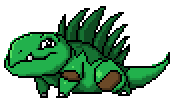
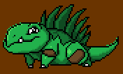
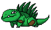
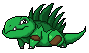
Since I have no intention to return to MetalReaper in the next little bit in these posts, I'll talk about Igurock. Igurock is another fakemon he posted concept art of, but did not sprite. I decided to make it myself for fun, and ended up teaching with it as well. If you were curious about one of the ways my process works, here it is!
Sorry for Bandcamp, but no Youtube vids for this one. This is Fabrication by zircon (Andrew Aversa) and featuring Jillian Aversa, from his newest album Identity Sequence, which I've talked about before. Been really enjoying this song lately, as well as Unity. The lyrics to this one burst with game potential to me: "Agents of Miscreation" is an awesome premise for a game. Also liking "ghosts of fabrication" but that first one is just stuck in my head and I don't know what to do with it. Ideas?
Hello again! I was gonna do OCEANSCENTED today, but decided MetalReaper's was a better fit. Surprisingly, most of my talk at OCEANSCENTED isn't that long, plus some of it gets at some more advanced material. I mean, while I've come at a lot of stuff over the past month of doing these, I haven't actually hit the "let's do the basics" stuff!
MetalReaper's "Starter Sprites", plus Dimibite
Major Themes: The Basics of Pixel Art (Lines, Colors, both count and the threat of black, Anti-aliasing, Shape, and my process)
MetalReaper is a fucking awesome artist. He has a bunch of these great drawings of re-interpreting pokemon as though they were to actually exist - not a super-original idea, but instead of trying to fit pokemon into existing animal molds, he bases it more off the pokemon and just makes sure it's sensible.
On the other hand,he's a brand new spriter. Like, I'm talking about his very first sprites today. I'm gonna pre-empt this: I might come off a touch harsh. I KNOW I make the medium come off as intimidating, and I apologize about that. But I think I'm a soft enough touch in how I teach that it's still user-friendly.
Now, my work actually started before he posted the pieces. HE made a journal entry asking:
P.S. if anyone has any experience in Spriting i really could use some help lol, ive been making a few but im not thrilled about themTo which I replied:
Post up a couple of the sprites (or just upload somewhere and link here) and I'll see if I can't help out some. It'll also help to know if you have restrictions to work with, such as size or color count. I'm no fakemon designer, but I've got I think I've got enough pixel experience to help out.Good advice. Never be afraid to seek improvement just because you feel ashamed of the pieces - if you don't know how to get better, ask away!
MR:
thankyou, ill post up some sprites soon, and i have been working with a 64x64 canvas for small sprites, and a 90x90 for the large sprites on MS paint, as for the colors, i dont have any set in stone, but i have a general idea of what it will look like, just getting the shade of color downMe:
Awesome.This is important. TO ALL ASPIRING PIXEL-ARTISTS OUT THERE: NUMBER OF COLORS MEANS NUMBER OF HEX CODES. Blue is not a color. Blue is THOUSANDS of colors. Understanding this, and the idea that in pixel art we attempt to restrict our color count, is vitally important.
I think we spoke on different wavelengths here - in spriting and pixel art in general color count refers less to how many kinds of colors (such as, say, red, maroon, green, brown) and more to the number of very exact shades (essentially the number of hexadecimal codes present). It's the latter that really matters to pixel art from a skill/technical perspective (though obviously the former is a major aspect on the design side).
The question of which colors is a bit less important than the actual number of precise shades - color count is often limited by the technology, and when it's not (as is generally the case on a computer) we self-impose restrictions either as a personal challenge or to foster a particular look. Color-conservation is one of the hallmarks of pixel art when compared to other mediums, along with avoidance of general tool use (such as the smudge tool or automatic anti-aliasing as is common with brush tools). Fewer colors is also harder though typically.
If you know this and I'm being daft, my apologies.
As for the size, 64x64 and 90x90 is a pretty large set of sprites. Cool though, and definitely doable. As for MS Paint, lots of spriters do use MS Paint so it's totally usable but I must say I recommend downloading a free program like GIMP or GraphicsGale for their ability to work with layers, which is nice for keeping track of changes over time and for testing animations (if that's relevant for this project).
And hey, no problem. Looking forward to helping out - it's been a bit since I've stretched my pixel muscles so this'll be some good fun.
MR:
holy crap, lol i had no idea about all that, ive honestly never done any spriting before so what you just anounced was helpful, and about ms paint lol, ive somewhat been doing that>> i um copy what ever im working on atleast like 3 times and paste them side by side to see what changes i like or shading lol, so i guesss i was doing it the hard way. but yeah ill post some of the sprites i have finishedMe:
Yeah, it's a pretty major disconnect from most other artistic mediums since we use the same word to refer to different things.That's when he posted 'em.
And yeah, just keeping a bunch of side by side stuff definitely works, after a bit it just becomes a little space-heavy and comparison becomes a side-by-side thing rather than directly toggling them over each other (for me personally, putting 'em side by side tends to make me think of those spot-the-difference images while using layers just makes it that much more obvious). Same end result hough, so if you're comfortable doing it as you are, keep it up! Can't wait to see 'em!
The three starters, plus shiny versions. I devote 90% of my attention to the first one, Dimibite. Here's a link to his own concept art for Dimibite.
http://metalreaper.deviantart.com/art/Fakemon-Grass-Starters-338183171
Aaand here I go:
Pretty good for a first try!Umbbe posted this:
I'll note that if these are using an official pokemon style, I'm no expert there and operate without regard to any particular established style most of the time. umbbe seems to know what's generally going on there, but I'll try to incorporate those elements here.
Also, this is probably gonna get really long. I'm trying not to make it too wordy or anything, but I have a tendency to do that. So apologies if this becomes an intimidating wall of text - I'll try to break it up with pictures!
Regarding the pokemon style - avoid blending the black into the background, as the sprites are supposed to be portable and blending the color in gives them an awkward halo.Which is absolutely correct. As I said, I'm not a pokemon-style pro, but what Umbbe said matches my own experience.
Also try to use large even areas for shading, as dithering is not really used anymore in the modern pokemon sprites.
To add interest to the outlines, lighten them up according to the shading, using the main shadow colors.
Back to me!
Alright, let's begin from the top! I'll zone in on just the top-left on to start.
If you're now a regular reader of my pixel art critiques, starting from here you should try to identify some of the issues you see. It's been four months since I posted this critique originally, so without re-reading it, I see black outlines, outer-AA, banding, misshapen curves, nonsense shading, single-pixel highlights, and iffy color selection. What do you see?
First idea is what umbbe mentioned: outer-antialiasing. This is a spriting technique where you place an intermediate color between the outline and the background, rather than standard AA where the same is done between the color masses inside a sprite. Outer AA is a strong skill when doing a solid scene of pixel art, but is problematic when doing sprites that will be used over a large number of backgrounds. Let's see it when I take away its white background and pretend he's moving over some brown rocks now.
Not so pretty, huh. Now, there ARE colors that operate as decent Outer AA even on sprites, but they tend to be confined to extremely neutral colors such as grays and deep browns. An example of this can be seen on the Mario & Luigi Superstar Saga sprites, which all have consistent outer AA. However, for here, let's scrap it. (This is one of the primary benefits of a non-Paint program, because Paint doesn't handle transparency).
This other pixel artist was Metaru. I don't remember where he said it - on a deviantArt piece, on the Spriter's Resource Community, or what, but it's stuck with me.Now, let's tackle a few more things. Hmm..let's start with outlines. For starters, you used solid black. This is extremely common, even in professional pixel arts, but, thanks to a lesson taught to me by another pixel artist once, I no longer use solid black in large amounts, especially as sprites get smaller in size. The issue is that black is a space-hog.
Zoomed in, you can see all the colors and pixels really easily. Zoom out though, and the black eats up pretty much any specific work that happens to be next to it. However, black makes an excellent color to keep the sprite separated from the background. What I do now is I try to avoid INTERNAL black outlines - in other words, if the outline isn't touching the transparency directly, I don't use black. Thankfully, you have some additional colors to use - you have 11+Transparency (and we do have to treat transparency as a color), and you average color restrictions are: 4 (8-bit), 8 (16-bit), 16 (32-bit), and while a few have 32 color limitations typically from that point the technology is no longer a restriction. I'll call this a 16-color piece then - gives me some wiggle room, but I can't go crazy. So let's change some of those black outlines into colored ones!
So let's see how I'm doing with colors: added a dark brown, a dark green, and a dark grey, but removed a very light gray that was only present in the tooth - one-off colors are pretty pointless. I made an exception for the pupil. Overall, this will help a bit, but it's not enough yet. The outline still has issues.
Probably the largest issue with the outlines is...well, there's two. The first is that you've outlined somethings off when I think they don't need to be - the head could be integrated into the body, the back leg connected, etc. The different coloration on the back can probably be eased into the rest of the body as well - I don't think it's actually a separate mass. Let's try that...
The other issue is one that will come with practice - smoothness. Some of those curves are pretty rough. This isn't easy to explain - but I'll give it a shot. When you move along a curve, you have lines of varying length, each cluster offset by a single pixel as it moves around the curve. Look at the bottom curve of the tail, for example. From the bottom, it goes "Insdistinct distance covered by leg + 2pxH showing" -> "4pxH" -> "1px" -> "2pxH" -> "1px" -> "2pxH" -> "1xp" -> "1px" -> "1px" -> "1px" -> "2pxV" -> "1px" ->"6pxV" where H and V refer to the Horizontal or Vertical orientation of the line. Now, all that moving back and forth between 2s and 1s isn't very smooth! In an ideal curve, you would have a progression, large horizontals narrowing down to ones, and then rising linearly to larger vertical lines.
Now, I've done quite a lot of smoothing. In a couple spots I smoothed with a touch of AA, but in most cases I smoothed by evening out jagged curves. Three areas got major curve treatment: the tail, the belly, and the leaf-spikes/back. Let's begin with the tail, since I was just talking about that. Here's what it looks like now: "Indistinct distance behind leg + 3pxH showing" -> "3pxH" -> "2pxH" -> "2pxH" -> "1px" -> "1px" -> "1px" -> "1px" -> "1px" -> "1px" -> "1px" -> "2pxV" -> "6pxV". That certainly SOUNDS smoother, and it is in reality too.
The key to doing the back-spikes this way is to determine what's in front of what and remember that curves need to be set up to continue smoothly even once the curve is no longer visible behind another spike. That same principle drove my change on the belly - the underside now follows a strong curve, making the belly seem less flat and more natural.
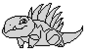
You know, I think it's a bit hard to see the difference this is really making with all of the colors and AA and everything in the way. Can you believe I haven't even gotten to colors or shading yet? Let's make it really obvious what the outline work really did - let's drop the colors. This is what your original looks like with all the colors replace by a single solid gray.
And this is what our new repaired one looks like with all colors replaced by the same grey, with internal outlines given a darker grey.
Big changes. And it's definitely stronger, if I do say so myself.
I'm not hugely thrilled with some aspects of the head outline either (it looks too long to me, even given the design) but it's good enough that I'm not going to touch it. Other than that, I think it's time to move into the next stage!
Let's talk about color next. Not even shading yet, just color. Looking at the colors of official pokemon sprites, I see one trend more than any other, and that's toward using two or three shades of each type of color and using them in large blocks. Thanks to smart shaping and curving (along with lightsource-affected outlines - don't worry, I'll get to that), they have remarkably little AA, dithering, or other smoothing techniques. Other observations worth noting:
1) The black isn't black. At least on Pokemon Black2/White2 sprites, the "black" they're using is actually hex-code #101010. Doing something like this isn't uncommon in spriting. The GBA Fire Emblem games, for example, used a "black" of #282828, which is actually remarkably light. Conversely, their white isn't white, but instead is an extremely light grey - also common, but this one is also very common among the nonprofessional spriting community because, for some reason, solid white eats color the same way solid black does, plus since many spriters work on Paint's white background it makes transparency all weird.
2) Almost nothing remains at its saturation level, and there's a distinct pattern. The brightest color of a ramp (which is the progression of colors used to represent how a single color is affected by the light - for example, your greens form a ramp, your browns form a ramp, and your greys form a ramp) is the least saturated, and as you get darker, the saturation increases. Your piece follows this rule in general, but in a far more subtle fashion - it really is quite grand in the pokemon sprites.
3) The color ramps are integrated into each other sometimes. This is where certain colors from one ramp show up in other ramps. For example, Venusaur has two major instances of this. The first is that the dark colored outline for his blue-green skin is ALSO the dark colored outline for the leaf. The darkest color of the plant stump growing from his back is integrated both as its own brown color, plus as the darkest yellow, and the darkest red. In this way, the color scheme is drawn together and colors are conserved in the process. This isn't always necessary - Bulbasaur has none, for example - but it's always a good idea to keep an eye out for where one can unify their colors.
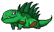
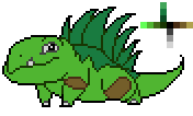
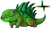
Now, to Dimibite himself. You intention is clear - a light green for the skin, a dark green for the back and spikes, and brown spots on the knees. I'll note that, looking at the concept art for Dimibite you drew, the knee bits looks more like spots there, where here they looks like large almost-square bands that expand over almost the whole knee-elbow region - consider shrinking them. Let's build a color ramp diagram of your existing Dimibite sprite, with my colored outlines thrown in and the extraneous grey thrown out.
Let's take the refined colorless fellow and try blocking out some color regions. I used some colors of my own picking this time - they're just preliminaries though.
Learning color ramp integration is a great skill. Honestly, the ramp is only mildly integrated.
Colors will slide around slightly as I work, as I experiment or reconsider things. I've got the base colors slotted into place, and have built my color ramp - I integrated the greens into two branching paths, and built the others off of the black. I employed a technique known as hue-shifting (where the colors slide toward a different hue as I move along the ramp), which is pretty common since it infuses some major visual interest in things. That integrated color ramp I built has 15+Transparency colors, which is actually exactly where I want it.
As an aside, I'll now be smoothing curves whenever I notice that they need fixing, and likely won't call out every time I do so.
Is it time to move to shading? Yeah, yeah it is. How exactly should we start? Well, I'll start by setting this new little fella aside and looking at what you did on your original!Explaining banding is HARD! Which sucks because it is SO COMMON. That's likely linked - it's common because it's hard to explain and understand, since common sense makes it sound like a good idea. Next week (probably) I'll be presenting a much better explanation of banding, one I think I really nailed.
In general, you avoided the #1 issue facing new pixel artists - light source problems. Many new pixel artists forget to set a particular light source and operate from there, which produces a flat image. Despite you having done so mostly-correctly here, I just want to stress that light source is SO important. I'll point out that the middle section between the legs doesn't really follow your lightsource great - chances are it would just be all in shadow.
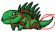
However, you fell into a far more subtle trap of pixel art is multiple locations: banding. Banding is strange in that it seems like it would help, but really doesn't. What it is is where you have a block of color and you exactly trace along that line with your anti-aliasing color, forming a sort of exact barrier between the lighter and darker color. This doesn't smooth the color like AA does, instead creating what I can only call "fuzziness." You do this several times, as I circle in red here, but you really exemplify it on the tail - you couldn't have given me a better example really.
The next bit I want to call attention to is how you used your highest highlight on the green. Pretty much, you didn't use it enough. On the foreleg, you used two single-pixel dots of it. That doesn't really DO anything. Single pixels in regions of other colors don't really show up, they get drowned out by the surrounding color. Lots of single pixels working together can affect things pretty heavily (and that's actually the basis of dithering), but otherwise you need larger clusters to affect the image. On the back leg, the highlight probably should be larger. Lastly, the head highlight is more effective, but shouldn't be hugging the outline. Even disregarding banding, his head is round and since the lightsource is slightly from the front rather than just from the left, it would hit a bit more head on.
Let's get back to the new little fella now and draw in some shading blocks.
...Okay, I got carried away and forgot to keep saving intermediate steps to show off a process. I'll just work through what I did in text.
So I went through a few distinct stages. First I worked on the main body color and started with the darker shade. I filled in where the light would shield the light from view, taking care to keep curves smooth. I followed up with the highlight color, marking out the high spots. I repeated this process with the back-spikes, and decided to fuse some parts together (made sense with your concept sketch at least) and then did a quick marking up of the knee spots and the grey bits. Really, I think a lot of this came from intuition, so it's hard to explain. If you have any specific bits you want explained, let me know and I'll expand.I admit, it's not exactly the pokemon style, but I think it looks pretty good as an image.
I made two special changes to the piece. First, the tail. I made it shorter. It felt really long as it was, and looking at your concept sketch it DEFINITELY looks shorter, so hey, shifted it. I think it looks better now.
The other thing? I expanded the shading to the outlines. Typically on the left side, I decided to change outline segments to be brighter in following the lightsource. I was careful to not do it in a way that made the specific parts unreadable, and as long as the lines are essentially contiguous it doesn't encounter the issues seen with Outer AA.
And, uh, I think that about wraps up this guy. Compare between original and my edit!
Okay, I'm going to talk about the others in more abstract terms now - I'm not image-editing anymore or this post would take me EVEN LONGER.A lesson in critique: End with excitement. If it sounds like you're bored or you don't actually care, why should they bother? Even if you don't intend to return to discuss it again, just be excited for them. It's encouraging, especially if you've just spent thousands of words pointing out their flaws.
About the middle fella, uh, Pupyre. We have an... issue here. Look carefully - you can see a couple of stray pixels of varying colors floating around. And that's just the visible ones. With a color analysis in GIMP, you have 163+Trans colors there. What does this indicate? Well, more than anything, this is indicative of automatic tools, which have the ability to use these near-invisible colors to help smooth things over. I can tell you worked on this without tools, but there were tools SOMEWHERE leaving it all over. I would recommend fixing that first.
Other things involve dropping the saturation of the red mouth (it's WAY too vibrant for the rest of him), maybe adding a bit of color to the pup (even a grey pup likely has a hints of color, solid grey is pretty rare as a primary color), and fixing the WILD banding on the underbelly. Also, there IS such a thing as over-antialiasing, where you antialias to a point that it becomes blurry rather than smooth. Also, I'm not sure that's the best way to handle the furry tail, but I'm not sure what WOULD be. Lastly, I'd increase the size of his spots, but recall that since they're not separate masses raised from the fur, they'll follow the shading pattern of the fur without changing it up.
The last one, Plattle, doesn't have anywhere near the weirdness of Pupyre. In general, the same lessons applied to Dimibite will work here. As umbbe mentioned though, dithering has kinda fallen out of style with the official pokemon sprites. I again will warn against large sections of solid greys, outer AA, internal black outlines, and the weird curve of the bill. I think Plattle is the best-executed of them.
I would not concern yourself with shiny pokemon yet. Worth considering, but that can be messed with later once you have sound outlines and shading.
If this sounds like an awful lot of stuff, don't worry about it. These are definitely good for a first attempt at pixel art, and this really is just a matter of practice. Keep up the hard work, I'm excited to see the next revision!
Since I have no intention to return to MetalReaper in the next little bit in these posts, I'll talk about Igurock. Igurock is another fakemon he posted concept art of, but did not sprite. I decided to make it myself for fun, and ended up teaching with it as well. If you were curious about one of the ways my process works, here it is!
Actually really did feel unhappy with the tail, so I did a new version. There's an extra color in there too, but it's still only 12+Transparency.
...heck, let's make this a bit educational. Not in detail, just basic process since it's quite different than how I edited Dimibite.
1. Took your concept art directly and scaled it down to the 90x90 limitation box.
2. The most significant step, called Color Blocking. I use various colors, none of which will be used in the final and each entirely unrelated to the actual piece, to separate the actual form and color blocks of the character. So essentially, I have horns, brown/rocky body, smoother white underbelly, grass spikes, stony clusters in the skin (represented by several colors that will not be so segregated in the final). The arms and legs are also separated at the elbow/knees, and the underjaw and underbelly are separate. These color blocks form the basis of the next step...
3. Stuck it over white and made the color blocks partially transparent and established the external pure black outlines.
4. Extended a slightly lighter outline over the main junctions internally, so as separating out the legs/arms, the head from the body, and the tail from the foreground mass.
5. Used an even lighter grey to finish outlining.
6. Removed the colors to have my basic form.
7. The final. I established a palette, perhaps a little too unsaturated to really be a pokemon sprite, but it's still a pretty small palette without much integration - I don't need it so much. Also shaded, using some of my own pixel stylings rather than the more explicit and clean pokemon style. Still not 100% happy with the grass spikes and a couple textures and the tail, but I like it enough now.
There. Hopefully that wasn't too much at all, just thought I'd share the process since I'm used to doing that.





No comments :
Post a Comment