http://www.youtube.com/watch?v=MHElkK59BwI&feature=player_embedded
Don't just listen to the song - watch the video! This is an amazing pixel art music video. Much of the pixel work is by PixelJoint's Halffish, and it's extraordinary. The song is good too, but the Scott Pilgrim-meets-Metal Slug-meets-Arcade Game style with a huge pile of retro geek references makes for an astoundingly appealing video.
Hello again, welcome to another lesson on Pixel Art! If you missed last week, I started this series of posts with an introduction to myself and the purpose of these posts. I'll give you the cliff's notes:
* I'm an avid pixel artist with 8 years experience, but don't do a ton of work myself as of late. However, I'm an avid and in-depth giver-of-critique.
* Critique isn't only applicable to the subject! Seeing a piece and understanding it's flaws, and their solutions, can give you insights to upping your own game. I provide some really thorough critique on pieces, and I try to be as readable as possible with it. Recently I've come across some really interesting observations in pixel art, and some very common problems, so I wanted to put my experience to use helping people!
* You can learn a lot by analyzing the pros. Helm and ptoing are gods of the c64 and other high-restriction pieces, Snake is great at definition, Jinn and mrmo tarius are overflowing with style, frankiesmileshow can do large-scale animation like no one's business, OCEANSCENTED has boundless creativity and the skill to put into it, etc. Aside from that last one, I'll likely not talk about them! I don't have too much I can critique about most of them (though I have literally a half-dozen posts about the last one), so I'll only touch them occasionally.
However, did you know that you can learn as much, or more, from examining the newbies, the ambitious and dedicated who don't yet have the technique to back it up? By looking and recognizing the flaws, you know how to not make that same mistake. When you idolize a pro, you tend to start copying their style. When you analyze an amateur, you learn to not make their mistakes, and that gives you room for your own growth rather than another's influence. I've learned more about art by doing amateur critique than I ever did looking through the galleries of masters.
If you want a fuller introduction, here!:
http://the-logbook-project.blogspot.com/2013/03/pixel-art-lessons-introduction-and.html
To the lesson!

Now, I mentioned recognizing the inspiration. This is built from the mold of Superbrothers: Sword & Sworcery EP, an indie game I have played, loved, and reviewed in the past. Let's take a peek at some S:S&S EP images to see the inspiration.


1) We're zoomed in wicked far. I personally work at 800% zoom, and at that range it can be easy to forget to see the trees for the forest - we just think of what's immediately there, rather than always keeping in mind that everything needs to mesh together.
2) The black outline. SO many new spriters are addicted to the outline - even not black outlines can do it, but solid black ones are the worst. Basically, it splits your piece into explicit sections, and uniform-width black outlines help create a flat and depth-less appearance. Many people apply light sources, but re-apply it differently on different sides of a black line, instead of the whole thing following a united lightsource.
3) The game-based nature of spriting is a problem. Spriting, as opposed to pixel art, is hard to do this with because the sprite is likely to be exposed to many external lightsources at different times. When doing sprite work for a game, it makes sense not to include a particularly significant light source, but it's extremely rare for there to be no light source - it's become convention to light from above and in front of a character's face. And while it's cool to mess with that (a lit form underneath game could be sweet), you still need to remain consistent with whatever you have. The ambiguous nature of where the source should be on a sprite sometimes gets countered with shading from straight on from the viewer, which tends to promote pillow shading and banding.
Essentially, the key is to always be internally consistent. Even if you have the skills to break the general conventions, whatever ruling you replace them with should stay the same. If you decide to make it a 4-color piece, you can't toss in a fifth color in just a little spot. If you rule that you're gonna use all black outlines, you can't just switch out willy-nilly.
And I'm gonna alter what I just said: The key is to be both internally and externally consistent with conventions, except where carefully and deliberately changed. A firm and concrete understanding of the rules is important before you break them in the name of "style".
Anyway, I also wanted to use this moment to talk a bit about the sketch, the pixel-over. You see that, in step 2, I drew freehand over the base in another layer. I then shrunk it down to an easily-manageable size and moved to pixels. This is not cheating as long as you're not using any tools and the drawing was your own. It's an alternative to drawing lineart from a zoomed-in point and gives you a baseline to refine rather than a black space to fill. It's my preferred method for building linearts, as I'm bored by the normal method. The better you are at the concepts of traditional drawing, the better a shot you have at this path. Of course, line-art's not the only thing out there (I tend to color block nowadays to avoid strictly outlined pieces), but this is a decent method for it.
There! Hope you were able to learn something. I'll be back next week with yet more pixel lessons! Next week I think I'll be featuring either a color-theory heavy posting, or featuring a complete re-creation edit of a piece by me! Later!
End Recording,
Ego.
Don't just listen to the song - watch the video! This is an amazing pixel art music video. Much of the pixel work is by PixelJoint's Halffish, and it's extraordinary. The song is good too, but the Scott Pilgrim-meets-Metal Slug-meets-Arcade Game style with a huge pile of retro geek references makes for an astoundingly appealing video.
Hello again, welcome to another lesson on Pixel Art! If you missed last week, I started this series of posts with an introduction to myself and the purpose of these posts. I'll give you the cliff's notes:
* I'm an avid pixel artist with 8 years experience, but don't do a ton of work myself as of late. However, I'm an avid and in-depth giver-of-critique.
* Critique isn't only applicable to the subject! Seeing a piece and understanding it's flaws, and their solutions, can give you insights to upping your own game. I provide some really thorough critique on pieces, and I try to be as readable as possible with it. Recently I've come across some really interesting observations in pixel art, and some very common problems, so I wanted to put my experience to use helping people!
* You can learn a lot by analyzing the pros. Helm and ptoing are gods of the c64 and other high-restriction pieces, Snake is great at definition, Jinn and mrmo tarius are overflowing with style, frankiesmileshow can do large-scale animation like no one's business, OCEANSCENTED has boundless creativity and the skill to put into it, etc. Aside from that last one, I'll likely not talk about them! I don't have too much I can critique about most of them (though I have literally a half-dozen posts about the last one), so I'll only touch them occasionally.
However, did you know that you can learn as much, or more, from examining the newbies, the ambitious and dedicated who don't yet have the technique to back it up? By looking and recognizing the flaws, you know how to not make that same mistake. When you idolize a pro, you tend to start copying their style. When you analyze an amateur, you learn to not make their mistakes, and that gives you room for your own growth rather than another's influence. I've learned more about art by doing amateur critique than I ever did looking through the galleries of masters.
If you want a fuller introduction, here!:
http://the-logbook-project.blogspot.com/2013/03/pixel-art-lessons-introduction-and.html
To the lesson!
vrocaan's "A Simple Hiker"
Major Themes: Sketching and Pixel-Overs, Lightsourc, Proportions
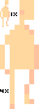
vrocaan is a pixel artist over on PixelJoint. He posted this piece, A Simple Hiker, which drew me in with because I recognized his inspiration! Let's see that image.
This is the original image. Looking at it, you can probably detect some of the abnormalities on your own! Sometimes things just look a bit distorted.
(aren't those so bloody beautiful?)
Anyway, vrocaan is inspired by that, although he's not actually attempting style replication. I just love sharing S:S&S art. You should see it in motion by the way, it's some of the most impressive stuff this side of the indie/core divide.
Anyway, the head design is very obvious built from it. Anyway, let's see what I told him. I replied with a simple post first, got a response, and decided to go all out.
Reminds me quite a bit of Superbrothers: Sword & Sworcery EP. Good stuff.The preview was basically just the head blown up, but it didn't lose appeal at a higher size. So he responded:
You only use that darker skin shade once though - is there a way to incorporate more, in the hands and neck, or would it be optimal to remove it to reduce color count? Just options, it does look good with the darker shade.
Only having shading on the one leg like that is a bit odd, it kinda makes them look like they're different lengths with the angle and all. Also, shading on the left strap of the backpack (our right) seems a bit odd to me.
I love stuff with this style though, and the preview is just as stylish as the piece itself. Nice one.
Thanks for the nice summary, Ego. The reason the shading looks so odd is due to how I planned this out -- shading is both for lighting and hard creases. The darker areas are shared with the base of it, which I'll link to at the end. Thank you for the help, I will certainly put it to use!Following that I decided to do a lot more in-depth. This is a well-illustrated step-by-step thing!
Also, I am a big Sword & Sworcery fan, which is what I based my original character off of.
Once again, thanks.
Original Base: http://puu.sh/1nFvi
I really love S: S&S EP myself, and the inspiration shows (in a good way). No problem man. In fact, here, I'll toss out a little more in-depth of what I would do differently.
1. Taking that base, I enlarged it to a size I wanted to look and work at.
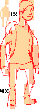
2. I followed by pulling out the 1-pixel pencil tool in a contrasting color (blood red for me) and sketching out a general organization of what parts exactly mean what for me. In this case, I drew around it and included the backpack, since it would be important to include it. This is an important step for me because while the base is a good guideline, it doesn't do a great blocking out. Just stick with me for a minute. A particular point to observe is his left leg - despite the shaping of the base's leg as being in two columns of pixels, this is a concession that was made due to size, and as it's scaled up it would even out to something in between the two. In your image, it's two separate 5-wide columns, connected linearly at the knee, while the truth would put the two quite a bit closer together.
3. A little layer changing and I used a brush to just fill in the general color blocks.
4. Blocked in some shades to try and understand how shadows would fall. Significant spots to notice include the lightsource coming from the left at an angle to cast a shadow over the back arm and leg, which you already did. A new thing though is that due to the way the pants would fall, the lower part of even his right leg would be in shadow. I think this is a big part of why his right leg on your version is strange, it doesn't really fully follow the light.
5. Shrinky-dink it down to the size of your original.
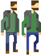
6. Compare to your original!
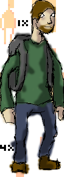
7. Here's where I did the brunt of my edits. Here's some highlights: I shrunk the head a bit, altered the widths and angles of the backpack straps to match the perspective, moved the shielded arm in a bit for perspective, widened the close leg and represented the shadows on it, and applied some basic anti-aliasing/shadings. I changed the far leg to be tighter together instead of having a large diagonal, and made an extremely loose hair texturing that is there entirely due to taste. Probably the most obcious change is that I changed the colors to something a bit more muted - it's easier on the eyes, and doesn't have the weird issues I tend to find very saturated blue has. I also ade the decision to simplify the hand to preserve the aesthetic, and moved the arm to look a bit more natural.
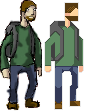
8. Here's a side-by-side comparison.
And that's the final I went with. It preserves the general style I think, but is a little more refined. Hope seeing the process helps a bit - no need to fix this piece in particular if it feels too large of a change, but this general process works pretty decently for pixeling in general. Enjoy it, and thanks - this was inspiring enough to come out of seclusion and stretch my pixel muscles a bit, it's been a while for me. Anyway, have fun pixelling and I hope to see more from you sometime! Favoriting so I can remember to come check :)And that was it. It's, again, about keeping two ideas in mind. One: Things need to stay in proportion and self-consistent and should seem to follow from reality. Two: Know where your lightsource is and how it affects the cast shadows of your piece. Those two things are So. Incredibly. Key. to understanding and creating pixel art. In my experience, the majority of pieces have a grasp on the first concept (though sometimes their line-building ability is a bit underdeveloped), but many many pixel artists have trouble keeping their lightsources straight. I think it comes from a few places:
1) We're zoomed in wicked far. I personally work at 800% zoom, and at that range it can be easy to forget to see the trees for the forest - we just think of what's immediately there, rather than always keeping in mind that everything needs to mesh together.
2) The black outline. SO many new spriters are addicted to the outline - even not black outlines can do it, but solid black ones are the worst. Basically, it splits your piece into explicit sections, and uniform-width black outlines help create a flat and depth-less appearance. Many people apply light sources, but re-apply it differently on different sides of a black line, instead of the whole thing following a united lightsource.
3) The game-based nature of spriting is a problem. Spriting, as opposed to pixel art, is hard to do this with because the sprite is likely to be exposed to many external lightsources at different times. When doing sprite work for a game, it makes sense not to include a particularly significant light source, but it's extremely rare for there to be no light source - it's become convention to light from above and in front of a character's face. And while it's cool to mess with that (a lit form underneath game could be sweet), you still need to remain consistent with whatever you have. The ambiguous nature of where the source should be on a sprite sometimes gets countered with shading from straight on from the viewer, which tends to promote pillow shading and banding.
Essentially, the key is to always be internally consistent. Even if you have the skills to break the general conventions, whatever ruling you replace them with should stay the same. If you decide to make it a 4-color piece, you can't toss in a fifth color in just a little spot. If you rule that you're gonna use all black outlines, you can't just switch out willy-nilly.
And I'm gonna alter what I just said: The key is to be both internally and externally consistent with conventions, except where carefully and deliberately changed. A firm and concrete understanding of the rules is important before you break them in the name of "style".
Anyway, I also wanted to use this moment to talk a bit about the sketch, the pixel-over. You see that, in step 2, I drew freehand over the base in another layer. I then shrunk it down to an easily-manageable size and moved to pixels. This is not cheating as long as you're not using any tools and the drawing was your own. It's an alternative to drawing lineart from a zoomed-in point and gives you a baseline to refine rather than a black space to fill. It's my preferred method for building linearts, as I'm bored by the normal method. The better you are at the concepts of traditional drawing, the better a shot you have at this path. Of course, line-art's not the only thing out there (I tend to color block nowadays to avoid strictly outlined pieces), but this is a decent method for it.
There! Hope you were able to learn something. I'll be back next week with yet more pixel lessons! Next week I think I'll be featuring either a color-theory heavy posting, or featuring a complete re-creation edit of a piece by me! Later!
End Recording,
Ego.
No comments :
Post a Comment