Thursday, July 31, 2014

Midsummer '14 Day 31: The The - Lonely Planet

DAY THIRTY-ONE: THE THE - LONELY PLANET

The final day! Nothing has changed since three years ago when I did my first Songaday: The The is still my favorite band. Something about Matt Johnson's voice and spirit and mind is enchanting. Lonely Planet was the last song on Dusk, which is my second-favorite album after NakedSelf, which tragically has almost no good videos online. I really wanted to do December Sunlight. I still love Dusk though, it's much slower overall and very introspective and focused on love and loss.

Thanks for coming along with me this month on another Songaday! Midsummer '14 was a lot of fun. You're all great and I love doing these. Hopefully the blog won't seem to be dead once the daily posts stop, as I'll be around!

G'night folks, hope your July was great.
End Recording,
Ego.

Midsummer '14 Day 30 & Watch Dogs Revew: Rise Against - Help is on the Way

Not late so much as delayed, I was writing this thing and the deadline slipped by.
DAY THIRTY:  RISE AGAINST - HELP IS ON THE WAY

This song is by Nickelback-clone Rise Against. Rise Against is not a particularly good or bad band - they are at best competent and at worst trite and dull. This song is among their competent ones.

So if they're insignificant, why do we care? Because it's also one of the only interesting songs on the Watch Dogs soundtrack.

VIDEO GAME REVIEW: WATCH DOGS
Watch Dogs is a Ubisoft cross-generation video game that came out in May. It was met with great anticipation after solid showings from trailer footage and pre-release hype. Of course this is all a wind-up for the punchline:
The game sucks.

Okay, that's not precisely what I mean. Instead, the game passes every basic competence test while failing every single test for excellence. The game is thoroughly and universally mediocre.

Let's start with the all-important plot. I didn't get all that far, through the middle of Act 2 before returning my rental copy, so I won't judge it based on the ending but based mostly on the impressions the game gives to a new user.
You are Aiden Pierce. You were a dude who has a criminal past, but you've tried to put that behind you. Then all of a sudden your beloved niece is the victim of seemingly random violence in a car attack that you managed to live through. You get involved with the underworld again to try and hunt down the culprit, despite the ubiquitous surveillance.
Did I mention the surveillance? The setting is a near-future Chicago in which a single system controls watches every part of Chicago, maintaining a rigorous database of every single person in Chicago. Aside from the fact that even in the growing surveillance-state nature of the states, this would not be the route taken (as it provides the same weakness the game preys on - a single exploit would unlock the whole thing), it's aware to an almost silly level. In fact, scanning every single person in the city, the only one who comes up "unknown" is, well, Aiden Pierce. Even though his absence is kind of conspicuous - every single cop should immediately know to stop him if he's in view of any camera.
Aiden is a hacker (though a rather poor one if I do say so, in spite of how great we're told he is), and has gained access to the system that now controls literally everything in Chicago. The system, dubbed CTOS, controls every single digital interface in the city, and Aiden has cracked it. Hooray.

To hunt his niece's killers, we're opened into the game with him beating and terrorizing a man who ultimately doesn't know much of anything, hanging out with a renowned fixer. He seems to spout some kind of "I'd rather not kill" philosophy, which is immediately thrown away. In this game, you will kill hundred of people - ordinary gang members, agency workers, security forces, cops (an infinite supply of cops), anything. The game's tagline is "Hacking is your weapon" but it's not, your collapsible baton and  your silenced pistol and your sniper rifle and your grenade launcher and your automatic shotgun and your grenades are your weapons.
Does that sound like a lot of high-grade guns for later in the game? Nope. I had 'em three missions in, because everything opens up immediately. No, wait, actually things open up halfway through Act I, then there's literally nothing that seems to be locked off. You can do all the side missions, unlock everything, get every weapon and car, reveal the whole city, do literally everything that isn't directly a story mission. There's no real sense of the game pacing things out.
And if things seem like they're expensive, well, no problem! One of Aiden's tricks is that he can drain the bank accounts of the people he meets on the street! Not everyone though. Only some people can be drained, and they're usually the people with, like, one or two hundred in their account at most. You're taking the poor for what they have. And since you get a little blurb of insight into the life and occupation and income of every single person you see, you feel bad for people. Especially when I'm told that I'm robbing people in situations like "Taking out a second mortgage" and "Recently laid off" and "coming from family's funeral." Maybe its just me, but when I was playing this with friends, there was a trend toward the people you can steal from already being down on their luck.
And this isn't just something you the player know - Aiden knows it too. So what do we have so far? Aiden is a murdering vigilante using the mass surveillance but not breaking it down, robbing ordinary people down on their luck to fuel his crusade against what at first could only have seemed like random violence.
So he acts like he's doing this to bring peace to his niece's mother and brother, the latter of which has PTSD as a result of the loss. Oh, but he's doing it against his sister's wishes, who just wants him to let it go so they can heal and try and move their lives forward. Instead he gets them caught up in it and makes targets out of them.
And Dead Cell! Dead Cell is fictional Anonymous, hacktivists against the surveillance state. Oh except these guys actually seem to be behind virtual (and perhaps physical) terrorism.

So okay. Aiden is a vigilante, willing to kill anyone and everyone in his way to get vengeance for a single murder, falling in with virtual terrorists while taking advantage of the surveillance state they are also fighting, working with criminals who are mostly killers themselves, robbing average civilians to buy automatic weapons and fancy sport cars, and putting on a batman voice and pretending to be in the right this whole time.
And this is the protagonist.

Aiden is not a likable character by any stretch of the word. He doesn't even have that lovable charm of most anti-heroes and he's an asshole to his former friends (he has no current friends). In any other game, this is the man you're stopping!
The game tries to wrap itself in an anti-surveillance-state PRISM-is-bad message, and while I didn't see the end myself, I'm told it kinda handles it ham-handedly.

So what about the gameplay? Is it fun at least? Not particularly. Lots of driving everywhere, except the driving's not particularly fun. The controls are loose and the for a seemingly-realistic traffic flow, the lack of turn signals alone kinda screws with the flow. Turning is a bear, even with the best-handling tightest-turning motorcycles. I stopped using cars fairly quick and relied on just motorcycles - much easier, plus you can just ignore the traffic and blaze your own path through the streets. Hell, getting hit isn't even that bad, you just get thrown from the bike.
You can hijack every single car in sight, but because the game wants you to use the phone's Cars On Demand app that orders a vehicle to near your location (for free at least) there aren't very many parking spots let alone cars parked in them. Chicago is apparently a city of people driving but never parking. And because the Cars On Demand app always puts it somewhere in a lot or on the street near you but not right AT you, it's often a hassle.

The stealth gameplay wasn't that bad, but not exceptional. I'd play, well, any other cover-based stealth game as soon as Watch Dogs. Even The Last Of Us, which while I loved its plot and characters found its gameplay slow and unsmooth, was far more effective. I personally made it a bit harder on myself because I didn't like killing people in Watch Dogs (I interpret the melee takedown as nonlethal), but even if I wanted to use my guns there's only one silenced pistol as well as a silenced uzi that's hidden behind a pretty extensive unlock requirement.
And god help you if the cops find you. They're everywhere, spawn from everywhere, are fast and smart and call in helicopters pretty quick, and it is literally impossible to fight your way out, as they spawn infinitely until you hide and they give up.

The soundtrack is varied, but none of it is particularly noteworthy. Passable, but not exceptional. None of the voice acting is awful, though Aiden's gravelly grumbling is just, like, whatever.

The graphics are okay, though the debacle with the PC version's graphics is just ridiculous. Even on next-gen they're really not the revolution they'd been talking about, but they're still good.

So the plot's early game sucks, the protagonist is supremely unlikable and hard to root for, the driving sucks, the stealth sucks, the guns are whatever, the soundtrack is whatever, the graphics are good but not exceptional, is there anything I really like about the game?

Yes. The minigames.
Now, none of the minigames are killer apps that make the game worth its price tag, but they're nice pieces to mitigate the boredom. A decent shooting minigame, but that one's only okay. The highlights are:
* The poker minigame. It's basically a complete 4-person poker simulator. It's fairly robust, and while there are some tricks to abuse it into making your odds slightly better it's a decent model for someone who just wants to spend some time playing poker. I played it all the way through twice, the second time winning, in order to get its unlock, the best motorcycle in the game.
It is rather lengthy though, and some of the required animations are annoyingly long.
* The chess minigame. Unlike the poker game, it's not just a chess simulator. It's instead a series of chess puzzles, working within a situation and making best moves. It's pretty fun actually, a good puzzle.
* The hacking minigame! In general, the game's use of hacking is superficial - making distractions, looking through cameras, moving some cover around. The main minigame itself though is a pretty involved puzzle that takes some real thinking, especially the more you go through. A full puzzle game for 3DS that expands upon the concept and explores it fully and finds the extent of its challenges would be really interesting, or a low-cost Steam release. I'd buy it. As an occasional and only slightly-explored diversion to the main slog, it's fun but not a selling point.

So yes. Watch Dogs has points of occasional quality that shine through the dull mediocrity, but they're far too few and far-between. Overall, I can't warrant the game at its current price, or even half the price really. A $20 game? Maybe. It'd make a good timekiller. Really though you'd be much better off buying GTAV or Saint's Row or Assassin's Creed or any of the other comparable-but-better alternatives to the game.

There's my opinion. Later folks, see you later today in the final installment of Midsummer Songaday!
End Recording,
Ego.

Tuesday, July 29, 2014

Midsummer '14 Day 29: Lime of the Season - I Like, Like Like You

DAY TWENTY-NINE: LIME OF THE SEASON - I LIKE, LIKE LIKE YOU

Brandon Strader made this remix of an array of The Legend of Zelda: Oracle of Seasons songs for Lime of the Season, Hylian Lemon's remix album of that game. A follow up to HL's previous album remixing Oracle of Ages (Essence of Lime), this one doesn't disappoint. This song isn't actually my favorite from the album (check DJ Mokram's "Quicksands") there's a very limited selection uploaded in video right now.

I love Oracle of Seasons. Not only was it my first Zelda, it was one of my first games period. I have extremely fond memories of the game, and it's got a permanent place in my heart. When I talk about favorite Zeldas I put Wind Waker first, but I always make the point that the Oracle games aren't even in the same running, they get to jump the line.

Check out LIME OF THE SEASON and ESSENCE OF LIME!

End Recording,
Ego.

Monday, July 28, 2014

Midsummer '14 Day 28: Avicii - Addicted To You

DAY TWENTY-EIGHT: ADDICTED TO YOU

I listen to about half of Avicii's album True a lot. Some of the stuff is just whatever, but other bits are great. I wish Levels was on it. Wake Me Up is a radio powerhouse and hasn't stopped getting daily radio play on basically all the stations I listen to for over a year - it's truly amazing how much staying power it has. I think Avicii hit the goldmine of genre-blending, carrying more pop-styling into his EDM tunes and augmenting with folk sensibilities and soul-inflected voices (this one, for example, features Audra Mae but reminds me a lot of Adele). His constant parade of guest vocalists on the album gives a wide variety of sounds, which acts both for and against him but largely for.

I credit Avicii with being one of a small handful of names largely responsible for the mainstreaming and pop-ification of EDM and house, which may not appeal to some people but does to me.

End Recording,
Ego.

Sunday, July 27, 2014

Midsummer '14 Days 2, 27: Hitman Blood Money, Bobby Hurman

This time's missed day wasn't actually my fault! The servers that manage the university ePass for my email (which also manages my blog) were bugged out until just a little bit ago, so I couldn't get in here to post this D:

DAY TWENTY-SIX: HITMAN: BLOOD MONEY - YOU BETTER WATCH OUT

I don't think Jesper Kyd's Hitman soundtracks are as good as his middle Assassin's Creed soundtracks, but they're still pretty good.

DAY TWENTY-SEVEN: BOBBY HURMAN - FORSEENFUSION
ForseenFusion from Immaculate Restitution on Myspace.
Bobby Hurman aka Immaculate Restitution aka 9inchesoffun is a pretty chill musician. I met him on Sheezyart many many years ago. Sadly, Sheezy has been closed for remodeling for years, so I actually have songs of his saved to my hard drive that don't exist elsewhere on the internet. It took a good bit of digging to even find this one, which I admit was one of my favorites. I wish Crystallinity was still up. Maybe I'll upload it myself sometime.

End Recording,
Ego.

Friday, July 25, 2014

Midsummer '14 Day 25: of Verona - Match

DAY TWENTY-FIVE: OF VERONA - MATCH

I love of Verona. Indie rock fronted by Mandi Perkins, focusing on an ethereal ghostly resonance to their tone? Hell yeah, I'm in. Castles, Match, Dark In My Imagination, Take Me, Centipede, The White Apple, We Are Not Alone Here, yeah.

End Recording,
Ego.

Pixel Art Lesson: s0mber's "cloak" (Contrast, Palette Size, Resolution, Lightsource)

Abhainn Mor from Young Dubliners on Myspace.
The instrumentals of The Young Dubliners are pretty great. I'm not totally into their lead singer's voice, but the celtic rock style is pretty sweet. Also their new album is barely anywhere yet so sorry about having to embed friggin' MySpace.

I've been running my mouth some more on PixelJoint, so I guess it's time to share some of my and my recipient's experiences.

s0mber's "cloak"

Major Themes: Contrast, Palette Size, Resolution, Lightsource


The piece actually went through a lot of stages. What you see here are, on the right, the final stages of the piece. I don't actually have the very first iteration, and it seems that s0mber also saved over them. Unfortunate, but what can you do? I'm gonna have to get in the habit of saving originals. Technically, the one on the far left isn't actually what it was - you'll see it's true form through the critique.

I don't have the first image, but my points were very quick before the first edit.
s0mber uploaded it as his first image. I wasn't the first commenter, but I thought I was - I was typing my comment when 7heSama cut in beneath me with:
7heSama says: Needs higher contrast, esp. in the light gray in his foot/shdow and the dark/medium red
Looks nice tho
Which is basically what I ended up saying in more words:
Ego says: Welcome to Pixel Joint!

There's a bit of readability trouble. The saturated red distacts from the grey shirt enough to make it harder to read, and the shading on the cloak is really hard to see without zooming way in because of the low contrast. I like the character though!
That's basically the briefest I've ever posted in, like, years. I had so much I could pick on but didn't want to scare away a new poster. Like I said though, I've been running my mouth lately, so that didn't last long...
s0mber replied: Thank you! This is one of my first creations, I'm fairly new to arts.. Will play with colors, thanks for the motivation.
Followed soon by
s0mber says: Updated. Not perfect, but better?..
Well, first off, that's the right way to take critique! Right in stride, and immediately incorporating it. Any regular readers can catch some potential troubles already: a different sort of contrast issue, and a color count one.
Ego says: Ah, interesting. You've solved the one issue, but stepped into a different one - no biggie, that's how you get better, right?
Fix the previous problem and give me a whole new subject to talk about? My favorite. Lets me practice a bunch of kinds of pixel knowledge.

So yes, you've done a decent job solving the contrast thing. Even at 1x the feet in the shadows can be made out, and the red of the cloak is less saturated to the point that the other bits show through a bit better. Nice job!

The new issue is partially about contrast till (yes, same concept, but in a different way), and partially about the way pixel art in particular works. It centers entirely on the cloak - there's little things you could work on elsewhere, but the cloak is the big deal. In this version, you added some extra colors to the cloak. I can guess why you did it: you switched the dark bits from before to the much darker red, and the change felt too abrupt so you added some intermediate colors. Not unreasonable. However, there's a couple problems with doing that here.

The first is with regard to contrast. While the difference between the light part and the dark part is visible, most of the intermediate stuff fades together when zoomed at 1x or even 2x because the colors are close together. Getting the contrast right here is going to be a bit of a struggle - both solid red and solid blue are hard colors to show the contrast without being too abrupt. But just adding colors in a gradient like that isn't usually a great strategy - it starts doing this thing we call banding (you should look up Banding in The Pixel Art Tutorial in the resources section of the forum here - you do it pretty heavily in a couple places) that we try to avoid.
That tutorial is easily accessible right here! The Ramblethread cure links there is super interesting but much more advanced - I link the Pixelation Knowledge Repository later, which is a summation of a lot of the points of that thread. In the PJ tutorial by cure, section IV-4 is the one I'm pointing at, which talks about banding. If you read my Lessons here, I've discussed banding a lot - it's the hardest-to-explain fundamental concept of pixel art, and is commonly caused by otherwise-good practices used without care.
Another question for you to think about: what's your light source for this piece? This is an important question for any kind of art, not just pixel art. Based upon the highlights on the chest, the light is in front of him on the right. Based upon the shadow, the light is coming from right above him. Based upon the cloak, the light is coming from the left, or maybe from above if you're looking at the hood. Pick a light source, and think about how the form of the character would cast shadows over other parts.

About color count: well, a) you don't have 20 colors, you have 19 now! I arranged your palette here: https://pbs.twimg.com/media/BtLj8VOCcAAcHEH.png:large Take a look and think about how many of those look similar to other ones you have. An unspoken goal of pixel art is to have as low a color count as needed to provide the impression you want - it's considered good craftmanship. Looking at your palette, some of those colors are really close to other ones - you could just make them the same! When we're zoomed out, looking at the piece at 1x or 2x, the differences are often not too noticeable, so always keep in mind that THAT'S the scale people will mostly be looking at your piece.
Here's that image if you don't feel like clicking a link.

I always worry when I explain the idea of low color count to new users because it's NOT a rule. High-color work can be great, like the TheoVision piece I showed last time. You don't need low colors, but if you can achieve the same effect in a piece with fewer colors it's considered good form to do so. If the impression you want ends up needing a lot, so be it. However, this is pretty rare - go through the PJ hall of fame and you'll be hard-pressed to find many pieces with more than 40-ish colors, and the ones that are almost all demoscene-style pieces from a very different tradition of pixel art. Also, the smaller your piece, the fewer colors you'll need, although the opposite is not true (larger pieces do not necessarily require more colors).

A last note: if you have the capability, consider making the background to the character transparent! It's by no means necessary, but I think it might actually look nicer without the box of color around him. This isn't too big a deal though, it still looks fine with it.

Hope this stuff helps! Let me know if you'd like something explained further, and sorry about it being such a dense block of text. Keep it up man, I'm looking forward to seeing your stuff here in the future!
And s0mber took the concepts well! And posted the following post and new iteration.
s0mber says: Thanks for the pointers! Still don't seem to get it right, but at least the number of colors is down to 6 now.. Need to do some more reading and experimenting and then reiterate :) Getting the colors right is tough, lights and shadows - even more..

Ego says:
No doubt this is the best iteration yet by a good deal!There's still a couple floating contrast things that could be perfected (using the pant shade on the shirt might be too harsh a transition, and the hair shade blends with the cloak) but the reds are great with each other and you cleaned out the superfluous colors.

You've stumbled into an odd situation - you mixed resolutions! Most of the piece (and the entirety of the previous versions) was blown up 2x beforehand so that each individual pixel was actually a 2by2 square. That's totally fine. However, when you made this iteration, you have those mostly 2x2 blocks but a couple of 1x1 pixels. I'm sure that you wanted the extra room to add detail, but since now the eye can distinguish what a 1x1 pixel looks like the rest of the 2x2 shading seems blocky by comparison. Wherever a single pixel is visible, that provides your resolution.
 I'll be honest: I don't see this problem very often at all! I most often talk about resolution with banding because I'm basically parroting what the Pixelation tut says about it. Here though I think I finally understand exactly what it means in those explanations and why obfuscating your resolution is one of the primary goals of pixel art. This is really why I write long explanatory crits, because it teaches me as well as other people. I mean, just last night I was musing about clusters on Twitter and broke through how AA interacts with cluster theory. That's unrelated to this crit of course.

The other thing would be that I can tll what you were doing with the shading on the cloak, but it seems more like the idea of a cloak fluttering rather than how a cloak would actually fold. Think about it like this: those sorts of ripples, while iconic for a cloak, make the most sense if it's being blown in the wind. If that were the case, it would be blown up a lot more. At rest, it would have a much more predictable shadow, cast simply by the body against the cloak.
This is very much a composition crit, and yes lightsource is (to me) a composition-level problem. It's a good sign for you when I stop talking about pixel-level stuff and move onto your composition-level stuff! While those are harder to fix as they require redoing whole sections completely, it means that your pixel-level stuff is at a point that I'm not concerned about it.
Of course, it also could be the result of the fact that no amount of pixel refining can fix a piece with a broken composition.
(I also talk about it less because I'm totally not a pro at composition - there's a lot of great resources for that if you want to learn, but I need to figure out more myself before I start talking about it TOO much)

A very specific note: you see that shading on the cloak right next to the arm? The way that it exactly mirrors the shape of the arm? THAT is banding. This is the tutorial you want for a good opening explanation, at section IV-4: http://www.pixeljoint.com/forum/forum_posts.asp?TID=11299

I try not to do this with new folks, but I did a quick edit of your piece to show you what I mean. I show you this on a condition: don't just copy what I do. Understand how it works and apply those lessons in your own way.
I think I've been quite clear in the past why I don't like showing edits to new folks; it's the same reason I write my tutorials as examinations of others and not walking through a thing of my own - learn from it, don't copy it.

Hopefully that puts a visual point on the points I was explaining. Keep going - your improvements have been in leaps and bounds :)
And the process continues:
s0mber says:Thanks! A couple more iterations. I see what you mean, but still can't get it right in some places.. well, trial and error.. Think I shall switch to something else, read some tutorials for a moment and review in some time, as I feel like I'm out of ideas for this one.. Iterations so far: link
This is the linked image.
Ego says: Aye, and the latest ones have the best forms yet :) Still a bit of that resolution mismatch, but whatever.

Don't feel obligated to stick onto this one at all. I rarely actually go back to change a piece and just apply critique to the next one. You've made tremendous progress with this piece, and you should be proud of that :) If you're ever stuck and itching for critique, hit me up and I'll see if I can't help.

To help with the tutorial searching, the one I linked in the previous post is one of the best. This one is actually my favorite, though it doesn't go out of its way to explain all the lingo (but has a great explanation of the resolution thing I was talking about): http://www.pixel.schlet.net/. And I'll be a bit selfish and link my own lessons, mostly teaching through observing other critiques to understand what to watch out for: http://www.logbook-project.com/p/pixel-art-lessons.html
The rest is asking permission to write, well, this. I could have left off with some additional crits about the final ones (such as the resolution issue not being resolved) but it's also made some great choices like the switched hair color and the generally fixed cloak shape. I decided not to though, better to leave it as it is and keep an eye out for whatever he comes up with next. Keep it up man!

End Recording,
Ego.

Thursday, July 24, 2014

Midsummer '14 Day 24: Everything But The Girl - Walking Wounded

DAY TWENTY-FOUR: EVERYTHING BUT THE GIRL - WALKING WOUNDED

Oops I'm a good-for-nothing who can't keep track of the time of day, enjoy some chill downtempo.

End Recording,
Ego.

Wednesday, July 23, 2014

Midsummer '14 Day 23: The Megas - History Repeating Pt 1

DAY TWENTY-THREE: THE MEGAS - HISTORY REPEATING PT. 1

Been listening to a lot of The Megas these past few days. They're a Mega Man cover band that writes lyrics and radically arranges the songs - and for once, the lyrics are good! Most video game things with lyrics really really suck, they're too on the nose or just don't feel right.
The Megas haven't always been awesome. Anything before Get Acoustic (the acoustic version of their MM2 themed album Get Equipped) is weirdly out of tune. Get Acoustiic is awesome though, and they seem to have figured out how electric guitars work by the time they got to History Repeating Blue. History Repeating Red is also out now, and you should go listen to it!

End Recording,
Ego.

Tuesday, July 22, 2014

Midsummer '14 Days 20, 21, 22: Queen of Hearts, Arty, Cryoshell

Sorry about the lateness! Due to poor time management, and then due to life commitments and helping friends with stuff, I'm now two days late. To make it up to you, here's some of the best gems I've been holding.

DAY TWENTY: QUEEN OF HEARTS - FREESTYLE

I only discovered Queen of Hearts right after starting this month's Songaday. She reminds me of a different entry into the subgenre forged by Lady Gaga, with a strong female lead doing pop-style vocals over an otherwise dance-y song. I love Queen of Hearts' whole album, but especially check out: Neon, Secret, Colourblind, Surrender, Overcome By the Rhythm.

DAY TWENTY-ONE: ARTY - MUST BE THE LOVE

I don't know much about Arty. I know he's a pretty big producer, responsible for a lot of remixes and participating in a lot of compilations, and other releases under some aliases like Alpha Nine. He's Russian - that's pretty cool, we don't have many star DJs out of Russia.
Nadia Ali though, she's a superstar. I've been a fan since her work as iio, and she's one of the most powerful and memorable voices in trance.
This particular remix was featured in Trance Is Life Episode 43, one of my favorites.

DAY TWENTY-TWO: CRYOSHELL - CLOSER TO THE TRUTH

Cryoshell is widely known as an Evanescence clone, but I actually prefer Christine's voice to Amy Lee's. It has more texture to it, which is a weird thing to say about a voice I guess. The lyrics are definitely in the angst zone, but I let myself indulge in that sometimes.
My Monsterhearts game starts Season 2 today! I have a disc full of albums I use to get me in the mood that's led by Cryoshell (followed by Halestorm, Ke$ha, Linkin Park, Lacuna Coil, The Birthday Massacre, and the Underworld Awakening soundtrack).

End Recording,
Ego.

Saturday, July 19, 2014

Midsummer '14 Day 19: Roland Orzabal - Ticket to the World

DAY NINETEEN: ROLAND ORZABAL - TICKET TO THE WORLD

You probably know Roland Orzabal better as half of Tears For Fears. However, this is from his only solo album released under his own name, Tomcats Screaming Outside. It's actually a great album! I'm not that into a lot of Tears for Fears stuff (its age shows to me) but this feels suitably modern. I like it a lot.
He had the unfortunate coincidence to release the album on 9/11/2011. As you can imagine, more was going on than people paying attention to his album.

End Recording,
Ego.

Friday, July 18, 2014

Midsummer '14 Day 18: Triple-Q's Gangnamcore

DAY EIGHTEEN: TRIPLE Q - GANGNAMCORE

I'm not sorry. This wasn't on my original list but this came out today and it's glorious. I've was drawn into the alien world of bizarre and comedy mashups by Triple-Q's Psybrid Style, and this open collaboration of PSY songs mashed up with everything under the sun doesn't disappoint. Some of the pieces are funny, hilariously so. I think a lot of Psybrid Style was maybe better mashed up with the originals, but there's some real gems in that playlist. And what a playlist - 107 entries from 40 artists. The ones Triple-Q begins and ends with, his own "#SELFIE is a new and original song which doesn't plagiarize at all" and "TENGEN OPPA GANGNAM LAGANN!" are really good independently. There's a couple more Linkin Park mashups in there, multiple Metal Gear Rising ones, and some Kill la Kill ones that'll probably make it into Cut, Paste, Kill. Also lots of anime. You can pick which ones are the comedy and which ones are the quality for yourself.
Thanks for organizing the whole thing Triple-Q.

End Recording,
Ego.

Thursday, July 17, 2014

Midsummer '14 Day 17: Star Citizen - Opening & Main Theme

DAY SEVENTEEN: STAR CITIZEN - OPENING & MAIN THEME

Star Citizen is a thing I know nothing about. Enjoy the sci-fi tunes.

End Recording,
Ego.

Wednesday, July 16, 2014

Midsummer '14 Day 15 and 15: Vas - The Reaper and the Flowers and Angel City - Stay

The 15th was a very busy day for me. The 16th will also be busy. Hopefully you don't mind me merging the posts for simplicity.

DAY FIFTEEN: VAS - THE REAPER AND THE FLOWERS

Vas is one of Azam Ali's many little projects, though my favorite continues to be Niyaz. Vas is with Greg Ellis of Juno Reactor, and is heavy on the haunting side of things. It is often compared to Dead Can Dance.

DAY SIXTEEN: ANGEL CITY - STAY

Angel City is a pair of DJs and frontwoman Lara McAllen. The electronic backing tunes are pretty great, though the lyrics are a bit saccharine at times. Most of what they do is covers of other dance songs.
It should be noted that Australian band The Angels is called Angel City in the US. This isn't them. Those guys, while influential, are definitely not my style.

End Recording,
Ego.

Monday, July 14, 2014

Midsummer '14 Day 14: Amethystium - Meadowland

DAY FOURTEEN: AMETHYSTIUM - MEADOWLAND

Oops, this is almost too late. My bad.
I don't know anything about Amethystium as a group. They make ambient-type stuff that reminds of a good soundtrack for a fey-heavy fantasy setting.

End Recording,
Ego.

Sunday, July 13, 2014

Midsummer '14 Day 13: Uffie - ADD SUV

DAY THIRTEEN: UFFIE - ADD SUV

Say what you want to about Uffie being a precursor to Lady Gag, I think they're pretty distinct in style. Either way, this French synth-pop artist has a pretty good album, but I really enjoy this song featuring Pharell Williams. And I don't usually like Pharell Williams!

End Recording,
Ego.

Saturday, July 12, 2014

Midsummer '14 Day 12: Giana Sisters Twisted Dreams - Ingame 1

DAY TWELVE: GIANA SISTERS TWISTED DREAMS - INGAME 1

Some BGM from the pretty interesting Giana Sisters: Twisted Dreams soundtrack. Since you can jump between the light and dark sister at any time (whose positions are linked but are separated into light world and dark world), there's two tracks for each level. One is by the game's composers, the other is the same track done by Machinae Supremacy, leading to the jumping back and forth seamlessly integrating with the soundtrack. It's really quite clever, and works really well. The game itself isn't a masterpiece, but it's pretty interesting and has some cool ideas, and has moved far beyond its roots as a Super Mario Bros clone.

End Recording,
Ego.

Pixel Art Lesson: coolsarahkry's "Battle! Darkwing" (Outline, Composition, Form, Process)


What can I say? Like I said for the Midsummer post, I'm in love with her album Halcyon Days.

It's been a while! One day less than a year since my last Pixel Art Lesson. Should I have waited a day to make it a little more momentous? Probably. Whatever.
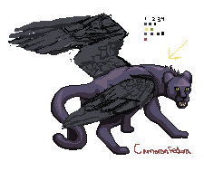
But I recently threw some crits around on a couple pieces on PixelJoint. Most of 'em were pretty small deals, though I suppose I'm pretty wordy even when I'm trying to stay brief. One stands out though - I had a lot of thoughts about the piece Battle! Darkwing by coolsarahkry.
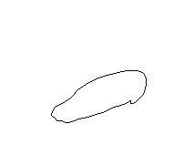
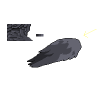
Here's the piece:

coolsarahkry's "Battle! Darkwing"

Major Themes: Outlines, Composition, Form, Process


If you've read my other lessons so far, you ought to be able to pick out some things for working on.
Now, she's a fairly new member of PJ, and I knew that if I got started I'd be typing a LOT. She'd also stated that she was tired of working on the piece and wasn't going to throw any more edits into it. I feel like that all the time though and I still want some crits though so I can put the lessons to use in the future, so I decided to ask!
Cool if you think it's done, but there's definitely some things that could use some touching up. I could provide a few crits if you'd like so you can apply the lessons to future pieces you do if you'd like. Does that sound like something that would be helpful to you? No pressure to actually do anything to this piece.
I thought that was polite enough, and I was lucky enough that she agreed that it could be helpful! And then I burst into a wild amount of critique.
Okay, this is going to look terrifyingly dense - sorry about that. I'm really not trying to pry your piece apart, I'm just overly wordy. Just take it a piece at a time and don't feel any pressure to get things right immediately, just try and keep some of these things in mind the next time you're at the pixel canvas. This might split into two posts if I was accidentally too long - apologies. Hopefully this is all worthwhile to you!
I began with a disclaimer because PJ cuts posts at 4000 characters and I wrote more than that. Also because this was lots, like usual.
I'll start with the palette. In general, your palette's fine, so this is more about refinement than repair.
I'll start with the easiest point: you have a couple loose colors, by which I mean there are a few scattered pixels of colors that obviously aren't supposed to be there. You have a single pixel of a slightly different purple on the neck, and a small patch of grays on the front-left leg. I suspect these are leftovers from a previous draft - not a big deal.
Another small thing is that I'm confused by the color ramp you selected for the fur. It's all over the place in terms of both hue and saturation, without a clear direction. It looks alright, but it makes the highlight colors look a bit out of place on the fur. The only color on the fur I feel needs a change would be the dark purple (but not the outline) - it's way too dark compared to the previous color in the ramp, it needs a touch less contrast.
Here's a third small thing: you have three separate colors that all read as a black outline color. Might as well just use one - even zoomed-in I can't tell the difference without some serious inspection.
That stuff's not a big deal. Makes me wonder what program she's using, since palette management is a built-in feature to GraphicsGale and ProMotion and is easy in Photoshop and GIMP. From another piece she's animation-capable though, so it ain't Paint. This is, of course, completely unimportant but I thought I'd point out the palette-management capacities of various programs.
The biggest trouble with the palette is that it's not very optimized. You have some bit colors, meaning colors that only appear for a couple of pixels in the piece without leaving much of an impact. Most notable are the eye and teeth colors. The yellow you use in the eyes is there for 4 pixels in the entire piece! Similarly, you have ten pixels of teeth total, with three different tooth colors, none of which is more than a single pixel per cluster. You could probably cut it down to a single tooth color and just the one eye color pretty easily. And beyond that, then try and see if your bit colors can be integrated elsewhere in the piece.
Anyway, I could talk for days about palette - it's my favorite subject and I feel like I have a good grasp of it. However, let's move away from it and talk about the other things in the piece.
I don't know if it's obvious from my other Pixel Lessons but I really do looooove color. It's my favorite. I could talk about the weird ramp of the fur colors and optimization by intermixing the wing and fur ramps and how to make use of the bit colors (which I should be clear, I made up that term, but it works really well for my purposes). I could talk about contrast and why single-pixel-clusters need it so much. But I didn't think it was worth the post space at this time. Maybe sometime in the future, but today I'm good with what I said.
For once, I'm not gonna talk about lightsource extensively! You seem to have that in hand here, although when it comes to the tail you kinda switch to a different light source.
This was probably not necessary to mention, but I think it's totally worth adding elements of praise to a critique. I also neglected to mention that the lightsource falls apart on the wings, but there's bigger trouble with the wings than that.
Instead, let's talk composition. Y'know, pose and form. I looked through your process thread, and you definitely made great strides in pose as you progressed, both in the legs and in the form of the wings. One thing would be the back foot that's obscured by the tail. Because the wing and the tail block almost the whole leg, and because the foot is very dark, it was hard to read what that dark spot was at first. You made the best of the pose you did, but a bit of moving things around might have made it easier to read. The easiest shift would have been to narrow the tail, exposing more of the concealed leg. The proportions on that tail are off - it's enormous, easily as thick as any of the legs.
Another form thing is to consider where the wings are coming from. I don't get a clear sense of how they connect to the panther - I would've imagined them to be out of the shoulder region, but they seem to come laterally out of the sides of the cat.
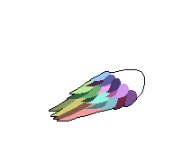
As for wing anatomy, once you got a reference it started looking much more natural. I really like this progress step:

In my opinion, you would have been best just cleaning up some of the lines on the wing and leaving it rather than trying to pick out and define each individual feather. Because of the way you did your edge highlights, not really following the lightsource, they look flat and unnatural.
That last line is a big focus in a few minutes because I think that's really the crux of the issue. The feathers need to not be treated as individual components but as part of a whole, following an overall light source rather than given special treatment and edge highlighting. You need some kind of definition to make it read "wing of feathers" and not "blob that follows the lightsource," but too much and you bleed out the depth and the form. 
The takeaway lesson for future pieces: Watch your proportions and make sure that, in addition to being dynamic, your pose allows each part of the creature to read logically. Use your highlights to define provide depth rather than to pick out and outline each feature - not every single separate element needs its own outline and highlight if the lightsource doesn't really call for it.
I feel like I didn't articulate myself very well here. If this makes no sense or you'd like clarification/expansion just say so and I can do that.
Usually when I write critique stuff I separate out linework and shading into two sections. In this case, it would be easier to talk about them both simultaneously, as together they make up "form."
I'll put it bluntly: your outlines are hurting you. This is a really really common thing in pixel art is the urge to give everything its own outline. The different sections of the face, the feathers, the ridges on the body, etc. each have their own outlines here. This wouldn't be a big deal except most of those outlines are black. Black is the darkest tone you have - and as a side note, it's recommended that you don't actually use pure #000000 black - and wherever you have it says "this is a dark shadow." The problem is that on edges of things, we usually don't have deep dark shadows like that. You look at your arm, and while it darkens toward the edges you can't actually define an outline. Use your colors right up to the edge. On a related note, having outlines inside the piece breaks it up, separating sections off from each other instead of allowing them to look like part of the same object. That's not to say don't ever use outlines on things! But be cautious and deliberate when you do, and know the effect it has on your piece. It flattens it, makes it look more cartoony, and breaks things up.
There's my diatribe on outlines. I don't like 'em without a specific purpose. I could talk a lot more on that, and a lot more incoherently.
I'll be brief on the idea of "smooth curves" as you seem to show at least some understanding of that in various sections. I'll just say that when it comes to longer, more gradual curves (such as the long feathers) you don't really keep up the natural smooth curves. It's hard with those large sections, but it shows, so always be careful not to let your curves get really bent out of shape. You made it extra hard on yourself - by making that last purple so close to the black, at 100% zoom it's hard to tell where that dark purple ends and the outline begins, meaning the unsmooth curves of that dark purple undo some of your hard work making the outline smooth. Basically, keep in mind that all your curves should be smooth and form-following, not just the outlines.
Read, um, almost any other lesson I've written and you can find more about smooth curves. xolstice's "Kiki & Jiji"was my most laser-focused on smooth curves. I find that they're one of the defining features of my own art.
Oh, actually, one other note: the signature. If you're going to have it, I would put some work into it - you obviously did it freehand. Put a bit of effort into cleaning it up and making it look smooth as well - by putting a really rough looking signature on a completed piece you kind of drag down the overall sense of the piece because the roughness is distracting.
THIS IS A THING FOR MORE PEOPLE TO HEAR. Seriously. I see a lot of half-assed signatures and it just makes the piece look unprofessional. The WHOLE thing needs to look like you put effort into it - any bits just thrown in, even a signature, do a bit to drag down the whole piece.
Now I'm done. I apologize for writing all this text - I'm a wordy guy and like explaining things. If there's anything you don't understand, or want a better explanation of, or something I didn't mention, just ask and I'll see if I can't do a better job. And I don't mean to scare you away with all this - you're a good artist (your traditional art stuff on your dA gallery is pretty good!) and a little knowledge goes a long way to improving when it comes to pixel art. Keep it up! I'm looking forward to what you show next!
And I try to ease the blow as much as I can! Desperately. And thankfully it seems that it all comes out okay! Here's her response:
THANK YOU SO MUCH! It means a lot to me that you would write all this up about my piece.

I think you were solidly able to explain your points without making me feel bad(I feel honored, actually).

I really, really, appreciate your advice on color, composition, and the outlines. I will definitely reconsider some of the choices (using multiple shades for the teeth and eyes). The bit colors, I believe you called them. I hadn't known that term, so thank you for bringing it up!

You mentioned using the colors right up to the edge, which is something that I'm interested in trying for next time. Sometimes, I've seen people use lighter outlines for the lighter parts of the pixel. Not sure if you have any advice or opinions of whether that would/could've worked for this(or if that was what you meant, haha). 
Give me a second and I'll elaborate on this.
I understand what you're saying about the wings, I think, as in defining them more overall without getting caught up in details. Still, I wonder how to make them look voluminous without losing the detail.
Same here! Just hold on!
I agree with your notes on the composition- now that you mention it, I should have made the leg more visible. I'll try to keep in mind readability for my next composition((pixel or not. Although for pixels I believe each piece holds more weight because of the small size)). I really like what you said about it-
" The takeaway lesson for future pieces: Watch your proportions and make sure that, in addition to being dynamic, your pose allows each part of the creature to read logically."

Also, what you said for shading:
Basically, keep in mind that all your curves should be smooth and form-following, not just the outlines."
^ Always good to know that lack of effort  shows. Truthfully, I knew this, but.. my effort did wane at some points.
I say this later as well, but this is totally fine. This is a big piece, and a lot of effort goes into it, and it's natural to take shortcuts.
I might just use a font for the sig next time (I have a cool pixel-looking font saved). Once again, good to know that certain lacks of effort show. I need to know this or I'll stay lazy!
The last sentence there? That's why I do this. (also a font-sig is fine if doesn't do automatic antialiasing)
Basically, wow, thank you~! I'll probably need to read this a few times again as it holds a lot of information, but really, thank YOU! I hope you'll keep an eye out for my next pixel. I look forward to hearing from you again.
This makes me very happy. I won't dwell on my self-satisfaction for now. I did that on Twitter already and I think I've shown enough arrogance for the day.
I felt like there were enough open-ended questions in the reply to do a follow-up! Except, um, my follow-up is longer than the original critique. Oops. I think I came up with some great product though!
*whew* It really makes me happy that you were able to understand and make use of some of the ideas. Scarin' people away with such information-dense posts is basically my number one fear. Let's follow up and clarify some of those things you mentioned! (this is gonna split into a few posts again, sorry)

I should note: I'm pretty sure I made up the phrase "bit color" but the idea is definitely out there. It's one of those products of the pixel art goal of reducing our color count, trying to either make the maximum use of the colors we have and eliminating colors that aren't really needed. While not a vital objective to good pixel art (there's some great high-color work, like by TheoVision), it's a sign of skilled craft to only use as many colors as you need to achieve your desired aesthetic.
TheoVision is a PJ user who often used high color counts, often as high as 32 in even small pieces, though he displayed an obvious skill in low-color situations too (I use the past tense cuz he hasn't posted new art in years). This one is by far his highest-color piece, and is impressive (if imperfect). I mention him mostly to emphasize how high-color art isn't necessarily a bad thing, even in pixel art, it's just a crutch if you're not doing it with very specific purpose.
Do you notice how I talk a lot about how "bad" techniques can be fine if used with deliberation and understanding? It's pretty much a trick in art in general. Any rule can be broken and a good product produced so long as it's done carefully and intentionally, but break the rules right and you branch into other mediums. For example, pixel art's generalized rule against "tools" such as automatic antialiasing on brushes. You break that, you're probably straying into digital painting, not pixel art. It's why the digital medium is so complex. One of the modern hallmarks of pixel art is a constrained color count, but I never want to make it seem like that's a requirement of pixel art.
Colored outlines and adjusting outline to the tone is a great step! If you feel the need to have outlines, that's a great way to go. Just using a color as an outline instead of solid black is beneficial; solid black is a really strong color and one of the hardest to work with, especially if your body colors are relatively desaturated.
I like colored outlines! If you have to do outlines, colored is the way to go. The thing I don't mention is the technique/trap called sel-out, or selective outlining. I have a very complex relationship with sel-out. Ask me about it sometime and I'll talk about it. It might take a while to come up in a critique - it's typically a medium-grade technique (probably why I sometimes like it, as I'm a pretty medium-grade artist) and I don't tend to crit medium-grade pieces, and even then it's pretty rare nowadays. It was a fad and technique-theory controversy a few years ago. Still important to talk about though.
I mean a few things when I talk about coming right up to the edge with the color, but I'll jump to the most extreme version of my explanation: why outlines? Like, why use them at all? They have very concrete effects on a piece; namely, they differentiate a section from the sections around it. This could separate a sprite from a background, or internal parts of a picture from other parts. They flatten a piece to the page it's on, and in general give a slightly cartoony look. Why not try working without any outlines at all?
Wondering what that'd look like here? Well, I was debating whether I should show this to you, but as I was writing the posts, to guide my thoughts I was making an edited version of the head to see if the advice I was giving was sound and actually made things better.
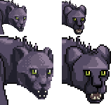
Edit by me on the left, original on the right.
That's heavily modified. I messed around with the head's colors and anatomy and shading and slightly more than half as many colors as on the original head. To stay on the topic I was talking about though, I erased all the outlines! just look at it and think about what exactly that choice is doing for the picture. I still have darkness where it would fall (around the eyes, in the cheek under the cheekbone, in the mouth), but I didn't enforce the separation with actual lines except slightly around the far ear, which IS partially concealed by the rest of the head, taking advantage of the separating force of outlines.
Hopefully that gets across some understanding of what I mean when I say it's worth trying to limit or remove outlines. There will be pieces where outlines are to your advantage, but don't let them be the only way you define form - use your shading to do that.
The edit really is heavily modified. Originally it was a part of the original critique where I talked more heavily about outlines and their form-breaking nature, about color count, and about using shading to define form, but I abandoned that draft of the critique. It's not often I have to restart a critique because I'm not satisfied with how I'm going about things, but it happened with this piece. I went way more in-depth than I think was necessary or helpful. The second (and final) draft hits the important points more directly.

A line that didn't last long was a small explanation about the fact that I was showing off an edit. I've explained before why I don't do that, but to reiterate: what I did is not the way. Do not imitate my side. Learn from it and apply the concepts you glean from it, but don't make my style your style.
I now go on to do a hell of a lot of editing.
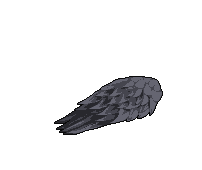
Since you're wondering, let's see if we can't figure out how to get those wings to work, shall we?
For ease, we'll skip Step 1, which is figuring out how they connect to the body. Stick to pixel stuff for now.

With Internal Lines
Completely Hollow
Here I've torn out everything but the outlines on the front wing (the one I'll be working with). I've also changed the fur colors a bit to make things a bit easier to work around. My purpose is to show that, even before you started shading your weren't going in fully equipped. Shading is a powerful tool, but if your foundation is wonky, which I'm sure you can see in some of the curves, then you'll have trouble compensating for that later.
From here, the exact approach is really subject to your personal preference. Pull up a small pile of wing references if that's important to you, but I say feel free to deviate slightly if it feels better aesthetically. For example, one thing I learned is that wing feathers rarely have pointed ends, but to heck with that.
The trick I think is to go symbolic with things, by which I mean don't bother trying to render as many feathers as an actual bird wing would have. Wings have tons of feathers; instead, focus on giving the impression of feathered wings. I chose to do this by using fewer large feathers, sized so each has its own form. Here's a quick rundown of my process, going with the idea that I'm keeping outlines. Remember - this is MY process, not THE process.
Curves fixed, mostly.
* Take the hollowed out wing and fix the curves and have a vague mental picture of where feathers might be.
One row added.
* Moving from back to front, fill up the long end feathers. Remember that feathers overlapping is what really contributes to a wing-like appearance. How exactly you do this is up to you, but my strategy is to avoid any outlines but the ones around the outside of the wing. Fill in each feather with a different color, putting no hard outline barriers between feathers.
2 Rows and change.
3 Rows.

4 Rows and change.
* Do the next row up, filling in the little gaps left between them with other feathers. Keep doing this until you're pretty near the top.
5 Rows.
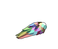
Completed "Colorful Wing"
* Each feather I've done up until the top has been pointed. I'll round off the feathers near the top. I end up with this very colorful wingful of feathers!
* Now comes the hardest part: realizing that you're not going to actually do each of those feathers, and that some of them are going to just blend in. Set yourself a light source and pull up your wing palette. I'll be using the three wing colors you had before, and putting the light source toward the top right.
All grey. I actually quite like this one!
* For each feather, I pick which of the three colors will be dominant in that feather and fill it with that. That'll result in a wing with no concrete feather distinctions, but very clear delineation of where the light is focused. Frankly I think it looks pretty good!
I didn't mention it in the description, but I did the work away from the outline and then moved it on top of the color before moving the next row of color out of the outline to shade.
* I go back to the colorful wing but keep a copy of the three-tone one on the page. I take one row of feathers from the colorful wing, starting at the top, and fill them in with the tone I chose for them on the grey wing - the bright color for the top row. I then add touches of shading around the edge of the feather where the one underneath it will have a shadow cast upon it. I add in the next row of colorful feathers and repeat, working my way down the wing. I don't immediately start using the darkest color, I slowly phase in using it in the darkest shadows as I move down the wing. Similarly, by the end of the wing I'm only barely using the highlight color.
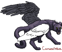
Fully refined for its outline. I still prefer without the outline, but hey, it's not my piece.
* Once you're all the way through, clean it up and do any antialiasing you feel is necessary. If it was me I'd be trashing the outline pretty thoroughly, but I'll keep it here. A couple notes about antialiasing: keep in mind that antialiasing is basically buffering the outline itself, and as such is essentially a modification of whatever curve you had before. Keep in mind that your curves should be fairly smooth. Be careful of banding - you had a lot of banding on the original piece. If you don't know what that is let me know. The biggest overlap between antialiasing (good) and banding (bad) is that you should almost never antialias a 45-degree angle.
Didn't feel like clogging up a a three-post followup with a description of banding that might not have been needed. If you the reader doesn't know, I talk about it a LOT in other lessons. Or ask, I'll explain it.

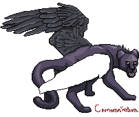
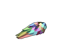
Look at that majestic beast.
* Alright, pretty darn balanced now. I stuck it back on the original piece.
The basic procedure here, removed from the context of wings and feathers, is simple. Give yourself a general outline shape, define your details with color blocking, apply your final palette and light source to the color blocks, and refine the details with shading to add depth. It's a pretty intensive process, but produces consistent results. I could apply the same concepts to the head, or the legs, or the tail, or anything. Now, the final result here looks a lot like my work because of my own tendencies in it. But hopefully this provides an insight as to how you can try to make wings with form without meticulously picking out each bit.
I think, having gone through the process now, that the biggest problem with the original wings is that they're TOO consistent. There's no variance of the highlights and shadows as you move along, and elements don't seem to obey the lightource. Put those things, your shape and light, above detailing each little thing.

And yeah, this is a tonnnnn of work. You made a big piece, 200x100 and largely filling the canvas. I rarely work that big, and even more rarely have the dedication to really detail it all in full. I know that tiredness with a piece all too well. I mean, hey, I took two days to follow up on this because of that edit - it's not easy or quick. So don't worry about running out of steam here :) And a font signature is a decent idea, though it's better if it doesn't do automatic antialiasing since that's not really pixel art (even though it's just a signature so no one would care really).

I'm looking forward to what you pull up next! (and thank you again for being so receptive to my ramblings :D)
She hasn't gotten back about the follow-up yet, but given that it's been a few days I think it's been enough to share this five-post epic of a critique. Hope it helps you at home as well! And hopefully it won't be a whole year before the next one again.

End Recording,
Ego.

Friday, July 11, 2014

Midsummer '14 Day 11: Flexstyle - Unvanquished (Prologue)


Uh oh, I'm creeping later and later into the day with these postings. I've been down that road before, it leads nowhere good.

Flexstyle is cool. I'm most familiar with him from the video game remix circles, but also know of his game soundtracks and his personal albums. This is the latest full personal album, released in 2011, Eye of the Storm. I really like the album. It goes a lot of interesting places for electronic music.
This song in particular gives me Bit.Trip Runner 2 feelings, and that's never bad. Keep listening to the playlist, and if you like what you hear you should buy his album!

End Recording,
Ego.

Thursday, July 10, 2014

Midsummer '14 Day 10: Ellie Goulding - Ritual


Halcyon Days is the definitive Ellie Goulding album. It contains her radio-hit singles Lights and Burn and Anything Could Happen, her collaboration with Calvin Harris I Need Your Love, multiple versions of Hanging On, her cover of Alt-J's Tessellate (good, but not half as good as the original), and a huge sampling of her other stuff that wasn't quite mainstream-y enough to make it to the radio.
Ellie Goulding is a bit of a treasure. She manages to walk this very fine line where she's got high production value, celebrity marketing ability, and dips into the pop and electronic wells while at the same time bringing the raw force of an indie act. She plays like a half-dozen instruments, and her voice has this breathy special quality.
I thought she was pretty good until I got my hands on Halcyon Days. The stuff they play elsewhere really is just one side of her music. Halcyon, Figure 8, In My City, Goodness Gracious, You My Everything, Under Control, and, of course, Ritual. I love this song.

As a side note, this album was a major part of my listening through the past few weeks of my Monsterhearts season and it emotionally resonated with the bleed I was getting out of that game.

End Recording,
Ego.

Wednesday, July 9, 2014

Midsummer '14 Day 9: Ar nosurge - Don't Run in the Train


I've established in the past that while I know jackshit about the noSurge games (I think they're raising/life sims in the Atelier universe?), I love the soundtrack to Ciel noSurge and the sequel doesn't disappoint. The whole thing is varied and fun and folksly and tech-y and fun.

I really recommend checking out the whole soundtrack for both games.

End Recording,
Ego.

Tuesday, July 8, 2014

Midsummer '14 Day 8: Gunpoint - Cold Halls and Footfalls (Crosslink)

DAY EIGHT: GUNPOINT - COLD HALLS AND FOOTFALLS (CROSSLINK)

I haven't played Gunpoint. I don't even think I own it yet. I do, however, own its soundtrack, which is great and jazzy and synthy. It's just all around a good, fun-feeling soundtrack.

That's it folks. Extra short today!

End Recording,
Ego.

Monday, July 7, 2014

Midsummer '14 Day 7: Armin van Buuren - Turn This Love Around

DAY SEVEN: ARMIN VAN BUUREN & NERVO FT. LAURA V - TURN THIS LOVE AROUND

So I'm not van Buuren's biggest fan. I like that his music isn't quite as cynical as a lot of other music these days, but a lot of what he makes just doesn't sound very unique. Sometimes unique isn't all that important though as long as it's competent, and I think his album Intense is one of those cases. I like it. A lot of it found its way into Trance Is Life Episode 43, which is one of my favorites.

You know, I've heard a whole bunch of songs that feature NERVO but I don't think I've ever heard one of their own original songs.

I dunno, this song was really good to me yesterday and Armin was on my list of Midsummer '14 artists. Enjoy.

End Recording,
Ego.

Sunday, July 6, 2014

Midsummer '14 Day 6: Game of Thrones - The Pointy End

DAY SIX: GAME OF THRONES - THE POINTY END

I'm a fan of the show, though I came late enough that I'm still slowly burning my way toward the present. I'm at the end of season 2.
I like the music! I found that, of the Season 1 OST, this song held most of what I really loved in the soundtrack's mood. I can't really pick out what it is about it, but there's something really appealing in it.

The soundtrack to the show is by Ramin Djawadi, who does a bunch of other really cool soundtracks like the Pacific Rim one!
End Recording,
Ego.

Saturday, July 5, 2014

Midsummer '14 Day 5: Krewella - Alive

DAY FIVE: KREWELLA - ALIVE

Krewella is pretty cool. They've had a couple of radio hits now, driven primarily by their heavy electronics mixed with female vocals, which happens to be a soft spot of mine. They're not house, they're not dubstep, they're not DnB, they're somewhere in between.
Alive is easily their strongest hit, and for good reason. Enjoy the Ride and Live For The Night are both also good. Their album Get Wet is good, but the stuff that got picked for radio play really is the best stuff on it. Worth a listen if you like what you hear though.

Krewella's also done well at being a member of the EDM scene, featuring for others and doing plenty of re/mixes. I'm looking forward to seeing where the trio goes. Nice to see an American group capable of keeping up with the North European and Scandinavian EDM powerhouses.

End Recording,
Ego.

Friday, July 4, 2014

Midsummer '14 Day 4: Theory of a Deadman - Drown

DAY FOUR: THEORY OF A DEADMAN - DROWN

Theory of a Deadman is not a great band. Taken as a whole, they're ok at best. They come from the cookie-cutter mold that Nickelback generated when they were plucked to fame, down to the same genre cues - you know the type. The sort that's just far too light-headed to really be labeled "post-grunge" or "hard rock," whose understanding of the genre is superficial at best and downright generic at worst.
On the other hand, the mold doesn't tend to generate BAD artists, just generic ones that lack anything particularly special. And even generic artists occasionally pop out something pretty interesting, and this is one of those cases. I like it. Maybe that says something about my taste I guess, but whatever, you're here to hear what I like to listen to. Given that this is the first release from their upcoming album, it almost makes me hopeful that it'll be genuinely good. Probably not though, sadly.

Where did I hear about ToaD (that's a silly acronym, I'm not gonna use that again :/)? They had some songs in David Cage's early game Indigo Prophecy aka Fahrenheit. Now THAT'S a shitty game.

End Recording,
Ego.

Thursday, July 3, 2014

Midsummer '14 Day 3: CombatPlayer - In Utero

DAY THREE: COMBATPLAYER - IN UTERO (MENU MUSIC)

CombatPlayer is Kristian Jensen, a Danish musician who works with Dischan Media, an independent company that makes visual novels. Their free work Juniper's Knot is pretty good, and their Dysfunctional Systems: Learning to Manage Chaos is really really good. The second and third episodes of that series were recently kickstarted, and I'm a big fan.
Jensen made this song for their first game that ended up cancelled, Cradle Song. A few of the pieces from that game, including this one, found their way onto his own albums. It's of note that Jensen is completely self-taught, with no formal training. I really like his style, which is often melodic and piano-driven with electronic influences. Check out the Juniper's Knot soundtrack too, it's great.

End Recording,
Ego.

Wednesday, July 2, 2014

Midsummer '14 Day 2: Sang-Froid: Tales of Werewolves - Les Deux Vendredis

DAY TWO: SANG-FROID: TALES OF WEREWOLVES - LES DEUX VENDREDIS

Sang-Froid is an interesting game. It's fun, and at the same time stunningly low-budget in places. The voice acting is truly, truly atrocious. One thing that stands up is the soundtrack, which all has this vibe that I can only call Canadian Folk (a belated happy Canada Day to all my fellow Canadians).
I picked Sang-Froid out of my list today because it's the polar opposite of the Tiesto song yesterday.

I love the feeling I get out of the whole soundtrack, but it's not up for download or buy anywhere I can find! Just gonna have to stitch together some Youtube videos into a playlist. What did we ever do without Youtube?

End Recording,
Ego.