Monday, July 29, 2013

Video Games: A Liminal Gamer's Confusion Part 1 (Phil Fish, Judging Games By Creators)


I kinda wanted to talk about my thought on the games industry right now. I'm a self-identified indie supporter, but I'm also a fan of mainstream gaming. I'm in a very confused state about what the games industry should do, or even if there's something that it should be doing at all. That's what the "liminal" thing in the title is - I consider myself to be somewhere in between an indie gamer and a mainstream gamer, balancing on that fence, unsure of where I really am going.

The question comes on multiple levels. A good deal of this confusion started when I watched Indie Game: The Movie, which I now consider to be near-required watching for those who want to discuss the state of not just indie games, but also corporate and studio game development. I've done some discussing in private, both in person and online with friends, but the thing that's really kicked the confusion into high gear is the hubbub yesterday with Phil Fish.

If you don't know, Phil Fish is the head of independent studio Polytron and the creator of widely-acclaimed game Fez, along with programmer Renaud Bedard. He was one of the four stars of Indie Game The Movie, which chronicled the very very rocky development of Fez, along with the development of Super Meat Boy and the fallout of Braid's release. In the movie, Fish said some rather petulant things and generally made himself a rather unsympathetic person in a lot of people's eyes. Admittedly, the situation was hyper-stressful at the time of the interviews. But Fish has continued to make generally unfriendly comments, especially toward Gaming Journalism outlets. A couple days ago, in an interview with GameTrailers' Marcus "AnnoyedGamer" Beer he refused to comment on Xbox One's self-publishing decision, and Jonathan Blow did the same. Beer replied by spewing a set of insults at Fish, calling him a "hipster," a "tosspot," a "wanker" and a "fucking asshole". Fish responded by claiming that Beer had assassinated his character and told him to ""compare your life to mine and then kill yourself". Fish ended the thing by declaring Fez II cancelled and locked his Twitter.

Now, I'm upset about the loss of Fez II. I'm really fucking upset by the pure immaturity of the gaming journalism world. And I'm confused about whether or not Fish's response was reasonable. He's been hounded for a long time about Fez, and his brash personality has been at the center of the vast majority of commentaries on his game. His clash with journalism has been loud and public. The original journey ended with the production of a game that is perhaps the pinnacle of puzzle video games in recent memory. It is layers upon layers upon layers of accomplished and intricate pure game. However, Fish's clash with the journalism world didn't end, and the usual crowd of mainstreamers who see the big indies as pretentious and narcissistic didn't help much.
Now, I consider Beer to be pretty much entirely at fault for the breakout of the argument. No journalist should resort to throwing insults at someone just for refusing to give a quote about something, but games journalism (meaning IGN, Kotaku, Gametrailers, etc) tend to be even worse than your usual reporter. The way Beer acted is a fucking embarrassment (and it says some rather, um, unfortunate things about the industry that we let a guy called AnnoyedGamer be the one to talk to creators and tell us about it; a baseline of "annoyed" ain't exactly bias-free). But Fish wasn't exactly the model individual either here. His frustration with his treatment finally boiled over, and that rage isn't really ideal behavior, but what should we think of Fish now? Many think that he should just mellow out, which would give him the stance of being level-headed and clear. However, that says something horrific about the gamer audience, that all game developers should be clear and well-spoken. What's wrong with a game developer being an angry sort of guy? That's his choice and we shouldn't condemn his contributions to gaming for that. Of course, we can't let him entirely off the hook; as a person, he's kind of a dick, and so treating him like a dick isn't exactly out of line. It comes down to this:
How closely do we tie a game to its creator?
If a creator's a dick, do we avoid their game? I say no. If a creator supports causes you don't agree with, do you avoid their game? Yeah, sometimes, especially if much of the money goes direct to that creator (less an issue in studio development as your purchase does not impact individuals who were payed by salary rather than royalty).

What do I think of Fish after all this? I think he's a man in an impossible situation who has lived through a shit ton of harassment and has maybe not handled it with grace and poise. I think he's an incredibly skilled game developer and that Fez is a masterpiece that the entirety of the game development scene should look to as a game that innovated in fascinating ways. I think that I'm disappointed in the cancellation of Fez II. I think that it was entirely his right to not cancel it - no one was entitled to receive it. Game cancellations happen, and sometimes happen for stupid or petty reasons, and while the story would be different if he was taking preorders or something, he had no obligation to make a Fez II.
This is, of course, assuming it's for realz dead. Fish is dedicated as hell to his craft. Honestly, I don't think Fez II is gone quite yet; he's going through shit, but he'll come back around. And I hope he does. But if not, I'll be glad to buy his next game (you know, when it goes on Steam Sale, because I'm a cheap-ass fucker).
Heck, this comes around to a good point made in an editorial on Kotaku someone linked to. It was overblown and exaggerating, but the gist of it was that the absurd bluntness that makes Fish such a prominent figure in the games gossip scene is an evidence of an incredibly strong passion for what he believes about video games, and that revolutions like Fez don't often come around without someone with that sort of intense passion. Fish says the things he does not because he's trying to rile everyone up (though I think his frustration gets the better of him sometimes - understandably, but not necessarily excusably), but because he simply believes that the design philosophies he works with are the ones that can bring games forward. I'd rather we had the explosive, unruly Phil Fish we do than have a cooperative and appeasing Phil Fish because I don't think he could do what he does without being the way he is. What I think you need to be a true innovator is a powerful unhappiness with the current state of the medium, to see missed potential and want it so bad to do it yourself, to push boundaries. To use IG:tM examples, Edmund pushes the social taboos on every level of his thoughts - he's unhappy with Super Meat Boy for being too safe. Tommy sees the current direction of the industry and thinks it's shit, and wants to do it himself to show what he thinks it should be like. Blow has greater ambition in the movie; he sees the reaction to his game and finds it lacking, even though they love his game, they're not seeing the real beauty of it. He wants to change the way the culture views games, and the best way to do that is through being vocal and making games that hit those higher levels to push viewers into thinking that way (this is my own interpretation of his message from the movie; perhaps I'm wrong, but that's what I saw). Pushing boundaries and innovation is the true power of the indie scene for me. Corporate game design is motivated by the bottom line, and that means safety. Experimental is rarely the most profitable option, or, more accurately, it's like playing the lottery. The indie scene has the freedom to innovate without the supervisors overhead, and that lets them do great things.

I love the indie scene. But I don't have that passion that these developers do, that Fish or Refenes or any of them have. If I had that sort of passion, I imagine I'd be a part of that scene myself, rather than just an onlooker. Instead, I enjoy much of what the mainstream does too.

I didn't intend for this post to be all about Phil Fish. I came into this thinking I'd talk about mainstream vs indie confusion in the realm of film-inspired game design. But I think that I've really needed to talk about this Phil Fish stuff, so here it is. My bottom line is this:
Phil Fish, if you ever read this, please, don't stop being you. Keep being that loud obnoxious guy yelling what you think about games, and don't let these idiots stifle your drive. You have a supporter in me, whether you come back to do Fez II or something brand new. Stay passionate and don't give into the angry mob of the status quo.
(also, seriously, what's the deal with that black monolith puzzle? holy cow man)

I'll be back to talk about those other things later. For now, I hope these thoughts give you something to chew on.
End Recording,
Ego.

Sunday, July 28, 2013

Sunday Songs: Solarstone & Clare Stagg - Jewel (Pure Mix)

Sorry for the vanishing act yesterday. I've just been having zero drive to write recently. I hate myself for it because I really want to give you guys some good thoughts and stuff but it feels like a huge chore to actually write things. The Games For A Month/August Songaday thing I was talking about is on track though, I have more than the first week already written and everything, so activity will kick right back up into high gear in a couple days.
Besides, I kinda warned that the Pixel Art Lessons might not be weekly for a bit. I've covered almost all the super-major topics in some detail, and I'd rather not keep retreading old ground, but sometimes I can't find something to critique in a new way.

SOLARSTONE & CLARE STAGG - JEWEL (PURE MIX)

So this song is by trance people who I don't know anything about. For loving trance music, I just don't bother to keep track of all the DJs and producers (though vocalists seem to recur regularly enough for me to recognize some of 'em). Instead, this is another song I found through Trance Is Life. In fact, this is the second Sunday Songs to come out of Episode 43 - When I Go by tyDi was also from 43.
It's pretty much excellent. Upbeat in tone and tempo, with ethereal female vocals - reminds me of other favorites of mine like My Enemy and Lost.
Sorry that it's so long. Trance songs have a tendency to get on the lengthy side, but it's great, I swear!

Links:
Trance Is Life (currently giving a 403 Error, it'll be back up soon)
" Episode 43 (also currently 403'ing)
tyDi - When I Go
Sied van Riel ft. Temper Heart - Carved By Your Hands
Arty feat. Nadia Ali - Must Be The Love (Benya Remix)
Kenneth Thomas ft. Molly Bancroft - Hiding (Gal Abutbul Progressive Remix) (I like Molly Bancroft's voice)
The Blizzard & Daniel van Sand ft. Julie Thompson - Made For You (Club Mix) (Also I like Julie Thompson's voice)
Armin Van Buuren ft. Miri Ben-Arti - Intense (I usually DON'T like Armin Van Buuren, but this one is really good)

End Recording,
Ego.

Sunday, July 21, 2013

Sunday Songs: Element4l - Close Your Eyes So You Can See


Element4l is an indie game that is available on Steam. It is a cool game that wears its ancestors on its sleeves. While it's not by any really known designers, it very obviously draws on the gems of the community. Gameplay-wise, it's very much an enhanced and nuanced version of Nightsky (also it's way harder - this game is difficult!). Visually, it's like a bizarre crossbreed of LIMBO and Nightsky, with the bloom and lighting effects coming very reminiscent of LIMBO and the black foreground elements and colorful and atmospheric backgrounds from Nightsky. It's very fun, very creative, and very pretty. The game is also cheap, at $10 normally and $8 if you buy it like RIGHT NOW before 10am PST tomorrow. IT also comes with the soundtrack, which is a very good thing.
The music also shows evidence of those who came before. The most obvious inspirations come from Coil (a small game by Edmund McMillen) and Fez, but there's SpaceChem, Superbrothers: Sword & Sworcery, and other stuff. But it's all tied together still, and it also brings in its own flair to everything. All in all it's just an amazing soundtrack. Kind of a downtempo electronic vibe, a little bit of dubsteppy flavor (very very very little), calm and gorgeous.
This song is particularly noticeable in its SpaceChem inspiration. It is also just plain good. Mind Tree (the band who did the soundtrack) has done an incredible job.

Links: (songs have the game I think I hear in them in parentheses)
Element4l homepage
Element4l on Steam
Mind Tree on Bandcamp
The Owl And The Penguin (Nightsky)
Adrift Flows Bronsonic Delight (Coil)
Paxton (Coil)
Manifestation (Fez)
Mother Nature (Fez)
The Mind Tree (Sword & Sworcery)

End Recording,
Ego.

Pixel Art Lesson: Juniorps's "Warrior in cave" (Composition, Lighting, Perspective)


I have a tough time with a lot of Daft Punk. It's too repetitive, and generally not active or energetic enough to hold my interest long. However, mixes of Daft Punk are often excellent! This mix, of two of Daft Punk's most famous (and to be frank, most repetitive) songs, was done for their Alive concert tour in 2007 (wait holy cow that was six years ago!?). It's fantastic.

So, before I jump into the pixel art lesson, I want to talk about the thing I announced on Twitter earlier today. You know those Songaday things I did? Where I make a dedicated music post every day for a month (if not click the Music button up top!)? Well, I'm not doing one of those next month. As it happens, the weekly Sunday Songs, along with songs on each post, means it's hard to store up a whole 31 songs to use on top of regular stuff, and I think doing it more regularly is better anyway.
However.
There IS a daily event next month! Except it's not about dedicated music posts, but I'm gonna do a post about a video game every day! This is an excuse and an opportunity to talk about video games, something I've been wanting to do without writing up whole review posts. Monday, Tuesday, Thursday, and Friday are for general games, while Sunday, Wednesday, and Saturday are reserved for indie games! Some you'll know, some maybe not so much.
And because I put songs on every post, and will be posting every day, I guess it will be a Songaday of sorts!
It begins August 1st, and goes all the way through the month. Pixel Art Lessons and Sunday Songs will not be disrupted.

Juniorps's "Warrior in Cave"

Major Themes: Composition, Lighting, Perspective

I think this is going to work in the right way, but sometimes I do not know what to do so I need some tips from you for me to continue.

Would you like to help me also in focus lighting.

I would also like some tips on what I should do in the scene, if this certain perspective among other things. As the warrior. 
Thanks
This is a little bit of a different posting - this comes from PixelJoint's WIP forums. It also has way more work done to it by a guy called Night rather than just me. It's also still ongoing. But I'll post everything that's done so far.
Me:
So wait, what exactly do you want help with? I'm kinda interested in helping out, but I'm not entirely sure what you want. What I think you're asking about is how the lighting would affect the scene and how the perspective works, so I'll try and help with that.

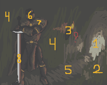
In order to make sure I understand what everything is, I labeled everything to make sure:

1: Opening of cave.
2: Outcropping of wall, partially concealing entrance.
3: Torch on wall.
4: Wall.
5: Floor.
6: Helmet.
7: Cape.
8: Sword.

Now, assuming that those labels are correct I can actually give some advice.

The big deal with the image is that the lighting from the torch doesn't make very much sense with the perspective. Judging by the angle of the floor, the torch is behind the knight and in front of the door, held onto a flat wall. Think of it in a 3d sense - the light from the torch would only hit the very edges of the warrior, on both sides, and anything concealed would be completely in shadow. There might be a little bit of firelight reflected to the front but it would only hit the very tips of things. Instead, the way it is right now makes it look like the warrior is directly to the left of the torch, ignoring the 3d perspective.
Additionally, if the wall is flat, the light from the fire would extend much, much further, as well as to the outcropping I labeled 2 and the floor. However, the firelight look would only be intense close to the flame.
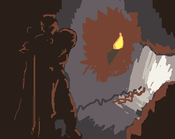
As an example of how the light wouldn't really hit that much, I produced this image.


Keep in mind that any little protrusion of rock will likely have a small amount of highlight to it. Use these little protrusions and angular edges to add some visual interest to the large plane of the wall, but don't add too much or you'll distract from the focal point of the warrior.

For perspective, much of the background is fine. However, the warrior is outside of the perspective. While the entire background is at an angle (and perhaps TOO much at an angle, it looks like the floor is at a forty-five degree which people would almost fall off of), the warrior's feet are on the same horizontal line, and don't make much sense.

As a whole, it looks like the warrior and background were created separately and then combined.

All in all, it's hard to help too much at such a rough stage. Once you actually start placing pixels it'll be much easier to help you with it. Next time though wait for a few days or some such before coming to the chat box on the front page, sometimes it takes a bit for some of the more regular critique writers to come around the forum.

Oh, and judging by your typing and website that English isn't your main language (though if I'm wrong, my apologies). That's totally fine, just let me know if you need me to explain something in a different way that makes more sense to you!
 Followed by Night saying:
I think that the major issue here is the composition itself. The way I would approach it would me to make the knight slightly smaller, move him closer to the middle, and move the cave opening away from the picture's boundaries to the left. This would make the scene more balanced overall.

Furthermore, you should ask yourself questions such as "what is he doing?" "where is he going?" "who is he?" etc. It would give more meaning to the picture and something to work from on after.
(for example; I don't understand why would he pose like this in a cave for no reason).

Leaving that aside, the second major issue[s] is the lighting and the perspective.

You should really start the whole piece with just making the basic lines of the picture for the perspective (something I didn't do with my edit), so everything would make sense afterwards, when you go to the colouring stage.
And the lighting could definitely do some work. The warrior appears as if he is almost "pillow shaded", and the cave is way too well lighten, even with the torch.

Speaking of the torch, Ignoring the fact that it doesn't emit any light (none that I can see), you should rethink if you even need it there at all, I suggest that if you do add a torch, then put it in one hand of the warrior, and have his sword in a scabbard, or something along those lines.

I won't go into anatomy and colour, as I think I have rambled enough about the picture, but it could be improved.

Here are two rough edits depicting what I meant.


(I wouldn't suggest to use them as references at all, because I did them in a really half-arsed way, but they do convey the general idea I was heading for with my criticism.)
Night focused much more on how to put the piece together, while I focused on what to do to repair it if the current composition was what he was going for. Juniorps confirmed that Night's stuff was more what he was talking about, which is totes fine. Also Night's blocked together composition is way better than the thing I put together :p
Juniorps replied:
Well my biggest doubt was what to do because I did not know what else to do before you start to refine.
@ Ego, thanks for the comments I made ​​me to be and is observed more what I was doing and English is not really fluent in the language my parents, sorry for the mistakes in the writing.
I was trying to fix by following what you said, and was ready to post up.

But the comment of the Night was where I most identified my idea.
Yup, that's fine by me. Night was a bit more articulate anyway.
@ Night Man, I could understand your comment on my work and actually even had some bizarre errors only after I realized that haha.
The question to ask the questions for my character even gave me some ideas to create a story for art.
"He may be running behind a treasure, a precious stone that is a very important symbol for your people, and you need to venture into large caves" That's what I thought when I asked myself those questions.
This is the key. Art tells a story, it isn't just some elements tossed together. Controlling that story is pretty much key to making your image look like something that should be happening.
I made an edition following what you did and I hope I'm on the right track, the question of the treasure I intend to do so over time.

Here it is:


The lighter part of the front armor is where I want to do some details not to be just a darkness, what do you think?
 ...Night calls this out too, but if you're a new folk reading these tutorials, when people give you edits with their critique, they're meant as examples, not images that you then use as your baseline. We're not doing your work for you. I'm more sensitive to this after Jiinchu used one of my edits in a new submission. I don't mind really, but it doesn't allow you to develop your own abilities. It's a cheating shortcut.
Night:
I'm glad my comment could be of help. :)

You might want to try a different composition design than that, considering that you want to emphasise is that he is running towards something, specifically a treasure.

Regardless of the composition though, you should make him as someone else than a warrior dressed in full plate armour.
I reckon it'd be quite hard to run in full plate armour for just some treasure, don't you agree? ;)

Bah! But that's just a thought, don't follow it if you don't feel like it.

Also, my edit wasn't there for you to edit over, I just wanted to show you want I meant with my criticism by that edit, not to do the work for you.
You won't learn much if you take an edit that was made to help you understand something, and then draw over it and call it your own.
 And Juniorps current response:


I set some ways just seems that something bothers me that the texture of the rocks are very cartoon style and theme are out of work in general
So this is still ongoing. But I think that between my talk of keeping the perspective in mind, Night's talk about story and composition, and the overall theme of lighting, there's some pretty good lesson in this. Hopefully next week I'll have something more concrete. This is why I usually prefer to critique in the gallery rather than the WIP forum.
End Recording,
Ego.

Sunday, July 14, 2013

Sunday Songs: Blade & Soul


This is from the game Blade & Soul, a Korean MMORPG. I know nothing about it other than that I downloaded the soundtrack last night and it was great, followed by trying to find uploaded video of the soundtrack and, well, not finding it in any usable condition. So this is a good song from what I could find, and the same person has uploaded a whole bunch of songs from the game but they're not really well labeled. Still, it's pretty much all worth listening to, so check it out!

Links:
Blade & Soul Playlist

End Recording,
Ego.

Saturday, July 13, 2013

Pixel Art Lesson: ssm-04's "Still Human?" (Over-anti-aliasing), also a follow-up to Style

Well, before we get to the core of today's thing, I have a couple of things to touch on.
1) I'm sorry the GPNW AP posts aren't here yet, I'm working on 'em! My mom's in a sling right now so I've been quite busy helping out with stuff.
2) In other RPG news I'm very excited to have my hands on this!:
Thanks Sean Preston, the book looks and feels really nice!

3) In a nice coincidence, the PixelJoint Chatbox had an excellent discussion on evolution of style and the established styles and habits that have appeared over the years. The discussion has moved over to Pixelation as it's much more theory-based, and the thread is ongoing. It is fascinating and if you have interest in the style stuff I talked about last week, PLEASE check it out because these people are smarter than I am, or at least more experienced. And as Helm and Cure have pointed out, none of this is firm or formal really, but it is fascinating.
HERE IS THE LINK TO THAT THREAD
I'm also editing this into the end of last week's Lesson.

And now to today's PAL!

ssm's "Still Human"

Major Themes: Over-antialiasing, Picking the right Antialiasing color


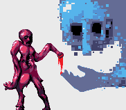
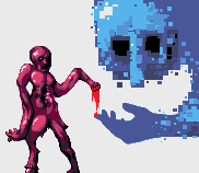
The second one there is the Preview image. I make reference to it and it's actually different is why I included it.
Artist's Comments:
So long since my last pixel art, this is really just a pallete test, and I think it turned out well.
No reference... actually I really don't know what I just drew.
So, let's put it out up front: I like this piece. It's very stylish and you could learn a lot by looking at the positive aspects of the piece. Also it's super-creative. Another thing to note is that this is a short as hell lesson, so I hope the padding up there and the Pixelation thread can tide you over.
Here we go!
I really like this piece's creativity. Just the whole structure is very pleasant. I've got a couple issues though.
The desaturated blue that makes up the main color on the big hand is messing with me. In fact, the whole big hand is bugging me. The pose and the style is fine, but I think it's in the colors and the way you've anti-aliased it. See, the AA seems to be coming through an excessive amount, and is giving it almost a blurry edge rather than a crisp and smooth edge. I think this is from a bit of over-antialiasing, combined with the main color being too desaturated. The color is kinda hard to explain - it's not that a desaturated color is bad, but having a desaturated color anti-aliased by a more saturated color makes the AA color actually pop out more than the primary color. Highlighting those little edge spots makes the hand more poorly defined.
The solution there would be to make the AA on the hand less saturated (maybe not less than the hand, but less than it is), or to make the hand more saturated, which I think would be the better path.
I also think you could use less AA in general, defining it with the main color and only using the AA where things get jagged.
Here's some edits I did as an example: "Same AA/Shape, different color", "Same color, different AA/shape", "Both different".

Another couple comments would be that the middle section of the guy on the left is quite indistinct, I don't know what's going on there. Additionally, the preview is FAR worse than the actual image, each bump on the back of the hand is blurred out by the AA and it doesn't look refined.
All in all though, great stuff in here.
Well, I'm just gonna call that done for today. Later.
End Recording,
Ego.

Sunday, July 7, 2013

Sunday Songs: Balance and Ruin - Tastes Like Victory (Fanfare)


Balance and Ruin came out! That's the Overclocked Remix Final Fantasy VI remix album, and it's really good. It's not taking the "favorite" slot still held by Summoning of Spirits and Voices of the Lifestream, but solidly excellent. Andrew Aversa aka zircon, the album director (along with McVaffe) did an awesome job, and the Kickstarter counts as a resounding success getting music of this quality out there.
This song is a remix of the fanfare when you win a battle, except it's a total inversion of how you'd think a Fanfare remix would go. This is my first exposure to Leitbur, the collaboration of Jaron Widman and Sharron Krzyston, and I'm way into it. They also did On The Run (The Returners), which is also great. More than any other song, this is the one that jumps at me and says "yes, this is something very special."

Links:
For some stupid reason, no one's uploaded all of the songs to Youtube. To save my sanity, I'm just going to point you to the album's website, where you can download it. These are the pieces I consider truly noteworthy, though they're all good.
http://ff6.ocremix.org/

Remember (Awakening)
Polemos (Battle Theme)
Tastes Like Victory (Fanfare
Castles in the Sand (Edgar & Sabin)
On The Run (The Returners)
A Fistful of Nickels (Shadow)
Savage Triumph (Wild West)
Courage, Failure, Rosebud (Under Martial Law)
Train Suplex (Decisive Battle) (This is a Danny Baranowsky track, and it shows, in a good way)
Terra's Resolve (Terra)
Electro de Choco (Techno de Chocobo)
Til We Meet Again (Aria de Mezzo Carattere)
Full Speed Ahead (Setzer)
The Megiddo Brigade (Devil's Lab)
There's Nothing Like Flying (Blackjack) (DDRKirby(ISQ) strikes again! Such a great 9-bit artist)
Illusionary (Another World of Beats)
Meditations on an Apocalypse (Catastrophe)
Event Horizon (The Day After)
13th Floor Demonstration (The Magic House)
The Endless Stair (Fanatics)
Demon, Fiend & Goddess (Dancing Mad) (Dancing Mad is one of the most important FF6 tracks, and I wouldn't have it by anyone but zircon and Sixto Sounds)
Humble Beginnings, Great Expectations (The Prelude) (It's hard to keep this song fresh in every FF album, seeing as they've done FF1, 4, 5, and 7, but they pulled it off again)
Bass of the Returners (The Returners) (woah, bLiNd! Been a while since I've seen him)
Savage Dance (Wild West)
Strange World (Another World of Beasts) (This is quite different from WillRock's usual material)

End Recording,
Ego.

Saturday, July 6, 2013

Pixel Art Lesson: Style


Watching Attack on Titan right now.  Annoyed that it's still only subtitled (I like dubbed anime cuz I can multitask, with subs I have to put all my attention on the screen), but enjoying it a lot. This is a kickass song from the soundtrack.

Style is a touchy subject in art, not just in pixel art. The idea of having a consistent appearance is tempting and alluring. But Style is dangerous if not handled properly.
First, let's talk about what Style is, or more accurately, what the Style I'll be talking about really is. Style is a set of rules, on the pixel or composition level, that the artist follows in order to provide a consistent look to their art. It's my general thought that falling to style without clear deliberation is akin to strangling your creative abilities. With intention, it can work just fine, but in moderation, and I'll go into that, but in general I consider Style a thing to be avoided without the utmost care.

So how does style actually come about? The two primary ways is through natural tendency and by forcing it. Forcing style has a lot of motivations as well, but let's touch Natural Tendency first. Natural Tendency is the best path to Style as a whole, and it's entirely normal. As you pixel and gain experience, you'll discover things about how you like to pixel. Maybe you find that you have a fondness for dithering, or you really like handling saturated colors, and those elements start recurring over and over in your work. It turns into consistency, and you have Style! It's entirely normal. There's nothing wrong with allowing this process to happen. The only thing that a lot of people don't quite grasp when starting out that this MUST be an organic process, you CANNOT rush it. And a style completely found through Natural Tendency is forever evolving, never completely static. Basically, Natural Tendency causes a Style to occur at the composition level, not the pixel level. The exact number of colors in a piece, a certain pattern of dithering, these things aren't set in stone by a Natural Tendency.
Natural Tendency alone can have an issue though, and that's falling in ruts. If you just keep languishing in the same compositional choices that you're comfortable with, they're consistent, but you aren't expanding. If I tend to do low-color high-saturation pieces with lots of dithering, try moving outside the box! Do something high-color, or low-saturation, or use no dithering.

The other way Style appears is if you force it. Now, "forced" carries with it some negative connotations, but that's not to say that it's universally bad. There are perfectly good reasons to enforce a style. The reasons we force style are:
* As an excuse
* Building an identity
* Games
* Technique Mastery
* Exploration

Let's hit 'em one at a time.
* As an excuse: This is an extremely common excuse among beginning pixel artists that they use to try and cover up their lower skill level. If I had a nickel for every time I'd read "That's not wrong, it's just part of the style!" I'd probably have a few bucks at least. There are two reasons this is such a prevalent excuse: genuine misunderstanding of how style should work, and because it is very hard to counter. Maybe it WAS just a part of the style! That's why, when I intentionally leave a flaw in a piece for purposes of style, I call it out while posting that element X or Y is a stylistic choice, not a mistake. The thing is, if they're not using an established style (modeled after a certain game, a person, a console), their choices of style are totally open to critique. Style can be WRONG. If I like to make my lines all jagged and don't clean anything up, it doesn't matter if it's the style, it's still bad pixelling unless done with the utmost care. And if they really don't understand that the sort of style they're pushing should be developed over time rather than forced, well, explain it to them.
Style is also an excuse for laziness when it comes to experimenting. It's easy to fall back on what you usually do, rather than branching out and trying new things.

* Building an Identity: In my opinion, the ultimate reason that people want a style. It's also the most viable reason to force a style consistently over time. In order for an artist to go commercial with their talents, they need to be distinct from the rest of the herd. If they can't do it with pure talent, they need some sort of visual edge to them that makes them special, and a unique style is the easiest way. When I look at the front page of PixelJoint, or heck, even the front page of DeviantArt, on occasion there's a piece that jumps out and I say "I know who that's by!". That sort of brand recognition is the main reason people want to say they have a "style" in my experience. And that's an important thing if you ever want to stand out.
HOWEVER.
You cannot let that identity rule your art. That style identity is meant as an expression of yourself and the way you work, and if you abandon your own continued exploration in order to maintain that public image, the image really isn't genuine anymore. Of course, if you only show the public your normal styled pieces, sure, go ahead. But never stop trying new things and experimenting just because you have an image to maintain.

* Games: The biggest reason to use a style. I say "games," but I mean any unified project, so it could include things like the music video for Gowe's song Aurora or whatever other projects, but video games are the most common. There are two reasons a game leads to style. The first is much less common nowadays, but involves limitations of the target console. If you make a Super Nintendo game's graphics, you have to obey the limitations of the SNES (16 colors per sprite, colors per tile, number of sprites per line, etc). This isn't a matter of choosing style, but having it thrust upon you, and that's totally okay and without issue. The other reason is in order to create a cohesive whole. Think about the Legend of Zelda series. If you're playing Wind Waker, imagine if all the graphics were the same but the Link model was the one from Twilight Princess. Kinda jarring, right? That's because the styles are different. The same applies to pixels - imagine if Sonic sprite fell into Super Mario World. It can happen on a much milder level too: if you look at sprites from Phoenix Wright: Ace Attorney and ones from Apollo Justice: Ace Attorney, there's subtle differences but they're enough that transplanting from one game to another would be somewhat unsettling (either looking oddly poor-quality or oddly high-quality, depending on which game was the transplanter). My point with all this is that when you have multiple parts to a single whole, they need to look like they match each other, and to do that you need to establish style.
Basically, using a game's style, whether for an actual game or for a mockup isn't as much an exercise in style as it is an exercise in operating under limitations. You shouldn't lock your personal style into just being a game style.

* Technique Mastery: Certain styles showcase certain techniques. Repeated use of that style can give you an excellent understanding of that technique. For example, Fire Emblem's mugshot style is fantastic for learning really REALLY smooth AA and skin tones. Commodore 64 style is exceptional for learning how to operate under a highly unconventional palette, for learning how Wide Pixels work, and for how to use gray as a buffer color. Most styles have something in particular they're good for learning, but the big key here is that you then have to take that mastery and apply it elsewhere, on other art outside of that style.  Understanding gray as a buffer in the c64 palette is only really valuable if you can then understand gray as a buffer color outside the c64 palette.

* Exploration: Related to the others, you can use styles for exploration and experimentation. This is, in my opinion, the purest reason to use styles on a personal basis. It's close to style mastery, but instead of doing a ton of it for fully understanding a technique, it's more like just dipping your toe in and experiencing a style and moving on. It's a decent test of skill as well, trying out weird or different styles just to try. This is the entire purpose of the April Fools challenge that Pixel Joint has had a couple times, where the goal is to imitate a different artist's style (whether it's just Natural Tendency or an established thing of their's).

And those are a bunch of reasons for why people force style, and how forcing style isn't always a bad thing. However, this can't be a retroactive thing; if you don't have the intention of doing a game's style or mastering a technique through style repetition or trying out something new just to learn, then those things simply become excuses. That's what I mean when I say that using style has to be a very deliberate process.

Basically, I've set up a set up steps that are more or less a way to Safely Establish Personal Style.
1. Don't rush yourself into a style. Work until you understand your Natural Tendencies. This can take some time. Just pixel and analyze your older pieces as you progress.
2. Try a lot of established styles. Game styles, console restrictions, other people's styles, whatever, just do lots and lots.
3. Now you can start thinking about what it means to have a personal style. Absolutely make sure you understand the difference between a Style and a Restriction. Restrictions are pixel-level limitations, either self-imposed or caused by the system, while Style is composition-level guidelines. There's some nomenclature weirdness here - often you'll see a game's set of Restrictions referred to as that style; Fire Emblem style, for example. But even things like that are Restrictions in this distinction. The biggest difference is that Style is flexible and evolving, while Restrictions are hard and unbreaking.
4. Devise the basic guidelines of your Style. Keep in mind that it's Style, not Restriction, and that it should generally be on the composition level rather than the pixel level. Base the guidelines on your existing Natural Tendencies and conscious thought you have about how pixel art should work. For example, some artists think that dithering is a strong tool and make frequent use of it, incorporating it in their style (eg Jinn) while others think that dithering is less necessary and that strong pixel clusters are a more important thing to focus on (eg Cure). That sort of stuff is also good to include in your guidelines.
5. Use it a lot. Release pictures in that style. Keep using it.
6. NEVER STOP EXPERIMENTING. Keep the stuff private if you're worried about diluting a public image, but always keep trying new things. Let your style improve over time - after all, if you're establishing a style for commercial purposes, no one wants an artist who's letting him/herself stagnate in sameness.
 That's basically it. But before I'm done for the day, I want to talk about a couple individuals. They're examples of a couple different things, some good elements, some bad. I don't mean any offense to any individuals here.

Jinn
Jinn is an incredible artist. His art is also very distinct, recognizable at first glance. More than anything else, this is due to his color selection. He has an established palette he uses, but frequently deviates from it if the piece demands it. He does a lot of dithering, and typically has very distinct highlight and shadow regions. To me, Jinn is a perfect example of crafting style without becoming slave to style.

OCEANSCENTED
So I don't have to keep typing OCEANSCENTED, I'm just calling her Iggy. Iggy's a damn good artist who has managed to NAIL the "building an Identity with Style" thing. She still experiments and has no problems with trying out all sorts of stuff. In general, this is the proper approach to style. However, her style is definite itself has some issues. As the product of almost complete Natural Tendency (I suspect), it's not particularly refined, but that's okay, as often those pieces that lack refinement are stress-relief or productions of boredom. When it comes to the big, significant pieces, she works hard on making things work.
This is an example of a personal style that has been approached properly, but has pixel-level techniques holding it back. And that will come with time and practice - she's already improved at an exponential rate over the past year.

The_Merc_FCS
The Merc FCS is a master of the Fire Emble style. He's also my definition of "Style-as-rut". And if he finds it fun to keep doing it like this, more power to 'im. But he knows he ought to branch out and continue experimenting, that unless he does he'll probably start to stagnate. He's been sticking to the style lately, but has been adding full bodies, and a whole horse, and such to start branching out. That's enough for now, and his mastery of skin AA that Fire Emblem teaches will serve him well.

So that's three different artists, with three different approaches to Style. Oh, and I wanted to mention one more:

Ego
Myself. No images. I just wanted to call out that I'm not exempt or anything, nor have I mastered staying out of style ruts. But a lot of common elements you see in my pieces are due to laziness on a pixel level, rather than an experimental or stylistic level. I do a lot of coloring others' linearts instead of doing my own, which is definitely laziness, but not actually an impediment to style. You can draw the same subject matter a million times and still be doing it in different styles and experimenting with it. So that's an important distinction to remember.

I think that's a pretty good discussion for today! I confess that I'm pretty much out of any backlog for Pixel Art Lessons so they might not be an every week thing, but I hope to get one up as many Saturdays as possible. Later folks!

EDIT: In a nice coincidence, the PixelJoint Chatbox had an excellent discussion on evolution of style and the established styles and habits that have appeared over the years. The discussion has moved over to Pixelation as it's much more theory-based, and the thread is ongoing. It is fascinating and if you have interest in the style stuff I talked about last week, PLEASE check it out because these people are smarter than I am, or at least more experienced. And as Helm and Cure have pointed out, none of this is firm or formal really, but it is fascinating.
HERE IS THE LINK TO THAT THREAD
End Recording,
Ego.

Tuesday, July 2, 2013

Go Play NW: Last Generation Actual Play


The Last of Us's soundtrack has this desolate, end-of-the-world but still actiony vibe to it that made me instantly pair it with Last Generation.

Friday has one game slot, 8pm-Midnight. I decided to go with the Donut (the GPNW version of a pitch circle - this was pretty much just a pitch circle since we didn't split it). I ended up going with a game called Last Generation, by Jeremy ("Jerry") Tidwell, run by the same. I played with Sylvia (if you know her last name please alert me so I can find her on G+), Joe Mcdaldno, and Pat Kemp. Jerry just facilitated it rather than playing - we couldn't have done it without him though. The game is currently playtesting - this is Playtest Version 3.5. Here, I'll walk you through the basics of the game in condensed forms.

Last Generation is an Apocalyptic game. Not post-apocalyptic, but about the actual end of humanity. It is set in the 1930s, when The Dustbowl began to appear and sweep over places. However, in this alternate 1930s, The Dust is not just a storm, but a psychic confluence of self-destruction, breaking the rules of reality and causing supernatural events, but most importantly its influence brings out the worst side of someone, exaggerating their traits to implosion. The players are Angels, a small group of people who are immune to the Dust and can read the past and present of people and restore Hope to communities, perhaps forestalling the Dust or letting people live out their final days in relative happiness. The ultimate ruling, however, is that no matter what the apocalypse cannot be stopped, Angels or no.

Mechanically, the game is GMless. We have pregenerated characters with a single important decision to to make that will decide our past response to a trauma. We collectively build 5 Pillars, or townspeople that are the focal points for saving the fate of the town. They are the people the Angels want to save. We then take turns playing scenes. On your turn, you select a Pillar to play. The player to your right will be the Angel in this scene, and the player to your left will represent the Dust. The Angel and the Dust have small hands of cards (specialized tarot created for the game) used to pace the scene and exert emphasis and truth on the Pillar. It acts as both a resolution mechanism ("does the Dust or the Angel have more influence on you?") and as a pacing mechanism (the scene ends when a player has played four of a suit). When four of a suit appear, Influences are awarded. There are three influences: *Provide the direction of the end of the scene, *Decide if the Angel gains a point of Hope, *Ask, but do not answer, a question about the character if you want. The winner of the scene gets first dibs on choosing which Influence they want. The person with the highest single card gets second choice (it can be the same person). The Pillar gets the remaining Influence. If the Angel won, the Pillar gets a point of Hope. If the Dust won, the Pillar gets a point of Dust. The Pillars all start with 1 Dust.
After four scenes (one for each Angel) the Act ends and the Angels get together and discuss the progress and plan out what to do. There are three Acts normally, but only 2 in a con game. At the very end, Judgment happens. At Judgment, you look at the Pillars, and each one that has more Hope than Dust survives ("more" - ties go to Dust). If three Pillars survive, the town is saved from immediate destruction by the Dust. If less, the Pillars with more Hope than Dust still survive, the town is destroyed. Angels pool their Hope at the end and may spend it to add Hope to Pillars, 2 Angel Hope for 1 Pillar Hope.

Sound complicated? That's okay. It worked pretty good. And I haven't even explained the card mechanic for how to actually win scenes.  I'm not gonna, it's complex and much easier to play than to read.

So let's go through what happened in OUR game!

LAST GENERATION
starring...
Joe as Estelle the Idealist!
Sylvia as Henry the Guilty!
Pat as Julius the Dutiful!
and me, Max/Ego, as Beryl the Prideful!
With Jerry Tidwell, designer of Last Generation, as Facilitator!

Each character had an established backstory, leading to an important choice (with three different paths). The player chooses one to determine their character's personality further. It was a cool idea, and I imagine it allows for the Angels to definitely have an Angel-worthy backstory while still providing some variation between sessions. We start with 1 Hope.
Estelle's best friend was a victim of abuse by her father, and Estelle, when her Angel powers manifested, confronted the father who left forever. The best friend has never forgiven her. She is 19, and Driven By Hope.
Henry was in love. He was a philanderer and asshole until he fell in love. One day, he came home to find his beloved in a pool of her own blood, having committed suicide. He is 2, and is Driven By Guilt.
Julius was a soldier. He found a youth in the trench prepared to shoot himself. He talked the kid down, but the Dust finished him off a week later, resulting in him hanging himself. He is 48, and is Driven By Duty.
Beryl was a psychiatrist, a miracle worker at curing shell-shock in the Great War. She had a perfect record until Walter, who was too far gone. She attempted to help but he burned down the hospital, leading Beryl to resign. She concluded that she should heeded those doubts, as her instincts are never wrong. She is 51, and is Driven By Pride.

Next we created the Pillars for this community. We started by drawing from the Tarot deck to determine Notable Traits. We got "Blind To Love", "Empty Platitudes", "Pronounced Limp", "Apprentice", and another that I don't recall but I don't think it ended up in one of our Pillars anyway. We then brainstorm character concepts for these traits and a few people they interact with, and then select five from all of them to be our Pillars. We got the Doctor's Intern, Troubled Spouse, Consoling Bartender, Crippled Veteran Sheriff Who Thinks He's Unlovable, and Alcoholic.
We drew another round of cards and this time looked at the names section - each card had a male and female name. We picked a character concept, and applied one of our names to it. We also make up an age. The Doctor's Intern became Andrew, 26. The Spouse became Martha, also 26. The Bartender became Earl, 62. The Sheriff became Lawrence, 50. The Alcoholic became Lena, 34.

Next we distributed the pillars more or less randomly. When it was our turn, the person to either side of us asked a question to flesh out the character. We then answered it as that Pillar.
Questions, Round One:
Andrew:
? Why didn't they figure out you're the one who killed her?
    Who would kill their own sister?
? Why does Virginia deserve the way you treat her?
    She abandoned me wehn I was a boy.
Martha:
? What did your husband forget?
    Running bath water.
? What happened to your kids?
    Susie is with God, and Johnny found her.
Earl (I handled Earl for these answers):
? What makes you feel better about seeing people worse off than yourself?
    I can better their days.
? How did you gain your sexual prowess?
    Taking advantage of the drunk girls.
Lawrence:
? Who did you destroy to make you think yourself unlovable?
    Mother, when he came back from the war.
? How does your injury manifest itself in your behavior?
    I exaggerate it, so nobody forgets.
Lena:
? Other than booze, what do you waste your money on?
    My children.
? What's the one memory you'd kill to forget?
    The way his fingers felt when he brushed my hair gently off my face.

We then reshuffled so that none of us had the Pillar we were just holding and repeated the exercise. This time we could ask 1 or 2 questions, and at least one question on the page needed to have a positive tone. We then asnwered the established opening question: "My biggest immediate problem is..."
Questions, Round Two:
Andrew (I held Andrew this round):
? What do you do for patrons outside of your job description?
    I slip them the meds they need, under-the-table.
? What thing is happening to your body that is unexplainable by medical science.
    All my teeth and hair fell out.
* My biggest immediate problem is the addict blackmailing me for extra drugs.
Martha:
? Where do you still feel happy?
    Playing piano.
? What color is your skin?
    Black with vitiligo.
* My biggest immediate problem is...unanswered! Since Jeremy wasn't playing as an angel he didn't answer this, which may have just been oversight.
Earl:
? Why did you poison her drink?
    She said no.
? Who do you owe for your bar?
    My sister.
* My biggest immediate problem is...someone's been talking, and I don't know who.
Lawrence:
? What memory keeps you from ending it all?
    Buying intimacy from Lucille.
? Why did you decide to keep your job as sheriff after the injury?
    Because I hate the guy who would have replaced me.
* My biggest immediate problem is... armed men, openly hostile, are in town.
Lena:
? Why didn't the hourse brun down?
    I lost my nerve.
? What color is my hair?
    Grey.
* My biggest immediate problem is...my husband is back in town.

Every NPC starts with 1 Dust.
And that's the setup!

We then moved onto scenes. Every Angel will have one scene in each Act. When it is your turn, you choose a Pillar to play. The player to your right is the Angel for the scene, while the player to your right controls the Dust. Each of them is dealth a hand of cards. The Angel will play cards to drive points home, while the Dust will do the same to introduce self-doubt and further exaggerate the Pillar's flaws. Everything the Dust says is only in the Pillar's mind, and they believe it is themself thinking it, but the Angel can hear it as well. Scenes go until a four-card trick is on the board. If the Dust played it, they win and the Pillar gains 1 Dust, if the Angel played it then they win and the Pillars gains 1 Hope. The other effects of winning/Hope v Dust is up above.

Joe was the first Pillar, making me the Angel and Sylvia the Dust. Joe picked Lawrence. The Pillar frames the scene, and the Angel comes in. Until the Angel plays, the Dust can't talk.

In general, the game is extremely connected to the exact dialogue used rather than the broad strokes, which means I have some hard time recounting it - my memory's good, but it's not THAT good without a recording. The game IS, however, an Actual Play writer's dream because it has a mandatory step at the end of each scene where the Pillar writes down what happened on the sheet.
Lawrence was standing out by the front of town when Beryl came over the horizon. As she approached, Lawrence stopped her, warning her that visitors weren't very welcome right now. Learning that Beryl's a psychiatrist just sours her to him, and he's even less impressed that she doesn't seem to have money. I won the cards against the Dust however, so I got Influence. I took the point of Hope. The end of the scene went with Lawrence blowing me off but still letting me in, and directing me to go prove myself with the bandits outside town.
Joe asked, but did not answer: "What softens Lawrence?"

Next I was the Pillar, and I picked Andrew, making Joe the Dust and Pat the Angel Julius. Andrew was standing behind the clinic, with a bag of drugs waiting for his blackmailer. Julius stumbles upon him, and they talk, with Andrew trying to push Julius out of here and Julius trying to convince Andrew to stop. Julius tries to connect with him, but the Dust is making him feel like no one could possibly understand what he's going through. Eventually though, Pat won the cards, and chose to direct the ending. Andrew ends up going inside with Julius, leaving his blackmailer in the cold.
Pat did NOT get Hope from the scene since he did not have the highest card (giving the second Influence to the Dust). I did not ask a hypothetical question.

Now Pat was the Pillar, playing Earl, with Sylvia playing Henry the Angel and me as the Dust. Henry showed up as a big spender, buying a lot of drinks. He basically drinks the night away, talking to Earl and trying to appeal to him. But Earl's commntary is empty and meaningless. Henry gave him some hope though and succeeded the cards (again). Sylvia took the hope AND the direction, drinking through the night.
No hypothetical question. I was a pretty poor Dust this round, but the direction given to make the Dust about threats and violence just wasn't really working for me.

Last scene of the act was between Lena (Sylvia) and Estelle (Joe), with Pat as the Dust.  Estelle came into Lena's house, past her kids, trying to get her to be a better mother, and then stop drinking. When Lena couldn't, she kept following, and the threats from the Dust made her go get the shotgun. And pump it. But Estelle just kept standing there, and while standing in front of the lady with the shotgun in her arms, Estelle asked for a job. Faced with such nerve, she relented, despite the Dust winning. Lena commanded her as her first job to go buy her another bottle of booze.
Sylvia asked "Why did Lena's husband leave?"

This ended the Act, which brought us to a special Communion Scene, where the four Angels come together, talk, and plan. We all met in the bar, and talked through our plan. We knew we could save some, and decided we'd target Lawrence and Andrew and Earl.
We also answered the other Chapter Question for the Pillars.
Questions, Round Three:
Andrew: If the Angels left town now... I'd slip further into drug trafficking and abandon medicine altogether.
Martha: Unanswered - the Angels aren't a part of her life yet.
Earl: If the Angels left town now... the lynch mob shows up.
Lawrence: If the Angels left town now... It'd be up to me to kill as many badits as I could before they gunned me down.
Lena: If the Angels left town now... I would drink myself to death, unless my husband finds me first.

Act 3 began. Because it's a con game, we skip Act 2. In Act 3, the Dust has arrived, a swirling storm overhead, causing all sorts of supernatural activity to start happening. Pretty much anything goes now on that front.
I was the first Pillar this time. Lawrence was standing out at the front of the town, with his revolver in his holster and his shotgun on his back, standing next to his horse and staring out at the storm and the bandits. Julius showed up behind him. Lawrence was talking about going in there and killing them all in a last stand. Julius tried to talk him out of it, with the Dust whispering in Lawrence's ear "...one by one, lure them out, kill them, one at a time, maybe you'll live, one by one...". Finally Julius won the conflict and Lawrence decided not to charge in there. He stepped back, and began his action: one by one he would kill them, starting with Julius. He shot him in the back, and Julius fell to the ground, dropping his own gun, exclaiming with his last breath "7 shots. It's got a bit of a kick...".
Pat and Julius both got their point of Hope. Lawrence finished with 2 Hope, 1 Dust.

Next it was Pat's turn as a Pillar. He played Andrew. Andrew was in the packed clinic, working as hard as he can, running high on amphetimines. Henry was in there, giving out liberal doses of morphine. Andrew told him to stop, and Henry thought he was helping. Andrew thought that Henry was trying to take over for his role, trying to obsolete him, and reacted with anger. Dust won the cards, so I took direction. I didn't have high card though, so Julius took Hope. Every person who Henry had given morphine to started screaming, and started to bleed from the pores. The walls were bleeding, and every space of the room that wasn't the aisles for Andrew was suddenly filled with corpses, piling up, more than the were ever in the clinic, more than could have been in the town, just there, rotting. Henry ran. Andrew went up to 1 Hope, 2 Dust.

Now Sylvia was a Pillar, and she was Earl. Estelle came into the bar with intent to teach Earl a lesson. Earl tried to take advantage of her, but it didn't work, and so Earl switched to violence. He came at her with the bat, but when it struck it was blocked by glowing white light and shattered the bat. They fought, and in the end, Dust won the cards. The Dust overcame, and a dervish of wind roared in from the storm. It picked up glass shards from all over the ground and started swirling them through the air, circling around and around and around Estelle, giving her thousands and thousands of small cuts, white light around her until the Dust in Earl's mind whispered "...it's what she deserved...", shattering her idealism and hope and her Angelic light vanished away as she was consumed and killed by the swirling glass.
Estelle got the point of Hope,  but Earl descended to 1 Hope, 2 Dust.

The final played scene was Joe as the Pillar. And he picked Martha, who had thus far not been seen in this game. Beryl knocked on her door, and it swung open a bit. She came in to find little Johnny sitting over in a near room, with water cascading down the stairs from above. Lilting piano music could be heard from the end of the hall, where Martha was entranced on the keys. Beryl talked to Johnny and explained that she was a mind doctor, and Martha stopped suddenly. Martha came over and tried to get Beryl to leave, with the Dust guiding her thoughts in her still entranced state. The water started coming down the stairs even harder and faster, filling the floor.  The Dust won the cards as Martha took it as a sign from God and told Johnny to close the door. The house flooded and filled, and Beryl was shielded by her shining white light, but upon the realization that she'd failed a second patient, that she wasn't infallible, her pride broke and the water rushed in on her, destroying her. Johnny drowned, but the house collapsed and Martha poured out into the sidewalk before dying.
I got no Hope, and Martha went to 0 Hope, 2 Dust.
The hypothetical question was asked: Will she see her children in heaven?

The final scene was over, so we moved on to Judgment. We traded around our Hope, and had some clear choices. Lawrence was definitely saved. We could distribute up to 4 points of Hope. We could save Andrew and Earl and reach 3 Pillars, thus saving the town, but then Earl would live and he's a demon in human skin. Alternatively, we could spend three points to save Lena but let the town die. We had some suggestion that Henry and Lena should totally get together, and that's what we did: we shipped Lena and Henry without regard for the town. As Joe put it, we had a tumblr moment. Estelle managed to preserve her Angelic nature in the afterlife as well, with swirling shards of glass for a halo. Henry maintained his nature and helped Lena with her kids to the end of their days. Earl was killed by a girl who resisted his charms once he'd gotten her to his place. Andrew was killed. Martha drowned herself in the river after surviving the flood. Lawrence took out the bandits, one by one, with seven shots and a bit of kick.

The last human being dies on April 30, 1955.

All in all, a really fun game! The setup stuff was really really good, and the modified Tarot deck, even in an incomplete form, was very impressive. I would definitely play this game again, and all the characters were really memorable, which is pretty impressive. If you get a chance to play this, whether Jeremy is running it or otherwise, you should jump at the chance.

Later folks.
End Recording,
Ego.

Go Play NW 2013 Wrap-Up


A cool song. A bit long and repetitive, but still very enjoyable!

So I'm back from GPNW! Feeling so satisfied.

Had a couple of goals this year:
* Play games, but also Run games (as either facilitator or GM).
* Meet and play with new people.
* Play with people I've met but not gamed with.
* Participate in the Lottery, and at least one Donut game.
* Play new games, and limit Apocalypse-Powered games to half the con.

How'd I do?
* Yup! Ran two games, one GMless, one MC'd.
* Done.
* Done!
* Done and done.
* Done! The reasoning behind this limit was that if I felt like it I could have played ApW-powered games every single session. Heck, I probably could have played 7 straight games of Monsterhearts. The rule was to keep me playing new sorts of games that I hadn't experienced before.

So what was actually done?
* Showed up to Seattle around noon. Couldn't see Johnstone or the other Vancouverites over at Cal Anderson so went back to SU. Found Everyday Music on the way though - I love this record shop over in Portland and it's a regular stop for me there, so stumbling across the nearby one is great.
* Hung out with John Powell and Tony Dowler and Carl Rigney for a while.
* Went to the Friday Night Feast with Cristoph, Lisa, and Kynnin. I already played a game with Kynnin last year (Geiger World), but the other two were new to me - I saw quite a bit of them through the con, we hung out a bit, and they were in my Monsterhearts game. They were all from Vancouver, so it was pretty interesting. The Feast was very good actually.
* After dinner was the only game of the night! Written and run by Jeremy Tidwell, I played Last Generation. It was really fun, and quite interesting. I've a third of my AP post for this one already written :3 Found it through the Donut by the way, so fixed up one of my requirements already.
* Pat let me stay at his place. It was really nice of him and any time you're down in Tacoma Pat, my place is open.
* Saturday morning I was gonna play something, and went for the Donut. I felt like there weren't too many people facilitating, so I threw myself into the fire and pitched The Quiet Year. After a mild panic at the start of the game where I couldn't find my keys (they were out in the lobby), we got underway. As my first time running a game, I was a little nervous, and I felt okay about how I did. I know I rushed Dan some and he vocalized at the end that he was a little discomforted by it and I feel really bad about that, bu he liked it enough to buy the game so I'm glad he was still able to enjoy it.
* After a calm lunch hour, I had the Lottery. Pulled Joli, Martin, and Eileen. Joli facilitated Spione, written by Ron Edwards, which is a GMless game about spies in Cold War Berlin. It was very interesting, and a little boundary-pushing at first, but I enjoyed it a lot.
* Went for dinner with a whole gaggle of people at Elysium Brewery. Damn good burgers. HIGHLY recommended.
* The evening game was my scheduled running of Monsterhearts. During the feast the night before Ben Robbins convinced me that 5 players was probs. too many, so Feiya was willing to switch to another Monsterhearts game. Then Neil accidentally double-booked himself so he did his other thing and Teri jumped in, so 4 players. Then, at the start of the game Jess showed up and just asked to watch cuz he was later and games were full, so we just let him join in so I had 5 players anyway. Everyone was pretty new to it other than Jess, who I played with at Technicolor Dreams, and Teri had played once. Jason had read the rules quite thoroughly, and Cristoph and Lisa played Dungeon World earlier that day and as such had a rudimentary familarity with the basic ApW framework. The game was fantastic. I'm pretty sure that was my favorite Monsterhearts session yet. Everyone had their A game going, it was damn satisfying and every character had a cool arc that happened. The Doppleganger was not played, but we playtested Orion's Skin The Firestarter, so that was interesting.
* I went home that night. I then slept in too late and missed the SUN-01 session. Sucks, but I got to be rested, so that's cool. In the space though I played Trans-Europa with Morgan and a couple others. It was actually really cool - I'm not a big board-gamer, but it was a really good one. Learned it and pulled off the whole thing within a half-hour, which is swift and still interesting, plus there's some pretty elegant design in that game.
* Jackson and Johnzo and Christian invited me to play Anima Prime with them for Sun-02 and then I went to lunch with Joe and Jackson and someone else who's name escapes me so I'm sorry, it was cool talking to you but I'm bad at names.
* We came back and played Anima Prime. I haven't decided whether this game or my Monsterhearts game was better, but one of those was definitely my highlight game for the con. Christian (the writer of the game) ran it, and it was really cool. It was very accepting of wanting crazy cool and creative powers, and hit an interesting balance between being very lightweight but also being fairly intricate. Fiction-wise, it's a combination of action anime and Final Fantasy. The whole time I was thinking "this is definitely a game Kris should check out." On a hunch, after the game I asked Christian which FF game he drew most from, and he came back with Final Fantasy X. I had guessed that actually, seeing as its Kris's favorite. I would definitely play this again.
* Last game of the con was Dungeon World with Jay running and Ross, Johnzo, Erin Sara, and Drew playing. Johnzo and Drew's characters were returning, with this being their third adventure in as many cons, so Nesmit and Emory had some experience. We were all third level. It was cool and maybe I died at the very end, I'm not sure. We had to cut it short right at the end of the slot cuz Johnzo had to bail. Fun stuff!
* Finished out the night by going to Von Trapp's and enjoying food with a whole gang of people. Then I drove Ross and Orion home before heading back myself. And that was Go Play NW!

So to sum up:
* Last Generation (Donut)
* Quiet Year (Ran, Donut)
* Spione (Lottery)
* Monsterhearts (Ran)
* Anima Prime
* Dungeon World

Also, I bought three (well, 2.5) games!
I own the Quiet Year already! But I talked to Joe and worked out how to pay for just the Bag and the fun things that came with it. I especially really wanted the little skulls for Contempt Tokens. Don't need to carry around my tin of pennies anymore!
This is 300, a little set of rules Orion wrote for Fabulous Replacement. The resolution mechanic is bowling. Like, at a bowling alley. It starts with "When you pay, tell whoever is handling the transaction 'My life for Xerxes!' Their reply implies your current relationship with the great God-King, Xerxes.
Maintain a serious and respectful silence as you wait for your shoes."
I want to play this game.
They Became Flesh, a game by Elizabeth and Shreyas Sampat. It's about Fallen Angels who love humanity, who hate them. One GM plays God, one GM plays Humanity, everyone else is Fallen Angels. It looks really really interesting.

I think that's a good wrap-up of the con! I'm gonna write up AP of as many as I can.
Later!
End Recording,
Ego.