Well, before we get to the core of today's thing, I have a couple of things to touch on.
1) I'm sorry the GPNW AP posts aren't here yet, I'm working on 'em! My mom's in a sling right now so I've been quite busy helping out with stuff.
2) In other RPG news I'm very excited to have my hands on this!:
 Thanks Sean Preston, the book looks and feels really nice!
3) In a nice coincidence, the PixelJoint Chatbox had an excellent discussion on evolution of style and the established styles and habits that have appeared over the years. The discussion has moved over to Pixelation as it's much more theory-based, and the thread is ongoing. It is fascinating and if you have interest in the style stuff I talked about last week, PLEASE check it out because these people are smarter than I am, or at least more experienced. And as Helm and Cure have pointed out, none of this is firm or formal really, but it is fascinating.
HERE IS THE LINK TO THAT THREAD
I'm also editing this into the end of last week's Lesson.
And now to today's PAL!


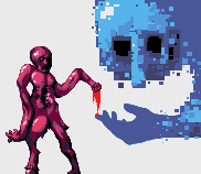
The second one there is the Preview image. I make reference to it and it's actually different is why I included it.
Here we go!

End Recording,
Ego.
1) I'm sorry the GPNW AP posts aren't here yet, I'm working on 'em! My mom's in a sling right now so I've been quite busy helping out with stuff.
2) In other RPG news I'm very excited to have my hands on this!:

3) In a nice coincidence, the PixelJoint Chatbox had an excellent discussion on evolution of style and the established styles and habits that have appeared over the years. The discussion has moved over to Pixelation as it's much more theory-based, and the thread is ongoing. It is fascinating and if you have interest in the style stuff I talked about last week, PLEASE check it out because these people are smarter than I am, or at least more experienced. And as Helm and Cure have pointed out, none of this is firm or formal really, but it is fascinating.
HERE IS THE LINK TO THAT THREAD
I'm also editing this into the end of last week's Lesson.
And now to today's PAL!
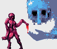
ssm's "Still Human"
Major Themes: Over-antialiasing, Picking the right Antialiasing color
The second one there is the Preview image. I make reference to it and it's actually different is why I included it.
So, let's put it out up front: I like this piece. It's very stylish and you could learn a lot by looking at the positive aspects of the piece. Also it's super-creative. Another thing to note is that this is a short as hell lesson, so I hope the padding up there and the Pixelation thread can tide you over.Artist's Comments:So long since my last pixel art, this is really just a pallete test, and I think it turned out well.
No reference... actually I really don't know what I just drew.
Here we go!
I really like this piece's creativity. Just the whole structure is very pleasant. I've got a couple issues though.
The desaturated blue that makes up the main color on the big hand is messing with me. In fact, the whole big hand is bugging me. The pose and the style is fine, but I think it's in the colors and the way you've anti-aliased it. See, the AA seems to be coming through an excessive amount, and is giving it almost a blurry edge rather than a crisp and smooth edge. I think this is from a bit of over-antialiasing, combined with the main color being too desaturated. The color is kinda hard to explain - it's not that a desaturated color is bad, but having a desaturated color anti-aliased by a more saturated color makes the AA color actually pop out more than the primary color. Highlighting those little edge spots makes the hand more poorly defined.
The solution there would be to make the AA on the hand less saturated (maybe not less than the hand, but less than it is), or to make the hand more saturated, which I think would be the better path.
I also think you could use less AA in general, defining it with the main color and only using the AA where things get jagged.
Here's some edits I did as an example: "Same AA/Shape, different color", "Same color, different AA/shape", "Both different".
Another couple comments would be that the middle section of the guy on the left is quite indistinct, I don't know what's going on there. Additionally, the preview is FAR worse than the actual image, each bump on the back of the hand is blurred out by the AA and it doesn't look refined.Well, I'm just gonna call that done for today. Later.
All in all though, great stuff in here.
End Recording,
Ego.
No comments :
Post a Comment