Tuesday, February 25, 2014

Avatar World: About Art


Been jamming to a lot of tNaF lately. Love them so much.

So the latest version of Avatar World is easily the best-looking version I've released. So I wanted to talk real quick about plans and troubles regarding the art of the game.

First off, while I'm willing to accept help with the art, I'm not seeking to use art by anyone else. I'm sure as hell not paying for art for a game I'm not planning to sell. So all of it is created by me. Additionally, you may have seen past works of mine where I do vectorization and art-creation out of stock art - that's how I did The Doppleganger after all. I do not plan to do that. All of the art will be mine, as well as any art donated to the project that I think fits.

Among these donations is the logo text.
This was provided by Michael Wight! It's great. It heavily inspired the font-shift from Kingthings Foundation to Edo SZ. I have no intention of trading it out for now.
I did, however, add to it.
That's sharp, and gets my point across very easily. This is a troubling image though! While I like it a lot in terms of style, this is the closest I've come to direct copyright infringement aside using the name Avatar and the word "bending." There's no wiggle room to say that I'm not directly representing Avatar the Last Airbender imagery. That's a problem should Nickelodean drop the hammer eventually.

The copyright imagery problem is playing itself up on my drawing board too. The most trouble of all is coming from the Airbender (big surprise...). See, the air-magic-user image isn't particularly stable in anything but Avatar. The problem is that the airbender aesthetic is the same as a monk aesthetic! Very little says "airbender" that doesn't also say "monk." So, given that I have a Monk playbook too, I'm against a wall. The closest I can get is to make the character actively airbending in the image, which is tough considering air is invisible. That's where the tornado image in the book comes from, it's a trial run. For the record, that won't be a final image - I'm pretty sure I'm gonna stick to the sharp black vector look, so that knocks it out.
There's one little visual cue that says "Airbender" exclusively that no other monk in the series has: arrow tattoos. Oops, those are undeniably indication of Avatar itself and not a slightly more generic Avatar-like world - aka those are copyright killers.
Similarly, there's a thing I'm avoiding in the waterbender image - furs. Those are a little on-the-nose. Even Katara/Sokka's warm-weather outfits are fair game, but I'm staying away from the fur parkas.

Something I haven't mentioned yet is other art to be present in the book, in theory. Here's a thing: I like pretty books. I like pictures in them. It makes my experience with a book better. There was some discussion about the purpose of art in RPG books on Story Games a bit ago, but since I enjoy art I'm gonna put it in.
But what to put in? That's tough. There's two types of image I have very little experience with that are critical: landscapes / backgrounds, and interactions. My art is usually just one person, floating in empty space, and that's dumb. It's good for playbook archetype images, but it's not good for my art as a whole, so I'm gonna try to put 'em in. That's hard though. It's also a slightly unnecessary step, in the vein that all the art other than the playbook images are unnecessary (even those are technically optional, but I've committed to them and even included space in the playbook layout for them, so they're sorta locked in right now).  So I want to at least start by filling in all these freakin' playbook images, but they're not all that easy. It's the concepting that's the hardest - I can persist and work at getting the art itself right, it's just finding out what I want. Posing and fashion are the hardest bits. I want 'em to be kinda dynamic, not just bein' there. I've had some ideas about the Aristocrat, the Firebender, and the Warrior, and I think I nailed down an Earthbender image finally (this one's been plaguing me). I had a Scholar image, but I've converted it to the MC Section header, which is a great place for it.
Hey, why not show off that Earthbender?
Obviously the colors are softened a bit (not straight black, not flat white) but that's easy to change. I'm feeling it, the style is very fitting with the MC section / scholar picture, which is my favorite.
I don't feel entirely solid about the fashion, but I wanted it simple, plus it's kinda vague still thanks to the style.
I even managed to get the "controlling earth" thing in, which I was struggling with intially - without it it's a bit hard to distinguish him from any old warrior. I focused on a deep and stable stance and strong gesture.

That ought to be good for today. Just wanted to give some insight to what I'm doing right now with regard to the art.

Sunday, February 23, 2014

Sunday Songs: Ke$ha - Warrior


I've backed off from using Ke$ha for over a year. It's one of those lines that I try not to cross for a couple reasons. While there's certainly an element of trying to hold myself at a certain level of "indie" credibility because of dumb priorities, it's more that she's one of those artists who really doesn't need any help promoting her work. She's on the radio all the time, anyone can find her stuff. But I'll be honest, that's an excuse for the first thing.
So, uh, fuck hipster elitism. Come enjoy some radio-style party rap.

In the time since I actually started listening to her, I've moved through stages of my opinion of Ke$ha's music. First stage was guilty love, then just straight up liking Warrior (the album) a lot, to not really being that into Animal to liking it as well (that's recent!). I will say that Warrior is eons ahead of Animal in terms of maturity, both from the themes and in the musical ability.
I initially heard Ke$ha through Tik Tok and Die Young on the radio, but it was C'mon that actually got me to pay attention. I have a soft spot for live-in-the-moment themes. I was gonna use that, but I thought I'd post up one of her overall stronger songs, up there with Supernatural and Love Into The Light. Wonderland and Past Lives are some of the best vocal work she's done, but I don't actually like them as much! And nothing from Animal ever even made it into consideration for this post.

Also, if you keep track, Ke$ha is one of the central stars in my Monsterhearts playlist.

Links:
From Warrior:
Die Young
C'mon
Thinking of You
Wherever You Are
Supernatural
All That Matters (The Beautiful Life)
Gold Trans Am
Out Alive

From Animal:
Your Love Is My Drug
TiK ToK
Take It Off
Kiss N Tell
Hungover (this is easily the strongest song she had on Warrior, though it doesn't have the pulsing energy of TiK ToK)
Backstabber
Dancing With Tears In My Eyes
Frenzy
Chain Reaction
We R Who We R
Cannibal (I heard this one first in a nightcore mix)

End Recording,
Ego.

Monday, February 17, 2014

Sunday Songs: Payday 2 - Master Plan


Thanks to Geop's anime pre-stream for informing me that the Payday 2 soundtrack is really good! The sort of thing I've been looking for recently.
Enjoy it!


(If you come back some time tomorrow there will be links here! I'm running behind)

(also eventually I will reveal the identity of SECRET PROJECT that has been appearing on twitter)

End Recording,
Ego.

Friday, February 14, 2014

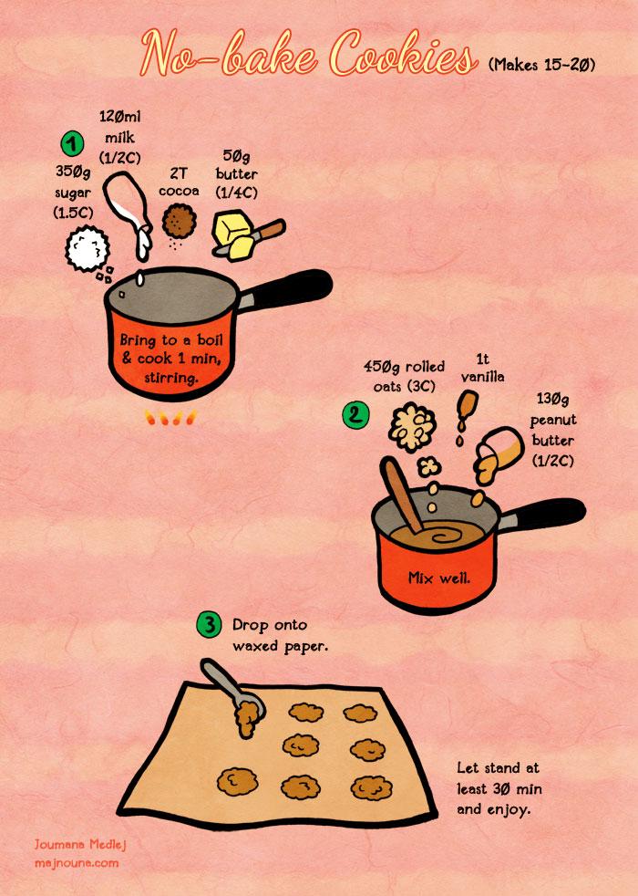
Cooking: Fast No-Bake Cookies for Valentine's Day!


Forgive my- wait, what? Against all odds, One Direction seems to have written and performed something that's actually pretty mature. I'm as leery of "That's What Makes You Beautiful" as the next person, but but this is a definite step up for them. They probably won't keep that up consistently, but it's nice to hear they've got it in 'em.

In a fit of inspiration and physics procrastination I decided last night around midnight to make some snacks for Valentine's Day! I don't do anything really for V-Day, but it felt suitably festive and I wanted some good vibes about doing something for a special occasion.
But it's midnight, I'm kind of afraid of the oven (not bad, but I rather not use it if I can help it), and I don't even know if we have any materials in the house, plus I did have physics to do.

Thankfully, I had just the recipe!
http://majnouna.deviantart.com/art/Quick-food-No-bake-cookies-432615208
Image and Recipe by Joumana Medlej of majnouna.com, check out all of her recipes HERE!
So Joumana Medlej makes this whole series of one-page "Quick Food" recipes, with a bunch of different ethnic foods in addition to more western fare, and they're all really cutely drawn. I love them, but this is the first one I've actually tried.

I did a few substitutions. Like I said, I wasn't sure if the house was stocked for this, but it turns out that the only scarcity-driven substitution was trading out the whole oats for Quaker Quick Oats, which are a smaller cut of oat so it provides a bit of a different texture.
I used Dark Cocoa, as that's what I found. I don't think it made a big difference.
I also substituted out the peanut butter, because I actually don't like peanut butter! In the comments on the recipe page, someone mentions just leaving it out, and someone idly posits if Nutella would work. Running on that idea of putting in something of the same consistency, I used a Banana-Chocolate Spread we got from World Market.
This stuff is actually really good.
It worked! Here's the result.
These are cookies, I swear. What else would they be?
They're pretty darn great! As the description on the dA page notes, they're quite sweet, and my substitute sure as heck had more sugar than peanut butter does. They aren't soft now that the chocolate has hardened, but they aren't hard like solid chocolate (I think the butter is responsible). They likely won't harden or go stale very quickly since they lack any of the usual stuff that leads to staleness. The recipe made 14 cookies which were slightly more than 2" in diameter and maybe 2cm tall at the middle, which are pretty big - I couldn't decide how many I wanted to make so I just went with this for an experiment. The banana taste from the spread is definitely present, which was surprising and actually quite tasty. Based on that, the peanut butter taste would probably have been decently prominent in the original.
And they really did only take about an hour from start to eating, and could be even faster if you actually know where stuff is and are comfortable working in your kitchen. I recommend trying 'em, and I think I'm gonna do another thing soon-ish. I need to get more comfortable cooking with heat (mild 'phobia' of getting burned), so these are nice for that.

Later folks, have a great V-Day.
End Recording,
Ego.

Wednesday, February 12, 2014

Avatar World: Version 1.3 Released (Plots/Threats, Revisions)


You know, I reviewed The Last of Us when I played it. I loved it. But I think that as time has passed and the little bits of dissatisfaction are forgotten it is rapidly becoming one of my best memories of a gaming experience. Much of that reflection and reminiscing of the game is the result of Santaolalla's soundtrack. Quiet. Brooding. Sad. Hopeful. I don't own The Last of Us - I'd rented it - but I think I'm going to have to. And as much as I am interested in seeing more of Ellie and Joel, I don't think a sequel should happen. But if it does, I'll be there to buy whatever console I need to play it, a level of anticipation only matched by Mirror's Edge 2.

I don't need to say much! Avatar World is progressing awesomely. This update doesn't do anything surprising conceptually, it's just fulfilling promises I've been making. Visually the game is updated some, with some art shifts and a nice-looking (to me) title page that will get  me in trouble if Nickelodean ever looks in here. The Basic Moves sheet is revised to actually be its own thing instead of just being an excerpt from the rules, there's an MC sheet now, and The Red Mountain got the format update to half-sheets. Many of the playbooks have had a move or two updated, as per the post I did a bit ago, though I left a couple of borderline moves alone.

Basically an unsurprising update that just makes things prettier and more usable.

So what comes next? Continued tweaks / revisions and sub-playbooks. The whole basic system is here now. I don't think I'm forgetting anything, and it feels solid. Also it looks great printed out into a saddle-stitched booklet form.
Basically I hope you're as excited about all this as I am.

Later folks!
End Recording,
Ego.

Monday, February 10, 2014

Sunday Songs: The Banner Saga - An Unblinking Eye


I haven't gone to bed so it's still Sunday.
I haven't played Banner Saga, but I quite enjoy its soundtrack! Wintory may not be hitting it quite as out-of-the-park as he did with Journey, but it's still a great listen.
I know it's a short song - I'll make it up to you folks later.

I'm tired, I have to get up soon, I haven't given a thorough enough listen to determine a link list. Later.
End Recording,
Ego.

Monday, February 3, 2014

Monday Songs: Pokemon B/W (remix by draze4blaze) - Entralink


Whoops, I'm off classes until Wednesday so I didn't even comprehend that yesterday was Sunday.
I have very little special to say here. Of all of the songs in the Pokemon Remix Project, which has some decent stuff, this was a standout piece. Browsing his channel, he's got some cool stuff. Enjoy it. Hope you like Pokemon music.

End Recording,
Ego.

Art Tutorial: Turning a Background into Transparency using Paths in GIMP


Very much enjoyed Bakemonogatari, though I've only finished the first season. It was weird and occasionally, um, leery, but generally very smart and interesting.

Well, a friend asked me to maybe teach her how to slice the background out of an image so you have a transparent-backed render. I figured, hell, why not just make it a thing for the blog in general? She can't be the only person who might want to do this.

For this tutorial, we will be using The GIMP, a free image-editing program with a steep learning curve but about as much potential power as Photoshop.
I will be listening to the Bakemonogatari, Kill La Kill, and Ghost in the Shell Stand Alone Complex soundtracks, plus CHVRCHES' album. Those are not required but are recommended.

For our purposes today, I will be extracting the background out from behind the beautiful and talented Elena Fisher, because she's an awesome character and can always use some more love.
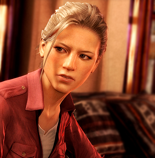

Looking pretty good there Elena. Thank you to Google Image Search for this. Also thanks to Naughty Dog for the character and game graphics, along with the rest of Uncharted 3.
Now let's look at our Toolbox.
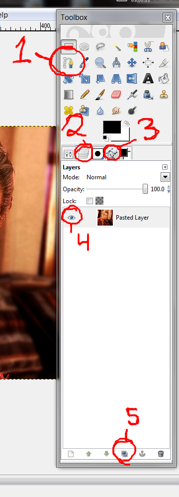

There are 5 objects labeled on that image.
1: This is the Pen tool, also called the Paths tool. It is the key to victory.
2: This is the layers tab. All of these little tabs do not appear by default - the only one that should be there by default is Tool Options. See that little arrow to the right side, the one pointing the left? On the image, the arrow is on the same row as the word "Layers". Click that, hover over the Add Tab option, and select Layers. Repeat the same procedure with Paths.
The Layers tab is important to setting up! It shows all of your current layers and allows you to do things with them. If there's one thing that puts MS Paint at the bottom of the stack of art programs, it's the program's inability to do layers.
3: This is the paths tab. I already explained how to get it. It shows all the paths you have currently created and lets you do things with them. We'll actually only need it briefly.
4: This little eyeball icon is a layer's visibility. Clicking on it will make the layer disappear! This is mostly only important for a back-up step of mine.
5: This is the duplicate layer button. It is also only necessary because of a back-up step.

In fact, let's do that back-up step. Regardless of what I plan to do with an image I'm manipulating, I like to keep a copy of the original in case I need it for something. You could of course just save another copy, but this keeps it close, and it's really easy.
In the layers tab, select your one layer, click the duplicate layer button. You should now have two layers, exactly the same. Now, click the eye next to the layer on the bottom, making it invisible. When you're done, it should look like this:
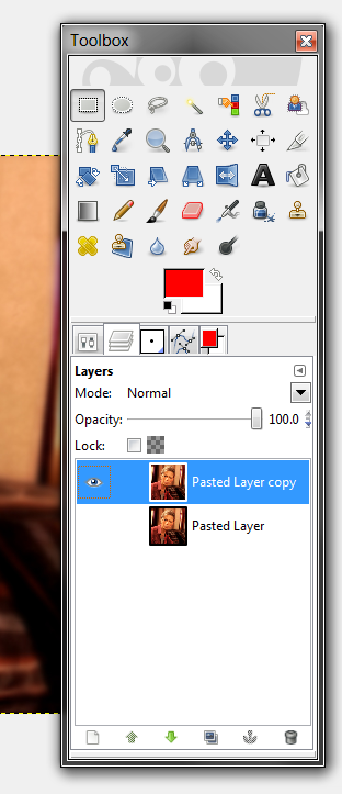

Now is a good time to save. Now, you can't quite save as a flat image file yet - you want to keep all those lovely layers. GIMP has a native file type called .xcf. Save your image as whatever_you_want.xcf.
Here's an important note: you cannot upload .xcfs to the internet as images. It has no idea what to do with them. Only GIMP understands how to open .xcf files.

Let's teach how to use the Paths tool. Select it. No need to follow along with what I'm doing here though, this is a demonstration.
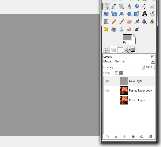
I've created an all-grey layer over Elena. Sorry Elena, we'll be seeing you again in a second!
Here's the basics of how the Paths tool functions. When you click the first time, you create a point.
Like this.
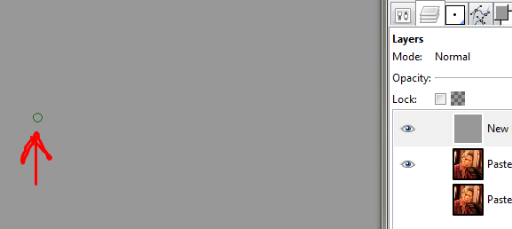
That's one point. Now I make a second point!
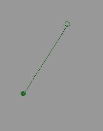
See how a straight "path" has been formed between them? Now I think I'll make a few more paths real quick... I'm going to be on the Paths tab now by the way.
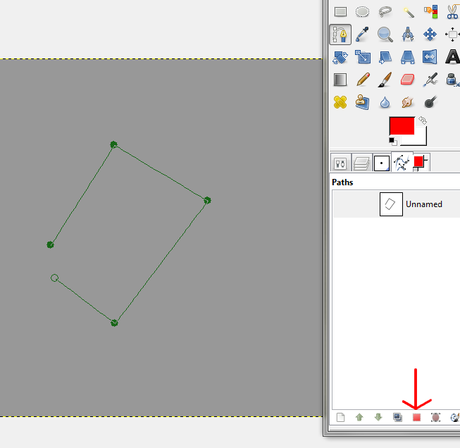
Now I have a bunch of lines in this path. See that box that I'm pointing at with a red arrow? That's the Path-To-Selection tool. It creates a selection, running along the path, connection from the first point to the last point and acting as if there was one more line connecting the first and last points.
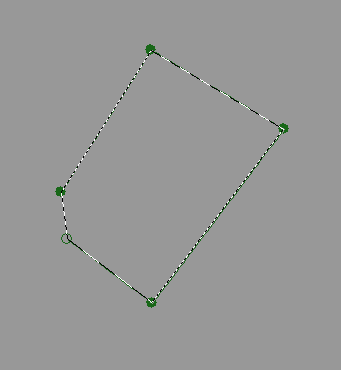
I clicked the button. The dotted line, which is animated in reality (I'm not high-quality enough to actually make a gif of it), indicates a selection. Until I end the selection, I can only effect inside the selection. I can do things like fill it with color:
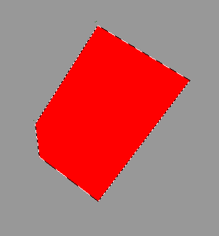
Or, critically, I can DELETE everything I currently have selected by, uh, clicking the delete button on my keyboard:
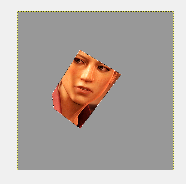
Hello Elena! When I clicked Delete, what technically happens is everything I "deleted" is converted to transparency. Because my duplicated Elena layer is still marked as visible, when I delete parts of this top gray layer, the lower layer shows through. If I delete elements of that duplicate Elena layer though it will turn to actual transparency, because there is no visible layers beneath it.
Let's show off the reasons I like using the Paths tool though.


What's the difference between the left and the right? The left was done with the paths tool using the above technique, while the one on the right was done with just the regular old eraser tool in like 5 seconds.
If it isn't popping out at you, look at the edges. On the paths tool, it looks like they're blending together a bit! But they can't be, they're on different layers, they don't interact! This happens because the very edges of the Paths Selection doesn't fully turn to transparency. Instead, they leave the very edges in a state of PARTIAL transparency, allowing a bit of it to show through. This is why I like Paths, they make a super-smooth look. And because it's NOT blending but partial transparency, it means it will blend that way with anything you put under it.

The other thing the Paths tool excels at is curves. Let's fill in the canvas with grey again and place two points just by clicking.
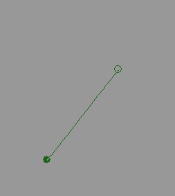
Now, I could place a third point the same way, but let's do something slightly different. Instead of just clicking, I'm going to click and hold it and then drag off to the side, THEN unpress.
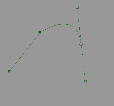
Woah! A curve. I pulled it downward, and where the little box on the bottom is is where I let go. The top box always moves in the exact opposite direction of where I move the mouse while holding it in that initial pull. Now I can click and drag that top box around to CHANGE the curve. Here's a couple.

So, that other box doesn't change. What is it for? It impacts the next curve in a sequence. Here, look at this:
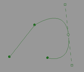
That's the original path (the first one there, all alone) when I made a new point. Important to know is that I did NOT hold and drag that one! If I had made that path off of, say, the first point, it would be straight. All the effect is from the bottom box, the previous curve informing this line. Let's move that bottom box around a little.
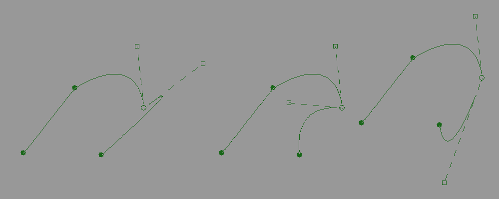
Moving it around only affects the next curve, not the previous one. So the two boxes let you influence the curves on either side of the point. Messing around with them gives you all sorts of control over your curves. Experiment a little to get a feel for it!
Now let's stop messing around in this grey layer. I'm gonna delete it and look at Elena some more.

Alright. So I'm going to zoom all the way in on the image and move over to where I'm starting, at the spot where her shoulder goes off the edge of the image. Make your first point at the very edge. Heck, maybe even put it a little over the edge of the image.
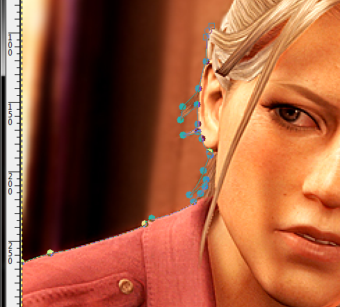
Here's me as I'm working along the side of her head, zoomed out a bit. Pull out those little boxes and move them around to make the curves match the image as you go, and know that whenever you want a sharp turn, take the box that affects the next curve and place it on top of the point - it won't have an impact. Don't worry about it being absolutely perfectly matching every little curve - too many little dips might be accuracte, but will cause a rougher line. I like to avoid having any straight lines if I can, I find they don't match well.
Hair is one of the hardest bits to do because of all the loose strands and layering and it's a complicated visual tangle. Use your best judgement to decide which bits to pick out. I'm serious, hair is one of the hardest parts of any render.
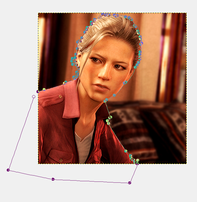
When I hit the edges I usually just go wide around it. They don't matter.
So select the image with that Path-To-Selection button! You might notice that we have a slight issue - if you hit the delete button, you delete Elena and leave the background! That's the opposite of what we want. And so, once Elena is selected, let's Invert the selection. You can do this by going to Select -> Invert, or by pressing Ctrl+I. Then hit delete.
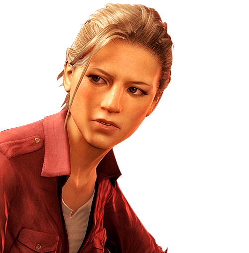
I checked it over a whole bunch of backgrounds and it looks pretty good in them! Of course, this isn't perfect. I did it in 5 minutes after all. But it's passable, and it's not all messed up, and if it's shrunk down for an avatar or something it'll look great.

So let's talk about troubleshooting real quick.
Your go-to fix is Ctrl-Z or Edit -> Undo. GIMP's limit of undos is super high.
If you change your tool off of the Paths tool by accident, it looks like your path disappeared! But don't panic, it's not gone. Select your Paths tool again. Now go to the Paths Tab in your Toolbox, and you should see it there! Remember how those eyeballs mean visible? Well, your path is currently invisible. Click on the left of the path you want (if you get a chain, try a little further left). You should now see the line of the path on your image. If you click that line with the paths tool, your points should reappear. Just remember later to make the path invisible again or the image won't look right later.

And just as a bonus, I messed around with the colors of the final image. That scene in the game had HEAVY red and yellow lighting, I wanted to tone it down a little into a more toned-down image.

Colors like that, she could jump right in with her voice-actress sister over in Haven. (I love you Emily Rose)

Hope you learned something. It takes some practice, but this is a pretty strong technique for extracting stuff due to the versatile shapes of paths and their sharp-yet-smooth edges. I make most of my digital art with paths these days.
Later folks.
End Recording,
Ego.