Sunday, May 26, 2013

Sunday Songs: Uncharted 2 - The Road To Shambhala

http://www.youtube.com/watch?v=jT0jWD-WbOA&feature=player_embedded
Sorry for missing yesterday's Pixel Art Lesson, we're residing the back of the house and it is exhausting work and I didn't already have something prepped. Hey, I've gone 11 weeks without missing it at all, that's pretty good! And pretty surprising that I've been going with those for THREE MONTHS. Hasn't felt it. 'Course, it hasn't felt like I've done half a year of Sunday Songs either.
Anyway, today we have Uncharted. Specifically, this song is from Uncharted 2, but I don't think it's actually very representative of the actual musical style of the series, I just like the song. I'm incredibly familiar with the first two games through Chip And Ironicus's Let's Plays, and I beat the third myself not long ago in a single marathon session. It was great.
As a whole, the series moves between having a very orchestral sound and having a more ethnic-inspired sound, using a certain guitar in particular across the series to evoke some of that feeling (the first link with it is Unlocking The Past, but it's in several). I was gonna show Nate's Theme 3.0 today, but when I saw the length I decided to go with this song instead.

The games are great. Must-haves for PS3 owners, and their soundtracks are all worth listening to. The lovely Azam Ali helped with several of the songs on U3, and most of it is composed by Greg Edmonson, who was also the composer for Firefly!

Links:
Uncharted
Nate's Theme
Uncharted Island
Unlocking The Past
Sanctuary
Eldorado Megamix (DJ Shadow)

Uncharted 2
Nate's Theme 2.0
Bustin' Chops
The Heist
Urban Warfare
The City's Secret
Fightin' Time
Broken Paradise, Part 2

Uncharted 3
Nate's Theme 3.0
Atlantis of the Sands
Boarding Party
The Caravan

Later folks.
End Recording,
Ego.

Monday, May 20, 2013

Monday Songs: Bit.Trip Runner 2 - Theme

Sorry for lateness on everything - it's finals week.
http://www.youtube.com/watch?v=E3iaVdBAArk&feature=player_embedded
At 9:50 this morning, I was stuck in internal debate. The sale on Bit.Trip Runner 2 would end in 10 minutes, and I desperately wanted the game. But I've been shelling out quite a bit of cash lately (90 for my Go Play NW tickets just a few days ago), so I wasn't sure I wanted to blow the money. I let impulse take over and I bought it.
An hour after starting, I can firmly say it was TOTALLY WORTH IT. This is a fucking awesome game by awesome people. I miss the pixelly goodness, and the art direction is a maybe a little too weird for my taste at times, but it plays super solid. Not as hard as the original though - Odyssey may have been brutal for a World 1 level, but it was oh-so-satisfying to beat it.

Links:
Welkin Wonderland
Cloud Titans
Welcome To Brine Time
The Supernature
BIT.TRIP
Frank Engage (feat. Disasterpiece)
Credits
Blue of the Brine (Remix)

End Recording,
Ego.

Sunday, May 19, 2013

Pixel Art Lesson: isatche's "Spece Ship" (Small Palette Color Selection)

http://www.youtube.com/watch?v=GNml9OtE1vM&feature=player_embedded
Chip and Ironicus started their Metal Gear Rising Let's Play today, and from the first 15 minutes I want to get the game SO BADLY. That Ray fight is SO. FUCKING. RAD. This is Locked and Loaded, he original version of Rules of Nature. Personally, I actually prefer L&L. They're both awesome though. God that game looks so amazing.

Sorry for the delay until now, I had friends over later than I expected to last night. Unlike last time I ran late with the PAL, this isn't a schedule change, I'm still usually gonna update on Saturdays.

But right to posting!

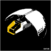
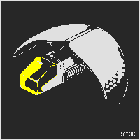
isatche's "Spece Ship"

Major Themes: Color Selection on Low Color Pieces, Working in a High-Contrast Environment

This is my submission to Pixel Art Challenge: Spaceships!
3 colors.
200x200px canvas
This is, obviously, a challenge entry. Unlike some of the other challenge entries I've featured lately, this was a wide-open challenge. The restrictions were to make an isometric space ship with 25 colors or less. Isometric is a perspective used for some pixel art. While most pixel art is head-on, isometric means that it's facing a sort of diagonal angle. It's not actually entirely relevant to this lesson cuz I don't want to do a lot of explaining about isometrics right now - I might be doing another lesson later on doing isometric stuff, but for now it's enough to know that games like Final Fantasy Tactics and Luminous Arc are examples of 2:1 isometry (by far the most common, and the type used here) while games like Boktai use the much rarer 1:1 isometry. But that's another day's lesson, the artist doesn't have a problem with understanding isometrics.
Also, he knows he misspelled "Space" in the title. He's from Belgrade, it happens. I do a llot of foreigners, don't I?

I kinda agree with Sertkaya that unless you told me it was a space ship I wouldn't have read it that way. However, knowing that it IS a space ship, I'm quite fond of it, it has some really interesting elements to the design, such as the circular pattern on the wings. Tackling this higher color-count challenge with 3 colors is also a cool way to stand out.
However, I'm not entirely sure you've made the most of the idea pixel-wise. My pixel issues with the piece revolve around three ideas:
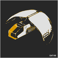
1) Colors. Not your color count - I wouldn't dare suggest violating the simplicity of the piece by adding more - but the exact colors you've chosen are a bit problematic. I would suggest you don't use pure black and pure white, as they are extremely strong colors that eat up the colors around them. Using a very dark gray and a very light gray, close to black and white but not quite there, might make the image softer on the eyes without losing its pop-out power. HERE'S AN EXAMPLE OF THAT.
So I want to elaborate on that. See, having high contrast over large regions can have two problematic effects, depending on where the contrast comes from. If the contrast comes from a saturation disparity (perhaps aided by hue but not necessarily), you have a good probability of one of the colors overwhelming the other and making the line indistinct. We've seen this sort of thing before when I discussed "eye burn" with YellowLemon's piece. However, if the barrier is caused by a high value difference, you get the opposite symptom - the line is incredible distinct, and any irregularities in the line will be very obvious. This piece has that one. There are three paths to solving it: first, you could lower the contrast. With this few colors, you can get that stark look with less contrast, especially with near-black and near-white (cuz 100% black and white are bad ideas usually anyway since they both act like high-saturation colors even though they have 0 saturation). Second, you can try to refine your irregular lines into smooth curves, but that's often very difficult. Third, you can make the curve smoother with AA, and the intermediary color reduces the contrast a bit so the problems are less noticeable. Trouble is it might mean altering your palette to get an AA color, and it might even mean upping the color count.
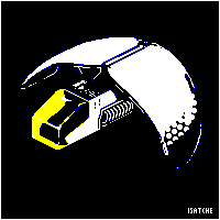
Additionally, consider the contrast between the yellow and the white. As it stands, on areas of the transparent yellow glass where you have white shines, much of it isn't particularly visible because of how bright the yellow is. Toning the glass a little darker is a possibility, as is shifting it to be slightly more orange, which would allow it to be just as bold while still letting the white shine through. HERE IS AN EXAMPLE OF THAT.
Best solution is to mix the two by the way, dropping both the black/white into grays and the yellow to orange. That's what I later go with.
2) Anti-aliasing and unrefined curves. A lot of the piece relies upon the perfection of the curves as they have no anti-aliasing to ease the transition from black to white. Especially visible on the wings, this makes all the little jagged bits apparent. However, you avoid using the yellow color anywhere else on the piece when you could actually use it all over as an anti-aliasing color. Yes, that would place a slight color inside of the rest of the ship, but the benefit from the cleanliness of the lines would overcome it in my opinion. If you choose to not change the black and white to slightly softer grays, you could really benefit from anti-aliasing with your color, and if you DO change your color (to either darker yellow or orange or whatever) it'll probably work even better as an anti-aliasing color. HERE'S AN IMAGE POINTING OUT SOME SPOTS THAT COULD USE SOME WORK.

I try to do this type of image over an actual edit nowadays. That didn't keep me from DOING an edit, but this is the most helpful thing I did I think, along with actually explaining stuff.
3) Banding. Also pointed out in that image at the end of point two are some trouble spots regarding banding. If you don't know, banding is a circumstance where you have two lines of pixels of the same shape but different colors exactly hugging each other, and it makes a piece look fuzzy and indistinct. To save post space, I'm LINKING TO WHERE I'VE DISCUSSED AND DEFINED BANDING BEFORE. You have some places where banding is particularly strong, and the piece could benefit if those were cleaned up.
While writing this, I've been editing your piece to show how it COULD look with some more work sunk into it. HERE'S WHAT I ENDED UP WITH.
 That's what I would do. I think it looks pretty snazzy myself.
You have a couple days left before the deadline, so you could have a really refined piece with a bit more work! This is a great start and I'd love to see if you do any more with it. Good luck in the challenge either way!
(also if you want you can change the title to fix the spelling if you use the "Edit It" button on this page)
 He replied:
Wow Ego, you made it look truly amazing!
Thank you very much for the detailed analysis, tips and comparison, really appreciate it.
As for refining and resubmitting the work, the very best I could do would end up looking like the one you did. So I will leave it like this, and apply your advices in the next work or competition.
Thank you.
 And I replied back:
No problem man, I love doing this stuff. Glad I could be of help!
I would still say it's probably worth it to try out editing it yourself - even if primarily inspired by my edit,  you'll always add some of your own personal flair. I know I can see my own flair in my edit (tapering the color near the back of the left wing, shape of the shine on the top of the cockpit). Trying it yourself is always worth a shot :3. That said, taking the information into the future is the most important thing really.
This is why I'm realizing I should edit less. I mean, I have personal flair of my own, and the entire purpose of teaching through critique rather than by example is so that the subject doesn't start picking up the style of the tutorial-writer. Picking up MY style defeats the purpose, it still stifles stylistic exploration and creativity. Maybe I'll try to keep these to myself in the future.
Nice work, and seriously, anytime.
Oh, and ultimaodin has a good idea for if you were to add a fourth color, using a darkker complimentary color can give you a really neat look as well. Personally I would have used purple over blue with yellow since it's directly across the color wheel and would amp up the brightness of the color, but blue is also an excellent idea - my choice is mostly just taste.
Looking forward to seeing more cool stuff from you in the future man!
For reference, here's the image ultimaodin proposed:
I'm down for that too! Required an additional color, but has interesting effect of making the yellow pop even more and still giving the AA benefit.
Later folks. Sunday Songs up tonight.
End Recording,
Ego.

Friday, May 17, 2013

Schoolwork: Essay on the First Crusade as a Religious Experience

http://www.youtube.com/watch?v=dPNhSzuxNwQ&feature=player_embedded
Well, Assassin's Creed 1 is actually the third crusade, but it's Jerusalem and the middle east and a crusade, so close enough thematically. Plus it's a great song by a great musician (Jesper Kyd).

It's essay-posting time!

Today I have my final History essay from my class The Middle Ages. For this essay, I focused on the First Crusade. We were given several essay prompts and allowed to choose which on to write toward. One was about the Investiture Controversy, several were about the letters between Abelard and Heloise, and there was an option to create a question of my own. I picked the last remaining prompt, about Jonathan Riley Smith's argument about the First Crusade being a religious experience rather than a politically motivated one like had been previously suggested. Here is the prompt:
According to Jonathan Riley Smith, how was the First Crusade a religious experience for the Europeans that participated in it? What aspects of the pope’s message appealed to lay people (Chapters 1 & 2), how did the message influence piety and an interpretation of events along the way (Chapter 3), and shape religious thinking as the crusaders reflected on their journey (Chapter 4)? To answer this question, do not offer a chronology of the First Crusade, but instead discuss what you see as important aspects of crusade piety for the knights and regular people who walked to the Holy Land, including their thoughts about pilgrimage, saints and relics, scripture, visions, miracles, martyrdom, and/or divine providence.
Overall, I'm pretty happy with the essay. It's not as superbly in-depth as my Beowulf essay, but 'm still proud of it.

As usual, this is my essay, made available so I can potentially receive feedback and to help others learn what I'm learning myself. I'm no expert, so seriously, none of the would-be paper thieves out there should use or even cite this. Still, I think I learned a lot to be able to write the essay, and hopefully you learn something too!
And if you know something about the subject, let me know if I got something right/wrong, or if you have interesting insights or thoughts about it! Same with folks who know things about writing essays! And I do love hearing when just other regular folks get some education out of my work.


Max Hervieux
The Middle Ages – First Crusade Essay
Word Count: 1947
Late in the year 1095, Pope Urban II appeared before the people of Clermont to preach the idea of a great endeavor. There we announced his intention to organize a host of warriors to trek to the Holy Land and rescue their endangered Eastern Christian brethren, and while there liberate the greatest of earthly relics, the City of Jerusalem, from the Muslims who occupied it. The call was pushed hard, and troops were organized. However, some scholars believed that Pope Urban II had non-religious reasons to go. Many suspected that the Pope was trying to channel the destructive local knights against enemies of the church. However, a modern scholar named Jonathan Riley-Smith presented a case for a religiously-motivated crusade that changed the face of First Crusade research. To the pilgrims on the First Crusade, religion was the driving force, motivating, invigorating, and affecting their behavior throughout their journey.
Urban II planned his pitch for the idea of a Crusade very carefully, crafting it to appeal directly to the audience he wanted to take up the Crusade. Despite the incredible response that the Pope's message created, the idea wasn't quite as revolutionary as one might believe. Ideas about holy war, and war instigated by the papacy, are nothing new1, but Urban's tact was different from earlier war propaganda. For one, the language used in communications was, “in comparison relatively restrained.”2 In fact, the idea of going to war on the authority of Jesus Christ himself “was originally introduced in a conventional, even a muffled, way.”3 The idea of a holy war may have been nothing new, but Urban made a smart move by downplaying the Crusade's significance as an act of war and instead “preached the crusade at Clermont as a pilgrimage and many of the measures he took brought it into line with pilgrimage practices.”4 A quest of religion, rather than an expedition of war, was a somewhat new approach to riling up the lay people, and with the recent resurgence in faith across Europe the call fell on ears eager for action. At the same time, the knightly aristocracy across the continent was embroiled in petty squabbling, with well-armed and well-trained castellans raiding territories before retreating to their keeps. These knights were itching for battle, and the Pope provided an non-Christian outlet for their violence. The Pope was willing to permit such incredible violence despite potential arguments of pacifism based upon the writings of St. Augustine. Augustine is considered the originator of Just War Theory, the idea that violence can be justified, even religiously so. “To Augustine the intentions of those who authorized violence and those who participated in it had to be in favour of justice, which worked through love of God and one's neighbor.”5 In Urban's estimation, the situation in the Middle East, both concerning the recovery of Jerusalem and rescue of the Eastern Christians allowed the Crusade to be considered a just war, and the backing from such an important saint reinforced his decisions with the people. Perhaps the most important idea that Urban infused into his message was the language of indulgences, granting crusaders penance for all their sins. The crusaders “believed that participation in the crusade would 'remit sins' and help save a man's soul.”6 Again, however, Urban's indulgence “was fairly conventional, even a little old-fashioned.”7 And it wasn't unconditional either, requiring that only “whoever for devotion only, not to gain honour or money, goes to Jerusalem to liberate the Church of God can substitute this journey for all penance,”8 The corrupt and greedy were restrained in their benefits, with the Pope only trying to draw in the religiously-minded. Of course, there would be materialists who would come, but it would be “hard to believe that most crusaders were motivated by crude materialism.”9 It's obvious how Urban's message was perfectly crafted to appeal to the community of the day, targeting the rising zeal of the people and setting their sights on the publicly-revered Holy City of Jerusalem.
What the Pope didn't expect was the sheer volume of response he would receive from the common people. Urban had planned for the knightly aristocracy to join the crusade, but wasn't prepared for the lay people to respond with such fervor. It's true that the Christian world was experiencing a surge of enthusiasm, but if Urban's message wasn't tailored for them (and we've now seen how carefully Urban designed his message) then something else must have inspired them to act. Sure enough, several aspects outside of the Pope's control served to stir up the common people. First was “the way nature foretold the liberation of Jerusalem.”10 There were “great earthquakes,” “pestilences,” “famines” and “terrors”11 preceding the Crusaders' outset from Europe. There was an eclipse of the moon “during which it turned red,” described as when for a “short period half the sky turned the colour of blood.”12 Twice more in 1098 the sky turned red, and again in 1099 “another red aurora filled the eastern sky.”13 These portents were seen as signs from God that the Crusaders would take Jerusalem, although some earlier events (such as a meteor shower half a year before the speech at Clermont) only were considered signs of such in hindsight. These signs, to the superstitious Christians, wrapped the Crusade in a “magical penumbra”14, seeming to reveal God's approval and desire for Urban's Crusade. Additionally, the French had been experiencing a severe drought that was several years long.15 The drought had resulted in multiple awful harvests, followed by famines, and the French reacted very well to the idea of leaving on a journey. Fortunately for the people of France, the drought ended in 1096 before the Crusaders had set out in force, but the preparations had already been made and they couldn't back out.
One of the most bizarre reasons that the people responded so well was a wealth of visions that struck people in the wake of papal visits. At the time, a great many people were blessed with grand visions, usually of religious figures. We can't completely rule out divine guidance, but the far more likely cause of the visions was the outbreaks of ergotism that were in the area at the time. Ergotism is “an unpleasant disease that was caused by eating bread made from mouldy rye. Epidemics in France often resulted in mass pilgrimages.”16 The theme of visions, however, continued throughout the entire Crusade. Many people, such as Peter the Hermit, were charismatic individuals who claimed to have experienced visions of the divine in various forms. There was hysteria whipped up by these “demagogue” figures, dragging many people together to join the crusade force.17 The people were also surprisingly obsessive over Jerusalem, and bursts of Millenarianism came up in conversation, but ultimately it's hard to believe “that hysteria affected more than a minority of crusaders.”18 Between the natural world acting up in coincidence with Urban's message and the emergence of powerful demagogues, in addition to the already-noted increase in religious zeal throughout Europe, reveals just how much of an impact religion had as a motivating force for the crusaders.
Even aside from being a motivating force, religion continued to affect the minds of the entire force during the First Crusade. For almost all of the crusaders, religion was very core to their being, and its impact was often incredibly inspiring and invigorating. The natural disasters that happened during both before and during the crusades often drew crusaders to new heights of activity. Before heading out on the journey, many, even the infamous castellans, devoted much material wealth to religious houses, hoping to both renounce the world and to appeal to God for success.19 Before battles they heard sermons and gave confession to cleanse and excite their spirits, and some sermons in particular, such as the large number given on the Mount of Olives (from a variety of individuals, including Arnulf of Chocques and Peter the Hermit).20 The most extraordinary acts of inspiration were driven by the discovery of relics. The acquisition of the Holy Lance (allegedly - many doubters existed21) led the besieged crusaders at Antioch to go on the offensive, and successfully repelled the enemy's forces. So great was the excitement over the Lance that wild rumors began circulating around the crusader encampment about such things as the papal legate personally bearing the Holy Lance or there being no injuries in the vicinity of the Lance, or one about an army of angels and ghosts aiding the knights.22 Along with the Lance, the Crusaders eventually recovered the relic known as the True Cross23, which was carried at the vanguard of each following battle. The very sight of the relic became a source of spiritual invigoration for the warriors, and the role of this and many other relics played a heavy role in the crusaders' lives on the march.24
Another major influence of religion on the crusaders' behavior was to drive them to make spontaneous decisions based on faith. Indeed, often these decisions were dreadfully unwise for the crusaders in a practical sense, but they were convinced they were spiritually justified or even mandated. Countless cases of looting and plundering of local land and towns was sometimes driven by practical needs25, but there were cases where the force made its assaults with their faith as not just justification but reason. Among the most shameful of these acts for the Church was performed before the force even got out of Europe – assaults on native Jewish populations. The crusaders, overcome with zeal, starting lumping in the Jews with their Muslim targets, taking out their anger over the betrayal of Jesus.26 The attacks were perpetrated with the intent to convert the Jews, rather than looting their territory, and the knights were not above using force to incite conversion.27 The later sack of Jerusalem as they breached the walls was terrifying in its brutality, and was driven as much by religious fury at those who they considered to have stolen Jerusalem from them as it was by desperate elation after the hardships of the march. Other faith-based decisions included fasting immediately before combat, to the extent that “one wonders how they managed to fight at all.”28 Faith also motivated actions such as the theft of St. George's arm from its reliquary.29
Religion played an enormous part in the crusaders' attitude and actions from the very beginning of the crusade to the very end. Despite Pope Urban II's precisely-targeted speeches meant to call upon the knighthood, the religious resurgence of Europe, in combination with other incidents beyond his control created a crusading fervor that motivated the soldiers for years of grueling marching and fighting. The entire force was changed by the religious attitude in the air, and many even returned with a brand-new religious frame of mind.30 In the end, religion cannot be ignored as an extremely significant aspect of the crusading psyche.
1Jonathan Riley-Smith, The First Crusade and the Idea of Crusading, (Philadelphia: University of Pennsylvania Press, 1986), 16.
2Ibid.
3Ibid. p.17
4Ibid. p.22
5Ibid. p.27
6Ibid. p.28
7Ibid. p.29
8Ibid.
9Ibid. p.47
10Ibid. p.33
11Ibid.
12Ibid.
13Ibid. p.34
14Ibid. p.33
15Ibid. p.34
16Ibid. p.35
17Ibid. p.34
18Ibid. p.35
19Ibid. p.36
20Ibid. p.82
21Ibid. p.96
22Ibid.
23Ibid. p.98
24Ibid. p.93
25Ibid. p.63
26Ibid. p.50
27Ibid. p.53
28Ibid. p.85
29Ibid. p.94
30Ibid. p.121

There. Hope you enjoyed it!
End Recording,
Ego.

Monday, May 13, 2013

Sunday (Monday?) Songs: tyDi feat. Sarah Howells - When I Go

SUNDAY SONGS: TYDI FEAT. SARAH HOWELLS - WHEN I GO
http://www.youtube.com/watch?v=3lsOM86WS-I&feature=player_embedded
This is the opening track to the latest episode of Vocal Trance Is Life, Episode 43. TiL is a vocal trance podcast that does a compilation mix approximately every month putting together the best stuff since the last update. They run about two hours, and are some of the best put-together compilation mixes around.

Episode 43 is amazing. My new second favorite after 38, beating and pushing 29 into third.

http://www.tranceislife.com/

End Recording,
Ego.

Monsterhearts: A Powerful Experience at Fabulous Replacement

http://www.youtube.com/watch?v=TGx0rApSk6w&feature=player_embedded
Sorry folks, a little dance-pop/house won't kill ya. I'm not a regular OneRepublic fan, but I enjoy a few of their songs. This one accompanied me back home from FabuRepla yesterday while I was thinking about this stuff.

NOTE: I talk about emotions and personal stuff, no hard content here today.

So this weekend I was at Fabulous Replacement. See, last year there was this Story Game con called Fabricated Realities (FabReal) that happened right before Go Play NW over in Olympia. I wasn't there, but I heard all the cool things about it at GPNW, and I wanted to go this year. Unfortunately, they couldn't secure a venue, so FabReal didn't quite happen. However, instead, Ross held Fabulous Replacement (FabRepla), a free three-day con at his house in Olympia. It was totally rad. I only went on Friday and Sunday (I was sick on Saturday D: ), but I loved every minute I was there.

* On Friday I played Montsegur 1244, a historical game about the last of the Cathars during the Albigensian Crusade. I've wanted to play this since I heard someone run it at GPNW - I was satisfied with the other stuff I played, but it stuck in my mind as one of the two that slipped through my fingers (the other was Silver and White, which is still oustanding). Very interesting experience. I'm way into Crusades stuff, and I already knew about the story of their destruction, but learning more specifically about their beliefs was fascinating.
* Later on Friday, for the night slot, I was FINALLY a player of Apocalypse World. I've run several sessions, I've played a bunch of hacks, but I've never been on the player side of ApW, and I've wanted to for over a year. I got to be the Quarantine too! That was the one I've wanted to be since the very beginning. I played an optimist, he was kind and helpful and enthusiastic while surrounded by nihilists and survivors. He was great - adorable, exploitable, annoyingly friendly.
* Sunday I got there and while I got there too late to play, I listened to almost a whole session of Fedora Noir, Morgan's game. I've been looking for a noir game for Dan for a while now, and you know what? THIS is the one I want to show once the beta goes public.

And then there was Monsterhearts.
This is not a full AP. I just want to talk about how the game fully meshed for me at last. Now, I've loved MH since the beginning, since I bought it at GPNW, since I played in September, since Joe ran it, since I wrote The Doppleganger. But it wasn't until last night that I think it really clicked into its perfect gear. I want to talk about how it did that and how that's affecting me.

Ross was running the game. The characters were Jacqueline The Queen, Lucca The Witch, Mara The Ghoul, and my character, Logan The Infernal. Logan isn't really all that weird - he's a sophomore, an average kind of guy who owes a pile of money to Lucca from a loan he used to buy his guitar. He likes The Matrix. Then over the summer he was Chosen by Salazar The Emissary who started feeding him visions of the Apocalypse. He hadn't asked much, and helped out Logan, so he was pretty happy actually, though he's worried about the future cuz the Apocalypse could come whenever.
Lucca's pretty normal too. She's got some magic under her, but she's usually just a rich girl who hangs out with her friend. There's this rumor going around that Logan's into her - the rumor was Mara's fault, she was just trying to make trouble (this was a condition that was inflicted upon Logan by Mara).
Speaking of Mara, Mara IS weird. She's dead, and she's completely okay with telling people that to cause Chaos, which she craves. She's missing an eye, you can visibly see that she's stitched together, and she's being a 15 year old sophomore for the second time now. Mara isn't relevant to my story though.

See,  we went through the game as normal for the first half. During the break, I was sitting there thinking about how things were going, and I realized I was falling into the same pit my Hollow did - non-interaction. I was spending a lot of time on my own, I wasn't feeling like I was ending up in scenes with the others. I mean, they were there, but nothing serious. I'd rolled like one time as well, I wasn't at the big action areas, and cuz I was regular guy I was kinda avoiding conflict (plus contacting Salazar didn't need rolls). I realized that I had to switch something up.

So I made the rumor true.

Logan actually did like Lucca. We hung out sometimes, we worked on projects on occasion, and we both spent time after hours in the library reading some of the really old masonic tomes (the librarian is still a mason actually - this was relevant to the plot but not my story here). And I decided to push this angle.
So Logan was at the library with her afterward, and when she left Logan was, um, elsewhere handling something for Salazar. When he got back, he chased after her, made lame excuses, and ended up walking back with her. Logan asked her if she was doing anything later - she wasn't, and gave him her number to call later.
Logan went back home and did Salazar things but ended up really stressing about what to do with Lucca. Okay, actually, I haven't a clue how much Logan stressed - I did. Ross pushed hard at my ambiguity/hesitation. I ended up with an alternative band show that was happening in the woods that night (the woods were a major location consistently). Called her up, let her know, we were to meet at The Gap (a clearing by the school that connects to the woods) in 20 minutes.
She, uh, took an hour. Well, whatever. There was trouble, she hexed a man within an inch of his life, she's got some leeway from a mild guy like Logan. They got along, and ended up meeting up with Mara, and Logan got this demand from Salazar to IMMEDIATELY go to the library and get the librarian's ring (long story...). He said he'd watch over Lucca, as long as I did it...
So I took Lucca and Mara with me. I convinced them to come with me and they did. Once there, I grabbed the guy's ring (he was already dead - like I said, long story) where I nonchalantly revealed that I was doing this for my demon. This actually wasn't that weird - Lucca had openly done magic in front of me (and screwed in Mara's eye for her with me watching as well), and Mara is very frank and open about being a walking corpse. Wasn't a smart move for Logan to admit he probably wasn't even the weirdest one there, leading eventually to Lucca asking why he'd asked her out and Logan confessing that he really really liked her!
More happened, in the end Logan chooses not to cause the Apocalypse but is swallowed into hell as the closing moment.

That sounds like what you'd expect from Monsterhearts, right? Well, I've not quite played that way before. And it has a particular emotional resonance from me. I've never dated, never had a girlfriend. No comments on that - for the most part, it's my choice. However, through high school's junior year, I had this enormous crush on a gal, and mostly out of abject fear of rejection (in addition to excessive rationalization of said fear) I never acted on it at all. I'm over the girl, but the fact that I didn't do anything still bugs me, mostly cuz I fear I'll be paralyzed into inaction in the future as well. Going back into this high school setting as a character who I already identified a bit with (more about social status than hobbies :/) and playing through that has been, I dunno, emotionally liberating I guess. I didn't really notice it at the time, only during some later reflection on the game.

What I mean by how the game really meshed for me was that I focused not on the Monster side of things but on the Teenager side. I hadn't really done that. I did it a bit with Cage, but the monster took over pretty fast, and I also focused on Adam's former demonhood over his teen-ness. This time, my demonic patron was really just flavor and the plot motivator, I spent most of my time just navigating high school. This was also the first time I really tried to push the Hot stat, despite a -1 in it. But really, it's just having that emotional resonance that really reminds me personally of my own high school experience is something I think the game is almost uniquely equipped to provide.

So thanks Joe for making this awesome game. Thanks Ross for hosting the con and running the game and pushing me into really going for it (even if you didn't know that's what you were doing). And special thanks to Maggie for playing Lucca and going along with things and for playing in such a manner that I felt comfortable doing a thing I had trouble with in real life.

I'm very excited to play more Monsterhearts anytime, I'm excited for the Gamerati Game Day at South Puget Sound Community College (if you're in this area, I'll be running Quiet Year most of the day!), I'm excited to get my home game back up now that Kris is done, and I'm excited to be done finals in two weeks.
End Recording,
Ego.

Saturday, May 11, 2013

Pixel Art Lessons: FreshSheet's "Jack Black" (Colour - in the most understandable terms)

http://www.youtube.com/watch?v=emgsUQN_YhE&feature=player_embedded
I have yet to find a bad Nutritious song, and this remix of his of Deus Ex for the recent Sonic Augmentation album is amazing.

I did this critique a few days ago, and I was extremely happy with the information I produced. For a total beginner, who's been putting in a lot of work. I'll just go into it.

FreshSheet's "Jack Black"

Major Themes: Colour

Description: Because Jack Black
Oh boy. If you've been following these tutorials, like usual, see what you can already spot! Decent-ish AA on the shirt, messy lines, and low-contrast craziness.

There's certainly some pixel-based flaws in the piece, but something must be goin' correctly since I recognized him as Jack Black from the front page.
Yeah, I don't have a clue what he did to actually make it look like him, but I recognized it. It's in the expression I think - basically a rather shoddily-executed caricature.
In case you're looking for actual critique, here's some stuff to think about (either to fix, or just to not make the same mistake next time):
I could tell he was kinda new at this - I hoped to ease him into the critique since I'm often so intense.
* Colors and Color Count. You have 26+trans colors - that's WAY more than you needed to get this effect.In fact, this COULD have been a challenge entry, I got it down to 8+trans with roughly the same visual appearance, and that's without any cleanup or anything. Here's what that looked like:
The key problem here is contrast. You have a bunch of colors, but most of them are very similar to each other. From a zoomed-out perspective, the difference is often not noticeable. Some shades show obvious evidence of hue shifting, while some show literally none at all, leading me to believe that some of the colors, especially the red-ish ones, might have been lifted from a photograph of him. That's cool and all (although taking colors from photos isn't very accurate for a piece usually), but if you did use a photo, either for colors or just general reference, please include the URL of the image in your description. Based on a google search, if I were to guess, I'd say it was this one: http://www.theplace2.ru/archive/jack_black/img/Jack_Black.jpg
Not gonna embed that cuz it's huge. As we'll see in a second, he did NOT actually use a reference, which is crazy when doing a portrait, but by some fluke I actually found a reference that looks pretty close to his piece. As for the color thing, apparently I'm just off base.
So you have a lot of colors very similar to each other. You can optimize! Combine similar colors, and if done carefully it won't cause much change to the piece. Other weird things about the colors are how the hair and beard are using different sets of colors. This strengthens my impression that you used the above reference photo, but in a piece this small you  should probably just have them be the same color.
Plus, when colors are too similar, they can blend together to create banding. You've avoided banding in general in a very literal sense, but combined colors are causing some banding (like along the hair at the top).
* Dithering. You've got a decent amount of it, especially on the cheeks and forehead. It's, well, it's unnecessary. As you were told by Cure on your other piece, a piece this small benefits much more from good clusters than from dithering. Plus, think abou tthis: dithering has two main purposes, texturing and transitioning between two colors. Faces don't need that kind of texturing, so it would be transitioning here, correct? Thing is, with so many colors, you should have no problem transitioning from one color to the next. In close spaces like this, you just don't have the room for the transitional space of dithering, which causes it to appear as the second form, texturing. And we don't want a rough textured face.
We discussed dithering as texturing vs transitioninga couple weeks ago! This is a common mistake - I've made it a bunch of times myself as well.
* Loose pixels. This is mostly in the hair - its presence elsewhere is due mostly to ineffecient dithering. You have stringes of highlights in the hair meant to evoke the appearance of strands (or clumps) of hair, but by leaving them disconnected, and often in single dots, they don't really suggest that. A single pixel alone without real connections or implied direction is fairly useless for that. It can act as utility, such as anti-aliasing, but is not very effective at transmitting information to the viewer. Instead of thinking about the hair as a bunch of strands forming a bunch of clumps, think about the hair as a mass and where the highlights are going and such - rendering indiviudal hair bits at this scale only serves to make it look messy.
While I'm talking about the hair, he probably has more of it. Think about the shape of his cranium - he probably has more head behind there, and the hair would lift higher off his head unless if was, like, plastered down.
* The shirt. This is a bit more evidence to me that you used that reference image, since this shirt looks like you weren't looking at a picture at all and fabricated it yourself. The big thing is that, if you look at someone wearing a shirt, it's never going to have that much mass without variation from folds and such. Also, I'm pretty sure Jack Black has significantly more shoulder than that.
All of this is just meant to help you, of course. I'm not tryin' to pick on you or anything. Like I said, I still managed to recognize Jack Black in the image before reading (I think it's in the full beard combined with the eyes. I seriously hope you get something out of this, keep up the effort!
That was a pretty good post! But that's not why I was so excited to post this lesson...
He replied...
Thanks for the critique. Although as I have no education in any kind of art and have been teaching myself, I have no idea what you mean by a lot of the critique and do not know how to fix anything. I (obviously) don't know how to use colors, so I just use a bunch because it's easier on me since I'm still bad at this. And I actually didn't pull any colors from a picture, nor did I use a reference picture. I was watching a movie with him in it and went from memory cuz I like Jack Black. But yea that picture does look similar. I've read tons and tons of tutorials but they all say the same thing and it's always what I had already figured out myself. I can't find any tutorials on how to make a body, on how to do hair or how to do hands (i'm terrible with hands), can't find anything on good color use or anything. I do keep practicing but I never seem to make any progress.
 Emphasis mine. See, that's where the blood rushed out of my face and I realized I didn't do a good enough job. Now, looking back, I feel pretty good about that previous post, but him not understanding any of what I said was a bit of a stab to my pride as a critique writer. But he can't help it, didn't understand, so instead of getting angry or sad I got determined!
That's totally okay! The key is to keep trying. I try to pride myself on writing relatively understandable critique, so I'll take another stab at this. For the record, I don't have any education doing this either, I've just been pixeling for a fairly long time now.
That right there is me on the defensive. Sorry. It happens. Course, guy's age and education doesn't mean a thing - guy's listed as being 16 years old, and I definitely was still pretty capable when I was 16 - I mean, last week's Lesson came from when I was 16, and I didn't have any education either, just practice. Never stand behind age as reason to be ineffective, it's kinda insulting to others of your age, like saying "this is what makes me incompetent, meaning all others like this are likewise ineffective." And education, well, there's no such thing as formal pixel art education. Classical art education is helpful, and knowledge of anatomy is basically necessary, but you don't need formal classes to do great pixel art. You can toss around being new or inexperienced as a reason, but if you do, you need to show enthusiasm to learn, which FreshSheet does, so okay.
For one, I 100% recommend using a reference picture. See, our brain does this funny thing where, in our memories, it turns things into symbols. We remember the significant or prominent features of something, maybe general height or if they have wide eyes or this wild beard or are wearing a very colorful shirt. These are the things that stick out to us, and our brain uses these notable things to assemble memories. However, these things aren't usually enough to tell the whole truth of what something looks like - our memory gives us an exaggerated version, a caricature, a cartoon. Obviously, when we're trying to make something that looks like someone, we probably want it to actually look like them, not just a cartoon-y version of them (unless that's the purpose, but even if it's your purpose to make a cartoon-y version, go from a reference image). If you want a practical demonstration of this, grab some paper and try drawing a squirrel from memory. Then look up a squirrel on Google Images and try drawing it while looking at what it actually is. Chances are, that second one is more accurate, right? Same theory.
This is kinda universal in art, not just pixel art.
Let's focus on the number of colors first, since I think that's present in most of your pieces and it's central to the issues of the piece. I understand your urge to just keep generating colors - the more transition colors there are, the smoother a transition it'll be, right? Unfortunately, pixel art doesn't quite work that way. Color count is one of the central tenets of doing pixel art as opposed to other art forms. One of the things about Pixel Art is that we try to use as few colors as possible to achieve the desired effect. That doesn't necessarily mean ALWAYS use low colors - sometimes you DO need more, but oftentimes the effect you're trying to achieve is doable with fewer colors. While there are tricks that make it look like you have more colors, the most important concept is color selection.

Color selection is hard. There's a reason that tutorials don't abound for how to select colors - the entire color spectrum can be made to work well in a piece of pixel art, there's no specific "use this color!" and "don't use this color!" warnings that are universally applicable. If you look at, say, a piece of Happip's art and then a piece of Ilkke's (those are two users here btw), or an EGA-palette piece and a C64-palette piece, you'll see that pretty much any color can be made to work. That means you need to practice some intuition and probably learn some color theory.
 Happip Ilkke EGA C64 
So how do you do that? Well, first is to just keep trying. Practice, practice, practice, and SHOW people your work and ask for help on the colors. The Work In Progress section of the forum is a good place to go, and I'll leave the door open myself: message me any time asking for help and I'll see if I can't give you some aid. But there are a few basic things to keep in mind.
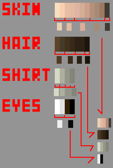
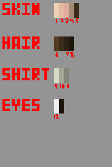
 1) Try selecting a palette beforehand. Pick maybe a dozen colors and put them in a palette map in the corner of the piece before you begin really shading and stuff. If you look at the edit I made of your piece where I reduced the number of colors, you can see one such map. What's the point? Well, as you work, you can alter it slightly if need be, but it's another element of planning. Having a plan for how to do a piece is incredibly valuable - it's why we do sketches and linearts and thumbnails and palettes. It also gives us a spread to see how our colors interact with each other. Here, I'm going to make one for your piece as it is: 

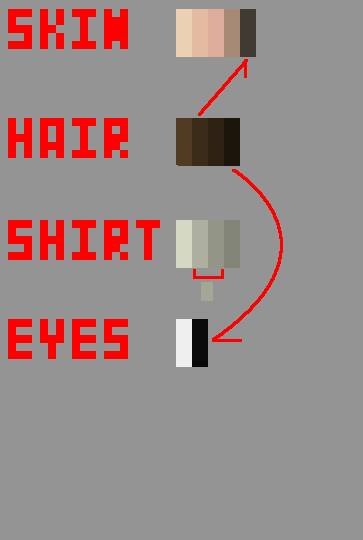
What do we have there? Well, if you look at the skin colors, you can see a lot of them. Like, honestly, that's an absurd number of skin colors. Some of them, such as the 3rd and 4rth, are incredibly close to each other so much that if they weren't blown up so big you'd be unable to tell them apart. The 5th and 6th of the hair are STILL indistinguishable at this size. The shirt is actually pretty decent - those four colors are well spaced and work well together. I WILL say that, how they're used in the piece (one main, three AA/outline), you probably could have gotten away with two or three instead of four, but the colors themselves make a decent palette. Another thing of interest to not is the darkest skin color and the eye colors - they're similar to the hair colors! In fact, no one would notice if you just used hair colors for those. Easy color conservation. That's actually a trick we tend to use a lot, called palette unification. See, the way I have it organized on that palette map right there is in four "ramps", each representing the colors of a certain type of object - the skin, the hair, etc. Palette unification is where we take colors from one ramp and use them in the OTHER ramps as well! It allows us to make use of a color in multiple places, saving us colors and presenting a piece that looks more cohesive. Let's try some unification and simplification of the palette from this piece:


Now we have a much smaller palette. But what if we wanted to do a new piece, picking the palette before we work? Well, we have a couple options. The first would be to just make whatever palette feels right, and then apply these ideas (grouping like colors, unifying ramps) to narrow it down. Easy, but it's not a very deliberate and careful selection of a palette. However, it might be a decent way to start getting comfortable with picking palettes - as time goes on, you'll probably start picking palettes that need less and less reducing until you'll be making the final product palette with your first shot.

Another option involves trying to create the final palette already - the key points to hit include staying at similar saturation levels (increasing slightly as you move into the shadows), shifting hue slightly through a ramp, and, important for you, making sure that there's enough contrast. If you don't know what contrast is in this context, it means that the colors should be different enough from each other that they don't blend together and are all apparent in the piece.
 A third path that I actually recommend trying is to not use your own palette at all. Try a few pieces using pre-created palettes! If you look through the PixelJoint weekly challenges, there are regularly ones that say to use a specific palette. Palette Challenge threads such as THIS ONE FROM PIXELATION can be very helpful, as well as restriction threads such as THIS ONE. The Commodore 64 palette is a very interesting challenge that teaches you a lot about color interaction just by using it, and Dawnbringer's Palette is an exceptionally versatile palette. I recommend trying to use one of these pre-built palettes to make a piece just for practice. Pay attention to how colors relate to each other, and how to work with what you're given.

This is going to seem like a scary suggestion, but don't be afraid of it: work a little larger. Maybe on a 100x100 pixel canvas. Small is actually HARDER than a medium-sized piece since you have to figure out how to cram a lot of detail into a small space. Give yourself some breathing room.

Here's some other ideas for learning this kind of thing. One idea is something you can't really post here ever, but in private it can be a pretty decent practice exercise. The idea is to find a relatively simple (but well-made) piece here on pixeljoint, something using not too many colors, and take it into your program and make it all grey. If you have a Desaturate filter or something, great, use that. Otherwise just manually make it grey. Then build it back up! Apply your own colors to it. Try to make things blend, see if you can make the colors work well together. This gives you something to work on and experiment with colors, but you can't post it because it's definitely not an original work.

Another idea is, well, the obvious. Read up on color theory. It's academic and tough, but valuable. Just absorb as much information as you can. Art magazines often have discussions of color, and even if the article doesn't apply to pixel art, the advice very well might. Read, learn, ask questions of people. Look at cool palettes and understand why they make the choices they do, and try to emulate them yourself.

I sincerely hope that this is any help at all. I can talk even more, and talk about other stuff like the dithering and loose pixels and other stuff I mentioned, but the color selection stuff seems to be a central concern. I'm going to stop for now because this is a ton of info already though. But if ANYTHING here remains confusing, help me out and quote it back to me or something and I'll explain it further. Just be specific about what you don't understand so I can target my advice at the problem. You seem committed to trying to figure this stuff out, so I'll help as much as I can - and I wasn't kidding before, message me anytime and I'll take a look over whatever you've got going.
And just so you know, I've actually been writing tutorials myself for the past couple months, so if the way Im teaching jives with you, you should check 'em out, they might help you understand some other stuff. http://the-logbook-project.blogspot.com/search/label/Pixel%20Art%20Lessons #ShamelessSelfPromotion

Cheers, good luck pixelling and hope this makes sense!
 That's a lot of stuff! He replied:
Thank you so much Ego that helps a lot. I've heard that a lot, that larger is easier but I started off pixel art doing FE splices and those are like tiny 32x16 sprites, and whenever I try to make something as large as 100x100 I always end up not taking the whole space or losing control altogether, so is there something to keep in mind when doing something big?
And I've already read Cure's tutorial, twice actually.
I recently made something as a request and I limited my palette like you suggested the whole time. I ended up using 14 colors, 15 including transparency. I'll upload that along with the reference pictures I was given since I'm pretty proud of it.
It's pretty decent! In the past couple pieces he's posted he's shown marked improvement.
Had to answer that question though!
No problem man, I'm really glad I could be of assisstance. I very much enjoy the mental exercise of giving this sort of advice - forcing myself to explain it in understandable terms gets me thinking about what the really fundamental aspects of pixel art really are, so I end up learning quite a bit just by doing it. And thank you ultimaodin!
Cure's tutorial is great. I confess that I'm personally a greater fan of the tutorial they've set up over at Pixelation - it's a bit more advanced but a fascinating read, gets into the idea of the goals of pixel art. http://www.pixel.schlet.net/
I actually also started with FE splices! Man, that was back in, oh, 2005 I think, back in the days of the NSider forums. Man, that takes me back. First online community I was ever a real part of. Those GBA games had some amazingly inspiring sprite (and animation) work.
Anyway, the biggest key for me when I start doing a large piece is to have a PLAN. If you just go in and say that you'll work in 100x100 and make it up along the way, you're probably going to, as you said, lose control or fail to optimize your space. A couple weeks ago I wrote one of my Lessons on some ways to create frameworks for a piece. The main strategy I'd recommend is to take a single-pixel pencil of a very light color, probably in an underlying layer if your program does layers, and make an actual sketch of what you want it to be. Plan things out, and work over the framework (preferably in another layer). The sketch does NOT have to be pretty, it just needs to remind you of the generally correct sizes and shapes of the piece. Sketches are much easier to adjust until you've fit the correct size, while finalized pixel art is hard to adjust for size, so being constantly reminded of how big something is supposed to be can be really helpful. I know I can't do large pieces without sketching things out.
I took a glance at the Milan piece, and it's definitely an improvement! Especially in the palette, it's much more disciplined and careful. Glad limiting it worked out good! I'll give that some time to give some basic critique a bit later when I get some time. But seriously, good improvement, and I'm super glad I could help! :3
And that was that! I feel really good about this one. Oh, and I'll just leave this comment from Ultimaodin here...
"I do believe Ego deserve an award of some kind."
:3
End Recording,
Ego.

Friday, May 10, 2013

Schoolwork: The Submission Essay (Muslim American Identity Conflicts)


I watched Angel Beats over the past couple days. WAY better than I was expecting. There was some general anime bullshit, but the vast majority of it was stunningly good. Very different from what I was expecting, in a good way.


Hey there, sorry for the postless week! Been super busy, semester is ramping up to the end. This is the essay I wrote for my class on Islam in America. In the class, we read the novel The Submission by Amy Waldman, and then combined what we knew with the book to write an essay. Here's the prompt:

Why do Muslims in the United States face challenges in identifying with the mainstream American culture in the early twenty-first century? The best essays will include a thesis (or argument) responding to this question in the introduction to the essay. In the body of the essay, please draw on evidence from The Submission to support your thesis. You should also draw on selected historical evidence from lecture and from other course textbooks to support your thesis. The goal is to construct a seamless essay that provides a compelling argument about why the Muslim characters in The Submission feel alienated, as well as evidence of that alienation drawn from the book and from other historical sources.
With that assignment, I'm just gonna post the essay.

As usual, this is my essay, made available so I can potentially recieve feedback and to help others learn what I'm learning myself. I'm no expert, so seriously, none of the would-be paper thieves out there should use or even cite this. Still, I think I learned a lot to be able to write the essay, and hopefully you learn something too!
And if you know something about the subject, let me know if I got something right/wrong, or if you have interesting insights or thoughts about it! Same with folks who know things about writing essays! And I do love hearing when just other regular folks get some education out of my work.

Max / Ego
WC: 1022
Cultural identities held in common by communities are an important force in the world. For an individual, they give a sense of belonging, a shared understanding and experience that allows people to support each other and engage on a closer level. On a wider scale, these identities provide a patchwork of viewpoints and perspectives that gives rise to diversity and fosters debate and discussion. However, sometimes there are cultural identities that have problems interacting with each other, that come into conflict with one another, and this causes confusion and alienation, both to individuals and to the society as a whole. The identity of being a Muslim and that of being an American have just that relationship. Amy Waldman's book The Submission helps us to understand this relationship through its plethora of liminal characters, stuck somewhere in between American and Muslim without knowing how to resolve the inconsistencies between the two. Specifically, the book highlights how the lack of a consensus on whether Islam and American democracy are compatible leads people caught between the two to find themselves alienated and lost.
Laila and Mohammad are two sides of the same problem – they both identify themselves as both American and Muslim, but have different approaches on how to reconcile the images. Laila's take on the problem is adaptation. What is meant by this is that she's taken the stance that a re-reading of the Islamic texts allows for new interpretations that more smoothly meld with typical western democracies. She's forward and headstrong, implied when she suggested that Mohammad use her as a public face for the proceedings (Waldman 90). Her most obvious change to the fundamentalist version of Islam is that she's interpreted the Quran as not requiring the wearing of a hijab, or at least considered that she needn't wear one to the American public. She considers herself a professional, but still a practicing Muslim. Visually, she doesn't appear Muslim – a passerby on the street would never know. That's one of the benefits of not wearing the headscarf in America, that one can blend into the crowd without drawing attention to themselves. This isn't a perfect solution though. While it finds acceptance in the eyes of the American culture, it is the Muslim culture that often rejects those who make Laila's decision. For them, the re-interpretation of the Quran is tantamount to a betrayal of the true religion, which has a vocal fundamentalist front. Laila faces this challenge even from the members in the organization she works with. While at the MACC, after leaving the meeting while talking with Khan, she mentions that “It's a big deal for me to even be in that room...Malik got me in there because I've been getting high-profile cases involving Muslims. Because I'm good. But it's tense, as you noticed.” (Waldman p91). Laila faces the challenge that, in adapting her beliefs to allow her to better accept her American identity, she distanced herself from her Muslim identity and alienated herself from that community.
Mohammad Khan is afflicted with the same sort of identity confusion as Laila, but handles it very differently. Khan doesn't act to change the Muslim identity to fit within his American identity, and he doesn't try to shift his American culture to be open to his Muslim one. Instead, Khan slingshots back and forth between the two, unable to decide what path he should really follow. To begin with he completely denies the Muslim portion of his identity. He still considers himself Muslim, but, as he tells the MACC, he's “basically secular” (Waldman 89). However, he's not willing to disavow the Muslim portion of himself, and he especially isn't willing to do so just so he can win. It's not precisely clear what drives him to be so steadfast on this point; whether it be principles or sheer stubbornness. What is clear is that Khan planned to be this way from the very beginning, and he confirmed it to himself after speaking to Paul Rubin, he refused to “reassure anyone that he was 'moderate' or 'safe' or Sufi” (Waldman 86). Khan's very name is representative of his struggle; he goes by Mohammad and by Mo, one name linked to his Muslim identity and another to his American one. In the end Mohammad doesn't really figure out how to put his two identities together, instead creating his own third identity, a secular form of the culture practiced in the Muslim world, and he steeped himself in that culture so he no longer really had a major identity crisis like he did during the events surrounding the memorial incident.
The division between the two identities goes even further than is explored in the book. One of the fundamental dividing lines between American democracy and Islam is the idea of Sharia. Sharia law is a concept from the Quran that blurs the line between state and religion. In concept, Sharia demands that the government be able to support and enforce the precepts of Islam, a concept which is completely antithetical to the government system of the United States and other “western” nations. The separation of church and state that the States prides itself on is meant to preserve the opportunity for freedom of religion, while Sharia law doesn't allow for this freedom under its restrictions. American Muslims such as those in the book are required to take a side in the debate: support the separation of church and state and further the American identity, or promote American Sharia and put forward a strong Muslim identity. Some individuals, like Laila, would want to adapt the standards of Sharia and find a compromising moderate ideal, but that would be opposed by the more extreme side of both identities. The idea of Sharia is an incredible divisive force, and a primary point of concern for American Muslims trying to reconcile their identities while avoiding alienation from both their fellow Muslims and American society as a whole. The book's characters provide an excellent window into this gap between the cultural identities of Americans and Muslims and the societal alienation that gap creates.
Works Cited
1. Waldman, Amy. The Submission. New York: Picador, 2011. Print. 

There we go. Hope you enjoyed it, totally open to any feedback. I don't like this essay as much as the other one I wrote last night, but that's due later in the day and I only post after an essay is due. That one will drop next week. Later!
End Recording,
Ego.