http://www.youtube.com/watch?v=f2D_mrFazEY&feature=player_embedded
Familyjules7x is a great guitarist who makes some incredible covers. I figured a Kirby 64 mix was appropriate.
Hey, an old one today! This piece, by Mr.Tsuyoshi (who has had a remarkable number of names, currently still going by MrTsuyoshi on PixelJoint but is now RabidGoldcart on deviantArt, where this crit came from).

I believe the link is accurate though. I responded with:
2 years later, he uploaded a further edit.
 While I don't think the background is as good, as it's much busier and more distracting, and the previous version adding a stylistic flair, the dithering on the main body is even more advanced than before.
Anyway, that's it for today. Sunday Songs up later.
End Recording,
Ego.
Familyjules7x is a great guitarist who makes some incredible covers. I figured a Kirby 64 mix was appropriate.
Hey, an old one today! This piece, by Mr.Tsuyoshi (who has had a remarkable number of names, currently still going by MrTsuyoshi on PixelJoint but is now RabidGoldcart on deviantArt, where this crit came from).
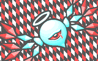
Mr. Tsuyoshi's "O2"
Major Themes: Dithering, Low Colors
I confess, this crit is from 2009. But it's still viable. The images there are progress shots - the original one we were shown was, I believe, the 4th or 5th, the previous ones are his own progress shots I think.
This was actually from a PixelJoint Weekly Challenge:
You are challenged this week to create an image using any of the CGA palettes listed below.
The image must include some kind of cyclops. You do not have to make it a 'typical' cyclops, it can be any creature with just one eye. However, it must be clear that the creature does just have one eye.
NOTE: If you were intending to make an image of the X-Men character "Cyclops" your piece will NOT be accepted into the challenge as technically that character is not a cyclops.
Canvas Size - Maximum 320 (width) x 200 (height).
Colours - Exactly 4. Select one of the following CGA palettes:
Transparency - No.
Animation - Optional.
Here's what I said:
That happens sometimes. I try to not leave these crit cliffhangers, but sometimes I can't help it.I commend you, MrTsuyoshi. This is a truly good piece in my eyes. It is stylish, well dithered inmost places, and the color choice is good. One criticism is that the bottom of the crystals off to the sides does not cut off good. Several of the red crystals appear misshapen, and middle-left and bottom-right white crystals appear kind of jagged on their bottom edges. The top-right one too, to an extent.
The red ones may be fixed with a one pixel solid darker red outline along the bottom edge, but the white ones will serve more difficult what with the 4-color limit you're applying.
I have to leave right now, but when I get back I'll add more in a reply to this post.
Alright, I'm back. Sorry for the comment break.
Okay. I think it might be worthwhile in distinguishing the 3-D nature of the diamonds, as that was a very important part of Kirby: Crystal Shards, and thus a part of the character. You understood the concept quite well on the bright face of the white diamonds, but you don't do that to any of the other ones.
The red outline I was referencing would be a good idea as it would solidify the shape, and allow you to sculpt it how you want, not just how the dither pattern requires it.Apparently, it is impossible, because I just realized that that dark red color you're dithering with is black. Sorry ^_^'. The best thing to do now is to make a full red outline. It'll seem a bit like a secondary light source, but altering the whole piece to code shouldn't be so hard with some of the other changes being made.
I think that a way to fix the jaggies of the dark blue diamond bases would be to put a more dark-inclined dither pattern on the half of the diamond that is lit-up more(e.g. the more left half on the left ones).
Which brings me to another issue; light sources. On the main body, it is coming from a little up and left of center screen. On the white arms and the nubs they extend from, it is coming from left(for the left ones) or right(for the right ones). The red diamonds are devoid of lightsource, which makes them awfully flat. And the halo is shaded like it produces light, but that is definitely not evident by the way light shines onto the body. The should be highlights on the very top of the head, beneath the halo, maybe even in a ring shape somewhat. The diamonds should all be unified and the light source should probably be placed in the top-right, like with the body. You can add in a small bit of extra highlighting on the front of the left diamonds and on the back of the right ones(on these it should make quite a nice effect of secondary light source), as the halo is still shining.
The red diamonds need some sort of light source to make them real good, and you should place it in the top right. On a similar topic, the red ones should have their shadows placed accordingly to the wide part of the diamond as well, as right now on some it just looks like a straight divide of top and bottom, with the width not changing at all(top red off of the bottom right white, I'm looking at you).
The eye. Probably my last topic of discussion, it is almost perfect right now, with only a few little changes to be made. First off, what with the brow, move the shine on the pupil down a little, as light would have trouble reaching it there with the brow in the way. Also move it a little to the right side of the eye, thanks to the slightly shifted light source.
Change the red AA on the outside of the black eye outline to blue, to match the surroundings. The bloody tear, oh my, the bloody tear. I don't know what it really is, so I'm gonna call it that, okay? Now, the tear looks flat on a round object. You should add a small white shine on the top right area, as to go with the light source. Shade the back of the tear with your black-red dither. Maybe AA the back with black instead/too. Your call.
Don't touch the background vertical diamonds! They're gorgeous! Very stylish, and a perfect fit for O2.Responses (in various posts, but all in response to this stuff):
Now, I'm very sorry if this feels like I'm being all nit-picky or that I don't like the piece. I really do like it, you're an incredible ditherer and top notch at the rounded objects. You have a great sense of style as well. You just got this issue on the angular things.
Alright, I'm tweaking the light source issue.
I tried dithering around the edges of the crystals, but it doesn't quite look right.This is where he switched into Notes (private messages). Normally I wouldn't share stuff from a PM, but this stuff is pretty much just a targeted form of crit rather than conversation.
Then I tried using the red to blend between the cyan and the grey but the cyan and red don't quite mix well.
I took some of your advice and here's what I got so farI don't know if the link is to the one he actually did or if he overwrote that link with later versions.
[link]
What do you think? Is the dithered edges a little much?
![[link]](http://www.deviantart.com/users/outgoing?http://i183.photobucket.com/albums/x271/mrTsuyoshi/Pixel%20art/cga-zero2-2.png)
I believe the link is accurate though. I responded with:
Actually, that isn't too much at all; it appears to be right on target. Unless a person REALLY focuses on the dithered edges, they blend and form straight line in the mind. Yours are perfect for that now.
You're right in your post about how the cyan AA doesn't much underneath the eye. Switch back to red, now that I've seen it its better that way.
The way you handled the 3-D nature of the diamonds suits it perfectly this time, and the light source being the halo the only light source is working out well.
A perspective issue I now see with the new light source is that the tail appears to be a little too long. Notice the very large gap between the tail and body where the light source reaches less: it looks a little too big. If you move the tail in by a couple of pixels, it will mtach up to the perspective.
On the diamond I'm examining right now(very top-left red), I've found an issue fixed on most of the others. The top-back(the upper pure red bit), your outline moves back and forth between a 2:1 pixel line to a 3:1 pixel line and back again seemingly at random. Evening out the line isn't a very difficult task, and it makes the diamond much more sleek.
With the halo as the light source, on the top sets of red diamonds, there may be an opportunity to place a LITTLE bit of extra highlighting along the close edge of the diamond. The line I was just talking about, on the very top left red diamond's top-back section, along the top outline that we just fixed up into an even line, you can lay out a small white trim, maybe straight along, or maybe dithered out(your choice), in order to show that the light wraps around the diamonds a bit when they are angled a certain way. The top red on the left and the middle two red on the right show potential for this.
The tear is not quite what I was thinking of. It is somewhat misshapen in this version and could just be a curve instead of angling down as much. It doesn't have to follow any sort of line here, because the character could be moving, say, sideways, and the tear would look different. So once its just a curvy little tear, a small, solid shine should suffice. I don't think it should be dithered for this one.
Lastly, the bottom-left two reds are MUCH farther away from the light source, and I think it would suit the piece better if instead of a white-red dither, they were just red. There isn't a back to compare to on those, so no one will know the difference.He responded with:
All in all, way better. You nailed the two major issues, the 3-D diamonds and the light source, so now its just minor details to perfect it.
Yeah, I was thinking about a highlight on the red crystals, so I gave it a try, I'd say it looks pretty good. I also tried changing the shape of the tear a bit and added a bit of a watery shine to the eye itself.And I fired back with:
[link]
![[link]](http://www.deviantart.com/users/outgoing?http://i183.photobucket.com/albums/x271/mrTsuyoshi/Pixel%20art/cga-zero2-2-1.png)
Very good! I like what you did with the eye, and I hadn't even thought of using the highlight on the white-dithered area. What I had meant was to add a similar edge highlight along the top-back area(the all red one).
After that though, I would think to consider this piece done!He replied with thanks, and that was it.This was long before I really started using pics to aid in my critique. Unlike a lot of the people I've been focusing on lately on in my tutorials, Tsuyoshi was already quite experienced. As such, these crits may be a bit more advanced in concept, especially with regard to using dithering. The final piece is also a fantastic example of how dithering can produce a much wider range of colors - recall that the piece uses only White, Black, Red, and Cyan. Impressive.
Congratulations, good luck on the Pixeljoint challenge. I'll vote for ya.
2 years later, he uploaded a further edit.
Anyway, that's it for today. Sunday Songs up later.
End Recording,
Ego.
No comments :
Post a Comment