http://www.youtube.com/watch?v=emgsUQN_YhE&feature=player_embedded
I have yet to find a bad Nutritious song, and this remix of his of Deus Ex for the recent Sonic Augmentation album is amazing.
I did this critique a few days ago, and I was extremely happy with the information I produced. For a total beginner, who's been putting in a lot of work. I'll just go into it.


He replied...

 Step
Three (counting colors - 12 plus transparency in this, which is a
pretty understandable number in a piece of this complexity - we could do
less, but it's not necessary right now)
Step
Three (counting colors - 12 plus transparency in this, which is a
pretty understandable number in a piece of this complexity - we could do
less, but it's not necessary right now)
Had to answer that question though!
End Recording,
Ego.
I have yet to find a bad Nutritious song, and this remix of his of Deus Ex for the recent Sonic Augmentation album is amazing.
I did this critique a few days ago, and I was extremely happy with the information I produced. For a total beginner, who's been putting in a lot of work. I'll just go into it.
FreshSheet's "Jack Black"
Major Themes: Colour
Description: Because Jack BlackOh boy. If you've been following these tutorials, like usual, see what you can already spot! Decent-ish AA on the shirt, messy lines, and low-contrast craziness.
Yeah, I don't have a clue what he did to actually make it look like him, but I recognized it. It's in the expression I think - basically a rather shoddily-executed caricature.
There's certainly some pixel-based flaws in the piece, but something must be goin' correctly since I recognized him as Jack Black from the front page.
In case you're looking for actual critique, here's some stuff to think about (either to fix, or just to not make the same mistake next time):I could tell he was kinda new at this - I hoped to ease him into the critique since I'm often so intense.
* Colors and Color Count. You have 26+trans colors - that's WAY more than you needed to get this effect.In fact, this COULD have been a challenge entry, I got it down to 8+trans with roughly the same visual appearance, and that's without any cleanup or anything. Here's what that looked like:

The key problem here is contrast. You have a bunch of colors, but most of them are very similar to each other. From a zoomed-out perspective, the difference is often not noticeable. Some shades show obvious evidence of hue shifting, while some show literally none at all, leading me to believe that some of the colors, especially the red-ish ones, might have been lifted from a photograph of him. That's cool and all (although taking colors from photos isn't very accurate for a piece usually), but if you did use a photo, either for colors or just general reference, please include the URL of the image in your description. Based on a google search, if I were to guess, I'd say it was this one: http://www.theplace2.ru/archive/jack_black/img/Jack_Black.jpgNot gonna embed that cuz it's huge. As we'll see in a second, he did NOT actually use a reference, which is crazy when doing a portrait, but by some fluke I actually found a reference that looks pretty close to his piece. As for the color thing, apparently I'm just off base.
So you have a lot of colors very similar to each other. You can optimize! Combine similar colors, and if done carefully it won't cause much change to the piece. Other weird things about the colors are how the hair and beard are using different sets of colors. This strengthens my impression that you used the above reference photo, but in a piece this small you should probably just have them be the same color.
Plus, when colors are too similar, they can blend together to create banding. You've avoided banding in general in a very literal sense, but combined colors are causing some banding (like along the hair at the top).
* Dithering. You've got a decent amount of it, especially on the cheeks and forehead. It's, well, it's unnecessary. As you were told by Cure on your other piece, a piece this small benefits much more from good clusters than from dithering. Plus, think abou tthis: dithering has two main purposes, texturing and transitioning between two colors. Faces don't need that kind of texturing, so it would be transitioning here, correct? Thing is, with so many colors, you should have no problem transitioning from one color to the next. In close spaces like this, you just don't have the room for the transitional space of dithering, which causes it to appear as the second form, texturing. And we don't want a rough textured face.We discussed dithering as texturing vs transitioninga couple weeks ago! This is a common mistake - I've made it a bunch of times myself as well.
* Loose pixels. This is mostly in the hair - its presence elsewhere is due mostly to ineffecient dithering. You have stringes of highlights in the hair meant to evoke the appearance of strands (or clumps) of hair, but by leaving them disconnected, and often in single dots, they don't really suggest that. A single pixel alone without real connections or implied direction is fairly useless for that. It can act as utility, such as anti-aliasing, but is not very effective at transmitting information to the viewer. Instead of thinking about the hair as a bunch of strands forming a bunch of clumps, think about the hair as a mass and where the highlights are going and such - rendering indiviudal hair bits at this scale only serves to make it look messy.
While I'm talking about the hair, he probably has more of it. Think about the shape of his cranium - he probably has more head behind there, and the hair would lift higher off his head unless if was, like, plastered down.
* The shirt. This is a bit more evidence to me that you used that reference image, since this shirt looks like you weren't looking at a picture at all and fabricated it yourself. The big thing is that, if you look at someone wearing a shirt, it's never going to have that much mass without variation from folds and such. Also, I'm pretty sure Jack Black has significantly more shoulder than that.
All of this is just meant to help you, of course. I'm not tryin' to pick on you or anything. Like I said, I still managed to recognize Jack Black in the image before reading (I think it's in the full beard combined with the eyes. I seriously hope you get something out of this, keep up the effort!That was a pretty good post! But that's not why I was so excited to post this lesson...
He replied...
Thanks for the critique. Although as I have no education in any kind of art and have been teaching myself, I have no idea what you mean by a lot of the critique and do not know how to fix anything. I (obviously) don't know how to use colors, so I just use a bunch because it's easier on me since I'm still bad at this. And I actually didn't pull any colors from a picture, nor did I use a reference picture. I was watching a movie with him in it and went from memory cuz I like Jack Black. But yea that picture does look similar. I've read tons and tons of tutorials but they all say the same thing and it's always what I had already figured out myself. I can't find any tutorials on how to make a body, on how to do hair or how to do hands (i'm terrible with hands), can't find anything on good color use or anything. I do keep practicing but I never seem to make any progress.Emphasis mine. See, that's where the blood rushed out of my face and I realized I didn't do a good enough job. Now, looking back, I feel pretty good about that previous post, but him not understanding any of what I said was a bit of a stab to my pride as a critique writer. But he can't help it, didn't understand, so instead of getting angry or sad I got determined!
That's totally okay! The key is to keep trying. I try to pride myself on writing relatively understandable critique, so I'll take another stab at this. For the record, I don't have any education doing this either, I've just been pixeling for a fairly long time now.That right there is me on the defensive. Sorry. It happens. Course, guy's age and education doesn't mean a thing - guy's listed as being 16 years old, and I definitely was still pretty capable when I was 16 - I mean, last week's Lesson came from when I was 16, and I didn't have any education either, just practice. Never stand behind age as reason to be ineffective, it's kinda insulting to others of your age, like saying "this is what makes me incompetent, meaning all others like this are likewise ineffective." And education, well, there's no such thing as formal pixel art education. Classical art education is helpful, and knowledge of anatomy is basically necessary, but you don't need formal classes to do great pixel art. You can toss around being new or inexperienced as a reason, but if you do, you need to show enthusiasm to learn, which FreshSheet does, so okay.
For one, I 100% recommend using a reference picture. See, our brain does this funny thing where, in our memories, it turns things into symbols. We remember the significant or prominent features of something, maybe general height or if they have wide eyes or this wild beard or are wearing a very colorful shirt. These are the things that stick out to us, and our brain uses these notable things to assemble memories. However, these things aren't usually enough to tell the whole truth of what something looks like - our memory gives us an exaggerated version, a caricature, a cartoon. Obviously, when we're trying to make something that looks like someone, we probably want it to actually look like them, not just a cartoon-y version of them (unless that's the purpose, but even if it's your purpose to make a cartoon-y version, go from a reference image). If you want a practical demonstration of this, grab some paper and try drawing a squirrel from memory. Then look up a squirrel on Google Images and try drawing it while looking at what it actually is. Chances are, that second one is more accurate, right? Same theory.This is kinda universal in art, not just pixel art.
Let's focus on the number of colors first, since I think that's present in most of your pieces and it's central to the issues of the piece. I understand your urge to just keep generating colors - the more transition colors there are, the smoother a transition it'll be, right? Unfortunately, pixel art doesn't quite work that way. Color count is one of the central tenets of doing pixel art as opposed to other art forms. One of the things about Pixel Art is that we try to use as few colors as possible to achieve the desired effect. That doesn't necessarily mean ALWAYS use low colors - sometimes you DO need more, but oftentimes the effect you're trying to achieve is doable with fewer colors. While there are tricks that make it look like you have more colors, the most important concept is color selection.Happip Ilkke EGA C64
Color selection is hard. There's a reason that tutorials don't abound for how to select colors - the entire color spectrum can be made to work well in a piece of pixel art, there's no specific "use this color!" and "don't use this color!" warnings that are universally applicable. If you look at, say, a piece of Happip's art and then a piece of Ilkke's (those are two users here btw), or an EGA-palette piece and a C64-palette piece, you'll see that pretty much any color can be made to work. That means you need to practice some intuition and probably learn some color theory.
So how do you do that? Well, first is to just keep trying. Practice, practice, practice, and SHOW people your work and ask for help on the colors. The Work In Progress section of the forum is a good place to go, and I'll leave the door open myself: message me any time asking for help and I'll see if I can't give you some aid. But there are a few basic things to keep in mind.
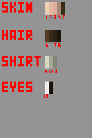
1) Try selecting a palette beforehand. Pick maybe a dozen colors and put them in a palette map in the corner of the piece before you begin really shading and stuff. If you look at the edit I made of your piece where I reduced the number of colors, you can see one such map. What's the point? Well, as you work, you can alter it slightly if need be, but it's another element of planning. Having a plan for how to do a piece is incredibly valuable - it's why we do sketches and linearts and thumbnails and palettes. It also gives us a spread to see how our colors interact with each other. Here, I'm going to make one for your piece as it is:
What do we have there? Well, if you look at the skin colors, you can see a lot of them. Like, honestly, that's an absurd number of skin colors. Some of them, such as the 3rd and 4rth, are incredibly close to each other so much that if they weren't blown up so big you'd be unable to tell them apart. The 5th and 6th of the hair are STILL indistinguishable at this size. The shirt is actually pretty decent - those four colors are well spaced and work well together. I WILL say that, how they're used in the piece (one main, three AA/outline), you probably could have gotten away with two or three instead of four, but the colors themselves make a decent palette. Another thing of interest to not is the darkest skin color and the eye colors - they're similar to the hair colors! In fact, no one would notice if you just used hair colors for those. Easy color conservation. That's actually a trick we tend to use a lot, called palette unification. See, the way I have it organized on that palette map right there is in four "ramps", each representing the colors of a certain type of object - the skin, the hair, etc. Palette unification is where we take colors from one ramp and use them in the OTHER ramps as well! It allows us to make use of a color in multiple places, saving us colors and presenting a piece that looks more cohesive. Let's try some unification and simplification of the palette from this piece:
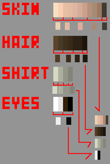 Step One (grouping similar colors
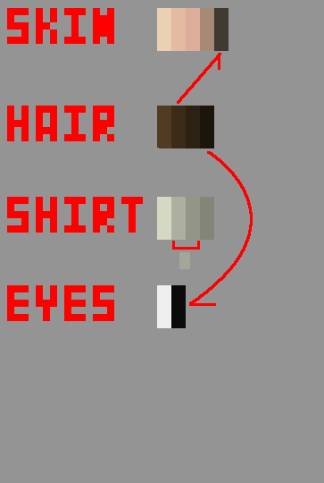 Step Two (Unifying Color Ramps)
 Step
Three (counting colors - 12 plus transparency in this, which is a
pretty understandable number in a piece of this complexity - we could do
less, but it's not necessary right now)
Step
Three (counting colors - 12 plus transparency in this, which is a
pretty understandable number in a piece of this complexity - we could do
less, but it's not necessary right now)
Now we have a much smaller palette. But what if we wanted to do a new piece, picking the palette before we work? Well, we have a couple options. The first would be to just make whatever palette feels right, and then apply these ideas (grouping like colors, unifying ramps) to narrow it down. Easy, but it's not a very deliberate and careful selection of a palette. However, it might be a decent way to start getting comfortable with picking palettes - as time goes on, you'll probably start picking palettes that need less and less reducing until you'll be making the final product palette with your first shot.
Another option involves trying to create the final palette already - the key points to hit include staying at similar saturation levels (increasing slightly as you move into the shadows), shifting hue slightly through a ramp, and, important for you, making sure that there's enough contrast. If you don't know what contrast is in this context, it means that the colors should be different enough from each other that they don't blend together and are all apparent in the piece.
A third path that I actually recommend trying is to not use your own palette at all. Try a few pieces using pre-created palettes! If you look through the PixelJoint weekly challenges, there are regularly ones that say to use a specific palette. Palette Challenge threads such as THIS ONE FROM PIXELATION can be very helpful, as well as restriction threads such as THIS ONE. The Commodore 64 palette is a very interesting challenge that teaches you a lot about color interaction just by using it, and Dawnbringer's Palette is an exceptionally versatile palette. I recommend trying to use one of these pre-built palettes to make a piece just for practice. Pay attention to how colors relate to each other, and how to work with what you're given.That's a lot of stuff! He replied:
This is going to seem like a scary suggestion, but don't be afraid of it: work a little larger. Maybe on a 100x100 pixel canvas. Small is actually HARDER than a medium-sized piece since you have to figure out how to cram a lot of detail into a small space. Give yourself some breathing room.
Here's some other ideas for learning this kind of thing. One idea is something you can't really post here ever, but in private it can be a pretty decent practice exercise. The idea is to find a relatively simple (but well-made) piece here on pixeljoint, something using not too many colors, and take it into your program and make it all grey. If you have a Desaturate filter or something, great, use that. Otherwise just manually make it grey. Then build it back up! Apply your own colors to it. Try to make things blend, see if you can make the colors work well together. This gives you something to work on and experiment with colors, but you can't post it because it's definitely not an original work.
Another idea is, well, the obvious. Read up on color theory. It's academic and tough, but valuable. Just absorb as much information as you can. Art magazines often have discussions of color, and even if the article doesn't apply to pixel art, the advice very well might. Read, learn, ask questions of people. Look at cool palettes and understand why they make the choices they do, and try to emulate them yourself.
I sincerely hope that this is any help at all. I can talk even more, and talk about other stuff like the dithering and loose pixels and other stuff I mentioned, but the color selection stuff seems to be a central concern. I'm going to stop for now because this is a ton of info already though. But if ANYTHING here remains confusing, help me out and quote it back to me or something and I'll explain it further. Just be specific about what you don't understand so I can target my advice at the problem. You seem committed to trying to figure this stuff out, so I'll help as much as I can - and I wasn't kidding before, message me anytime and I'll take a look over whatever you've got going.
And just so you know, I've actually been writing tutorials myself for the past couple months, so if the way Im teaching jives with you, you should check 'em out, they might help you understand some other stuff. http://the-logbook-project.blogspot.com/search/label/Pixel%20Art%20Lessons #ShamelessSelfPromotion
Cheers, good luck pixelling and hope this makes sense!
Thank you so much Ego that helps a lot. I've heard that a lot, that larger is easier but I started off pixel art doing FE splices and those are like tiny 32x16 sprites, and whenever I try to make something as large as 100x100 I always end up not taking the whole space or losing control altogether, so is there something to keep in mind when doing something big?It's pretty decent! In the past couple pieces he's posted he's shown marked improvement.
And I've already read Cure's tutorial, twice actually.
I recently made something as a request and I limited my palette like you suggested the whole time. I ended up using 14 colors, 15 including transparency. I'll upload that along with the reference pictures I was given since I'm pretty proud of it.
Had to answer that question though!
No problem man, I'm really glad I could be of assisstance. I very much enjoy the mental exercise of giving this sort of advice - forcing myself to explain it in understandable terms gets me thinking about what the really fundamental aspects of pixel art really are, so I end up learning quite a bit just by doing it. And thank you ultimaodin!
Cure's tutorial is great. I confess that I'm personally a greater fan of the tutorial they've set up over at Pixelation - it's a bit more advanced but a fascinating read, gets into the idea of the goals of pixel art. http://www.pixel.schlet.net/
I actually also started with FE splices! Man, that was back in, oh, 2005 I think, back in the days of the NSider forums. Man, that takes me back. First online community I was ever a real part of. Those GBA games had some amazingly inspiring sprite (and animation) work.
Anyway, the biggest key for me when I start doing a large piece is to have a PLAN. If you just go in and say that you'll work in 100x100 and make it up along the way, you're probably going to, as you said, lose control or fail to optimize your space. A couple weeks ago I wrote one of my Lessons on some ways to create frameworks for a piece. The main strategy I'd recommend is to take a single-pixel pencil of a very light color, probably in an underlying layer if your program does layers, and make an actual sketch of what you want it to be. Plan things out, and work over the framework (preferably in another layer). The sketch does NOT have to be pretty, it just needs to remind you of the generally correct sizes and shapes of the piece. Sketches are much easier to adjust until you've fit the correct size, while finalized pixel art is hard to adjust for size, so being constantly reminded of how big something is supposed to be can be really helpful. I know I can't do large pieces without sketching things out.
I took a glance at the Milan piece, and it's definitely an improvement! Especially in the palette, it's much more disciplined and careful. Glad limiting it worked out good! I'll give that some time to give some basic critique a bit later when I get some time. But seriously, good improvement, and I'm super glad I could help! :3And that was that! I feel really good about this one. Oh, and I'll just leave this comment from Ultimaodin here...
"I do believe Ego deserve an award of some kind.":3
End Recording,
Ego.
No comments :
Post a Comment