http://www.youtube.com/watch?v=GNml9OtE1vM&feature=player_embedded
Chip and Ironicus started their Metal Gear Rising Let's Play today, and from the first 15 minutes I want to get the game SO BADLY. That Ray fight is SO. FUCKING. RAD. This is Locked and Loaded, he original version of Rules of Nature. Personally, I actually prefer L&L. They're both awesome though. God that game looks so amazing.
Sorry for the delay until now, I had friends over later than I expected to last night. Unlike last time I ran late with the PAL, this isn't a schedule change, I'm still usually gonna update on Saturdays.
But right to posting!

Also, he knows he misspelled "Space" in the title. He's from Belgrade, it happens. I do a llot of foreigners, don't I?
 So I want to elaborate on that. See, having high contrast over large regions can have two problematic effects, depending on where the contrast comes from. If the contrast comes from a saturation disparity (perhaps aided by hue but not necessarily), you have a good probability of one of the colors overwhelming the other and making the line indistinct. We've seen this sort of thing before when I discussed "eye burn" with YellowLemon's piece. However, if the barrier is caused by a high value difference, you get the opposite symptom - the line is incredible distinct, and any irregularities in the line will be very obvious. This piece has that one. There are three paths to solving it: first, you could lower the contrast. With this few colors, you can get that stark look with less contrast, especially with near-black and near-white (cuz 100% black and white are bad ideas usually anyway since they both act like high-saturation colors even though they have 0 saturation). Second, you can try to refine your irregular lines into smooth curves, but that's often very difficult. Third, you can make the curve smoother with AA, and the intermediary color reduces the contrast a bit so the problems are less noticeable. Trouble is it might mean altering your palette to get an AA color, and it might even mean upping the color count.
 Best solution is to mix the two by the way, dropping both the black/white into grays and the yellow to orange. That's what I later go with.
 That's what I would do. I think it looks pretty snazzy myself.
 I'm down for that too! Required an additional color, but has interesting effect of making the yellow pop even more and still giving the AA benefit.
Later folks. Sunday Songs up tonight.
End Recording,
Ego.
Chip and Ironicus started their Metal Gear Rising Let's Play today, and from the first 15 minutes I want to get the game SO BADLY. That Ray fight is SO. FUCKING. RAD. This is Locked and Loaded, he original version of Rules of Nature. Personally, I actually prefer L&L. They're both awesome though. God that game looks so amazing.
Sorry for the delay until now, I had friends over later than I expected to last night. Unlike last time I ran late with the PAL, this isn't a schedule change, I'm still usually gonna update on Saturdays.
But right to posting!
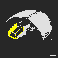
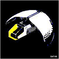
isatche's "Spece Ship"
Major Themes: Color Selection on Low Color Pieces, Working in a High-Contrast Environment
This is my submission to Pixel Art Challenge: Spaceships!This is, obviously, a challenge entry. Unlike some of the other challenge entries I've featured lately, this was a wide-open challenge. The restrictions were to make an isometric space ship with 25 colors or less. Isometric is a perspective used for some pixel art. While most pixel art is head-on, isometric means that it's facing a sort of diagonal angle. It's not actually entirely relevant to this lesson cuz I don't want to do a lot of explaining about isometrics right now - I might be doing another lesson later on doing isometric stuff, but for now it's enough to know that games like Final Fantasy Tactics and Luminous Arc are examples of 2:1 isometry (by far the most common, and the type used here) while games like Boktai use the much rarer 1:1 isometry. But that's another day's lesson, the artist doesn't have a problem with understanding isometrics.
3 colors.
200x200px canvas
Also, he knows he misspelled "Space" in the title. He's from Belgrade, it happens. I do a llot of foreigners, don't I?
I kinda agree with Sertkaya that unless you told me it was a space ship I wouldn't have read it that way. However, knowing that it IS a space ship, I'm quite fond of it, it has some really interesting elements to the design, such as the circular pattern on the wings. Tackling this higher color-count challenge with 3 colors is also a cool way to stand out.
However, I'm not entirely sure you've made the most of the idea pixel-wise. My pixel issues with the piece revolve around three ideas:
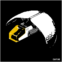
1) Colors. Not your color count - I wouldn't dare suggest violating the simplicity of the piece by adding more - but the exact colors you've chosen are a bit problematic. I would suggest you don't use pure black and pure white, as they are extremely strong colors that eat up the colors around them. Using a very dark gray and a very light gray, close to black and white but not quite there, might make the image softer on the eyes without losing its pop-out power. HERE'S AN EXAMPLE OF THAT.
Additionally, consider the contrast between the yellow and the white. As it stands, on areas of the transparent yellow glass where you have white shines, much of it isn't particularly visible because of how bright the yellow is. Toning the glass a little darker is a possibility, as is shifting it to be slightly more orange, which would allow it to be just as bold while still letting the white shine through. HERE IS AN EXAMPLE OF THAT.
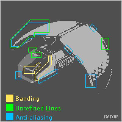
2) Anti-aliasing and unrefined curves. A lot of the piece relies upon the perfection of the curves as they have no anti-aliasing to ease the transition from black to white. Especially visible on the wings, this makes all the little jagged bits apparent. However, you avoid using the yellow color anywhere else on the piece when you could actually use it all over as an anti-aliasing color. Yes, that would place a slight color inside of the rest of the ship, but the benefit from the cleanliness of the lines would overcome it in my opinion. If you choose to not change the black and white to slightly softer grays, you could really benefit from anti-aliasing with your color, and if you DO change your color (to either darker yellow or orange or whatever) it'll probably work even better as an anti-aliasing color. HERE'S AN IMAGE POINTING OUT SOME SPOTS THAT COULD USE SOME WORK.
I try to do this type of image over an actual edit nowadays. That didn't keep me from DOING an edit, but this is the most helpful thing I did I think, along with actually explaining stuff.
3) Banding. Also pointed out in that image at the end of point two are some trouble spots regarding banding. If you don't know, banding is a circumstance where you have two lines of pixels of the same shape but different colors exactly hugging each other, and it makes a piece look fuzzy and indistinct. To save post space, I'm LINKING TO WHERE I'VE DISCUSSED AND DEFINED BANDING BEFORE. You have some places where banding is particularly strong, and the piece could benefit if those were cleaned up.
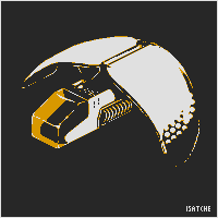
While writing this, I've been editing your piece to show how it COULD look with some more work sunk into it. HERE'S WHAT I ENDED UP WITH.
You have a couple days left before the deadline, so you could have a really refined piece with a bit more work! This is a great start and I'd love to see if you do any more with it. Good luck in the challenge either way!He replied:
(also if you want you can change the title to fix the spelling if you use the "Edit It" button on this page)
Wow Ego, you made it look truly amazing!And I replied back:
Thank you very much for the detailed analysis, tips and comparison, really appreciate it.
As for refining and resubmitting the work, the very best I could do would end up looking like the one you did. So I will leave it like this, and apply your advices in the next work or competition.
Thank you.
No problem man, I love doing this stuff. Glad I could be of help!
I would still say it's probably worth it to try out editing it yourself - even if primarily inspired by my edit, you'll always add some of your own personal flair. I know I can see my own flair in my edit (tapering the color near the back of the left wing, shape of the shine on the top of the cockpit). Trying it yourself is always worth a shot :3. That said, taking the information into the future is the most important thing really.This is why I'm realizing I should edit less. I mean, I have personal flair of my own, and the entire purpose of teaching through critique rather than by example is so that the subject doesn't start picking up the style of the tutorial-writer. Picking up MY style defeats the purpose, it still stifles stylistic exploration and creativity. Maybe I'll try to keep these to myself in the future.
Nice work, and seriously, anytime.
Oh, and ultimaodin has a good idea for if you were to add a fourth color, using a darkker complimentary color can give you a really neat look as well. Personally I would have used purple over blue with yellow since it's directly across the color wheel and would amp up the brightness of the color, but blue is also an excellent idea - my choice is mostly just taste.For reference, here's the image ultimaodin proposed:
Looking forward to seeing more cool stuff from you in the future man!
Later folks. Sunday Songs up tonight.
End Recording,
Ego.
No comments :
Post a Comment