I'm sorry. I'm going back and I'm switching my embeds into links. See, I'm really trying to get AdSense to be okay with this blog, and the embeds were getting in the way of that. I refuse, absolutely REFUSE to stop linking entirely, and if I'm still disapproved for AdSense without embeds you can bet they're comin' right back, but for now you're gonna have to click a link for the songs. If I AM approved, I'm gonna find a different (and okay) way to add a visual component to the link.
This is a background song (but it has lyrics!) from one episode of Ghost in the Shell Stand Alone Complex. It's pretty freakin' awesome, I downloaded the Yoko Kanno GitS albums the other day and I'm loving all the really nice background music I never even noticed.
I'M SORRY late late late
I was kinda out with friends all afternoon and evening til like 1:30am. I had expected to be back at like, 8pm. Whoops. Oh well, I introduced new people (a trad gamer and a newbie gamer, both chicks!) to Apocalypse World, which was rad.
Today is about OCEANSCENTED. aka crackerss. aka Izzy. Izzy is a cool gal who is in late high school and is the brightest star of creativity I've seen in the Pixel Art world in several years. Seriously. I emerged around the same time IlKke came on the scene, and watched the rise of folks like Jinn and Mrmo Tarius. In terms of animated pixel art I'm more into stuff like the stuff in Ghost Trick: Phantom Detective or the stuff FrankieSmileShow (aka Francis Coloumbe) makes (which includes Barkley 2 right now!), but when it comes to stills, Izzy is pretty up there. Now, here's the rub - there's some execution trouble. On the whole, OCEANSCENTED's gallery ought to just be printed out and taught as the importance of precision and patience, as it has a lot of stuff that lacks those, but some simply stellar material when it got full treatment.
Now, let's get this out of the way: Yes, I am a big fan of Izzy's. I think her mind sees the most twisted stuff when drawing, and her taste in fan-art reflects that creepiness; there's a lot of Giygas and several Perfect Chaos in there. She's also not just a pixel artist, she does digital painting and traditional drawing as well, though not with the level of natural proficiency her pixels show. Of course, that hasn't kept me from getting one of her pieces printed and framed for my wall, and I REALLY don't do that very often, or at all. I also respect the exceptional talent she shows for still being in high school. Damn. (the roughness is part of the appeal on that one)
Thing is, turns out being good and really really creative doesn't spare you from my critique. Actually, if I think you have more potential than you're using it kinda encourages me - if you're wondering how I pick the people I critique, it's a combination of interest in a piece, observed potential of the creator, and their enthusiasm to learn and improve.
OCEANSCENTED'S "WHO WOKE ME UP"
Major Themes: Lightsource, Saturation, Refinement
So today the big piece I wanted to mostly draw our attention to is WHO WOKE ME UP. It's actually a remake of an older piece of her's, so let's see that first.That was 2010.
*outdated VCR fast-forward noises*
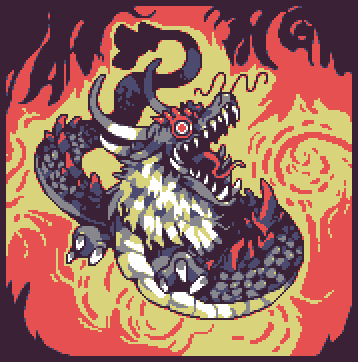
I should mention that this is NOT the original version! Technically the original actually had the darkest color as a solid black. Also the red was a more saturated hyper-red.
This is really a step above even your usually-high level of quality. Seriously, this is very cool.
Now since it's not being said elsewhere I may as well try to give a couple comments. I've said it before and I'll likely never stop, but this could be SO much more if you gave it a good careful refining. Parts that could use it most are the wobbly edges of the yellow in the background flame, the bizarre bulging width near the end of the tail, and the mishmash of scales that are close to us. The black outline of the dragon as a whole could use some smoothing too.
There's an unfortunate circumstance of color theory happening here. The red on the outside is such a strong bold color compared to the neutral blues/greys/purples/yellows that the background is kinda swallowing up the dragon himself.
Okay, I checked the color count to see if you had spare room to maybe make a new darker/less-intense red for the background, and found that you have 7 colors you're primarily using but have a whole 14 extra shades only barely off the base colors, mostly centered around the lower head. Here, this is their locations:
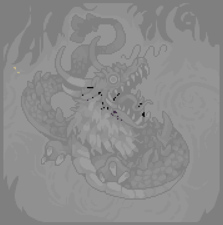
I'm not including our little conversation afterward, but these were actually caused by a Photoshop snafu - I've seen it in a few pieces lately so I think something changed in a recent update, and that was Manupix's best guess over on PJ.
I recognize the phenomenon that causes the color weirdness over on the yellow. Any chance you were playing around with partial transparency at all and drawing over it? Because that particular color differential is pretty common to that. Alternatively, if you were using brushes that had a little auto-AA on them while sketching things out that could cause it.If I didn't call it out already, this is a 6 color piece if you ignore the duplicate mistakes. Holy shit, right? I'd call this Izzy's most common strong point, she has an ACE intuition when it comes to color theory. When I did YellowLemon's critique I even used her as evidence while explaining color theory thingums.
While I'm harping on the bright red in the background eating everything up, as far as colors go on their own this is a freakin' gorgeous palette.
Here's a pretty good question: Where's the lightsource? Underbelly scales and mane say upper-left, as does the face flesh. Scales on the tail say a variety of directions (from the left, from the right, from above, from in front of the face), and the horns say from the left. The spikes along the body say right above the dragon, and the claws on the hands say right beneath them. All this on a bright red and yellow fire background that casts no lights on the dragon itself (that's a design choice and not a lightsource one, just thought I'd mention it). Now, maybe you've got a lightsource in mind here and I'm being dense, but it looks like light is everywhere and nowhere.If colors are her common success, lightsource is probably the most chronic conceptual issue (with refinement being the technical one).
Lastly, you may want to consider harshing up the black outline even more when differentiating parts. Especially from a 1x view (rather than the 2x view here), things like the hands are hard to tell from the body, and the effect of the very strong background is magnified. Similarity of colors on both sides of an outline makes the outline even more important or you risk losing the distinction and it all blending together.She did this one time a while back and it was kinda eye-opening, as it was definitely a very organic and intuitive, yet still a bit sloppy and reckless with pixel placement. Really cemented for me that it's a lack of dedication to single pieces and general laziness that keeps every piece from being a total knockout.
All that is me nit-picking to try to give you some things to think about for next time. I was serious at the beginning - this is a damn great piece of pixel art and your style is still one of the most distinct I've seen in recent pixel art.
As an aside, got any intention to stream you pixelin' again any time in the future? Watchin' your process was rather educational when you did it a while back.
Anyway, the response was brief and thankful and agreeing. It usually is, it can be hard to respond to those text walls of mine.
Afterward, I tagged on one more post:
Hey, in the interest of sharing things, I did an edit of the piece, refining the bits I thought could use it.That's how I say "I'm hijacking your piece for a minute". I do feel bad when I do this which is why I try to cover it up.

This was pretty much because I was bored and can't be assed to do my OWN pixel work these days. Hell, I can't even remember the last time I pixelled a full piece that wasn't an edit... Thanks for the fun project for the afternoon. I'll note that in a few ways it definitely looks more like a piece of mine than of yours - on the scale patterns more than anything else. Fixed the bulgy tail, established a lightsource on the right, didn't bother touching the mane, spent way too long cleaning up the fire lines in the bg, and ended up bumping the color count from 7 to 9.It's definitely true that I don't do too much of my own stuff anymore. I try, but get bored or uninspired. I'm fond of this edit though, I think I really did a nice job on the parts I worked on. I added colors, but bleeeh, whatevs.
Hope one of those PJ'ers had the solution to the photoshop troubles, and lookin' forward to whatever you've got comin' next!
I'll be back to talk Izzy up some more in the future. Anyway, later folks.
End Recording,
Ego.
No comments :
Post a Comment