Showing posts with label Art of the Pantheon. Show all posts

Thursday, July 5, 2012

AotP: A Return!

Previously on Art of the Pantheon:
Introduction, Concepts, Original Sketches
Hense Take 2, Design Guidelines
Hense Take 3 (with hood designs), Lemaign
Garmuth, a bit more Hense
More Garmuth, Roathus
Slimmer Hense, Hense Color, Windbags (Lore and Pictures)
Micia, the Lorn Mother
Colorful Forms (Hense, Jevel, Roathus, Micia, Garmuth) 
Olak Take 2
Finalizing Hense, Garmuth

Who is this? Well, it's not related to Bastion or the Pantheon in any way! Sharp viewers will recognize this as being from The Lord of the Rings: The Two Towers. This was the flash-forward to Arwen's potential fate should she remain in Middle Earth for Aragorn - eventually he would die and she would live on in eternal grief.
Why is it here? Because I was watching Two Towers the other day and saw this and instantly triggered my AotP reflexes. Who could it be about? Why, Hense, of course!
Here's some other versions of the shot. I took all these screenshots myself off my DVD copy, btw.

That second one there is actually from a different part of the same prediction. It looks MUCH better in motion, mind you.
Anyway, what it has from Hense is pretty obvious: all black, veiled (albeit more like the original veil idea I had, less like the second-and-onward one), in grief and pain but living on. Now, I obviously already have quite a bit of Hense decided. Maybe if I'd seen this early on in Hense's development she would have taken a different path, but that didn't happen.
It DOES have something to take from it beyond cool inspiration stuff. In case you couldn't tell, she has a whole body, something that Hense has as-of-yet been unable to come up with. Well, no more! With a little inspiration from here, Hense has a body!

Yeah, that sure is Hense! Hot DAMN! This is basically what I've been looking for from the beginning. She's strong and silent behind a veil of black and flame - in fact, that's not an awful tagline description.
"Left broken with pain, Hense stands strong and silent behind veils of black and flame."


This isn't particularly different, it's essentially just her dress alone. It's function is now pretty muddy, unsure if it's robe or dress, but I'm comfortable with that.

It hasn't born any fruit yet, but this work has also had me come to the idea that Acobi is TOTALLY bound in a corset.


Anyway, so yeah, here's some content! Art of the Pantheon is officially back on! Not on a schedule, but I hope to have more soon.

So if you're looking for my GPNW stuff, come back tomorrow. I want to give myself a little more time to write Microscope's AP seeing as it was the most revolutionary game I played.
End Recording,
Ego.

Wednesday, May 23, 2012

AotP: Finalizing Hense, Garmuth

Previously on Art of the Pantheon:
Introduction, Concepts, Original Sketches
Hense Take 2, Design Guidelines
Hense Take 3 (with hood designs), Lemaign
Garmuth, a bit more Hense
More Garmuth, Roathus
Slimmer Hense, Hense Color, Windbags (Lore and Pictures)
Micia, the Lorn Mother
Colorful Forms (Hense, Jevel, Roathus, Micia, Garmuth) 
Olak Take 2

Okay now, when I say "finalizing," that doesn't mean the design won't shift, as I'm sure it will. However, I've reached a point with these two that I can firmly say I'm happy with how they look, and did more complete drawings of each of them. I'll start with the pencil works I have laying here. By the way, everything in today's update was scanned in instead of cell phone photo'd like usual since I had the scanner out and hooked up already.

I'll start with Garmuth here. This is a doodle of him, in all his glory, with the mirror added in. I kinda made the mirror design up off the top of my head, incorporating various elements I remembered from the true design (such as the "wing" and the jewel) but not going with a reference, and I like the result.

Basically, THIS is what I want the final Garmuth pic to look like, just with some refinement. Scanner lost some detail on him unfortunately, but it's mostly conveyed.


This is Hense from the side. I did a pair of doodles of this angle back when designing the hood, so I figured I'd revisit it. The slimmed down head and body looks much more natural, and I bunched in up at the back a bit since I liked how that looks (plus it makes a bit more sense for why it doesn't fall off her). The veil is slightly misshapen, but only slightly. I didn't shade the robes black like usual since I didn't want them to be the focus here.

Of special interest is the flames on the hood - note their locations and patterns, because this has become more and more consistently the design I've placed on the hood. While it DOES shift around a bit, this is about what I want it to be usually.


And that brings us to my big piece today.

 HELL. YES. Okay, so I did a fairly large sketch of Hense, taking about 1/4 of a standard sheet of paper, and then went back and used my Sharpies to ink it. I scanned it in and digitally messed with it a bit on the very fine level to clean some lines. I'm very very very happy with this. Seriously, it does everything I want it to - even the eyes smile a bit, though I've mostly given up on making that work to a large degree. I think it reminds me a lot of Persepolis what with the very covered look and the black & white.  Now let's look at the variations. Click them for a real look.

Okay, so here's a variation  that added another tone for shadowed areas and the not-so-bright flames. I like it, not sure if more than the basic, but still quite a bit.


And this is the original scanned image. Just thought you might be interested in seeing it so you know how much work came digitally.


And this is the same final image as above but with the original plain white background, just in case I majorly screwed up the transparency again.


So that's it! This Hense design is definitely what I want to move forward with, and this Persepolis-looking image isn't even half bad as a final!

Oh, and guess what? I'm done with my freshman year of university!
This Week: Battleship, AotP, D&D Next annotations(excited!), DW 2.3 notes
Next Week: Men in Black III maybe, AotP, D&D Next, Binding of Isaac: Wrath of the Lamb review.
June: Songaday! YES I'm doing another round. Also, June 15-22 is the TheSpeedGamers Pokemon marathon, and June 5-7 is E3. June 29-31 is Go Play NW, so I'll have con stuff.
Stars Without Number: If you're wondering where this went, this will probably be a more project-style posting. Deciding how I want it to interact with AotP and June Songaday (catchier name suggestions? Oh! Midsummer Songaday maybe!), so dates are TBA.

Thursday, May 17, 2012

AotP: Olak Take 2

Previously on Art of the Pantheon:
Introduction, Concepts, Original Sketches
Hense Take 2, Design Guidelines
Hense Take 3 (with hood designs), Lemaign
Garmuth, a bit more Hense
More Garmuth, Roathus
Slimmer Hense, Hense Color, Windbags (Lore and Pictures)
Micia, the Lorn Mother
Colorful Forms (Hense, Jevel, Roathus, Micia, Garmuth)


So, before I get started I just need to say: I <3 The Binding of Isaac. Seriously, damn game is incredible. And I finally hit 100% of the achievements. Yeah, a game that I said was ridiculously difficult, that took a week of trying to get even one win, well, I sunk 150 hours into it and now I have all 64 secrets, all 133 items, and everything. Hell yes, this is one of the most nuanced, incredible games out there. I've been giving the whole Mass Effect series a lot of love lately, but that's a game that I'll praise for its storytelling and universe with a pretty good gameplay system to go with it. BoI has an excuse for a story (with surprising depth) sitting next to unbelievable gameplay. Rock on, BoI. I'll sink another eternity into you in a couple weeks when your expansion comes out.

Okay, done gushing over that game now. You came for AotP and Olak, right? Oh hey, did you know that as of the previous post, the colorful ones, this project has been going for a whole month? I'm impressed with my own resolve, I usually give up faster and move on to something else.
Well, here's what we know about Olak:
1) Olak is the Carefree Son.
2) Olak is the God of Chance and Whim (making him the only deity with two positives and no negatives)
3) "Alive forever in a single moment, the Carefree Son plays beyond the reach of time."
That's what the game gives us. Here's my additional pieces that come from my own interpretations.
4)  Olak is the son of Micia.
5) As such, Olak has white hair.
6) Olak is the spirit that brought color to the world during the planet's creation.
7) He wears extremely vivid and colorful clothing, not unlike that we see on Zulf and Zia.
8) He's young. HOW young is up for grabs still.
9) He no longer exists with the other gods. He left the general time stream to reside in his one moment.
10) He bears a Star of Caelondia as a relic of his mother.

So.
Yeah. This drawing has a lot of issues. But it gets the concept down. The face is much too high, though the mouth is in the right place. The fair is just...I have an issue drawing Olak's (and the Kid's for that matter) hair. One shoulder is much higher than the other, the arm are slightly odd, etc BUT it gets some patterns down. He might get even younger than this, though I've been avoiding that. Also, he has no Star on this, I haven't decided where it goes yet. Considering putting it on a necklace. How would that be?

Now, the important part is to see him in color. Not that there are still a lot of issues with the lines in the colored...


Well, his expression changed, but I tried to slide around the head and features. The arms came out much better than I'd expected. The clothes worked great, super bibrant and colorful, though I need to think up of even more possible patterns. I like the blue shoulder a lot, especially when touching that purple. The hair is still BLECH. Look, I did what I could. I'll have another go at it later.


So yeah, that's it! Quick showing of what's to come for Olak.

Schedule:
5/18: Maybe my DW 2.2 Annotations. The game IS happening, so AP soon! We aren't going to Battleship, but we will be this weekend probably. If I come up with some good AotP, that.
Next week: Battleship review, DW Session 2 (if that's what we play) AP, D&D Next release, Men in Black III release. Definitely some AotP. Olak needs some reworking, Micia needs a damn body, Pyth and Yudrig need redraws, Hense needs a finalized hood design (as in placement of the "flames", for consistency) and a rough body.
Following Week: D&D Next Annotations begin, hopefully either DW Session 3 or D&D Next Session 1, maybe a MiBIII review, a Binding of Isaac: Wrath of the Lamb review. By June I want to have someone's design finalized (it'll probably be Garmuth or Hense).
Later folks!

End Recording,
Ego.

Sunday, May 13, 2012

AotP: Colorful Forms (Roathus, Jevel, Garmuth)

Previously on Art of the Pantheon:
Introduction, Concepts, Original Sketches
Hense Take 2, Design Guidelines
Hense Take 3 (with hood designs), Lemaign
Garmuth, a bit more Hense
More Garmuth, Roathus
Slimmer Hense, Hense Color, Windbags (Lore and Pictures)
Micia, the Lorn Mother

 So, a quick one! I decided to do a quick color-over of each of the folks I've redone so far.
So let's just go through them all.
First is Hense, who you've already seen. This was the first color edit, and I didn't do any manual shading fixes on her, but it gets all the points across. I'm reshowing this mostly because I like it and now I've removed the white paper background and made it transparent. I really gotta figure out an easy way to make that yellow look less yellow and more gold. Also, again, does the veil need a design on it at all, or does anyone have a thought about the robe color?


I, um, did a Lemaign one, but it sucked. I'll redo another one later. So here's Jevel instead. I like it. This one is lighter than the other ones from way back in the beginning, but that's alright. I think the color difference is TOO much here actually, the left side is too yellow/green. Also, it's hard to transparency around hair. I do NOT envy green-screen digital artists, having to clear out and leave individual strands of hair...

And yeah, I'm definitely gonna go with this angle on the final picture for him, not the 3/4 most folks are getting.


Hey look it's Roathus! Definitely screwed up the expression in the coloring, it all has to do with the lips. Needs to be sadder. Still, I like the wood texture and the colors that came out, which was my main concern. Also tears fucking SUCK. I hate 'em. THAT is gonna take some practice. Just in general, Roathus' coloring came out exactly the way I wanted, despite messing up his expression. Also, I need to incorporate "Gorging" and his overall hunger better into it. It's there as a theme, but it needs to be more visual. Maybe his mouth is hanging open in a frown, with his lower jaw stuck out a bit further with a prominent lower lip, combined with sadder eyes and tears.

 You guys saw Micia last time! I still like it, and pretty much nothing in my opinion has changed in the, like, 2 days since making it.


And once again, Garmuth goes ahead and makes me love drawing him. The skin colors just WORKED. The purplish shadow tones that emerged? Hell yeah. Copper-ish cog trim for the shirt? Yup. The sealed over eyes actually receding and looking a bit sunken? God yes. Why is Garmuth such a joy to draw?
EDIT: Gave him an outline now.


Hey look, that's five colorful pictures and a sixth that's ready for color! I'm actually making significant progress on this project. Gotta keep making Lemaign better in the drawing department and gotta improve Roathus' expression (against all my instincts - I really like the drawing I did for Roathus Take 2!, and then I just need to make new drawings for Pyth and Yudrig (as all of the hard work for Yudrig happens at the color stage) and need to keep struggling with Acobi. Olak is in the works already, I think he might be up next.
Schedule:
Next Week: Dark Shadows review (seeing it tonight), DW2.2 changelog annotations, Stars Without Number, DW session 2 if all goes properly, AotP (maybe more Micia, I hope to do some Olak). End of the week might bring a Battleship review if I go right away.
Week of May 21st: Finals week, probably low content until I finish on Wednesday. This week is more likely for Battleship.
May 24th: D&D Next playtest goes public, I'll start writing up my annotations for that. Very exciting, might break from DW for a shot at it this week or the next.
May 28th: Binding of Isaac: Wrath of the Lamb releases, and I'll spend a bunch of time playing it and then review it. Very very excited for it. 

End Recording,
Ego.

Friday, May 11, 2012

AotP: Micia, The Lorn Mother

Previously on Art of the Pantheon:
Introduction, Concepts, Original Sketches
Hense Take 2, Design Guidelines
Hense Take 3 (with hood designs), Lemaign
Garmuth, a bit more Hense
More Garmuth, Roathus
Slimmer Hense, Hense Color, Windbags (Lore and Pictures)

Hello, and I've had no idea what to do with characters over the past week. I've been doing way too much Stars Without Number that I will never use. Seriously, it's crazy. I'll share some later, though you probably don't care about that.

Micia is the Lorn Mother, goddess of Loss and Longing, who tore out her own heart. She is the bearer of the Star of Caelondia. In my interpretation, she has the face of a crone and the body of a young maiden, and has long, pure white hair.  The left side of her chest is wide open, unhealed from her self-destruction, and the Star lies where her heart used to be. She still clutches the heart, and it continues to beat. Her actual outfit is still undecided and as such it is currently using the black dress placeholder from the original sketch. the final will incorporate some unique element of Olak's design.

So this was the first thing I drew when I decided to take another shot at Micia. I really like the expression she has here, it's really one of true unhappiness and it communicates age well, though her face is perhaps too tightly drawn. At first I was worried about design conflict with Hense since both are old women in the face, but the Hense redesign fixed that. I am aware that her ear is too high up here.
Something I'm not sure about is how I will tackle the neck area. She has an old face, but a young body, and the problem is where the transition is. I fear that if I make the neck old there won't be enough 'young' apparent. If it's young though I have to figure out how to draw the transition. Perhaps I'll have a lesson in this from Jevel.


And here's a much larger sequel drawing. This drawing actually spanned all the way to the waist, but I am unhappy with the rest and do not think it fit to share. This is a much more weathered face, though it doesn't capture the great expression from the other one. However, it's a different take on it, and I still like it.


There we go, this was the same sort of treatment I gave to Hense. I really like how the hair came out. It's definitely the right sort of look if the expression changes. Now I just need to think about what the rest of her looks like. Though the ear is still damn far away -_-

And here's a very quick drawing I tossed on the side of her arm on the big drawing. I didn't like the hand posture I'd done, but hey, came up with this alternative shape. It also shows the kind of strong posture I want her to have, a very 'proper' lady. And yes the doodle has black hair but give me a break, the whole thing is like an inch across the long way. You can also see here the  one-breast with a hole look that was in the main image. Drawing her with just the one breast is very bizarre. I'm considering just blowing open her whole damn chest to get the heart out. A lot more gruesome, a lot harder to draw, but still doable.

So hey, there's your update already. Had a hard time starting with Micia, though I like the end results so far. Hey, here's a quick run-down:
Hense: Main design complete, colored entry generated. Oh, question, anyone have an opinion on whether the veil should have a design or edging or something?
Acobi: Initial sketch only. I have ideas, but I need to figure out a new pose to put her in to showcase them. Nothing's worked as of yet and also been within reach for how well I can draw it.
Lemaign: Main design mostly complete (slightly lacking for godliness).
Pyth: Only the initial sketch, but it's pretty solid design-wise.
Jevel: Main design complete, colored entry sorta generated (need to take a second shot at that).
Yudrig: Initial sketch only. I have ideas for a repose, but need to look up a ref for it and haven't done so yet.
Roathus: Main design complete, needs some color. I like my sketch of him more every time I see it.
Micia: Head design complete and colored, need to keep trying to draw the body.
Olak: Initial sketch only, but I like it so I just need to do some redrawing.
Garmuth: Main design complete, just need to do one more drawing of him in his mirror and then color it.

Schedule:
his Week: AotP: DW 2.2, more Micia I hope. Also considering coloring Roathus or recoloring Jevel quickly.
Next Week: Stars Without Number, DW session 2 if all goes properly (Kris wasn't back in time this week), AotP (maybe more Micia, I hope to do some Olak). End of the week might bring a Battleship review if I go right away.
Week of May 21st: Finals week, probably low content until I finish on Wednesday. This week is more likely for Battleship.
May 24th: D&D Next playtest goes public, I'll start writing up my annotations for that. Very exciting, might break from DW for a shot at it this week or the next.
May 28th: Binding of Isaac: Wrath of the Lamb releases, and I'll spend a bunch of time playing it and then review it. Very very excited for it.

End Recording,
Ego.

Tuesday, May 1, 2012

AotP: Hense (Slimmed Down, Colors), Windbag Lore

Previously on Art of the Pantheon:
Introduction, Concepts, Original Sketches
Hense Take 2, Design Guidelines
Hense Take 3 (with hood designs), Lemaign
Garmuth, a bit more Hense
More Garmuth, Roathus

So, have some Hense.
So, the hood/face don't matter here, though it was alright practice. Still missed on the eyes (actually the eyes here suck. Not only are they entirely the wrong expression, they don't even line up with each other). Instead, what you should look at is the shoulders. Compare to previous entries (if you forget, I now have links up at the top!). If you can't tell from the images, you can tell by the title of the post. I mentioned last time that I thought it was the wide shoulders that was throwing off the robes, and I think I was right, because this worked pretty good. Have to keep this in mind in the future.
I might also be able to drop the neckline a bit, it seems a bit weird coming out of the veil straight down. Actually, never mind. It's too far to the left is what I think. Yeah, the makes more sense. At this angle, it shouldn't be coming straight down from the nose line, it should be more in line with the neck, which means the eye on the right I guess.

So, um, I don't want to make a post with just one little thing like this. Maybe if it was a new god or a major revision, but a very minor variation doesn't get a whole new post. So...hmm. What can I do with the rest of this post? Oh, monsters!

So, Bastion has two main nations/races, the Caelondians and the Ura. The Caelondians had the City, and were the dominant race on the continent. The Ura lived underground in the Tazal Terminals, and were long ago trounced by the Caelondians. Now, each of these two had a very distinct feeling about the Gods.
Caelondia was very in touch with the gods. It talked about them, and they openly worshiped all of the gods, though some more than others. Micia is the great patron of all of them. The Lorn Mother bears the Star of Caelondia, which is either where they drew the nation's name and symbol from or they started calling it that after how much they worshiped her. She's easily the most referenced god in the Pantheon - anytime you hear them talkign about Mother, it's her. Her name is used in the same sort of place we would use God. The other one they focus on is Pyth. Pyth is their great god of Order. His horns frame the Marshall's Badges, his visage adorns the Rippling Walls, they have mechanical Pyths as guardians, Pyth's iconography is probably the most prominent in the game, even more than Micia's. As they mention in the game, the Caelondians made a habit of objectifying the Gods. The in-game example is that they made the Gods into toys, like the Plush Pyth. (if you don't know it, check out http://www.annathered.com/2011/07/28/stuffed-stuff-plush-pyth-from-bastion/. Also, this thing is cute as hell, I totally want one). I assume that the implication is that this was their way of handling the mystery of the gods and their powers (my assumption come from the Ura context, give me a few moments to get to that).
The Ura are very different about the Gods. It's said that they fear the Gods, and they don't like the way the Caelondians make them into things and soften up their significance. They consider them to be great and might, but terrifying. I get the feeling that it's a bit like the muslim "don't make icons of Allah" thing but with several gods. My interpretation is that for the Ura, worship and religion are very private things. We have no idea if any of them are worshipped especially, but Zulf seems to have some of the same reverence for Micia (hear his song if you don't know what I mean). That could just be Zulf though, since he acts as an ambassador and likely spends a good deal of time in the City. Zia can't be used as a good judge of the Ura either, since she's spent her whole life in the City.
But through both of these, there is another category that the game doesn't really discuss the gods' place in. Monsters. The monsters are something strange in the game, and fall into three categories.
The easy ones are the plants. Obviously, the plants like the Pincushions and the Stabweeds and the Vineapples and all of them don't particularly care about the gods. They're plants. However, obviously something cares about them, or they wouldn't be there. And so, which god (or gods) cover plants? I say it's mainly Roathus. I mean, in this version, he's a plant himself. Makes for a pretty good connection point right there. Simple.
Next up are the animals. This means that it's generally referring to things like the Peckers and Lunkheads (but also includes less common fare like Rattle-Tails and Anklegators). So, just like the plants, the animals kinda already have an obvious representative in the two animal-form Gods: Pyth the Wakeful Bull and Yudrig the Morning Stallion. I kinda get a better vibe from Yudrig on this one - Pyth already has a lot of duties and is a big part of the game, and is very orderly, while Yudrig is wild (one of his domains is Impulse!) and honestly needs a bit more importance to the game. So Yudrig watches the animals.
Those two were pretty obvious. The last category, not so much. They're the Windbags. The three enemies from the game (the Squirts, the Gasfellas, and the Scumbags) are the three life stages of the single Windbag species. They're just, well, there. They don't seem to communicate with either the Ura or the Caelondians, but have their own social structure and perform their own general activity (such as the Gasfellas that run the mine). So where do they fit into the gods' plan? I don't know really. I don't think any god effectively covers these guys. Maybe they worship all the gods on their own like the Caelondians and Ura do, but I instead like the idea that perhaps the Windbags are godless. They're a forsaken people, living in any way they can. Their innate violent tendencies are a direct result of this. Really I can't find a better explanation for how they fit into the order.
If you really don't like that, perhaps they're the children of Lemaign. The Windbags originate in Burstone Quarry, so maybe the Mason King watches out for them. I mean, they work in the Workmen District of the City, and they wields picks, so maybe Lemaign is the right fit for them. I still think the Godless thing is cooler though.

And now, your reward for tolerating all that: this article has been written over a few days, interrupted by stuff, so I came up with a few other art bits over the time.
First, since I was just discussing the Windbags:

So here's the Scumbag. I don't really like the Scumbag drawing - these guys really don't have any interesting features unfortunately. It's all in their animations. Thankfully I don't need to expand upon this drawing for the project - these are just for fun.


This is a squirt again. I figured while I was drawing the other windbags that I might as well draw another squirt - they're cute and easy to draw.


And of course, a Gasfella! I spent some work on this one. Now, obviously my mechanical pencil doesn't come in blue or green, but still, imagine he's colorful. Actually it would be sweet if they made mechanical pencil leads of colored pencils - I mean, you pull it out and replace it when you want to change colors and stuff. That'd be pretty sweet. I should look into that.
Anyway, back to this sucker. Hand isn't quite how I want it (and I hid the other one because of it) but basic idea is fine. The star of Caelondia there isn't universal - this guy works in the Workmen Ward. I also think they personalize those bracers with their own designs. The pick is not detailed, this is just a sample of where it would be.


And now the rest of the stuff!
Hey, it's the same Hense from above! Except this time I went into gimp and airbrushed over some colors. I wanted to get a firm hand on what her colors would look like. I really like how the colors line up on the hood, all three of them. Her skin color will be different with wrinkles and scars casting shadows and highlights all around. He veil will likely be a bit darker, but I just wanted to make sure it differentiated here from the shadow the hood cast. Maybe in the future I'll make the inside of the hood a very dark red, that could help. The robes...I don't know what color they should be, black was a default. Meh. Black works, it's just boring. Fits the widow thing.


And here's the last bit, I overlayed it over the shading from the image to give an idea (though it sure ain't perfect).
I like it! So there it is, a very basic look at Hense and her colors.
So yeah, that's about it for today. Later folks!

End Recording,
Ego.

Friday, April 27, 2012

AotP: A Bit More Garmuth, Some Roathus

Meh, I don't care if this is multiple posts in a row on the same day. I know I could just edit it, but whatever.
Previously on Art of the Pantheon:
Introduction, Concepts, Original Sketches
Hense Take 2, Design Guidelines
Hense Take 3 (with hood designs), Lemaign
Garmuth, a bit more Hense

So just two images right now. I'll start with the guy I introduced us to earlier.
Hello Garmuth. So, this take does some pretty good things. I tried out the taller and narrower face from the profile views on a front view, and I think it worked. In general, I think I got the look I want - in fact, I think I went and made him a bit TOO severe looking. Gotta mess around with the eyebrows, the direction of the cheeks, and the lines framing the mouth area to remedy his expression a tiny bit more.
Speaking of the mouth area, I just don't know what to DO with it! I don't just want it blank, but shading really starts messing with stuff. Maybe have it all retreated back in a bit, a bit darker. That could work. Will try it out.


Oh, I lied. More than two images, just two important ones.

So yeah. I messed around with the color reduction functions and had some fun with a bit of solid noise stuff. I like the look. I'm probably gonna use the small one as an avatar on KG or something. Click the larger one for a full view.

Alright, I admit, there actually WAS a point to making these. I've found that the color-reduction function is an excellent indicator of whether or not I've blocked in my shading right. If I reduce it way down and it doesn't look all deformed and the shading is still in the right place, I got my values right. So yeah. Just thought I'd share this.

Okay, back to real things.
Roathus, the Gorging Host. God of Thirst and Plenty, Roathus "grows ever larger yet remains insatiable, his eyes awash in tears."
So, this design is obviously very different from the original. While I found that the original fulfilled some requirements, I just wasn't fully satisfied with his look. This time, I went a lot less Ent and a lot more Tret from Golden Sun. I wanted the face a lot more human-like, with larger, fatter cheeks than a lot of the other gods are getting (if only to jump out of the rut of drawing gaunt faces), with a fairly large nose. I do miss the huge gaping maw, but it doesn't work great here. Maybe later versions will find a way. I don't feel so good about doing later versions though - I really like the drawing here, it gives me a very bark-y tree look that I have a really hard time replicating. This was essentially a happy accident.
And if you think the tears look tacked on again, um...you'd be right. Again. Seriously, they're just not a compelling part of his design to me, I always forget them once I start drawing. Next time, I swear I'll get them!

That should be it for now. Maybe later I'll edit even more into here.

End Recording,
Ego.

AotP: Garmuth, Hense, Squirt

Hey, so I did some stuff yesterday. First, Hense.

Okay. I forgot the cog trim on the hood, but that's an oversight. I tried extending the trim along the edge, but I don't like it. The eyes are still problematic, and I dislike them a lot here. Overall, this is not my favorite Hense drawing.
However, I got a couple of things right in this. First, I was experimenting with flipping around the shaded part of the hood. I like this one too, but I'm just not sure. I'd need to try it in color.
Also, the staggered cog pattern going down the robe partition is pretty good looking.

I really just don't know what to do with the robes. If anything, I think the issue is that I'm making her shoulders too wide. Oh well, something else to try out.


So before I go on, have a picture of a Squirt from the Bastion series. Obviously he's not a god, he's a basic enemy from the game. I like him. He's fun.
I'd love to talk about monsters (including Windbags) and their relation to the gods of Caelondia and the Ura sometime. Now's not that time though. For now, just have a cute drawing.
On to Garmuth, the topic of the day!


GARMUTH, TAKE 2


So, Garmuth. Remember that he is the Crippled Duke, he is the God of Purpose and Folly, and that "despite his lack of senses, he provides council to the humble and the wise." My particular version of Garmuth lives in a mirror. So obviously, flanking this text, are two heads.
Garmuth has a bald head, and has no mouth, eyes, or ears in any of his renditions. This is the whole "lack of senses" thing. However, I'm sure you can tell the difference here: the nose. One has one, one doesn't. So, I'm not sure whether or not to actually have a nose on him!
Obviously, the implications of the nose kinda hurt my no-senses thing. I can, of course, counter it by just saying it's sealed over and he can't actually smell, but that has issues being communicated visually.
On the other hand, it has visual problems without the nose too. I mean, I just don't know what to DO with the front then. I like how the nose gives me an excuse to make the shading more interesting.
As another thing, I'll mention the expression. I wanted it to be a noble/wise stature, very purposeful, but perhaps a bit arrogant too. Basically, he needs to look aristocratic. Thankfully, the whole Crippled DUKE thing already had me going in this direction. A very straight neck, high cheekbones, tight drawn face, etc.

But I have more! This was the first image I was building of Garmuth for today. It's a bit more refined in the drawing than the others. However, as the first one for the day, it has some things that I fixed up on the others. For the largest thing, his face shape. The other ones I did afterward has a taller, thinner-looking face, even gaunter than this guy. I have a hard time drawing that face shape from the front, but hell, I'll give it a shot. He doesn't look as severe here, he looks much more relaxed. The facial shape will help that, as will the gaunter look, but other things involve that his neck isn't so straight up here, and he should have much more set-back rigid shoulders. Obviously, this one has the nose.
I want to talk below the neck for a minute. Pretty obviously, that's a shirt. If you're wondering about the texture, I just went without a reference while trying to think of a silk shirt. That's what he'd wear, silk. It has cog trim at all the edges, but it's a light, comfortable shirt. I need to learn how to draw silk in pencil.
One last little bit: arms. Here he has no arms, obviously. Did I just not draw them? Well, yes. That's true. But it's also a point of debate for me. I have this urge to give him no arms or legs. He's the CRIPPLED Duke. Of course, I could interpret that as his lack of senses, but I like the idea that he's limbless. It's not like he actually needs to touch anything - he lives in mirrors! Anyone care to help me out on this one? I could go either way, but I don't like drawing arms. Maybe I should just suck it up and try it both ways.

So, that should be it for today! Garmuth, Hense, and a Squirt. Enjoy!
-----------------------------------------------------------

Non-AotP: So, what's going on? Finals coming soon, so Kris can't make it for DW. Likely can't play until his summer, though that's soon. Avengers is probably the next movie I'm going to see, so that'll get a review. Video games, I'm still playing huge volumes of Mass Effect. Might play something else too soon though.
Oh yeah, and DW 2.2 came out, so I'll do some margin notes and quick look at the changelist at some point soon.
Later.

End Recording,
Ego.

Monday, April 23, 2012

AotP: Hense Take 3 (and hood designs) and Lemaign Take 2

Hey, two Art of the Pantheon posts in two days! So today was a really nice day and I didn't really feel like doing anything on the computer during my class break, so I just sat there and drew. I sketched some stuff, but I ended up doing brainstorming and trying stuff out with the AotP characters. Here, let me show you.

HENSE, TAKE THREE
Take three is a modification of take two. As I mentioned yesterday, I fulfilled criteria 1 and sort of 4, but needed to do a redraw to take 2 and 3 into account. I also decided to try to figure out how exactly the hood worked and what was happening below the neck, as well as trying to come up with a hood design. Oh yes, and all the pictures today are more crappy cell phone pics. My scanner is annoying to use, so I'm just going to keep doing this until I come upon drawings I really want to use.

So this is what I got at first, redoing how the hood fits in and I tried to give a little more room to work with on the face. Most obviously, it's lost a lot of the look that Tali's hood had that I wanted to change. Instead, now it reminds me of something I would see in the middle east, which I'm totally cool with. I intentionally left the hood blank at this point - I wanted to try a couple things out before I muddied this drawing with the pattern.
I didn't have a good reference, so I don't yet get "smiling" from the eyes, though it's deinitely better. I can visibly see "scratches and scars" though, so that's good. The main issue is that now that I see it, I don't think those will be enough to make her goddess-y. Gotta keep thinking.

 And so, here.
 I drew a couple of these blank, side views of the hood so that I could practice out some patterns. This is the swirl pattern, inspired by the Hense take 2 design, which was in turn inspired by Tali'Zorah's hood. I'm still on the fence if this is too similar to her's, as the note says. I'm also not sure what color it would be. Really, I think the two issues are connected - pick the right colors, and it wouldn't look too similar. I'd need an outside opinion though. Help?


This one, the Flames design, was the other one I drew. Honestly, I like how it looks a lot. I drew the flames in solid black and made the hood a lighter gray, but not as bright as the trim. By the way, you can see on both of them now that I actually added something to the trim - the cog look. I think this was a really iconic image that gave Bastion a lot of its flavor, at least for the Caelondians, so it's pretty much a go-to trim for me. Still deciding if it should be the trim by itself or if it should be a second band of trim, as shown here.
Anyway, the comments on it note a couple of issues. I think the dark flames might be too harsh in this drawing, they're overpowering. They would likely be much lighter in a final. Another one posits the colors: I was thinking a crimson red hood with light gold threaded flames. It's the inverse of the colors on the drawing, but I like the idea, and it solves the issue of not being boring while not treading on Olak's toes as the colorful one. Lastly, I question whether the flame design is thematically appropriate for a Bastion god. It's jagged and violent and fire, which I don't think are quite right, but I think Hense could make it work. I'll keep trying hood designs, but this is pretty good I think. So good that...
I put it on her. I also some robes, to get a sense of her body position. I think it actually meshes pretty well. I'd think she'd be boring to look at any lower than that, but most robes are, so that's not really my problem. This adding of the flames is kinda messy, but it's less harsh. I think this could really work for her. Just need to do some more eye work and I'd be prepared to call he done. Oh, does the veil need anything extra? Should I show the outline of her face under it to try to make it barely transparent-ish? I'd rather not (cuz it's hard!), but I'm willing to if others think it's a good idea.

Oh yeah, so I said I had some Lemaign as well, right?
LEMAIGN TAKE 2
This is less a take 2 and more a redraw just because I like drawing him and I need to figure out something godly for him here.
Hi Lemaign! I really like this drawing too. It's a little different, but it fits I think. This kid in my Stat lab saw this on my binder as I was setting up my laptop and complimented it, so that feels nice.


Here we go. Doesn't look like I changed much? I didn't. As it says, I found a godly trait for him: maybe he's made of stone. Make the Mason King bit really strong too. However, I can't do much for drawing stone without the color, so just cracks for now. Still gotta find out some hope/despair for him (though his expression right now is pretty hopeful I guess), but meh. Still not positive about the stone thing either, I'd need to try it.
Oh, and all the blurry? Yeah, I tried some body context and goofed it up, but my eraser smudged it all up. Ignore it.

So, that was fun! Any opinions about these? Especially about Hense's hood design? Do you actually like seeing this stuff?
Talk to you guys later.

End Recording,
Ego.

Sunday, April 22, 2012

AotP: Hense Take 2 and Designing the Pantheon


So, like I'd mentioned at the end of the Mass Effect commentary, I've managed to come up with a way better design for Hense. I'll be sharing that, but first I thought I had a pretty good opportunity to discuss my own criteria for designing the Pantheon.
DESIGNING THE PANTHEON
Okay, so for all of the first-takes, I took an index card (4"x6" is the size I believe), cut it in half, and then folded that in half again so I had a 2"x3" window to work in. I like having a small space to work in originally, though once I get onto the computer I'll expand the canvas infinitely. Anyway, so I take the little piece and start drawing. Usually I have an initial basic idea in mind, though I'll often just start from a base human head shape. Sometimes I'll go in with a full idea in my head too, like I did with Jevel and Pyth, while other times I went with just a basic idea and let it evolve (like Garmuth - I drew the mirror and knew he'd only be in the mirror, but taking away his face came partway through). Eventually, when I think I have a decent enough base, I go through a few checks. They aren't finished in my mind until they fit the checks.
1) The God represents their Title. Every God has a title, given in their Shrine description. For example, Hense is the Veiled Widow. Their title should be somehow represented.
2) The God represents their domains. Every God has two domains, and they're always a positive concept and a negative concept (Micia and Olak are exceptions). For example, Hense is the Goddess of Pain and Pleasure.
3) The God represents their dialogue and description. Every God has a blurb in the shrine that I want to adhere to. Several also have other dialogue mentions in the game, and while I'm not so insistent about these, I'd like to go after them. Pyth in particular has a lot of imagery in the game, and I want to sort of represent that (though my version's third eye is frequently unrepresented).
4) The God is not human. Most look human-like and have humanoid shapes, but they must in some way be obviously inhuman - more specifically, they must be godly or divine in some way. I think in the first post I referred to them needing to be special.
Not every God needs these to be in equal balance, as long as the requirement is even a little satisfied.

Let's scan through and see where I'm at so far.
Hense: I'll come back to here, since I made a new version already. On the old one, I barely satisfied piece 1, and that's it.
Acobi: 1 is mostly complete, though I'm not sure "maid" comes off well. I might be switching that to Maiden though, it makes more sense anyway. Besides, maidens can be maids. For 2, I got the oath part alright (though suddenly I'm thinking tattoos of words or promises could be sweet as hell), and I guess you could stretch to Abandon. Abandon isn't exactly an easy one to represent though. 3, I got, though again I might add a lock. 4 is alright, but would be even better supported if I did those power tattoos. Maybe they glow a dull orange. That could be neat. Oh man, chains made of promises. Now there's an oath concept. Maybe it won't come off very well, but I want to try that, at least as an alternate.
Lemaign: 1 is pretty good. The dwarf look and tough guy build, plus the hammer, says "yes" to Mason King. 2, I don't think I got Hope or Despair across. 3, hell yeah soldiers pray to this guy. 4, nope. This guy looks normal so far. Need something else. Pretty empty on ideas here.
Pyth: 1 is fine, he's the Wakeful Bull alright. 2 came off half right, the Commotion could be there. Maybe make his features a bit more angular to get "order" across. 3 is satisfied, as is 4.
Jevel: 1 is my trouble spot. I think the crown could work, but I'm not sure how to make him the Tower Keeper really. 2 is filled, 3 is filled, 4 is filled.
Yudrig: 1 works alright as long as I get some light into the image. 2 is fine, but not great. 3, I don't even know how to do 3. 4 is an issue on paper - when it gets into color and such, it should be a bit better.
Roathus: 1 is alright, though just barely. 2 I've got down I think. 3 is met, but should be more obvious, and the tears need to get actually added in (those were just added in, I'd forgotten them). 4 is good.
Micia: Weird one. 1 is satisfied if you know any of the lore I wrote, 2 is satisfied by the lore, 3 is fine, and 4 is completed by the old face on the young body (and by the eventual torn-out heart). However, I'm not satisfied with the design itself yet. I need to tie Olak in somehow and just make her more interesting to look at. White hair forever though.
Olak: 1 is good, though he might need to look even more youthful. 2 is good. 3 is good in the lore. 4 is not all the way there, gotta think of something.
Garmuth: 1 is there, what with the no senses things in the fine clothes. 2 is there in the lore. 3 is in the lore. 4 is achieved. I think Garmuth is the best at achieving everything I wanted, and he's my second favorite drawing too.

Alright, so Hense is redrawn, Acobi is going to get some redos, Lemaign needs to be godly, Pyth might need some Order but is otherwise good, Jevel might need some Tower Keeper but is otherwise good, Yudrig needs basic coloring to be judged, Roathus might need a bit but could work as-is, Micia is getting redrawn despite filling requirements, Olak needs a redraw, Garmuth is complete.
Hope this was kind of a cool look into the process.

HENSE TAKE 2
Yes, this is a shitty picture I took with my cell phone. I'll do a good scan later. But yeah, this is the new Hense! She basically does a lot of what I was concerned about. Let's see about those criteria up there-
1) This is the Veiled Widow. I realized that I was using one interpretation of veil, but that it was the wrong one. The description involves it being said that she's smiling, but it implies that you can't see that smile, so I flipped to the other veil. I like it a lot more, it's mysterious and evocative. Plus, WAY easier to draw. "Widow" is hard, but I made her old to make it a bit closer.
2) Pain and Pleasure. Well, this I'm going to have a bit of an issue with. Basically, both Pain and Pleasure are covered by her description in part three, so let's just jump to there...
3) So, covered in scars in scratches is definitely the pain. Smiling would be the pleasure. The fact that her scars and her smile are both covered by robes means that it isn't exactly easy to see on an image. I'll need to scar her face pretty intensively (which I didn't want to do on this initial concept drawing to avoid cluttering it up since it's so small). The smile will need to be communicated in the eyes, which I think I can do with some work. I'll pull the hood away a bit to give us some more room to see the head in.
4) Hmmm. Maybe the intense scarring will be enough. We'll see.

Okay, what about non-criteria stuff? Well, if you look at the hood, and you think its design reminds you of Tali from Mass Effect, you'd be right. The basic shape of the hood was inspired from there, and I might keep some of that look. The design on the hood was me doodling. It won't actually look like Tali's swirly design. Just don't know what to make it yet. My main issue is that I don't know what I'd do with the hood from here - What's below the neck? I need to think of Hense as a whole character, not just the head (haha I first typed "not just a bust" but then realized that sounded really bad). Also gotta figure out a design for the hood. I'll try not to go too close to Tali, but I want to be careful not to tread on Olak's toes with a colorful thing, but I also don't want it too boring/plain/colorless. Need to do some work. The veil will be black there (are there even non-black veils?), I just didn't want to muddy the image by making it too dark, it'll be better in later renditions.

So, how's the new Hense? Well, it's WAY better. I feel satisfied going this direction with her design, but it's obviously not complete yet. I need to think about her hood and its design, and pull it back a bit to give more room for scars and smile-y eyes. Gotta not look at any images of Tali/use Tali in game for a bit before I start drawing next time so I'm not so tilted in the design.

Well, I really do need to go write a paper. Not sure what'll come next in Art of the Pantheon, but I'm looking forward to it! Later.

End Recording,
Ego.

Friday, April 13, 2012

The Art of the Pantheon, Stage One: Concepts, Post One

The Art of the Pantheon. So what exactly do I mean by that? This is a Bastion art project of mine. After beating Bastion, I was basically just full of intense world speculation. Everything in that game has a name or phrase, but none of it gets fleshed out, so my mind was basically in overdrive thinking about what the rest of the world was like. Looking for something interesting, I walked into the Shrine.
It hit me. 10 gods of the Pantheon. Each one has a small blurb on it, and each of them is really interesting and unique. I had to make art of them. And so I began Art of the Pantheon.

This was maybe a week ago. Last few days haven't been used for it very well, what with my Mass Effect 2 craze. Still, I'm gonna start posting here to try to keep myself motivated to keep it up. Here's some basic info that'll help.
The Gods:
Hense - Goddess of Pain - Pleasure - "They say the Veiled Widow is smiling beneath her robes, her body all scratches and scars."
Acobi - Goddess of Oath and Abandon - "No one bound the Chastened Maid save for herself. Her shackles are her own design."
Lemaign - God of Hope and Despair - "Before each battle, soldiers prayed that the Mason King grant them high morale."
Pyth - God of Commotion and Order - "The Wakeful Bull, patient yet temperamental, adorns the City's walls with his likeness."
Jevel - God of Health and Atrophy - "Half of the Tower Keeper's face is that of a youth in his prime, and the other, an old man."
Yudrig - God of Impulse and Bravery - "The Morning Stallion affects the wishes of all people upon the break of each new day."
Roathus - God of Thirst and Plenty - "The Gorging Host grows ever larger yet remains insatiable, his eyes awash in tears."
Micia - Goddess of Loss and Longing - "The Lorn Mother gave away her heart, and bears the Star of Caelondia."
Olak - God of Chance and Whim - "Alive forever in a single moment, the Carefree Son plays beyond the reach of time."
Garmuth - God of Purpose and Folly - "Despite his lack of senses, the Crippled Duke gives council to the humble and the wise."

So I ended up making some concept sketches. Honestly, I'm not sure what I'm going to evolve most of these images to, and I'm not happy with all of these initial images, but it's a start. Oh, and just so we're clear, none of these is canon at all. I'm making this stuff up, other than those above descriptions and any other quotes I pull up. Other than that, everything is malleable.
Photobucket
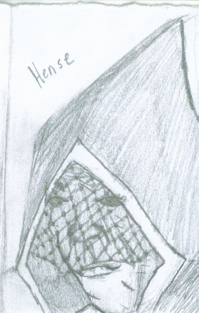
Hense:

So this is Hense, the Veiled Widow, goddess of pleasure and pain. She was actually the last one to be drawn, mostly due to a lack of skill to execute the image. Veils are HARD with just paper and pencil! When I have a greater range of shades and soem transparency to work with it'll probably go better. That, and I hate robes. The cuts and scarring will be more in detail later, and I'm aware that she has quite the chin going on there. Essentially, this one will be mostly redone. Also, I need to throw in a rose motif somewhere, as that's her Idol symbol, but I forgot.


Acobi:
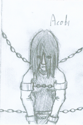
PhotobucketThis is Acobi the goddess who bound herself in oath. She's a sorrowful and self-loathing goddess, forever seeking to bind herself further. She's a patron of paladins and monks everywhere, a symbol of self-discipline and true belief in honor.
As for the drawing, her arms are all wonky, as is the depth, but I'm satisfied with the general direction to go with this. Maybe I'll throw in a lock near the center, that could be neat.


Lemaign:
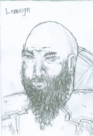
PhotobucketWooo, I like this one! As his Idol symbol is a hammer and he's the Mason King, I wanted a strong guy with some weight to him, with a dwarf-like black beard. I'm very happy with how the face turned out, gave the exact look I wanted. The rest, especially the breastplate, are just okay, but they're window dressing anyway. Not so much Hope or Despair in this one, but lots of soldier/mason look! He may need something special to reveal his deific nature - this is something I really tried to infuse into all of them, something to show that they're truly inhuman, like Hense's super-scarred body, Acobi's endless chains, and Pyth's third eye. Lemaign doesn't have something yet, he looks like he could just be a dude. But I like the drawing a lot.


Pyth:
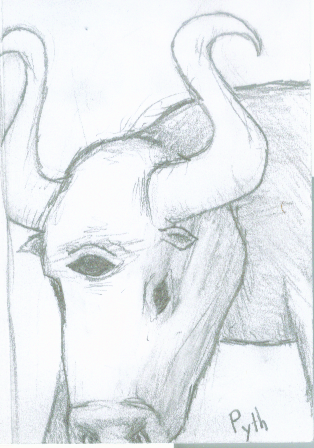
PhotobucketThe Wakeful Bull has three eyes, two normal and a third in his forehead, and only one is ever closed at a time. His horns stretch up above his head, curving in strange ways. I gave him small ears because I forgot about them until the end and couldn't figure out how to put them on. I'm not a big fan of the nose, but I'm surprisingly okay with the body. It will need some touching up and texturing (as well as some bulking up) but it's general shape has really grown on me, so this one was a happy surprise.
He needed to be somewhat special, because he's one of Caelondia's patron gods. He's their warrior god, symbol of peace, order, and power, and he adorns their walls. I'm considering doing something else with the design to make his visage more powerful and make The Rippling Walls a more imposing construct.


Jevel:
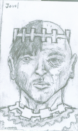
PhotobucketJevel is a lot of things. Jevel's description was the initial inspiration to start doing these, it just sounded really interesting to me. It was the first drawing I did, and I really wanted to get it right. And, well, I did. This is by far my favorite, with Garmuth coming in second and Lemaign in third. Now remember, Jevel is the Tower Keeper (inspiring the squared look of the crown and designs on the shirt), and half of his face is that of a youth in his prime, and the other, an old man. I wanted a seamless yet abrupt transition where it's definitely half and half, but I didn't want it to be like I'd drawn two images and just tried to match them to each other. Honestly, I think I succeeded on all counts. Beneath the neck was an afterthought - the face is what mattered. When it comes to doing more with these images, this is the one I want to do an awesome job on.


Yudrig:
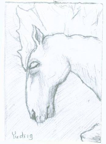
PhotobucketThe other animal of the Pantheon, I had a problem doing a pencil sketch of Yudrig. I couldn't decide what was deific about it, it just seemed to be a plain normal horse. My eventual decision was to make him glow with light in some areas (originally the whole skin, but that was axed for making him too plain. Eventually, mane was decided and then my bro suggested I add the eyes too). Unfortunately, glowing like that isn't suited to a pencil drawing really. This one will need to come through on the digital side. I'm generally happy with the shapes though, except I think the eye is slightly oddly formed, but in general I'm happy with the lines.


Roathus:
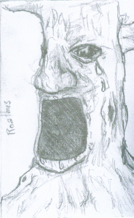
PhotobucketOh man, Roathus. The second to last one to be done, I really struggled with his concept. I had a couple ideas. The first was an enormously fat man, endlessly stuffing his face while weeping, but I deemed this unsuitable for a god; it seemed more like a personification of Gluttony. My next idea was to have him eating endlessly but remaining utterly emaciated. This was also a bit too gross for a god, and didn't cover the "grows ever larger" bit. In the end, my bro came to the rescure with the idea of him being a living tree like the Ents from Lord of the Rings. I switched it up and made him more like the Maku Tree, or like Tret from Golden Sun. His gaping maw swallows anything, and he eternally grows. The picture doesn't show the tears in his eyes very well - that was an oversight on my part, not a concept flaw.


Micia:
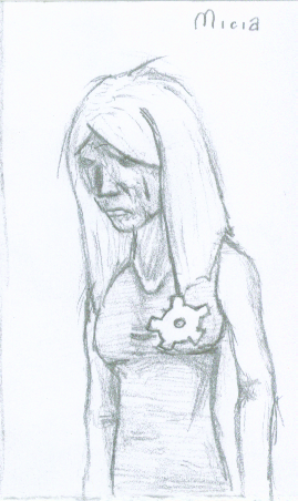
PhotobucketMicia needed to be special. She's an enormous influence on the game, but it's all subtle. She is the patron of Caelondia, and bearer of their star. She is frequently reffered to by characters like Rucks and Zulf, and Mother is more or less a replacement for God. She needed to be a strong design to fill these roles.
Something struck me about her description: her domains are both negative, Loss and Longing. She's a dark, sad goddess. I made a couple of design choices from all of it. First, her hair is white. I felt that it tied in with both Rucks and the Kid's white hair, which was pointed out as special. "Having his mother's white hair didn't do him any favors" is a paraphrase of a line about the Kid in one of the Who Knows Where bits - while I know they didn't intend it to reference the god, I think the idea that his family was made fun of for having the white hair of the sad goddess is a cool idea. Another thing I wanted was for her face to be visibly aged but her body to be that of a young maiden, the idea being that worry, longing, sadness, and tearing her heart out has prematurely aged her.
The outfit is more or less a placeholder - I want to show that she's placed the Star of Caelondia where her heart used to be, but I couldn't figure out how to draw it. Disregard the body. This drawing is much more about the concept than the specific execution. I think I also might want to reference Olak somewhere, and you'll see why...

Olak:
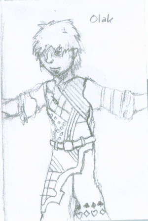
PhotobucketThis is Olak. I caught a small pattern that I'd like to think was fully intentional, but likely wasn't. Olak is the Carefree Son, who left time itself to live forever in youth and fun. Micia is the Lorn Mother, who lost something long ago and has been longing for it for eternity. Olak is the only god with two positive domains, Chance and Whim. Micia is the only goddess with two negative domains, loss and longing. See where I'm going with this? I like the idea that Olak is the lost son of Micia, who left her alone for all time for his own happiness.
So what's up with his design? I had two ideas. The first was to have him as a small child, a toddler, happy to the last. This idea ended up vetoed in my mind though. This one won out for the things I could do with it. Olak is dressed in brilliant colors and wild patterns, much like the designs the Ura wear but even more crazy. My idea is that Olak is the one who colored the world, who breathed vibrance and animation into the land. He was carefree and bright-eyed. I'm not so solid on his face, and the card suits on the pants there is just to remind me that he needs to be about Chance too. The rest of the design I very much like. I want to work in Micia though, a memento of her, or perhaps the Caelondian star.

Garmuth:
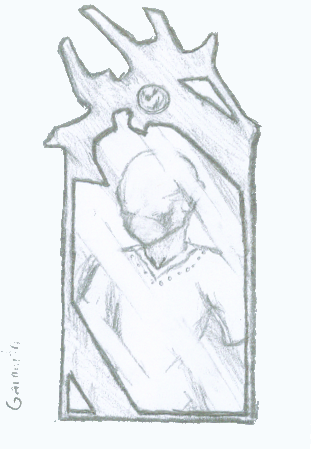
PhotobucketMy second favorite next to Jevel. My idea is that Garmuth only appears in mirrors. The wise and humble who revere Garmuth carry mirrors with them always, and in their spare moments they pull out their mirrors and reflect upon themselves and the world, looking to Garmuth to grant them the wisdom they need. On the rarest days of legend, Garmuth himself appeared in mirrors tot he wisest of men, a head with no face and a body with no limbs. He imparts wisdom through simple understanding, and though he cannot see, hear, smell, taste, or touch, he knows all.
The mirror is directly taken from his idol, though I added the bands of light over him to make sure it looked reflective. I'm aware that I want a little heavy on the shadows by the cheeks, and that I gave him ears - he's not supposed to have ears. Otherwise, I'm extremely pleased with him. He's one of the cooler ones in my mind.


So that's the Pantheon. I will probably redo Hense entirely, and everyone else needs revisions and new thoughts, and then I can go on to figure out what to do with these next. Cheers!

Oh yes, and it turns out I've already tried something just for fun.
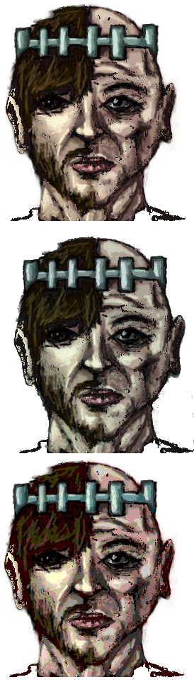
Photobucket
So, this is Jevel. I took the drawing and tried some painting over it. I'm a novice digital painter, but I kinda like it. It's messy, but a good start I think. The top is the original paintover, the second is a color edit for a much paler skin, and the third is a color edit done with the posterize function to color reduce it. It integrated things in some fun ways - the right side is heavier on the red, the left on the green. It's much too messy to use, but I like the thoughts in it.

So, until the next time! Please, give me some feedback on this!
End Recording,
Ego.

EDIT: Did a little reformatting; now the images are alongside their text, not above it! Learning how to use this blog a bit better.