So hey, I thought today I'd put up the art I did of The Succubus. Here's some background info:
The Succubus is a custom skin for Joe Mcdaldno's game Monsterhearts. The skin was created by Ernesto Pavan of the apoclypse-world.com forums. Here is a link to the thread in which the skin was posted and discussed:
http://apocalypse-world.com/forums/index.php?topic=2841.0
And here is a link to the skin itself on Google Docs:
https://docs.google.com/a/plu.edu/file/d/0B98eU24MQ87ua2tFY3N2TzJnVWM/edit
So, take a look. The first thing that struck me was that the art was pretty cool, but it wasn't MONSTERHEARTS cool. And what have I been doing with my time if not AW/MH'itizing art pieces? And so I decided that it would be really cool to find a good looking image and make the MH Succubus Skin a little cooler, at least in my eyes.
(PS Ernesto if you're reading this I really like the skin, great stuff in there)
And now, before you get to see any final images, let's give credit where credit is due! The Succubus skin belongs to Ernesto Pavan, the stock image was of MariaAmanda of Deviantart, and the photographer was Helle Gry Schaub (@MariaAmanda: I'm aware your stock rules require me to inform the photographer, but I've looked and I cannot find anywhere to do so or anywhere to link to. If you have a proper place you'd like me to link to, inform me and I will do so).
So here's the stock image I used:
http://mariaamanda.deviantart.com/art/Romantic-Goth-Stock-312781711
Can you see why I picked it? Aside from her being pretty enough for it, the outfit and makeup really said Succubus to me. I guess that says something about me in there.
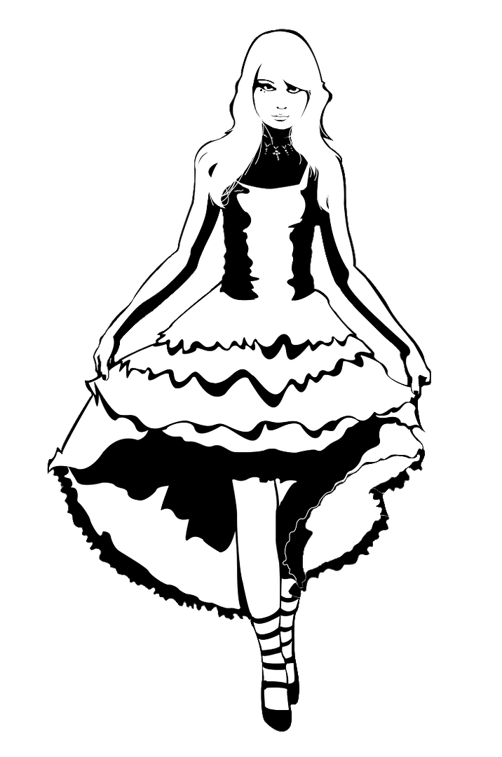
But what did *I* do with it? What I did was desaturate it and take my Pen tool and go crazy.
Yup. This is probably my favorite version of the image. If you want to see the full-size, hopefully just clicking it works, but if not go here: http://i22.photobucket.com/albums/b330/maxdxam/TheSuccubusOnTransparency.png
And extra step I went on this particular copy of it (it was not my first draft of the piece, believe me) was to make the outside transparent, making it usable on any background. It worked out much better than I'd hoped it would, but now's the real test of how well it blends with my BG I guess.
Of course, I do have some hangups. 1) It might be a bit too much white with the black mostly just serving as outline. 2) The skirt lines. They're WAY better than they were at first, but they still seem arbitrary. I could buy it though. 3) The bottom of the dress is still a bit confusing. On the other hand, the face, the hair (oh man that hair) and the hands are all EXACTLY as I want them to be and I'm extremely happy to be able to say that. Even the lips aren't causing me concern. Hell, there's even a variable thickness thing going on with the hair outline. Perfect.
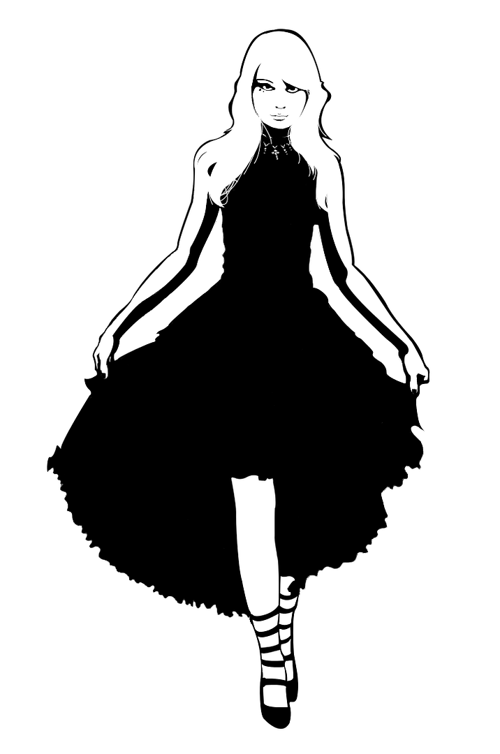
So what's the easy fix for the problems? This.
Again hopefully a click will give the full-size, but here's the link anyway: http://i22.photobucket.com/albums/b330/maxdxam/TheSuccubusOnWhiteMinimal.png
Honestly, if I were actually putting this onto the Skin booklet, this is the on e I would use. While I had a ton of fun and it was an enormous learning experience futzing with the skirt, blacking it out is both stylistically more appropriate and gets rid of all the annoying imperfections. This is what a finished product would look like.
In both versions, I did a curious thing of not giving any light to the exposed neck you can see on the stock. While this makes the dress appear like it goes all the way up and is a little less sexy/slutty (depending on how your Succubus is wearing it), I tried it other ways and nothing looked better.
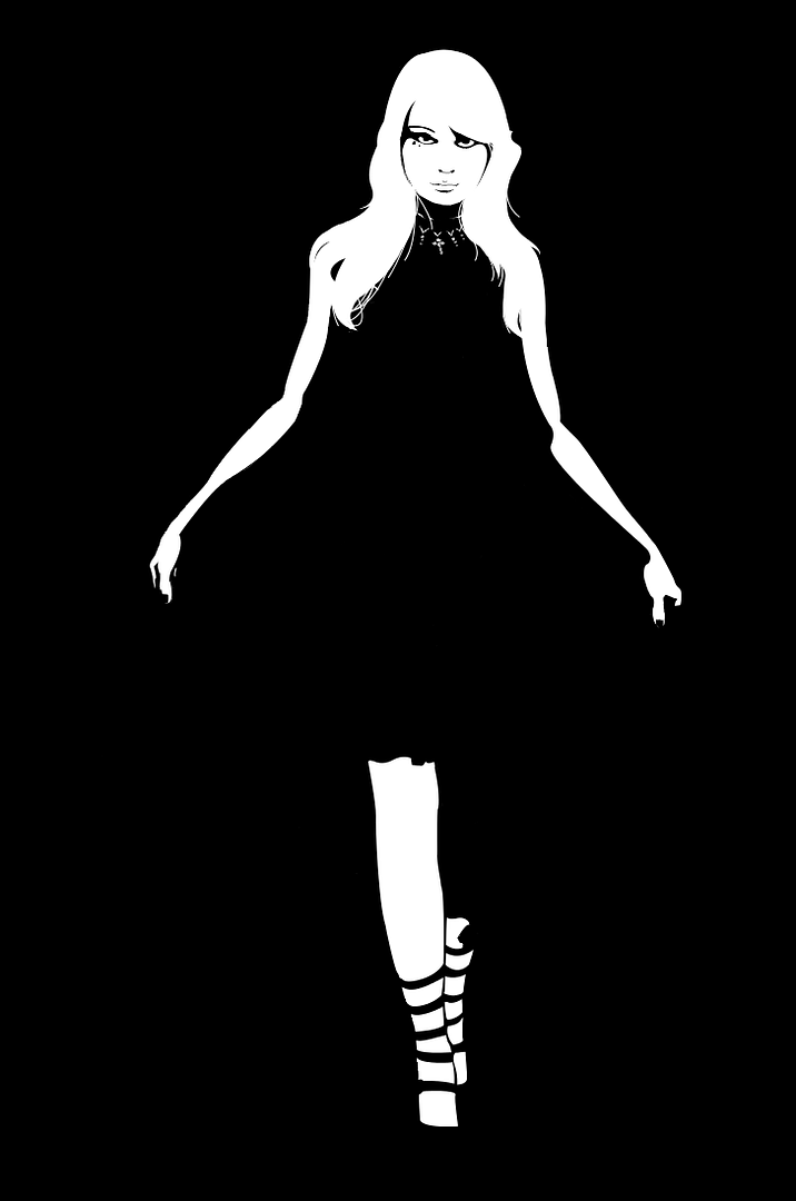
Want to see some other versions?

These are the black background ones. More suitable for an AW-style image, on this one I'd take the one with more white as the primary, what with the immense lack of definition on the all-black one.
So yeah, that should be it I think. A bunch of pictures of the art I did! Let me know what you think, or if you have an image you'd like to see this done to! If you enjoy this stuff, I might be getting my hands on some notes for a Dogs in the Vineyard-inspired Apocalypse World for me to come up with some art for and tri-fold-ize. Very excited to notes on a playbook like that though - I'd totally play that guy. If you don't know DitV btw, I did a couple sessions of that at the beginning of the year - you can find the posts with the labels Dogs in the Vineyard.
So what's next? I only need to do one more day to have done a straight week of new content! So far it's up in the air, but I'm thinking I'll finish that other Fiasco post or something. I'll let you know via Twitter (if you're reading my stuff, follow me for faster updates or small things I won't be doing full posts for! I'm @Logbook_Project, or just look at the top-right of this page!).
So I'll leave you with some music! The album I've been listening today has been Riot! by Paramore - I love Hayley Williams' voice. Anyway, I've been enjoying Crushcrushcrush a lot, but Misery Business is a hell of a lot more appropriate to the Succubus, so have a video.
http://www.youtube.com/watch?v=aCyGvGEtOwc
Anyone else like that I'm tossing music at the end of these posts? I'm figuring I'll try to do that when I have something else to post - dedicated daily music is for my Songaday runs, which if you didn't know I have another Songaday planned for December though I might run it a little early if I start overflowing with music. Anyway, seeya tomorrow folks (maybe even sooner if I have something to tweet!).
End Recording,
Ego.
The Succubus is a custom skin for Joe Mcdaldno's game Monsterhearts. The skin was created by Ernesto Pavan of the apoclypse-world.com forums. Here is a link to the thread in which the skin was posted and discussed:
http://apocalypse-world.com/forums/index.php?topic=2841.0
And here is a link to the skin itself on Google Docs:
https://docs.google.com/a/plu.edu/file/d/0B98eU24MQ87ua2tFY3N2TzJnVWM/edit
So, take a look. The first thing that struck me was that the art was pretty cool, but it wasn't MONSTERHEARTS cool. And what have I been doing with my time if not AW/MH'itizing art pieces? And so I decided that it would be really cool to find a good looking image and make the MH Succubus Skin a little cooler, at least in my eyes.
(PS Ernesto if you're reading this I really like the skin, great stuff in there)
And now, before you get to see any final images, let's give credit where credit is due! The Succubus skin belongs to Ernesto Pavan, the stock image was of MariaAmanda of Deviantart, and the photographer was Helle Gry Schaub (@MariaAmanda: I'm aware your stock rules require me to inform the photographer, but I've looked and I cannot find anywhere to do so or anywhere to link to. If you have a proper place you'd like me to link to, inform me and I will do so).
So here's the stock image I used:
http://mariaamanda.deviantart.com/art/Romantic-Goth-Stock-312781711
Can you see why I picked it? Aside from her being pretty enough for it, the outfit and makeup really said Succubus to me. I guess that says something about me in there.
But what did *I* do with it? What I did was desaturate it and take my Pen tool and go crazy.
Yup. This is probably my favorite version of the image. If you want to see the full-size, hopefully just clicking it works, but if not go here: http://i22.photobucket.com/albums/b330/maxdxam/TheSuccubusOnTransparency.png
And extra step I went on this particular copy of it (it was not my first draft of the piece, believe me) was to make the outside transparent, making it usable on any background. It worked out much better than I'd hoped it would, but now's the real test of how well it blends with my BG I guess.
Of course, I do have some hangups. 1) It might be a bit too much white with the black mostly just serving as outline. 2) The skirt lines. They're WAY better than they were at first, but they still seem arbitrary. I could buy it though. 3) The bottom of the dress is still a bit confusing. On the other hand, the face, the hair (oh man that hair) and the hands are all EXACTLY as I want them to be and I'm extremely happy to be able to say that. Even the lips aren't causing me concern. Hell, there's even a variable thickness thing going on with the hair outline. Perfect.
So what's the easy fix for the problems? This.
Again hopefully a click will give the full-size, but here's the link anyway: http://i22.photobucket.com/albums/b330/maxdxam/TheSuccubusOnWhiteMinimal.png
Honestly, if I were actually putting this onto the Skin booklet, this is the on e I would use. While I had a ton of fun and it was an enormous learning experience futzing with the skirt, blacking it out is both stylistically more appropriate and gets rid of all the annoying imperfections. This is what a finished product would look like.
In both versions, I did a curious thing of not giving any light to the exposed neck you can see on the stock. While this makes the dress appear like it goes all the way up and is a little less sexy/slutty (depending on how your Succubus is wearing it), I tried it other ways and nothing looked better.
Want to see some other versions?

These are the black background ones. More suitable for an AW-style image, on this one I'd take the one with more white as the primary, what with the immense lack of definition on the all-black one.
So yeah, that should be it I think. A bunch of pictures of the art I did! Let me know what you think, or if you have an image you'd like to see this done to! If you enjoy this stuff, I might be getting my hands on some notes for a Dogs in the Vineyard-inspired Apocalypse World for me to come up with some art for and tri-fold-ize. Very excited to notes on a playbook like that though - I'd totally play that guy. If you don't know DitV btw, I did a couple sessions of that at the beginning of the year - you can find the posts with the labels Dogs in the Vineyard.
So what's next? I only need to do one more day to have done a straight week of new content! So far it's up in the air, but I'm thinking I'll finish that other Fiasco post or something. I'll let you know via Twitter (if you're reading my stuff, follow me for faster updates or small things I won't be doing full posts for! I'm @Logbook_Project, or just look at the top-right of this page!).
So I'll leave you with some music! The album I've been listening today has been Riot! by Paramore - I love Hayley Williams' voice. Anyway, I've been enjoying Crushcrushcrush a lot, but Misery Business is a hell of a lot more appropriate to the Succubus, so have a video.
http://www.youtube.com/watch?v=aCyGvGEtOwc
Anyone else like that I'm tossing music at the end of these posts? I'm figuring I'll try to do that when I have something else to post - dedicated daily music is for my Songaday runs, which if you didn't know I have another Songaday planned for December though I might run it a little early if I start overflowing with music. Anyway, seeya tomorrow folks (maybe even sooner if I have something to tweet!).
End Recording,
Ego.


Ernesto here. This is soooooooo awesome *_*
ReplyDeleteCan I use that picture for the final playbook's illustration?
As long as you properly credit both the stock maker and the photographer (her rules), I would be absolutely thrilled to have my art go on the final thing.
DeleteAnd thank you very much for the complement, it means a lot to me. :3
I was so eager I forgot one thing: some time ago, on Google+, I offered a small sum of money (25 euro, more or less 30 dollars at the present exchange rates) for anyone who made the skin illustration for me. Do you have a Paypal Account? :-)
ReplyDeleteWorking on something for the Paypal account, I'll get the account to you in a couple days - do you have an email I can send it to?
DeleteThank you very much though, I'm ecstatic at the offer, and I'm very excited about it. I'll definitely be in touch once my account acts right.
Thanks!
nevyn.nevyn[at]gmail[dot]com ;-)
ReplyDeleteSuch a nice collection, i like it.
ReplyDelete