I have a little treasure trove of amazing songs from Ghost In The Shell: Stand Alone Complex and Solid State Society to post, and I'm basically just gonna abuse the fact that posts aren't Songaday and start using them when I can't think of anything else to use. This comes from Solid State Society and features one of Yoko Kanno (the general composer)'s main three singers. She uses Origa a lot, as well as Scott Matthew, but this is Ilaria Graziano! I honestly have no idea what language she's singing though - Kanno's music switches a lot, between Japanese, English, Russian, and Latin mostly, sometimes within a single song.
Today's a short one!
So this is actually pretty good! Before I get to the lesson, this may be Cristina's first submission to PixelJoint, but her deviantart (linked in her profile) shows that she's got some pretty good talent going on! Here you go Cristina, have some free publicity:
http://cristinalubas.deviantart.com/gallery/
I like this one in particular:

So cool art gal!
Anyway, back to Kick!
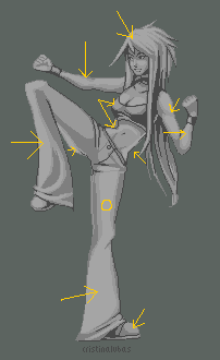
"Kick" by cristinalubas
Major Themes: Anatomy, Large Smooth Surfaces
So I came in after a couple of good comments by other people!First pixel work!
I'm still trying to get everything right, keeping practicing. Crits well seen!
ErekT said:
Nice shading, chr design and pose :) Anatomy proportions are a bit off in some places; the shins and upper left arm (her left) are too long, while the left lower arm is too short. The hand has a painful-looking angle too. Not sure what's going on in the neck area. I think you could probably clean up some black outlines, make em continuous.And Epoxy said:
Cool pose, but her waist is pinched and twisted at a funny angle and she seems to lack the abdominal muscles that would allow someone to do this kick.Which are both excellent advices on anatomy. Here's what I posted to add on!
Erek and Epoxy are right that the anatomy is kinda weird - I don't have much to add in that department.
In the pixel department, it's generally pretty decent. The lightsource is kind of all over the place, coming from the left, from the right, from the top, from straight on - it's pretty inconsistent. Here, I labeled some light dirctions:
There's also a pretty good deal of banding. This results from the way you're outlining - it's not super bad or anything, but it does drag down some of the piece's aesthetic. Here's some particular spots:
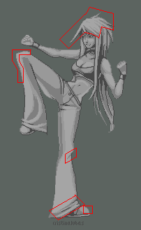
The biggest issue is just the way you're handling the large stretches of similar shades, such as the arms and legs. Where things are more intricate, such as in the crotch, abdomen, or face, things look pretty great. But I think you're trying to fill space with the excessive lighting on the arms and legs. Admittedly, large smooth surfaces like those are vert difficult to make look textured. My biggest recommendation is to look carefully at fighting game sprites - I advise Street Fighter III, I think it has some visual ideas you could use. Look at Remy's images in particular - his pants are similar in style to this girl's, and could give you some ideas about how to add some visual interest without making things look kinda blob-ish.
I like the action and attitude in the piece though, and where your pixel work is more focused it gets pretty excellent, especially for a first pixel! Keep it up, I'd love to see more cool stuff from you in the future. :)It would appear that lightsource and banding are my main things when it comes to critique. Anyway, the big thing to understand with this piece is that your context can have some major impact on what you're doing. This, while not literally a fighting game sprite, is going to be judged against its peers in the fighting game sprite world because of the similarity of subject matter, and that means knowing what you should get right. One thing that fighting game sprites are pretty awesome at is nailing anatomy. It's important to them, and they often exaggerate anatomy (see: Blanka), but it still looks "right" because it's rooted firmly in how things really would be.
But you shouldn't only be looking at fighting game sprites to compare yourself to, but also as a lesson in themselves!
Here's Remy, the guy I recommended Cristina look at:


Why do we want to avoid large smooth surfaces? Well, in my opinion, they're among the hardest thing in pixel art to do well. It's why faces in pixel art are hard to make look natural, because you can't smooth them easily. Our best tools are to use a million colors (bad choice), to dither (very very difficult), or to cel-shade (not always appropriate looking). If we have tricks to NOT do large flat surfaces, we should use them. And the best trick in the book is to make it not a large smooth surface, adding visual interest while remaining realistic-looking.
So that's my bit for today. I've actually been trying to improve my skill at Soul Caliber a bit lately, mostly after EVO a couple weeks ago reminded me of the depth you can go to with fighting game mechanics.
Later.
End Recording,
Ego.
No comments :
Post a Comment